Why Do Klimt Flower Prints Work Better in Unexpected Rooms?
A room-by-room guide to styling Klimt's gardens, meadows and sunflowers, with honest advice on frames, sizes and colour.

Klimt's golden portraits get all the attention, but his garden paintings are quietly the more useful art for a real home. They are softer, more intimate, and far easier to live with day to day. This guide tells you exactly which Klimt floral goes where, and why.
Why Klimt's Flower Paintings Are Unusually Versatile as Wall Art
Klimt painted his landscapes and gardens during summers at Lake Attersee, away from his Vienna studio. They were unpeopled, personal, and made largely for his own pleasure, which is why they account for nearly a quarter of his output yet feel nothing like the gilded society portraits people associate with him.
That difference matters when you're hanging one on your wall. A Klimt portrait demands a room built around it. A Klimt garden slots into a space and improves it without taking over. The patterning is dense but the subject matter is calm, which is a rare combination in fine art.
The other thing worth knowing is that Klimt's flower paintings aren't a single look. Bauerngarten (also called Farm Garden) from 1907 is a tight, vertical riot of red, white and blue blooms. Farm Garden with Sunflowers is taller, warmer, with strong yellow verticals. The meadow and orchard scenes are quieter, almost pointillist, with cooler greens. Treat them as different tools.

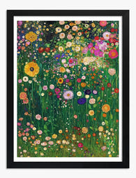
Living Room: Flower Garden as a Statement Piece
The living room is where you want the biggest, busiest Klimt you can find. Flower Garden (1907) is the one we reach for first. It reads as a wall of colour from across the room, then resolves into individual poppies, daisies and roses when you stand close. That dual quality is exactly what a living room wall needs because people experience it from both five metres and fifty centimetres.
Go large. On a wall above a three-seater sofa, a 70x100cm framed print is the minimum. If you have the wall and the ceiling height, push to canvas at 100x150cm. A small Klimt above a big sofa looks apologetic, which is the one thing this artist never was.
Frame choices for the living room
For a traditional or transitional lounge, an oak frame warms up Klimt's reds and greens without competing. For a more contemporary space, black slim profile frames give the print a graphic edge and stop the room feeling like a Viennese salon. We'd avoid gold frames in the living room unless your space is genuinely opulent already. On Klimt, gold can tip from rich to costume.
If you're nervous about commitment, canvas is the easier living room choice. It's lighter, doesn't reflect lamplight, and the mirrored edge wrap means none of the painting is lost to the frame. Browse the full Klimt flower wall art range to compare formats side by side.
Hanging height
Centre the print at roughly 145cm from the floor when you're standing, or about 20cm above the back of your sofa when seated. People consistently hang art too high. Klimt's gardens reward being viewed at eye level because the detail is genuinely worth seeing close up.
Bedroom: Choosing a Calmer Klimt Meadow or Field Print
The living room wants drama. The bedroom does not. Skip the dense floral compositions here and look instead to Klimt's meadow and orchard paintings. A Field of Poppies, Poppy Field and the Orchard series are softer, with broader washes of green and cooler tonal ranges. They give you the Klimt patterning without the visual volume.
A meadow print above the bed creates depth without keeping you awake. We particularly like the Orchard paintings for bedrooms because the rhythm of the trees is meditative rather than busy. If you sleep light or your bedroom is small, this is the right call.
Size and placement
Above a double or king bed, aim for a print that's roughly two-thirds the width of the bed. For a 150cm bed, a 100x70cm landscape print works beautifully. For a 180cm bed, push up to the largest framed size available. Hang it 15-20cm above the headboard.
If you have twin nightstands and a symmetrical setup, consider two smaller prints (50x70cm each) flanking the bed rather than one large piece above it. A pair of Klimt orchard studies in matching frames gives the room balance without the heaviness of a single statement.

Frame recommendation
Bedrooms work best with frames that disappear. White or pale oak in a slim profile is our default. The acrylic glaze on framed prints matters more in a bedroom than you'd think, because morning light through a window can wash out detail or create glare on traditional glass. Acrylic stays clear and the UV protection keeps the colours stable over years of direct sun exposure.
Hallway and Entryway: Making a Bold First Impression with Klimt Sunflowers
Hallways are the most under-used walls in most homes. They're also where Klimt's Farm Garden with Sunflowers genuinely earns its keep. The painting is vertical, which suits narrow walls. It's warm and welcoming, which is what an entryway should be. And the sunflower verticals draw the eye upward, which makes low-ceilinged hallways feel taller.
This is the one room where we'd actively encourage a gold or warm brass frame. An entryway is meant to make a statement and you only spend seconds there, so a bit of theatre is welcome. The frame catches whatever light comes through the front door and announces that someone with taste lives here.
Sizing a hallway print
For a standard hallway wall, 50x70cm portrait orientation is the sweet spot. It's substantial enough to register but not so large it dominates a passageway. If you have a wider feature wall at the end of a corridor, this is a perfect spot for the full 70x100cm format.
In long hallways, consider three smaller Klimt florals (40x50cm) hung in a row at consistent height. Mix Farm Garden with Sunflowers with Bauerngarten and one of the Orchard paintings. The variation in tone keeps the eye moving down the corridor, which is exactly what you want functionally and visually. The full Gustav Klimt collection gives you enough range to do this without buying anything that feels redundant.
Dining Room: Warm Tones and Garden Scenes That Set the Mood
Dining rooms are about atmosphere and conversation, which means art needs to add warmth without demanding attention. Klimt's Bauerngarten and the later Garden Path with Chickens are ideal because the red-green palette flatters skin tones under warm bulbs and the compositions reward the kind of casual looking that happens between courses.
We have a strong preference for one large print over a dining table rather than a gallery wall. A single 100x70cm landscape framed print, centred above a six-seater table, creates a focal point that makes the whole room feel intentional. Gallery walls in dining rooms tend to feel restless, especially when you're sitting still for an hour.
Working with dining room lighting
If you have a pendant over the table, hang the print on a perpendicular wall rather than directly opposite. Pendants cast downward light that can reflect off framed glazing if the print sits directly in the bounce zone. Acrylic glazing helps enormously here because it's far less reflective than glass, but geometry still matters.
For purely candlelit dining rooms (which we love), canvas is the right format. It absorbs ambient light rather than reflecting it, and the matte finish suits the romantic, slightly imperfect mood you're trying to create.

Colour cues from the painting
Klimt's Bauerngarten gives you a ready-made palette to pull from. The terracotta reds work brilliantly on dining chairs or a runner. The deep greens suit velvet curtains or a single accent wall. Avoid matching too literally though. The point is harmony, not theme.
Frame and Paper Choices: What We Recommend for Each Setting
The biggest mistake people make with Klimt is over-framing. These paintings are already maximalist. Heavy ornate gold frames can push them from rich to gaudy in the wrong room.
Our default recommendations
- Living room: Slim oak frame, framed print, museum-grade matte paper. The matte finish stops glare from lamps and TV screens, and the thick paper gives the print depth you can see at close range.
- Bedroom: White or pale oak slim frame, or unframed canvas for a softer feel. Small to medium size.
- Hallway: Warm oak or brass frame, framed print, medium size. The acrylic glaze matters here because hallways often have variable light from front doors and windows.
- Dining room: Black or dark oak frame for formal dining rooms, canvas unframed for casual ones. Larger sizes.
Paper versus canvas
The honest answer is that paper prints (giclée on thick matte) show Klimt's brushwork in sharper detail. You can see the impasto where he layered paint, which is part of what makes these gardens interesting up close. Canvas gives you a softer, more painterly impression with no glare and zero frame fuss. Neither is objectively better. Choose paper if you want detail and a polished, finished look. Choose canvas if you want texture, less weight, and a more relaxed feel.
The thing that does matter, regardless of format, is that print and frame ship together properly fitted. Prints fitted after the fact (or sold with frames bought separately) almost always bubble or warp at the corners within a year. It's the single most common failure in this category and it's worth checking before you buy anywhere.
Colour Palettes That Pair Beautifully with Klimt Florals
Klimt worked with an oppositional red-green palette punctuated by strategic blues. Once you see it in his paintings, you'll see it in every successful Klimt-styled room.
Three palettes that work
Warm earth: Terracotta walls, cream linen, oak furniture, brass fixtures. This pulls out the reds in Bauerngarten and Flower Garden and makes the room feel sun-soaked even in winter. Suits south-facing living rooms and dining rooms.
Cool botanical: Sage or olive green walls, off-white trim, pale wood, woven natural textures. This brings the greens forward and lets the floral colours pop. Particularly good for bedrooms and north-facing rooms where you want to amplify what daylight you have.
Moody contrast: Deep navy or forest green walls, brass accents, dark wood, cream upholstery. This is the most dramatic option and works brilliantly with the Farm Garden with Sunflowers because the yellow verticals glow against a dark backdrop. Save it for dining rooms, studies, or feature walls.
Colours to avoid
Cold greys and stark whites tend to flatten Klimt's palette. The paintings need warmth around them to sing. If your walls are pure white, introduce warmth through textiles, lampshades and rugs before adding the print. Otherwise it'll look like a poster on a gallery wall, which is the opposite of the lived-in feeling Klimt's gardens were made for.
If you want to build a wider palette around one piece, the broader floral art prints selection is a useful reference for what tones to layer in. And if you're styling a whole living room art print scheme, start with the largest piece and work outwards.
A note on mixing Klimt with other art
Klimt florals can absolutely sit in a gallery wall, but only if you give them a quiet neighbour. Pair a Bauerngarten with a botanical line drawing, a black and white photograph, or a single abstract in tones pulled from the painting. Avoid hanging two Klimts next to each other unless they're a deliberately matched pair from the orchard series. Two riots of colour side by side cancel each other out.
A final practical note
The best Klimt rooms aren't museums. They're rooms where one good garden painting hangs at the right height, in the right frame, against a wall colour that flatters it, and where the rest of the space has been allowed to stay quiet. Buy the largest size you can justify, frame it simply, hang it lower than you think, and let the painting do its work.


Prodotti Fab presentati in questo blog
-

Poster giardino fiorito di Gustav Klimt
Translation missing: it.products.product.sale_price A partire da €16,95€22,95 -

Tela giardino fiorito in stile Klimt
Translation missing: it.products.product.sale_price A partire da €64,95€91,95 -
Poster giardino di fiori di campo di Klimt
Translation missing: it.products.product.sale_price A partire da €16,95€22,95 -

Poster giardino fiorito di Klimt
Translation missing: it.products.product.sale_price A partire da €16,95€22,95 -

Poster giardino fiorito di Gustav Klimt
Translation missing: it.products.product.sale_price A partire da €16,95€22,95 -

Poster sogno floreale di Klimt
Translation missing: it.products.product.sale_price A partire da €16,95€22,95 -

Tela giardino fiorito di Klimt
Translation missing: it.products.product.sale_price A partire da €64,95€91,95 -

Poster giardino floreale di Klimt
Translation missing: it.products.product.sale_price A partire da €16,95€22,95 -

Poster sinfonia floreale di Gustav Klimt
Translation missing: it.products.product.sale_price A partire da €16,95€22,95 -

Poster fiori in giardino di Gustav Klimt
Translation missing: it.products.product.sale_price A partire da €16,95€22,95 -

Tela sinfonia floreale di Gustav Klimt
Translation missing: it.products.product.sale_price A partire da €64,95€91,95 -

Poster giardino fiorito di Klimt
Translation missing: it.products.product.sale_price A partire da €16,95€22,95 -

Poster giardino fiorito di Gustav Klimt
Translation missing: it.products.product.sale_price A partire da €16,95€22,95 -

Tela il giardino fiorito di Klimt
Translation missing: it.products.product.sale_price A partire da €64,95€91,95 -

Tela sinfonia floreale di Gustav Klimt
Translation missing: it.products.product.sale_price A partire da €64,95€91,95 -

Poster sinfonia floreale di Klimt
Translation missing: it.products.product.sale_price A partire da €16,95€22,95 -

Poster sinfonia floreale di Klimt
Translation missing: it.products.product.sale_price A partire da €16,95€22,95 -

Poster giardino selvatico di Gustav Klimt
Translation missing: it.products.product.sale_price A partire da €16,95€22,95 -

Poster giardino rosa di Gustav Klimt
Translation missing: it.products.product.sale_price A partire da €16,95€22,95 -

Poster sinfonia floreale di Klimt
Translation missing: it.products.product.sale_price A partire da €16,95€22,95


Di più da The Frame

Why Klimt Painted Forests: The Story Behind His...
The Vienna scandals that made Klimt crave the countryside By 1900, Gustav Klimt was the most talked-about painter in Vienna for reasons he had not chosen. He had been commissioned...

Who Did Klimt Actually Paint? The Real People i...
Gustav Klimt painted some of the most recognisable women in art, but most people couldn't name a single one of them. The faces draped in gold and pattern were real...

Klimt's Beech Forest and Birch Forest Paintings...
Klimt's forests are having a moment, and the search results are a mess. People type in "beech forest poster" and end up looking at three different paintings with overlapping German...