You're Overthinking Your Colourful Gallery Wall
The golden ratio, frame rules and floor-planning method that turns chaotic colour into a gallery wall that actually works.

Most colourful gallery walls fail for the same reason: every print is shouting. You don't need ten bold pieces fighting each other, you need one or two that carry the energy and the rest doing quiet, useful work around them. Here's the actual method.
The golden ratio: how many bold prints in a gallery wall
The rule we keep coming back to is one bold piece to every two or three supporting pieces. So a five-piece wall has one anchor and four supporters. A seven-piece wall can take two anchors and five supporters, as long as the anchors aren't sitting right next to each other.
This ratio exists because the eye needs somewhere to land and somewhere to rest. Stack the wall with five vivid abstracts and you've built visual noise. Hang a single saturated piece among muted companions and the bold one reads as intentional, almost curated.
The ratio shifts slightly by room. In a living room or hallway, where you want energy, push toward 1:2. In a bedroom, where you want calm but still want personality, pull back to 1:3 or even 1:4. Same principle, dialled to function.
A quick troubleshooting note: if your gallery wall feels chaotic, count your bold pieces. If it's more than a third of the arrangement, that's your problem, not the layout.

Choosing your anchor piece (go big, go energetic)
The anchor is the print everything else negotiates with. It should be the largest piece on the wall, the most saturated, and ideally the one with the strongest composition. Think a 70x100cm abstract in cobalt and ochre, or a punchy figurative piece with a single dominant colour.
Size matters here. Your anchor should be at least 1.5 times the size of your largest supporting print. If your supporters are 30x40cm, your anchor wants to be at least 50x70cm, ideally 70x100cm. Anything closer in size and the hierarchy collapses, leaving you with a wall of pieces that all feel equally important, which is the same as none of them being important.
Position the anchor slightly off-centre in the overall arrangement, not dead middle. Roughly one-third in from one side works well, because it pulls the eye through the composition rather than fixing it in place. Browse our energetic art prints collection if you're hunting for something that can carry this weight without tipping into garish.
One honest trade-off: a true anchor piece is a commitment. It will define the mood of the room. If you're not sure about a colour palette, start with the anchor and build the rest of the room around it, not the other way around.
Selecting supporting prints that don't compete
Supporting prints have one job: make the anchor look better. They should share something with the anchor (a colour, a mood, a subject) but never try to match its intensity.
Three practical rules for picking supporters:
- Pull one colour from the anchor and repeat it, quieted down. If your anchor has a vivid terracotta, a supporter might use the same terracotta but as a thin line on a cream background. Same hue, lower saturation.
- Vary the subject matter. If the anchor is abstract, mix in a botanical, a line drawing, a piece of typography, a black and white photograph. Don't repeat the same genre four times.
- Keep at least one or two supporters mostly white, cream or black. These are your breathing room. Without them, the wall feels packed.
Colour temperature matters more than people realise. If your anchor is warm (reds, oranges, ochre), most supporters should also lean warm, with maybe one cool piece for contrast. Mixing warm and cool in equal measure tends to read as indecision rather than balance.
For supporters, our abstract art prints and quieter line work tend to do this job well, because they offer texture and interest without raising the volume.
Frame consistency: why it matters more with mixed styles
This is the part most people get wrong. When you're mixing high-energy and low-energy prints, frame consistency is the single biggest tool you have for making the whole thing read as one piece.
Pick one frame finish for the entire wall. Black oak. Natural oak. White. Pick one and commit. The visual contrast between a vivid abstract and a delicate ink drawing is already doing plenty of work. Adding three different frame colours on top is what tips a gallery wall from "considered" into "yard sale."

A few specifics we'd stand behind:
- Black frames suit bold, graphic, modern interiors. They sharpen everything.
- Natural oak frames are the safest pick for mixed-energy walls because the wood tone reads as warm without competing with the print colours.
- White frames disappear against pale walls, which can be brilliant if you want the art to feel like it's floating, or a problem if you wanted definition.
Mount widths should also stay consistent. If one print has a wide white mount around the image, the others should too. A mount adds visual breathing room and makes smaller prints feel more substantial.
This is also where shipping quality matters. Frames that arrive warped, separated from their prints, or fitted unevenly will undermine all the work you've put in. Every Fab framed print ships fitted, fixtures attached, in one box. The frames are solid FSC wood, not veneer or MDF, with UV-protective acrylic glaze instead of glass, so they won't shatter and won't fade even in a sunny lounge.
Layout templates that work for energetic gallery walls
You don't need to invent a layout. Three templates do most of the work.
The Grid
Three by three, or two by three. All frames the same size, evenly spaced (typically 5-7cm gaps). Your anchor is one of the cells, ideally off-centre. Grids are the easiest layout to execute because the maths is simple, and they're the most forgiving for first-timers. They also make even very colourful prints feel orderly.
Best for: bedrooms, hallways, anywhere you want energy contained.
The Salon Hang
Irregular, organic, varied sizes. Your anchor sits roughly one-third in, and supporters cluster around it. The trick: align either the tops or the bottoms of adjacent prints, even when sizes vary, so the eye finds invisible horizontal lines holding the arrangement together.
Best for: living rooms, dining rooms, larger walls where you want movement.
The Horizontal Run
Three to five prints in a straight horizontal line, usually above a sofa or sideboard. Anchor goes second from one end (never dead centre). All prints align along a central horizontal axis through their middles.
Best for: above furniture, narrow walls, when you want impact without overwhelming the room.
For sets that already work as a coordinated group, our wall art sets take some of the guesswork out, because the curation and proportions are already done.
Sizing guide: mixing print sizes without chaos
The reason mixed-size gallery walls go wrong is usually that the sizes are too close. Three prints at 40x50cm, 50x70cm and 60x80cm read as awkwardly similar rather than intentionally varied. You need clear jumps.
A reliable formula: pick three size tiers and use them across the wall.
- Anchor tier: 70x100cm or 100x70cm
- Mid tier: 50x70cm or 40x50cm
- Small tier: 30x40cm or 21x30cm
Mix at least two tiers, ideally all three. One large, two medium, two small is a classic five-piece formula that almost always works.
For canvas anchors specifically, you can go bigger. Canvas prints scale up to 100x150cm, and at that size a single piece can carry an entire wall on its own with just a couple of smaller framed supporters either side. Canvas is also lighter than glass-fronted framing, which matters on plasterboard walls or in older houses with crumbly plaster.
Above a sofa, your anchor should be roughly two-thirds the width of the sofa. A 2.2m sofa wants a 140-150cm-wide arrangement above it, which could be one large canvas or a horizontal run of three to five framed prints. Hung 15-20cm above the back of the sofa, not higher.
Eye level for the centre of the overall arrangement should be around 145-150cm from the floor in standing rooms, slightly lower (130-140cm) above seating, where you'll mostly view it sitting down.
How to plan on the floor before you drill
Skip this step and you'll be filling holes. The floor planning method is genuinely the difference between a wall that works and a wall you have to redo.
Step 1: Lay it out flat
Clear a floor space the size of your wall. Arrange all the prints face-up on the floor in your intended layout. Anchor first, then supporters around it. Move them around until the spacing and balance feel right. Take a photo from directly above, look at the photo, not the floor (the camera flattens it and shows you what the wall will actually feel like).
Step 2: Cut paper templates
Cut a piece of brown paper or newspaper to the exact size of each frame. Write the print name on each one. Mark where the hanging fixture sits on the back of each frame onto the template (measure from the top of the frame down to the hanging point).
Step 3: Tape templates to the wall
Use low-tack masking tape. Position the templates in your chosen arrangement. Stand back. Look at it from the doorway, from the sofa, from across the room. Live with it for an hour if you can. Adjust.
Step 4: Mark and drill
Once the templates are right, push a pencil through the marked hanging point on each template directly onto the wall. Take the templates down. Drill into those marks.
This sounds laborious. It takes about 40 minutes for an eight-piece wall, and it eliminates almost every mistake people make hanging gallery walls.

A note on digital tools: free apps like Photoshop, Procreate, or even just taking a photo of your wall and dropping rectangles onto it in any image editor will let you mock up arrangements before you buy. Useful, but no substitute for paper templates at full size, because screens lie about scale.
Our recommended print combinations
A few combinations we'd stand behind, for different rooms and moods.
Living room: warm energy
- Anchor: 70x100cm abstract in burnt orange, terracotta and cream
- Supporters: 50x70cm botanical line drawing on cream; 40x50cm black and white architectural photo; two 30x40cm small abstracts in muted ochre and sage
- Frames: Natural oak throughout
This pulls warmth from the anchor through the smaller pieces without anything else competing for attention. Sits well above a mid-tone sofa.
Bedroom: quiet with personality
- Anchor: 50x70cm muted figurative or landscape in dusty pink and sage
- Supporters: Three 30x40cm prints, mix of line drawing, soft abstract, typography
- Frames: White or natural oak
Lower energy overall, with the anchor doing just enough work to give the room character. The ratio here is 1:3 because bedrooms reward restraint.
Hallway: bold and graphic
- Anchor: 70x100cm vivid abstract or pop-style print
- Supporters: Four 30x40cm prints in a strict grid, mostly black and white with one accent colour
- Frames: Black throughout
Hallways are short-dwell spaces. You walk past, you register the impact, you keep moving. They're the best place for your most confident colour choices, which is why our colourful art prints collection often ends up here.
Above a sideboard: horizontal run
- Anchor: 60x80cm landscape-orientation bold print, second from the right
- Supporters: Three 40x50cm portrait prints in muted tones
- Frames: Natural oak
A five-piece horizontal works beautifully here. Align the middles, keep spacing at 5cm.
The shortcut
If you remember nothing else: one bold anchor, two to three calmer supporters, one frame finish across the whole wall, paper templates before you drill. That's the method. The rest is taste, and taste is easier to apply once the structure is right.


Prodotti Fab presentati in questo blog
-

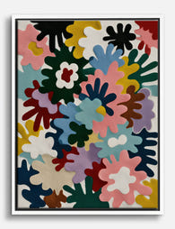
Poster astratto a blocchi di colore vivaci e armoniosi
Translation missing: it.products.product.sale_price A partire da €16,95€23,95 -

Tela astratta esplosione di colori
Translation missing: it.products.product.sale_price A partire da €64,95€92,95 -

Poster cavallo al galoppo multicolore
Translation missing: it.products.product.sale_price A partire da €16,95€23,95 -

Tela astratta con pennellate rosse e linee geometriche su blu notte
Translation missing: it.products.product.sale_price A partire da €64,95€92,95 -

Poster astratto esplosione di colori
Translation missing: it.products.product.sale_price A partire da €16,95€23,95 -

Tela fusione radiosa di colori
Translation missing: it.products.product.sale_price A partire da €64,95€92,95 -
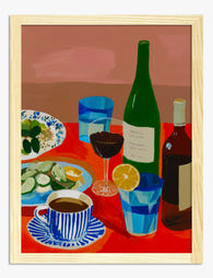
Poster tavola rossa conviviale
Translation missing: it.products.product.sale_price A partire da €16,95€23,95 -

Tela astratta geometrica a blocchi pastello vivaci
Translation missing: it.products.product.sale_price A partire da €64,95€92,95 -

Poster astratto cascata di colori
Translation missing: it.products.product.sale_price A partire da €16,95€23,95 -

Tela tavola in festa dai colori vivaci
Translation missing: it.products.product.sale_price A partire da €64,95€92,95 -

Poster astratto vortice di colori
Translation missing: it.products.product.sale_price A partire da €16,95€23,95 -

Tela libreria dai colori vivaci
Translation missing: it.products.product.sale_price A partire da €64,95€92,95 -

Poster cavallo al galoppo vibrante
Translation missing: it.products.product.sale_price A partire da €16,95€23,95 -

Poster paesaggio collinare colorato
Translation missing: it.products.product.sale_price A partire da €16,95€23,95 -

Poster tavola imbandita in stile fauvista dai colori vivaci
Translation missing: it.products.product.sale_price A partire da €16,95€23,95 -

Tela natura morta conviviale dai colori vivaci
Translation missing: it.products.product.sale_price A partire da €64,95€92,95 -

Poster astratto blu cobalto e rosso in equilibrio
Translation missing: it.products.product.sale_price A partire da €16,95€23,95 -
Tela soggiorno pop colorato
Translation missing: it.products.product.sale_price A partire da €64,95€92,95 -
Tela esplosione di colori
Translation missing: it.products.product.sale_price A partire da €64,95€92,95 -

Poster pop colorato per il soggiorno
Translation missing: it.products.product.sale_price A partire da €16,95€23,95


Di più da The Frame

Stop Spacing Botanical Prints Randomly: A Galle...
Most botanical gallery walls fail for the same reason: they're arranged by instinct. You hold a print up, eyeball the spacing, hammer in a nail, and hope. This guide gives...

Gallery Wall Rules That Work in 2025
The gallery wall has had a glow-up. The mismatched, frame-everything-you-own approach that ruled Pinterest a decade ago now looks like visual noise, and the modern version is quieter, more deliberate,...

Wall Art Sets for Living Rooms: What to Buy, Wh...
You've just moved in, or you've finally accepted that the wall above your sofa has been beige and bare for two years. Below is exactly what to buy, what size...