Art for Narrow Walls and Hallways
A practical framework for identifying your narrow wall type and choosing art that actually fits, not just fills.

Narrow walls are the most under-decorated surfaces in most homes. Not because they're hard to style, but because most advice treats every awkward space as the same problem when really there are four or five distinct scenarios, each with its own rules.
This guide breaks them down by type, gives you the measurement formulas designers actually use, and tells you what to put where.
First, identify what kind of narrow wall you have
Before you choose any art, work out which category your wall falls into. The right piece for one is completely wrong for another.
Tall vertical narrow walls are spaces where the height significantly exceeds the width: the strip between two doorways, the wall beside a staircase, the space between windows, the slim wall at the end of a hallway. Width is usually 30 to 80cm.
Wide horizontal narrow walls are the opposite: long, low strips above a sofa, headboard, console table or radiator. Width is generous, but vertical height is restricted by furniture below and shelving or coving above.
Corridor walls are runs of wall in hallways and landings, often two or three metres long but viewed at close range and on the move. They're rarely seen straight-on.
Awkward niches and recesses are alcoves beside chimney breasts, under-stairs nooks, or the space between built-in joinery. They have their own proportions dictated by the architecture.
Once you know which you're dealing with, the rest follows.

Tall vertical narrow walls
This is the scenario most people search for when they look up tall narrow wall art. The instinct is right: vertical spaces want vertical art. What's missing from most advice is how much of the wall the art should actually take up.
The two-thirds rule
For a tall narrow wall with no furniture below, aim for art that occupies roughly two-thirds of the available wall height. Less than that and the piece looks marooned. More and it starts to feel cramped against the ceiling or skirting.
For a wall that's 2.4m floor to ceiling with a 15cm skirting, you've got about 2.25m of usable height. Two-thirds is around 1.5m, which means a 100x70cm portrait print hung at proper eye level works beautifully. A 50x70cm print in the same spot would disappear.
Aspect ratio matters more than size
A narrow wall punishes the wrong proportions. If your wall is 50cm wide, a 40x50cm print is going to look stocky and apologetic. A 50x70cm or, better, 70x100cm portrait print fills the column properly.
The aspect ratio you want for tall vertical walls is 1:1.4 or taller. Anything squarer reads as a mistake.
What subject matter works
Botanicals with tall stems, architectural photography, single-figure portraits, abstract compositions with strong vertical movement, and landscape photography shot in portrait orientation all suit these walls. Avoid anything with strong horizontal lines, which fight the wall's natural axis.
Hanging height
Centre the piece at 145 to 150cm from the floor, not the centre of the wall. The eye reads art at standing eye level, and the gallery convention exists because it works. On a tall narrow wall with no furniture, this often means the bottom of the frame sits surprisingly low, which is correct.
If there's a console or radiator cover below, leave 15 to 20cm of breathing space between the top of the furniture and the bottom of the frame.
Wide horizontal narrow walls
The space above a sofa, bed or sideboard is the most common narrow wall in a home, and it's where the biggest mistakes happen. Usually those mistakes involve art that's far too small.
Span two-thirds to three-quarters of the furniture below
A 220cm sofa wants art (or an arrangement of art) that spans 150 to 165cm across. A 160cm headboard wants 110 to 120cm of art above it. Going wider than three-quarters tips into top-heavy. Going narrower than two-thirds makes the furniture look like it's wearing a hat three sizes too small.
This is where a large landscape canvas print earns its keep. A single 100x150cm canvas above a generous sofa anchors the whole composition. Canvas also has the advantage of being lighter than a framed print of the same size, which matters when you're hanging something this big over a place people sit.
The 15 to 20cm gap
Leave 15 to 20cm between the top of the sofa back, headboard or console and the bottom of the artwork. Closer than that and the art feels stuck to the furniture. Further than that and the relationship breaks.
One large piece or a horizontal pair
You have two good options for wide narrow walls: a single horizontal piece, or a pair of portrait prints hung side by side with consistent framing and a 5 to 10cm gap between them. Avoid an odd number of small pieces on this kind of wall. Triptychs work, but only when the three pieces together still span that two-thirds rule.

Hallway and corridor walls
Hallways are different from other narrow walls because you experience them in motion. You walk past the art rather than sitting in front of it, which changes what works.
Use rhythm, not single statements
A long corridor wants several pieces spaced consistently along its length, not one piece in the middle. Aim for two to four prints, all hung at the same centre-line height (145 to 150cm), with equal gaps between them. The repetition pulls you down the hall.
Match frames, vary content
Frame consistency is what keeps a hallway feeling considered rather than chaotic. Pick one frame finish, oak or black or natural wood, and stick with it. Vary the images, but keep the frames as a unifying element.
Our framed art prints collection is worth browsing with this in mind, because matching frame finishes across multiple pieces is the single biggest visual upgrade you can make to a hallway.
Make a narrow hallway feel wider
Narrow hallways feel wider when you do three things: light them well, paint them lighter than the adjacent rooms (or much darker, which works counter-intuitively in some homes), and hang art that has depth or perspective in it. Landscape photography, architectural studies and abstracts with implied distance all push the walls back visually. Avoid busy, high-contrast pieces that crowd in on you.
Watch for switches, sockets and doors
A swing door opening into your hallway dictates where art can't go. Sketch the doors, light switches and sockets onto a rough plan before you decide on placement. The most common hallway mistake is hanging a beautiful 50x70cm print exactly where the front door will hit it.
Staircase walls
Staircase walls are a sub-category of narrow wall that deserves their own approach because of the ascending angle.
Mirror the staircase line
Art on a staircase wall should follow the line of the stairs, not sit horizontally. Use a row of three to five prints in the same size, with the bottom edges of each frame stepping up in line with the stair pitch. This is the single rule that makes a staircase wall feel intentional.
Eye level on the move
Hang each piece at standing eye level relative to the stair it sits above, not to a fixed measurement. If you measured 145cm from each tread to the centre of each frame, the arrangement would work whether you were going up or down.
Frame material matters here
Staircases see a lot of incidental knocks: bags, hoovers, the occasional bannister manoeuvre. Solid wood frames with proper UV-protective acrylic glazing rather than glass are more forgiving in this environment. Acrylic also weighs less, which matters when you're hanging multiple pieces at height.
Awkward niches, alcoves and recesses
Alcoves either side of a chimney breast, under-stairs nooks and recessed sections of wall behave like rooms-within-rooms. They have their own walls, their own light and their own proportions.
Fill the recess, don't centre in it
A piece of art in an alcove should fill the alcove's width to within about 10cm on each side. A 30x40cm print floating in a 70cm-wide alcove looks lost. A 50x70cm print in the same space looks deliberate.
Use depth to your advantage
Alcoves are one of the few places where unframed canvas works better than framed prints. The recessed setting gives the canvas its own architectural frame, and the lighter, more minimal look stops the alcove feeling boxed-in.
Lighting transforms recesses
If you can fit a small picture light or spotlight above an alcove, do. Alcoves are usually the darkest part of a room, and even modest lighting on the art completely changes the impression of the whole space.

Lighting narrow spaces properly
Most narrow walls in British homes are in hallways, landings and corridors with poor natural light. Art that looked perfect in the shop or on screen can look muddy and disappointing on a dim wall.
Picture lights
A simple battery-powered or hardwired picture light above a single piece is the most reliable upgrade. Warm white (2700K to 3000K) flatters most colours and finishes.
Wall sconces
Where you've got more than one piece on a corridor wall, wall sconces between or above the art give better coverage than a single ceiling light overhead. Aim for sconces that wash light downward as well as up.
Avoid glare
This is where the choice between glass and acrylic glazing matters. UV-protective acrylic, which is what we use on our framed prints, doesn't reflect light the way glass does, so it works better in spaces where light sources sit at awkward angles. It also doesn't shatter, which is something to think about for a busy hallway.
How to decide between vertical, horizontal and gallery wall
Use this as a quick decision tool.
Single vertical print: Tall narrow wall where width is under 80cm, or any narrow space between two architectural features (doors, windows, joinery).
Single horizontal piece: Wide narrow wall above furniture, where the furniture below sets the horizontal axis. Also works above radiators and long sideboards.
Vertical pair (two portraits side by side): Wide narrow walls where a single huge piece feels too heavy, or where you want to introduce two complementary images.
Linear gallery (3+ pieces in a row): Long corridor walls, staircases, above long sofas or beds where you want rhythm rather than a single focal point.
Stacked gallery (vertically arranged): Tall narrow walls between 80cm and 120cm wide, where one large piece would dominate but you've got the vertical height to play with.
Grid gallery: Generally avoid on narrow walls. Grids need balanced proportions to read properly, and narrow walls rarely give you that.
Common mistakes to avoid
Art that's too small. The single most common error. If in doubt, go up a size. Small art on a large wall looks accidental.
Mixing too many frame styles. Narrow walls amplify visual noise. Stick to one or two frame finishes maximum.
Ignoring the doors. Sketch your wall with all door swings, switches and sockets before committing.
Hanging too high. Centre at 145 to 150cm, not at the middle of the wall. Most people hang art six to ten centimetres too high.
Forgetting about humidity. Bathrooms, kitchens and some hallways see moisture. Canvas handles this better than paper, and either way, canvas prints are worth considering for any narrow wall in a damp-prone space.
A note on getting the actual product right
The reason narrow walls go wrong as often as they do isn't really about the art. It's about scale, proportion and finish. A 70x100cm portrait print on a tall narrow wall transforms it. The same image at 30x40cm makes the wall look worse than if you'd left it bare.
Measure your wall, work out the two-thirds figure for height or width, and order at that size even if it feels bigger than you expected. The wall will tell you you were right the moment it's up.


Prodotti Fab presentati in questo blog
-

Poster passeggiata lungo i canali di Venezia
Translation missing: it.products.product.sale_price A partire da €16,95€23,95 -

Poster giardino incantato
Translation missing: it.products.product.sale_price A partire da €16,95€23,95 -

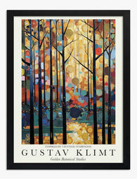
Poster foresta dorata di Klimt
Translation missing: it.products.product.sale_price A partire da €16,95€23,95 -

Poster scala botanica eclettica
Translation missing: it.products.product.sale_price A partire da €16,95€23,95 -

Poster fascino delle vie di Parigi
Translation missing: it.products.product.sale_price A partire da €16,95€23,95 -

Poster scena di strada a Londra in toni pastello
Translation missing: it.products.product.sale_price A partire da €16,95€23,95 -

Poster dei canali di Amsterdam in acquerello
Translation missing: it.products.product.sale_price A partire da €16,95€23,95 -
Poster foresta dorata in stile Klimt
Translation missing: it.products.product.sale_price A partire da €16,95€23,95 -

Poster sinfonia floreale di Klimt
Translation missing: it.products.product.sale_price A partire da €16,95€23,95 -

Poster torre urbana minimalista
Translation missing: it.products.product.sale_price A partire da €16,95€23,95 -

Poster urbano minimalista a blocchi
Translation missing: it.products.product.sale_price A partire da €16,95€23,95 -

Poster serenità dei girasoli
Translation missing: it.products.product.sale_price A partire da €16,95€23,95 -

Poster mezzaluna minimalista
Translation missing: it.products.product.sale_price A partire da €16,95€23,95 -

Poster grattacieli minimalisti
Translation missing: it.products.product.sale_price A partire da €16,95€23,95 -

Poster seggiovia vuota nella foresta innevata
Translation missing: it.products.product.sale_price A partire da €16,95€23,95 -

Poster fioriture notturne di Klimt
Translation missing: it.products.product.sale_price A partire da €16,95€23,95 -
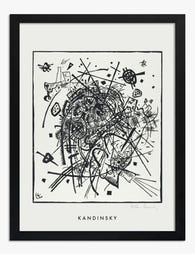
Poster piccoli mondi VIII di Wassily Kandinsky
Translation missing: it.products.product.sale_price A partire da €16,95€23,95 -

Poster vicolo mediterraneo colorato
Translation missing: it.products.product.sale_price A partire da €16,95€23,95 -

Poster passeggiata invernale nel bosco innevato
Translation missing: it.products.product.sale_price A partire da €16,95€23,95


Di più da The Frame

What to Hang in Awkward Corners
Corners are the dead zones of most homes. Your eye skims past them, furniture refuses to sit flush against them, and you end up with a triangular patch of wall...

What to Put on a Big Blank Wall
Big blank walls feel impossible because they multiply your options instead of narrowing them. Every idea seems plausible, nothing feels right, and the wall stays empty for another six months....

Art for Above a Console Table
A console table without art on the wall above it always looks unfinished. Get the art right and the whole vignette clicks into place. Get it wrong (too small, too...