
 Ordina oggi, consegna il
 The Best Wall Art for Plant Lovers (That Doesn't Need Watering)
A plant lover's guide to botanical wall art that survives sunlight, styles beautifully, and never needs repotting.


You already have too many plants. You know it, your partner knows it, the fiddle leaf fig blocking the window knows it. But your walls are still bare, and there's only so much square footage a monstera can cover. This is the guide for extending your green obsession upward, without turning your lounge into a garden centre.
Why plant lovers make the best art buyers
Plant people are already trained to think about aesthetics the way collectors do. You've spent months tracking down a variegated Monstera albo. You know exactly where the light falls in your kitchen at 3pm. You've rotated a pot 45 degrees because it looked "off." That's the same eye that makes for excellent art buying.
There's also a psychology at play. Plant collecting rewards patience, growth, and curation. You don't buy every plant at the garden centre, you build a considered collection. Good wall art works the same way. One well-chosen print earns its place on the wall the way a rare Philodendron gloriosum earns its spot on the shelf.
The other thing plant lovers understand instinctively is that living things have texture, movement, and imperfection. That's why generic mass-produced botanical posters tend to fall flat with this crowd. If you can tell the difference between a healthy leaf and a stressed one at ten paces, you can tell the difference between a lifeless print and one with real depth.

Monstera, fiddle leaf, and snake plant: iconic houseplant prints worth hanging
Three plants dominate the houseplant art print world for good reason. They're the plants you probably already own, and seeing them rendered as art creates a satisfying visual echo across the room.
Monstera deliciosa
The Monstera print is the workhorse of botanical art. Those split leaves photograph and illustrate beautifully because the negative space does half the work. A single Monstera leaf print in black ink on a warm off-white background is one of the most flattering pieces of wall art you can put in a modern flat. It reads as botanical without looking like clip art.
If you own a real Monstera, hang the print at least two metres away from it. Any closer and the eye starts comparing them, which nobody wins.
Fiddle leaf fig
Fiddle leaf prints work best full-plant, not just a leaf. The whole tree silhouette, tall and architectural, mimics the shape of the real thing and brings vertical energy to a wall. These look excellent in hallways, next to tall bookcases, or in bedrooms above a low bench.
We think 50x70cm or 60x90cm is the sweet spot for a fiddle leaf print. Any smaller and you lose the drama that makes the plant iconic in the first place.
Snake plant
The snake plant (Sansevieria) is the underrated hero here. Its geometric, sword-like leaves translate into graphic prints that feel more mid-century modern than tropical. If Monstera prints feel too "on trend," snake plant prints are quieter and age better.
Pairing plant art with real plants without overdoing the jungle look
This is the question nobody answers, and it's the one that matters most. If you already own 40 plants, will another Monstera print push your lounge over the edge into "haunted botanical garden"?
The rule we use: your art should either echo your plants or contrast with them, never compete. Echoing means using the same species in print form to reinforce a theme. Contrasting means picking prints that share a colour palette with your plants but bring a different subject entirely, like landscapes, abstracts, or botanical illustrations of species you don't own.
The two-thirds rule
Look at the wall behind or above your biggest plants. If two-thirds of your visual field is already green (foliage, pots, plant stands), keep the art in that zone neutral. Ink line drawings, muted terracotta tones, sandy beige backgrounds. Save the lush tropical prints for walls without living plants in front of them.
Colour palette matching
If your real plants lean deep green (Monstera, Philodendron, Pothos), pair with prints that use warm counterpoints: cream, terracotta, mustard, soft black. Avoid competing greens in the artwork itself.
If you're heavy on silver and grey foliage (snake plants, succulents, Calathea), cooler prints work: sage, dusty blue, charcoal, and off-white backgrounds.
Where not to hang plant prints
Bathrooms with poor ventilation are a bad idea for any art, not because prints are fragile, but because sustained humidity is unkind to paper and wood over years. A downstairs loo with a fan is fine. A steamy en-suite is not.
Also worth knowing: direct, all-day sunlight will fade cheap prints within months. Ours use UV-protective acrylic glaze and inks rated for hundreds of years even in direct sunlight, but a lot of what you'll find elsewhere won't survive a south-facing window through one summer.

The perfect gift for a plant person: what to pick and what size to go for
Buying wall art as a gift for a plant person is safer than buying them a plant. You don't have to worry about their lighting conditions, their pet situation, or whether they already own the same species in three sizes.
Safe picks by relationship
For a colleague, friend, or new-ish relationship, go with a single leaf study. A single Monstera leaf, a single fiddle leaf, a botanical line drawing. These are universally flattering, easy to place, and don't require the recipient to commit to a specific style. 30x40cm or 40x50cm framed is the giftable sweet spot.
For a close friend or partner who you know has strong taste, you can go bigger and more specific. A tropical scene, a vintage botanical illustration, a large statement piece at 50x70cm or 60x80cm. Framed is worth the extra spend here because it turns a nice gift into a genuinely considered one.
For a plant-obsessed family member, consider a diptych or triptych. Two or three coordinated smaller prints (30x40cm each) let them build a mini gallery wall without the commitment of one enormous piece.
What to avoid
Skip anything with a specific plant species you're not sure they love. If they don't own a Calathea, they probably don't want a Calathea print. Stick to the classics (Monstera, fiddle leaf, general foliage) unless you know for certain what's on their windowsill.
Also skip anything with text. "Plant lady" prints and "crazy plant mom" typography prints age badly and rarely match the aesthetic of someone who genuinely cares about plants.
Minimalist plant prints for the tidy plant parent
Not every plant lover wants a jungle aesthetic. Some of you keep three perfectly-placed plants in matte white pots and vacuum around them twice a week. Your art should match.
Minimalist plant prints lean on negative space, restrained palettes, and clean line work. Single leaves on cream or off-white backgrounds, delicate ink botanical studies, and monochrome plant silhouettes all fall into this camp.
What makes it work
The key is restraint in the frame as much as the print. A thin black frame or a slim natural oak frame keeps the whole piece feeling intentional. Avoid ornate frames, wide mats, or heavy mouldings. They fight the minimalism.
Solid FSC-certified wood frames (not veneers or MDF) make a real difference in how a minimalist print reads. Cheap frames look cheap regardless of what's inside them, and the contrast is brutal on simple compositions where the frame is doing half the visual work.
Where these live best
Minimalist plant prints work brilliantly in kitchens, bedrooms, home offices, and hallways. They're the prints you can hang and not think about again for years. In a bright kitchen with white cabinetry, a set of three small leaf prints in matching frames above the countertop is one of the most quietly satisfying setups you can create.

Tropical leaf prints for the maximalist collector
For the plant person whose lounge already contains 60 plants and who owns a humidifier specifically for their Alocasia collection, minimalism is not the answer. Lean in.
Tropical prints go big on colour, texture, and density. Think lush palm fronds layered over each other, banana leaves in deep saturated greens, birds of paradise blooms in coral and orange, jungle scenes with depth and shadow. Our tropical art prints collection is built for exactly this energy.
Making maximalism work
The trap with tropical prints is treating every wall the same. Pick one hero wall and let it be loud. A single oversized print, 70x100cm framed or 100x150cm on canvas, above a sofa or bed carries far more impact than five medium prints scattered around a room.
Canvas is worth considering here specifically. The matte poly-cotton finish and the depth of a stretched canvas suit tropical imagery in a way that flat framed prints sometimes don't. And at XL sizes, canvas is significantly lighter to hang than an equivalent framed piece.
Gallery walls for maximalists
If you do want a gallery wall, keep the frames consistent even if the prints vary. Six tropical prints in six different frames looks like a jumble sale. Six tropical prints in matching black frames looks like a considered collection. The prints can shout, the frames should whisper.
Print quality matters: why cheap botanical posters fade and curl (and ours don't)
Here's the part most articles skip or bury in jargon. If you've ever bought a cheap poster online, you know the drill. It arrives rolled in a tube, refuses to lie flat, the colours look muddier than the listing photo, and six months later there's a visible sun-fade line across the top.
There are three reasons this happens.
Ink quality
Cheap prints use dye-based inks that fade under UV exposure, sometimes within months. We use pigment-based inks (giclée printing) that are rated to last hundreds of years even in direct sunlight. In plain terms: the green in your Monstera print will still be green when you move house.
Paper quality
Thin, glossy poster paper reflects light, shows fingerprints, and curls at the edges as soon as humidity shifts. We print on thick matte paper that absorbs light rather than bouncing it, which means no glare and colours that look natural from any angle. It also lies flat and stays flat.
Framing and finishing
The biggest failure in cheap art isn't the print, it's what happens after. Frames shipped separately arrive scuffed. Prints aren't fitted properly, so they warp behind the glass. Glass itself is heavy, glares, and shatters if you drop it during hanging.
We ship the print and frame together in one box, properly fitted, ready to hang. The glazing is UV-protective acrylic, not glass, which means lighter to hang, no glare, and actual UV protection built in. No warping, no bubbling, no assembly on your kitchen floor at 10pm.

A final thought
Buy the print you'd still love if you moved to a flat with no light and had to give away every plant you own. That's the test. Plants come and go. A well-made print stays on the wall for a decade and still looks right. Start with one piece you genuinely love, hang it properly, and let the rest of the collection build the way your plants did: slowly, deliberately, and with room to grow.

Prodotti Fab presentati in questo blog
-
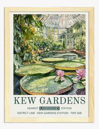
Poster oasi serena di Kew Gardens
Prezzo scontato A partire da €16,95€23,95 -
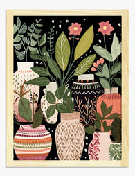
Poster vasi botanici boho con foglie e fiori
Prezzo scontato A partire da €16,95€23,95 -

Poster finestra botanica al sole
Prezzo scontato A partire da €16,95€23,95 -

Tela serenità dei Giardini di Kew
Prezzo scontato A partire da €65,95€93,95 -

Poster giardini di Kew con ninfee
Prezzo scontato A partire da €16,95€23,95 -

Tela vasi boho con motivi botanici
Prezzo scontato A partire da €65,95€93,95 -

Poster serra botanica di Kew Gardens
Prezzo scontato A partire da €16,95€23,95 -

Poster giardini di Kew, oasi botanica
Prezzo scontato A partire da €16,95€23,95 -

Poster piante sul pianerottolo
Prezzo scontato A partire da €16,95€23,95 -

Poster botanico oasi verde di Kew
Prezzo scontato A partire da €16,95€23,95 -

Poster ninfee tranquille ai Giardini di Kew
Prezzo scontato A partire da €16,95€23,95 -

Poster meraviglia botanica di Kew Gardens
Prezzo scontato A partire da €16,95€23,95 -

Poster della collezione line art botanica
Prezzo scontato A partire da €16,95€23,95 -

Poster oasi botanica
Prezzo scontato A partire da €16,95€23,95 -
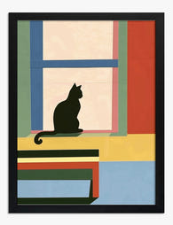
Poster pianta in vaso alla finestra
Prezzo scontato A partire da €16,95€23,95 -

Poster botanico fiori rosa e gialli
Prezzo scontato A partire da €16,95€23,95 -

Poster serra delle ninfee dei Kew Gardens
Prezzo scontato A partire da €16,95€23,95 -

Poster botanico Kew Gardens – oasi tropicale
Prezzo scontato A partire da €16,95€23,95 -
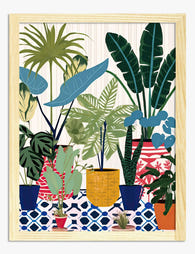
Poster oasi botanica mediterranea
Prezzo scontato A partire da €16,95€23,95


Di più da The Frame

Are Botanical Prints Still in Style? The Trend ...
Botanical prints have been declared "over" roughly every three years since 2015, and yet they keep hanging on more walls than ever. The truth is they're not a trend at...

Room-by-Room or Whole-Home? Styling Botanical P...
Most botanical prints are hung wrong. They're too small for the wall, glossy in rooms that need calm, and floating at eye level above sofas they should be anchoring. This...

You're Overthinking Art Above Your Sofa
The blank wall above your sofa isn't a maths problem. It's a mood decision, a colour decision, and a "what do I actually want to look at every evening" decision....