How to Build a Floral Gallery Wall Around Bouquet Prints
The practical framework for turning one bouquet print you love into a gallery wall that looks intentional, not improvised.

You bought a bouquet print. You hung it up. You love it. And now the wall around it looks emptier than before. This guide is for that exact moment, with layout templates, spacing rules, and pairing advice built specifically around floral art.
Start with one hero bouquet print and build around it
The print you already own is your anchor. Everything else gets chosen in relation to it, which is much easier than designing a gallery wall from scratch.
Identify three things about your hero print before buying anything else: its dominant colours (usually two or three), its style (loose and painterly, tight and botanical, abstract, vintage), and its scale. If your hero is 50x70cm or larger, it can carry the whole arrangement. If it's smaller, around 30x40cm, you'll want to either upgrade it or treat it as one of several equally-weighted prints rather than the centrepiece.
The hero doesn't have to be the largest print, but it should be the most visually dominant. That can come from size, colour saturation, or compositional weight. A small, rich oil-style peony bouquet can hold its own next to a larger, paler botanical study.
Once you've identified your hero, resist the urge to buy four more prints in one go. Start with two supporting prints, live with them for a week, then add more. Gallery walls grow better than they're built.

The 3-print, 5-print, and 7-print layouts that always work
Odd numbers do the heavy lifting in floral galleries. Bouquets are inherently asymmetrical (a vase tilts, stems fall to one side, blooms cluster), and odd-numbered arrangements echo that natural imbalance. Even numbers tend to look like a showroom. Odd numbers look like a home.
The 3-print horizontal row
The simplest layout, and the one we'd recommend if you're nervous. One hero print at 50x70cm in the centre, flanked by two supporting prints at 30x40cm. Keep the centre line of all three prints aligned horizontally. Spacing between prints: 5 to 7cm.
Works brilliantly above a sofa, sideboard, or bed. Total wall width needed: roughly 150cm for this exact combination.
The 5-print organic cluster
Five prints arranged in a loose, slightly off-grid cluster. One hero (50x70cm or 60x80cm), two medium prints (30x40cm), two small accents (21x30cm). Place the hero slightly left of centre, with the medium prints above-right and below-right, and the small accents tucked into the gaps.
This layout looks the most curated, and it's forgiving. If one print feels off, you can swap it without rebuilding the whole wall.
The 7-print balanced grid
For larger walls (180cm+ wide), seven prints arranged with one clear hero at 60x80cm, three medium supporting prints at 40x50cm, and three smaller prints at 30x40cm. Imagine a rough grid with the hero anchoring the left or centre, and the others orbiting around it with consistent spacing.
Seven prints is a commitment. Start with three or five and grow into seven over a few months rather than buying everything at once.
Size mixing: which combinations look intentional, not messy
The mistake we see most often is everything being too close in size. Five prints all at 30x40cm look like a contact sheet, not a gallery. You need contrast.
Use a size hierarchy formula: one hero, two to three medium, two to three small. The hero should be at least 1.5 times the size of the next-largest print. So if your hero is 60x80cm, your medium prints should be no larger than 40x50cm. The jump in scale is what creates a focal point.
Mix orientations too. Two portraits and one landscape in a row of three. Three portraits and two landscapes in a five-print cluster. A single landscape print breaks up a row of portraits and gives the eye somewhere to rest.
What to avoid: two prints of identical size sitting directly next to each other at the same height. The eye doesn't know where to land, and the arrangement looks like a duplicate rather than a pair. If you do want two same-size prints adjacent, stagger their vertical alignment by 5 to 10cm.
Keeping frames consistent (and the one exception to that rule)
Frame consistency is what separates a gallery wall from a jumble. Pick one frame style and stick to it for at least 80% of your prints. Black, white, natural oak, and walnut are the four that work hardest with floral art. Black brings drama and makes pale florals pop. White feels airy and gallery-like. Natural oak warms everything up. Walnut is moody and rich.
For bouquet prints specifically, we'd lean towards natural oak or white. Black can fight with the colour in a busy bouquet, especially if the bouquet has a dark background. Oak softens and complements.
The one exception: you can vary one element of the frame, but never two. Either change the colour while keeping the material consistent (all wood, but mixing oak and walnut), or change the material while keeping the colour consistent (a black wooden frame next to a black metal frame). Change both at once and the arrangement looks accidental.
A practical note on framed bouquet prints: shipping pre-fitted is the only way to get a gallery wall that actually looks finished. Frames bought separately and assembled at home tend to develop gaps, the print bows behind the glazing, and the alignment never quite sits right. Our framed art prints ship with the print already fitted into a solid FSC wood frame with UV-protective acrylic glazing, ready to hang. Worth knowing if you're building a gallery of five or seven, where one warped frame ruins the whole arrangement.

Colour threading: how to make different bouquet prints feel like a set
This is the trick that makes a gallery wall feel curated rather than collected. Pick two or three colours from your hero print and make sure those exact colours appear in every other print on the wall.
Say your hero is a peony bouquet with dusty pink, sage green, and cream. Every other print needs to contain at least two of those three colours, even if it's a totally different style. An abstract print with sage and cream brushstrokes. A typography piece with dusty pink lettering on cream. A botanical line drawing with sage stems on a pale background. The colour repetition does the cohesion work, even when the styles are wildly different.
Avoid introducing a fourth dominant colour. If your three threading colours are pink, sage, and cream, don't add a print with a strong yellow or navy. One outlier colour breaks the spell.
Vary the flower types within the bouquets themselves. Roses with wildflowers with peonies with anemones reads as a curated collection. Five rose bouquets reads as wallpaper. Browse floral art prints with the threading colours in mind rather than searching for the same flower repeatedly.
Spacing, height, and alignment for a gallery wall that looks professional
Floral and bouquet art needs more breathing room than other styles. Bouquets are visually busy by nature: lots of stems, lots of petals, lots of colour. Pack them too tightly and the whole wall reads as noise.
Standard spacing for a bouquet gallery wall: 5 to 7cm between prints. That's slightly more than the 2.5 to 5cm you'd use for graphic prints or photography. The extra space lets each bouquet read as its own composition.
For the height: the centre of your grouping (not the centre of any individual print, but the visual centre of the whole arrangement) should sit 145 to 152cm from the floor. That's gallery standard, calibrated to average eye level. If you're hanging above furniture, leave 15 to 20cm between the top of the furniture and the bottom of the lowest print.
The paper template method
Before you put a single nail in the wall, do this. Cut paper rectangles to the exact dimensions of every frame you plan to hang. Tape them to the wall in your planned arrangement. Live with it for 24 hours. Adjust. Then mark the nail positions through the paper, hammer in the fixings, remove the paper, and hang.
This sounds tedious. It saves hours. The arrangement that looks perfect in your head almost never looks perfect on the wall, and you'll move things three or four times before it clicks.
Alignment principles
For horizontal rows, align the centre line of every print rather than the top or bottom. For clusters, pick one strong horizontal or vertical axis and let two or three of your prints align to it, then let the others float. A cluster with zero alignment looks chaotic. A cluster with too much alignment looks like a grid that gave up halfway.

The prints that pair well with bouquets: botanicals, abstracts, and typography
Three categories work reliably with bouquet art. Stick to these and you'll never wonder if a print "fits."
Botanical prints
The closest cousin to bouquet art. Single-stem botanical illustrations, pressed flower studies, leaf drawings, herbarium-style prints. They share the floral subject matter without competing with the visual density of a full bouquet. Use them as the medium and small supporting prints in a 5 or 7-print arrangement to give the eye somewhere quieter to land. Our botanical art prints collection is built for exactly this kind of pairing.
Abstract prints
Loose, painterly abstracts in your threading colours work brilliantly. They break up the literal-ness of representational floral art and add a contemporary edge. Look for abstracts with organic shapes (circles, soft brushstrokes, watercolour washes) rather than hard geometric shapes, which can feel at odds with the soft forms in bouquets.
One abstract per gallery wall is usually enough. Two if you have seven prints. More than that and the abstracts start fighting the bouquets for attention.
Typography prints
A single typography print, used sparingly, anchors the wall and gives the viewer a moment of pause between all the visual texture. A short phrase, a botanical Latin name, a single word in a serif font. Keep the colour palette tight (one ink colour from your threading palette on a cream or white background).
Avoid typography prints with long quotes or busy decorative fonts. They compete with the bouquets and read as cluttered.
What to avoid
Photography of unrelated subjects (city skylines, portraits, landscapes) tends to clash with bouquet art unless the colour palette is exceptionally tight. Heavily geometric prints can feel cold next to organic floral forms. And anything with a glossy finish next to your matte bouquet prints will look mismatched. Worth knowing if you're mixing mediums: matte paper and matte canvas sit beautifully together, but a high-gloss print will always read as the odd one out.

A budget-friendly approach: start with 3, add later
You don't need to buy seven prints in one weekend. Start with three: your hero plus two supporting prints. Hang them in the horizontal row layout. Live with it for a month. Then add two more in the right and lower positions of an organic cluster, expanding into a five-print arrangement. Add two more after that if you want to grow to seven.
Pre-curated wall art sets are useful if you want a fast start with three or five prints already designed to thread together. They take the colour-matching guesswork out of the early stage, which is where most people get stuck.
Quick reference
If you're hanging tomorrow, here's what to remember. Odd numbers, always. One hero print, sized at least 1.5x your next-largest. Match frames except for one deliberate variation. Thread two or three colours across every print. Space at 5 to 7cm. Centre your arrangement at 145 to 152cm from the floor. Use paper templates before nails. Mix bouquets with botanicals, abstracts, and one typography print maximum.
And give yourself permission to grow it slowly. The best gallery walls aren't built in a day, they're added to over a year.

Prodotti Fab presentati in questo blog
-

Tela musa in fiore con cappotto floreale
Prezzo scontato A partire da €65,95€93,95 -

Poster bouquet floreale pop stilizzato
Prezzo scontato A partire da €16,95€23,95 -

Poster bouquet floreale cosmico
Prezzo scontato A partire da €16,95€23,95 -

Tela bouquet di fiori bianchi su sfondo rosa cipria
Prezzo scontato A partire da €65,95€93,95 -

Tela bouquet nell'angolo di lettura accogliente
Prezzo scontato A partire da €65,95€93,95 -
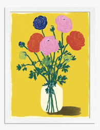
Poster bouquet di ranuncoli dai colori vivaci
Prezzo scontato A partire da €16,95€23,95 -

Poster bouquet di fiori per angolo lettura accogliente
Prezzo scontato A partire da €16,95€23,95 -

Poster mercato dei fiori
Prezzo scontato A partire da €16,95€23,95 -

Poster bouquet di ranuncoli su sfondo scuro
Prezzo scontato A partire da €16,95€23,95 -

Poster bouquet di fiori audaci
Prezzo scontato A partire da €16,95€23,95 -

Tela bouquet di fiori di campo ad acquerello
Prezzo scontato A partire da €65,95€93,95 -

Tela bouquet di fiori di Renoir
Prezzo scontato A partire da €65,95€93,95 -

Poster scena animata al mercato dei fiori
Prezzo scontato A partire da €16,95€23,95 -

Tela fiori di campo colorati
Prezzo scontato A partire da €65,95€93,95 -

Tela bouquet floreale vintage
Prezzo scontato A partire da €65,95€93,95 -

Tela rose rigogliose in giardino
Prezzo scontato A partire da €65,95€93,95 -
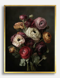
Tela mazzo di ranuncoli dal fascino intenso
Prezzo scontato A partire da €65,95€93,95 -

Poster bouquet di ranuncoli bianchi
Prezzo scontato A partire da €16,95€23,95 -

Poster bouquet di fiori blu su sfondo giallo
Prezzo scontato A partire da €16,95€23,95


Di più da The Frame

Are Botanical Prints Still in Style? The Trend ...
Botanical prints have been declared "over" roughly every three years since 2015, and yet they keep hanging on more walls than ever. The truth is they're not a trend at...

Room-by-Room or Whole-Home? Styling Botanical P...
Most botanical prints are hung wrong. They're too small for the wall, glossy in rooms that need calm, and floating at eye level above sofas they should be anchoring. This...

You're Overthinking Art Above Your Sofa
The blank wall above your sofa isn't a maths problem. It's a mood decision, a colour decision, and a "what do I actually want to look at every evening" decision....