How to Build a Folk Art Gallery Wall (With Layouts That Actually Work)
Specific layout templates, exact spacing measurements, and the cohesion tricks that make folk art groupings sing.

You've collected the prints. You've got a tape measure, a pencil, and a wall that's been blank for months. This guide takes you from indecision to nails in the plaster, with measurements you can actually use.
Why folk art is one of the easiest styles for a gallery wall
Folk art is forgiving in a way most styles aren't. The motifs (birds, florals, hearts, hands, suns, stylised animals) come from a shared visual language that ties pieces together even when the artists, eras, and origins differ wildly. A Polish wycinanki paper-cut and a Mexican otomi embroidery print don't match in any literal sense, but they read as relatives.
That visual kinship is the secret weapon. With abstract or photographic gallery walls, you have to work hard to find connection. With folk art prints, the connection is baked in. Your job is mostly to not get in the way.
The other advantage: folk art tolerates imperfection. The whole tradition is built on hand-made, slightly wonky charm. If your spacing is 2.3cm in one place and 2.7cm in another, no one will notice. Try that with a minimalist black-and-white grid and the eye catches every error.

Choosing your layout: grid, salon hang, or linear row
Three layouts cover roughly 90% of gallery walls worth hanging. Pick based on the wall, the prints you have, and how much chaos you can live with.
The grid
A grid means equal-sized prints in equal rows and columns. Think 2x2, 3x2, or 3x3. It's the most controlled option and the most flattering for folk art that's busy or pattern-heavy, because the frame discipline calms the visual noise inside.
Use a grid when your prints are similar in scale and you want a structured, almost textile-like effect (folk art often quotes textile traditions, so this works thematically too). Best for above sofas, beds, and dining tables where symmetry feels right.
The salon hang
The salon hang is the asymmetrical, organic cluster. Mixed sizes, mixed orientations, anchored around one or two larger pieces with smaller works orbiting them. This is the layout most people picture when they hear "gallery wall."
Salon hangs suit folk art beautifully because folk art collections are rarely uniform. You've probably got a big floral print, a couple of small bird studies, and something square. Salon hang absorbs that variety and turns it into a feature.
The linear row
A single horizontal line of prints, evenly spaced, hung at the same centre height. Three to five pieces usually. This is the easiest layout to plan and the hardest to mess up.
Linear rows work brilliantly above narrow furniture (consoles, slim sideboards, headboards) and in hallways. For folk art, a row of three medium prints with related motifs (three folk birds, three botanical samplers) reads as a curated set rather than a casual collection.
The best size combinations for folk art groupings
Vague advice about "varying sizes" isn't useful when you're choosing prints. Here are combinations that actually balance.
For a 3x3 grid (good for walls 150cm wide and up): Nine prints at 30x40cm each, with 5cm gaps. Total wall footprint: roughly 100x130cm.
For a classic salon hang (good for walls 180cm wide and up): One large 70x100cm anchor, two medium 50x70cm pieces, three small 30x40cm pieces, and one or two 21x30cm fillers. Eight pieces total, which is the sweet spot. Fewer than six looks sparse, more than ten gets fussy.
For a tighter salon hang above a sofa: One 60x80cm anchor, two 40x50cm mediums, four 30x40cm smalls. Seven pieces, total footprint around 180x110cm.
For a linear row above a 140cm console: Three prints at 40x50cm, portrait orientation, with 6cm gaps. Total span: 132cm.
For a linear row above a 200cm sofa: Five prints at 30x40cm with 5cm gaps. Total span: 170cm. Or three larger 50x70cm prints with 8cm gaps for a more confident look.
A useful formula: total wall width = (number of prints x print width) + (number of gaps x gap size). So a row of four 40cm-wide prints with 5cm gaps is (4 x 40) + (3 x 5) = 175cm of wall.
Keeping it cohesive: matching frames, colours, and motifs
Folk art's variety is its charm and its trap. Without a unifying thread, a gallery wall starts to look like a jumble sale. Pick at least two of these three to hold the wall together.
Frame consistency
The single fastest cohesion trick is matching frames. All black, all natural oak, all white, all walnut. With folk art, we'd push you towards warm wood (oak, walnut) or matte black. White frames can feel too clean against folk's earthier sensibility, though they work if your prints are pastel-heavy.
Black frames sharpen and modernise folk art, which is great if you want it to feel less twee. Wood frames lean into the craft tradition and work especially well in rooms with other timber elements.
Colour palette
Even if motifs and styles differ, a shared palette reads as intentional. Three or four recurring colours is plenty. Folk art often uses earthy reds, mustards, sage greens, deep blues, and cream backgrounds, so a palette like "rust, ochre, sage, off-white" gives you huge range while looking cohesive.
When you're choosing prints, lay them out and ask whether one piece is fighting the others. A neon pink folk print in a wall of muted earth tones will sing on its own and clash on the wall.
Motif repetition
Repeat at least one motif across multiple prints. Birds in three of them. Florals in four. Hearts or hands or suns somewhere. The eye picks up the echo and reads the wall as a collection rather than a pile.

Step-by-step hanging guide with spacing measurements
This is the part most guides skip. Here's the actual process.
1. Plan on the floor first
Lay every print on the floor in front of the wall. Move them around. Take a photo on your phone and look at it (the camera abstracts the layout and shows you imbalance you can't see live). Rearrange until the photo looks right.
2. Make paper templates
Cut newspaper or kraft paper to the exact dimensions of each framed print. Label each one (top, bottom, which print it represents). This sounds tedious. Do it anyway. It's the difference between a wall full of wrong holes and a wall that works.
3. Tape templates to the wall
Use low-tack masking tape. Start with your anchor piece, then build outwards. Stand back at least two metres and squint. Adjust until it looks balanced.
4. Apply the spacing rules
Standard spacing between frames is 5 to 7cm (about 2 to 3 inches). Tighter than 5cm starts to feel cramped. Wider than 8cm and the wall stops reading as one composition.
For grids, keep gaps identical. For salon hangs, vary slightly (5cm here, 7cm there) to keep the eye moving. For linear rows, identical gaps every time.
5. Centre at eye level
The centre of your gallery wall (not the top, the middle) should sit roughly 145 to 152cm from the floor. This is the standard 57-to-60-inch eye-level rule borrowed from gallery hanging. It works because it's calibrated to the average standing eye line.
6. Respect the furniture
If the wall is above a sofa, sideboard, or bed, the bottom of your lowest frame should sit 15 to 20cm above the furniture. Closer than 15cm feels cramped. Further than 25cm and the wall and furniture stop relating to each other.
7. Measure, mark, and hang
With templates in place, mark the nail position through the paper for each frame (measure the hanger position on the back of the frame, then transfer that measurement to the template). Pop the nails in. Tear away the paper. Hang.
Framed prints from us arrive with fixtures already attached, properly fitted with no warping, so step seven is genuinely just hanging. The horror of opening a box to find a print and a separate frame and a bag of unidentifiable hardware is not a thing here.
Mixing folk art with other styles (botanicals, typography, abstracts)
Pure folk art walls are wonderful, but a folk-led wall with one or two outsiders often looks more lived-in and less themed.
Folk plus botanicals. This is the easiest pairing because folk art constantly references plants anyway. A pressed-fern style botanical print sits naturally among folk florals. Browse botanical art prints for pieces with hand-illustrated, slightly imperfect line work rather than ultra-photographic styles.
Folk plus typography. A single typographic print (a folk proverb, a regional saying, a hand-lettered phrase) can anchor a salon hang and give the eye a place to rest. Keep the typography hand-drawn rather than digital. A perfectly kerned sans-serif fights folk art. A wonky brush script supports it.
Folk plus abstracts. Trickier but rewarding. Look for modern art prints with organic shapes, hand-painted textures, or earthy palettes. Hard-edge geometric abstracts will feel like a different conversation. Loose, painterly abstracts feel like a cousin.
The rule of thumb: outsiders should make up no more than 25% of the wall. One typographic piece in a wall of seven folk prints is balance. Three typographic pieces in a wall of five folk prints is a typography wall with folk accents.

Common gallery wall mistakes and how to avoid them
Hanging too high
This is the single most common error. People default to hanging at their own eye level, which is too high for everyone shorter than them and too high for seated viewing in lounges. Stick to the 145 to 152cm centre rule. Always.
Wrong proportions to furniture
Your gallery wall should span roughly two-thirds to three-quarters of the furniture below it. A 200cm sofa wants a 130 to 150cm-wide gallery wall. A small cluster of three 21x30cm prints above a vast sectional looks like a postage stamp on an envelope.
Inconsistent gaps
The eye is brutally good at spotting uneven spacing. If you've committed to a grid or row, measure every gap. For salon hangs, you have more latitude, but stay within a 4 to 8cm range so the wall feels intentional.
Too many frame finishes
Two finishes maximum. All black, or black and natural wood. All white, or white and oak. Three or more finishes (black, white, gold, walnut) reads as accidental rather than collected.
Buying for the wall before planning the wall
It's tempting to buy prints individually and figure out the wall later. Most people end up with five portrait prints when they needed three landscapes. Sketch your layout first, then shop to fit it. Wall art sets take this problem off the table entirely because the proportions are pre-balanced.
Skipping the paper templates
We know. It feels excessive. Do it anyway. The fifteen minutes of cutting paper saves you hours of filling holes.
Forgetting that prints fade
Folk art often uses rich reds, ochres, and indigos that are particularly vulnerable to UV damage. Prints with proper UV-protective glazing will hold their colour for decades, even on sun-facing walls. Cheap frames with standard glass or acrylic let prints fade noticeably within a few years, which is heartbreaking after you've spent a weekend hanging them.
A final note on confidence
Gallery walls reward decisiveness. You can plan forever and still not know if it's right until it's up. Trust your floor layout, trust your paper templates, and put the nails in. Folk art's whole tradition is about making things by hand, slightly imperfectly, with conviction. The wall should feel the same.


Prodotti Fab presentati in questo blog
-
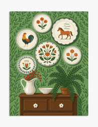
Poster stile folk con piatti decorativi
Translation missing: it.products.product.sale_price A partire da €16,95€23,95 -

Tela piatti da parete tema giardino folk
Translation missing: it.products.product.sale_price A partire da €64,95€92,95 -

Poster cavallo folk con motivo d'arazzo floreale
Translation missing: it.products.product.sale_price A partire da €16,95€23,95 -

Tela volto in stile folk moderno
Translation missing: it.products.product.sale_price A partire da €64,95€92,95 -

Poster ritratto folk moderno
Translation missing: it.products.product.sale_price A partire da €16,95€23,95 -

Tela ritratto folk moderno
Translation missing: it.products.product.sale_price A partire da €64,95€92,95 -

Tela cavallo folk con motivi floreali, stile arazzo
Translation missing: it.products.product.sale_price A partire da €64,95€92,95 -

Poster ritratto folk moderno
Translation missing: it.products.product.sale_price A partire da €16,95€23,95 -

Poster ritratto folk dai colori vivaci
Translation missing: it.products.product.sale_price A partire da €16,95€23,95 -

Poster ritratto folk moderno
Translation missing: it.products.product.sale_price A partire da €16,95€23,95 -

Tela ritratto moderno in stile folk
Translation missing: it.products.product.sale_price A partire da €64,95€92,95 -

Tela ritratto folk moderno a colori vivaci
Translation missing: it.products.product.sale_price A partire da €64,95€92,95 -

Poster ritratto folk blu intenso
Translation missing: it.products.product.sale_price A partire da €16,95€23,95 -

Poster volto moderno in stile folk
Translation missing: it.products.product.sale_price A partire da €16,95€23,95 -
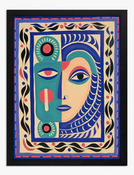
Poster volto folk moderno
Translation missing: it.products.product.sale_price A partire da €16,95€23,95 -

Tela volto folk giocoso
Translation missing: it.products.product.sale_price A partire da €64,95€92,95 -

Poster scena festiva in città
Translation missing: it.products.product.sale_price A partire da €16,95€23,95 -

Poster volto astratto colorato stile folk
Translation missing: it.products.product.sale_price A partire da €16,95€23,95 -

Tela grifone dal fascino folk
Translation missing: it.products.product.sale_price A partire da €64,95€92,95 -

Poster mercato dei fiori
Translation missing: it.products.product.sale_price A partire da €16,95€23,95


Di più da The Frame

How to Display Typography Prints Without the Cl...
Typography prints break the rules of normal art display. Text demands to be read, not just glanced at, which means the standard gallery wall advice you've absorbed from interiors content...

How to Build a Picasso Gallery Wall That Actual...
Most gallery wall guides tell you to "play around with the layout" and "trust your eye." That advice is useless when you're staring at over a hundred Picasso prints trying...

How to Build a Market-Themed Gallery Wall That ...
A gallery wall of market scenes does something a single print never can: it tells a story across cultures. You're not decorating with one image, you're curating a small museum...