Building a Gallery Wall Around Matisse Street Art Prints
How to build a balanced gallery wall around Matisse's bold Mediterranean street scenes without the colour chaos.

Matisse's street and town scenes are some of the most rewarding pieces to build a gallery wall around, and also some of the trickiest. The fauvist blues, terracotta rooftops and saturated yellows pull every eye in the room, which is wonderful, until you surround them with five other equally loud prints and the whole thing turns into visual noise. This guide walks you through the choices that actually matter: anchor piece, frame finish, supporting cast, layout and spacing.
Start with the anchor: choosing your lead Matisse street print
Before you think about layout or supporting pieces, pick the one print everything else will orbit around. Among Matisse street art prints, the strongest anchors tend to be his Mediterranean town scenes: the Collioure harbour studies, the Nice rooftops, the views through open shutters onto narrow Provençal streets. They have a clear focal point, a horizon line, and one or two dominant colours that you can pull through the rest of the wall.
Look at your room first, then choose. A north-facing lounge with cool grey walls comes alive against a warm Collioure scene with terracotta and ochre. A south-facing room flooded with light can take a cooler print with deep blues and shaded archways without feeling washed out. The anchor should solve a problem your room has, not fight it.
Size matters more than you think at this stage. For most living rooms, a lead Matisse town scene print at 70x100cm or 60x80cm gives you enough visual weight to carry the wall. Go smaller and the supporting pieces start competing with it, which is the opposite of what you want.

How many prints you actually need (hint: fewer than you think)
The instinct with gallery walls is more, more, more. With Matisse, resist it. His fauvist palette is doing so much work on its own that crowding the wall makes every piece feel smaller and less considered.
Three to five prints is the sweet spot for most rooms. Seven works for a wide living room wall or a long hallway. Nine starts to feel busy unless the supporting pieces are very quiet. Stick to odd numbers: 3, 5 or 7 reads as composed, while 4 or 6 reads as a grid that needs to be perfectly symmetrical to work.
The ratio we'd suggest is 60-70% supporting, 30-40% statement. If your anchor is a bold Matisse town scene, the rest of the wall should be visually quieter: line drawings, neutral landscapes, simple typography, or black and white photography. One statement, the rest in support.
Matching frame finishes for a cohesive look
Frame choice is where most Matisse gallery walls go wrong. Black frames are the safe default, but with fauvist colours they can feel heavy and funereal, boxing in the warmth of the print. White frames can disappear into a pale wall and leave the print floating without a clear edge. Neither is wrong, but neither is automatic.
Our preference for Matisse architectural prints is natural oak or light ash. The pale wood picks up the warmth in Mediterranean palettes (ochres, terracottas, sandstone) without competing. It also softens the saturation of the blues and reds, which is exactly what you want when the print is already doing the heavy lifting.
If your room leans modern and minimal, go with a thin matte black frame, but keep the moulding narrow (around 2cm) so it frames rather than encloses. Avoid gold unless your interior already has gold accents elsewhere; floating a gold frame on a wall with no other gold reads as accidental.
The non-negotiable rule: every frame on the wall should be the same finish. Mixing oak with black, or matte with gloss, fragments the eye and undoes all the work you've done choosing supporting pieces. One finish, varied sizes.
A note on matting
White mats are your friend with Matisse. A 5-7cm mat around each print creates breathing room and stops the colours bleeding into one another across the wall. For the anchor piece, you can go matless for maximum impact, but mat the supporting pieces. It pushes the visual hierarchy in the right direction.
Complementary artists and styles that sit well alongside Matisse
The artists who pair well with Matisse share his European sensibility but operate at a lower volume. A few that consistently work:
Picasso line drawings. His single-line nudes and dove sketches are almost colourless, which gives the eye somewhere to rest between the saturated Matisse pieces. They share an era and a hand-drawn quality, so they feel related without copying.
Cézanne landscapes. Muted Provençal greens, dusty greys and soft ochres. Cézanne's restraint balances Matisse's intensity, and they were painting the same part of France a generation apart, so the conversation between them is real.
Raoul Dufy. If you want more colour without losing cohesion, Dufy's regatta and harbour scenes use a similar palette to Matisse's coastal work but with lighter, sketchier mark-making. Useful as a bridge between Matisse and a quieter piece.
Modern minimalist photography. Black and white architectural photography (a Mediterranean doorway, a shuttered window, a row of clay rooftops) brings the same subject matter as Matisse's town scenes but in monochrome. The visual rhyme is satisfying.
Abstract colour studies. A simple block of colour pulled from your anchor print, or a soft watercolour wash, can sit beautifully alongside Matisse. Browse abstract art prints for pieces in colours that echo your lead print without competing.
What to avoid: other fauvist works, bright pop art, anything with heavy black outlines (Léger, for instance), or photography with strong saturated colour. Two statement pieces on the same wall cancel each other out.

The colour bridging technique
Pick one secondary colour from your Matisse anchor and echo it in two or three supporting pieces. If your Collioure print has cobalt blue roofs, find a quiet seascape with the same blue, a line drawing on cream paper, and an abstract with a single blue brushstroke. That's your colour bridge.
The mistake people make is echoing every colour from the anchor across the supporting pieces. If the Matisse has blue, red, yellow and green, and each supporting print also has all four, you've created chaos. Pick one colour. Echo it twice or three times. Let the rest of the supporting cast stay neutral.
Layout templates: the grid vs the organic cluster
Two layouts work reliably with Matisse. Pick one and commit.
The grid
Equal-sized prints (or two sizes alternating), evenly spaced, arranged in a clean rectangle. Best for 4, 6 or 9 piece walls (yes, even numbers work here because the symmetry is the point). Spacing of 5-8cm between frames keeps it tight without feeling cramped.
The grid is formal and architectural. It works brilliantly above a sofa, behind a dining table, or in a study. With Matisse, the grid can feel almost museum-like, which is no bad thing. Pre-curated wall art sets can save you a lot of time here, since the proportions are already worked out.
The organic cluster
One large anchor (your Matisse), with smaller pieces arranged loosely around it in varied sizes. The anchor sits slightly off-centre, often at eye level, with supporting pieces filling the space asymmetrically. Best for 3, 5 or 7 piece walls.
The cluster feels more collected, more lived-in. It works above a console table, on a stair wall, or in a reading nook. The trick is to imagine an invisible rectangle around the whole arrangement: every piece should sit inside it, with roughly equal visual weight on left and right.
Sizing ratios that work for hallways, stairs, and living rooms
Different walls demand different proportions. Here's what we'd recommend.
Living room (open wall, 2-3m wide)
Anchor: 70x100cm Matisse street scene.
Supporting: two pieces at 40x50cm, two at 30x40cm.
Total spread: roughly 180cm wide x 130cm tall.
Hang the centre of the arrangement at 145-150cm from the floor (eye level for a standing adult).
Hallway (narrow, long)
Anchor: 50x70cm Matisse town scene print, oriented to match the hallway flow.
Supporting: four pieces at 30x40cm in a horizontal line.
Spacing: 6cm between frames.
Hang slightly higher than usual (155cm centre line) since you're often walking past, not sitting.
Stair wall
This is the one place where the cluster really comes into its own. Anchor at 60x80cm, placed at the midpoint of the stairs. Supporting pieces of varied sizes (40x50, 30x40, 20x30) following the diagonal of the staircase, each one hung at a consistent distance from the stair tread directly below it.
Above a sofa or bed
The whole arrangement should be roughly two-thirds the width of the furniture below it. So a 240cm sofa wants a gallery wall around 160cm wide. Hang the bottom edge of the lowest frame 20-25cm above the back of the sofa. Closer than that and it looks crowded; further and it floats.

Hanging tips so everything stays level and undamaged
Plan on the floor first, always. Lay out the entire arrangement on the floor in front of the wall, shuffle pieces until it feels right, then photograph it on your phone. That photo is your reference.
Cut paper templates to the exact size of each frame and tape them to the wall with low-tack masking tape. Live with the arrangement for 24-48 hours before you commit to a single nail. You'll see things you missed: a piece that's slightly too low, a gap that's too wide. Adjust the paper, not the wall.
When you hang, mark the nail position on the paper template, hammer through the paper, then tear it away. This is the single most useful trick for getting things level on the first try.
Use a spirit level for every frame, not just the first one. Walls are rarely as straight as you think they are, and the human eye picks up a 2mm tilt across a gallery wall instantly.
For heavier framed prints, use proper picture hooks rated for the weight, not generic nails. A 70x100cm framed print with solid wood and acrylic glaze can weigh 4-5kg, which a small nail will eventually pull through plasterboard. Two hooks spaced 15-20cm apart, rather than one in the centre, also keeps the frame perfectly level over time.
If you're hanging on plasterboard, plastic wall plugs or self-drilling anchors give you the holding power you need without specialist tools. On masonry walls, masonry hooks or proper rawl plugs.
A note on shipping and assembly
One of the most common frustrations with framed gallery walls is prints arriving warped, frames shipped separately from the artwork, or fixtures missing. Look for prints that arrive ready to hang in a single box with the print already fitted into the frame. It saves hours of fiddly assembly and means everything looks the same once it's up.

Common mistakes to avoid
A short list of what we see go wrong most often:
- Mixing frame finishes (oak, black, gold all on one wall). Pick one.
- Two statement pieces competing. One Matisse anchor, the rest supporting.
- Hanging too high. Centre of the arrangement should sit at 145-150cm.
- Even numbers in a cluster layout. Stick to odd numbers (3, 5, 7).
- Echoing every colour from the anchor across the supporting pieces. Pick one bridge colour.
- Skipping the paper template stage. It's the difference between one nail and seven.
Final thought
Building a gallery wall around Matisse is really an exercise in restraint. The anchor is doing the work; your job is to give it room to breathe and a quiet supporting cast that makes it look even better. Choose one strong print, one frame finish, one colour bridge, and odd numbers throughout. Get those four things right and the rest falls into place.

Prodotti Fab presentati in questo blog
-

Poster vista dal balcone di Matisse
Translation missing: it.products.product.sale_price A partire da €16,95€23,95 -

Poster Vue de Collioure di Matisse
Translation missing: it.products.product.sale_price A partire da €16,95€23,95 -

Tela Matisse ritagli di carta
Translation missing: it.products.product.sale_price A partire da €64,95€92,95 -
Poster astratto ispirato a Matisse, eleganza minimalista
Translation missing: it.products.product.sale_price A partire da €16,95€23,95 -

Tela mercato dei fiori di Parigi ispirata a Matisse
Translation missing: it.products.product.sale_price A partire da €64,95€92,95 -

Tela musa vibrante di Henri Matisse
Translation missing: it.products.product.sale_price A partire da €64,95€92,95 -

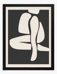
Poster astratto ritagli di carta ispirati a Matisse
Translation missing: it.products.product.sale_price A partire da €16,95€23,95 -
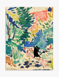
Poster gatto nero nel giardino ispirato a Matisse
Translation missing: it.products.product.sale_price A partire da €16,95€23,95 -

Poster paesaggio vicino a Collioure di Henri Matisse
Translation missing: it.products.product.sale_price A partire da €16,95€23,95 -

Poster astratto ispirato a Matisse
Translation missing: it.products.product.sale_price A partire da €16,95€23,95 -

Poster finestra parigina di Matisse
Translation missing: it.products.product.sale_price A partire da €16,95€23,95 -

Tela paesaggio a Collioure di Matisse
Translation missing: it.products.product.sale_price A partire da €64,95€92,95 -
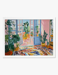
Poster giardino d’inverno ispirato a Matisse
Translation missing: it.products.product.sale_price A partire da €16,95€23,95 -

Poster mercato dei fiori di Parigi Matisse
Translation missing: it.products.product.sale_price A partire da €16,95€23,95 -

Tela vista dalla finestra ispirata a Matisse
Translation missing: it.products.product.sale_price A partire da €64,95€92,95 -

Tela giardino di ritagli di carta ispirata a Matisse
Translation missing: it.products.product.sale_price A partire da €64,95€92,95 -

Tela astratta gialla ispirata a Matisse
Translation missing: it.products.product.sale_price A partire da €64,95€92,95 -

Tela ritagli astratti ispirati a Matisse
Translation missing: it.products.product.sale_price A partire da €64,95€92,95


Di più da The Frame

Why Matching Frames Make Botanical Gallery Wall...
Botanical gallery walls have a higher failure rate than almost any other style. Too many leaf varieties, mismatched frames, and guesswork spacing turn what should feel like a calm indoor...

Why Seafood Art Works in Every Room (Not Just K...
Seafood art has a reputation problem. Mention an octopus print or a vintage lobster illustration and most people picture a fish market, a beachside diner, or someone's nautical-themed bathroom. That...

What Gallery Curators Know About Displaying Sur...
Surrealism has a reputation for being difficult to live with. Floating apples, melting clocks, men in bowler hats raining from the sky: not the obvious choice for the wall behind...