How to Create a Gallery Wall That Looks Intentional (Not Chaotic)
A measurement-led system for hanging a gallery wall that looks curated, not cobbled together at midnight.

You've seen a hundred gorgeous gallery walls saved to a Pinterest board. The gap between those images and your actual blank wall is execution, and execution is just measurements, spacing, and one or two rules you commit to. This guide gives you the numbers.
The 3-5-7 rule and why odd numbers always look better
The 3-5-7 rule is simple. Build your gallery wall around an odd number of prints: three, five, or seven. Even numbers split the eye into pairs and read as symmetrical, which works for matched sets above a bed but rarely for a gallery wall. Odd numbers force the eye to move across the arrangement, which is exactly what a gallery wall is meant to do.
Three prints work for narrow walls and above smaller furniture (think a console table or a 120cm sofa). Five is the sweet spot for most living rooms and feature walls. Seven is for big walls above large sofas, dining areas, or staircases where you've got real estate to fill.
If you're tempted to go with four or six, add one more piece or take one away. The arrangement will look more deliberate immediately. The only exception is a strict grid (more on that below), where even numbers are fine because the geometry does the work for you.
Choosing a unifying thread: frame colour, colour palette, or subject
The most common gallery wall mistake is trying to unify by subject. People pick five botanical prints or five black and white photos and assume that's enough. It usually isn't, because the frames, mounts, and print styles fight each other.
Here's the contrarian bit: frame consistency matters more than subject consistency. A gallery wall of wildly different prints (a moody landscape, an abstract, a line drawing, a vintage map, a portrait) will look intentional if every frame is the same colour and finish. The opposite is rarely true.
You've got three ways to create a unifying thread, listed from most foolproof to most ambitious:
- Match the frames. Same colour, same finish, same profile. Subjects can be anything.
- Match the colour palette. Different frames are fine if every print pulls from the same three or four colours.
- Match the subject. Hardest to pull off without looking thematic in a stuffy way.
If you're nervous, do option one. A row of identical black or natural oak frames around mismatched art prints is the closest thing to a guaranteed result in interior design wall art tips.

Three gallery wall layouts that work every time (with dimensions)
These are the templates. Pick one based on your wall and follow the measurements. All spacing assumes 5cm between frames, which is the gap that reads as deliberate without looking cramped or random.
Layout 1: The Symmetrical Grid (3x2 or 3x3)
Best for: above sofas, dining tables, beds, or any rectangular space where you want a clean, architectural feel.
For a 3x2 grid using 30x40cm prints in 40x50cm frames (with mount):
- Total width: 130cm (three frames at 40cm + two 5cm gaps)
- Total height: 105cm
- Wall space needed: at least 150cm wide
For a 3x3 grid using 21x30cm prints in 30x40cm frames:
- Total width: 100cm
- Total height: 130cm
Grids only work if every frame is identical. The geometry is the design.
Layout 2: The Linear Row
Best for: hallways, above long sofas, above sideboards. A row of three to five prints hung at the same height.
For five prints at 30x40cm framed (40x50cm finished):
- Total width: 220cm (five frames + four 5cm gaps)
- Hang the centre point of every frame at the same height
For three prints at 50x70cm framed (60x80cm finished):
- Total width: 190cm
- This works beautifully above a 240cm sofa (more on the 2/3 rule shortly)
Layout 3: The Salon Hang
Best for: feature walls, stairwells, and anyone who wants the curated-over-time look.
The salon hang mixes sizes and orientations around a central anchor piece. Here's a foolproof five-piece configuration:
- One large landscape print (70x100cm) as the anchor, slightly left of centre
- One medium portrait (50x70cm) above and to the right
- One medium landscape (40x50cm) below and to the right of the anchor
- One small portrait (30x40cm) far left, level with the anchor's middle
- One small square or landscape (30x30cm or 30x40cm) above the anchor
Maintain 5cm spacing between every adjacent edge. The arrangement should fit roughly within an invisible rectangle, which is what makes it feel composed rather than scattered.
A good salon hang covers between 60% and 75% of the available wall area. Less and it looks like you ran out of art. More and it overwhelms.
How to plan your layout on the floor before you commit
Never hang directly from a Pinterest screenshot. Plan on the floor first.
Step 1: Lay it out flat. Clear a floor space the same shape as your wall. Arrange your framed prints in the configuration you're considering, with 5cm gaps between them.
Step 2: Photograph from directly above. Stand on a chair, phone parallel to the floor, and take a photo. Looking at the arrangement on screen distances you from it. You'll instantly see what's wrong.
Step 3: Adjust until it feels balanced. Move pieces around. Visual weight matters more than physical size. A dark, busy print weighs more than a pale, minimal one even if they're the same dimensions. Spread the heavy pieces across the arrangement, not clustered in one corner.
Step 4: Make paper templates. Cut a piece of brown paper or newspaper to the exact size of each frame. Mark where the hanging hook sits on the back of the frame onto the template. Tape the templates to the wall with masking tape, in your chosen configuration, and live with it for 24 hours.
Step 5: Hang through the paper. When you're ready, drive your nail or hook through the marked spot on the paper template, then tear the paper away. Your fixings will be in exactly the right place.
This sounds like a lot. It takes about 90 minutes including coffee breaks, and it's the difference between a wall you love and a wall full of patched-up holes.

Mixing print sizes: the combinations that look deliberate
If you're doing a salon hang, size mixing is where most people lose the plot. The trick is to use no more than three print sizes in a single arrangement, and to repeat each size at least twice (except your anchor piece).
Combinations that work:
- One anchor + repeated medium + repeated small: 70x100cm anchor, two 50x70cm pieces, two 30x40cm pieces. Five prints total.
- Two large + three small: Two 50x70cm pieces flanking three 30x40cm pieces. Reads as composed because the larger pieces frame the smaller ones.
- One anchor + four matching mediums: Big central piece surrounded by four identically-sized prints. Easiest salon hang to pull off.
What doesn't work: five prints in five different sizes. Even with matching frames, the eye has nowhere to rest.
When mixing orientations, alternate. If you've got three landscape and two portrait prints, don't cluster all the landscapes on one side. Spread them across the arrangement so the orientations balance each other out.
Browse small art prints for the supporting pieces and modern art prints for anchor pieces with enough visual weight to hold a layout together.
Staircase gallery walls: spacing and angle tips
Staircases are the trickiest application because the wall slopes but the prints don't. Get the angle wrong and the whole arrangement looks drunk.
The rule: follow the angle of the staircase, not the horizon. Imagine a line running parallel to the staircase handrail. The centre points of your frames should sit on a line parallel to that, typically 145 to 150cm above each step (measured vertically from the step directly below each frame).
For spacing, use the same 5cm gap between frames horizontally. Vertically, the spacing will vary because the wall slopes, but aim to keep the visual gap consistent (around 5 to 8cm between the bottom of one frame and the top of the next as you ascend).
Staircase walls suit linear arrangements better than salon hangs. Pick three to five prints of the same size in matching frames, and step them up the wall at a consistent angle. A salon hang on a staircase is possible but requires confidence and a lot of paper templates.
Avoid hanging anything within 10cm of the ceiling line where the wall meets the slope. The frame will look squashed.
Common gallery wall mistakes and how to avoid them
Hanging too high. The single biggest mistake. The centre of your gallery wall (not the centre of the top print, the centre of the whole arrangement) should sit at around 145cm from the floor. This is the gallery standard, the height at which most adults' eyes naturally land. Above a sofa, leave 15 to 25cm between the top of the sofa back and the bottom of the lowest frame. No more.
Ignoring the 2/3 rule. Your gallery wall should be roughly two-thirds the width of the furniture below it. A 240cm sofa wants a gallery wall around 160cm wide. A 120cm console wants around 80cm of art. Anything narrower looks marooned.
Spacing that drifts. People start with 5cm gaps, then ease off and end up with 8cm here and 4cm there. Use a ruler or a piece of card cut to 5cm as a spacer for every single gap. It takes thirty extra seconds per frame and it's the difference between intentional and chaotic.
Mixed frame depths. Even with matching frame colours, mixing chunky 4cm-deep frames with slim 1.5cm frames breaks the unity. Match the profile as well as the colour.
Going too small. Five tiny prints scattered across a four-metre wall look like postage stamps. If your wall is large, your prints need to be large, or you need more of them.
If you've already hung something and you hate it, take it down. Patch the holes (filler, sand, touch-up paint, twenty minutes), and start again with paper templates. Living with a bad gallery wall because you can't face redoing it is the worst outcome.

Recommended print sizes and frame finishes for gallery walls
For most living rooms and bedrooms, these are the sizes that do the heavy lifting:
- 30x40cm: the workhorse for grids and supporting pieces in salon hangs
- 50x70cm: medium-weight pieces, good for linear rows or salon hang mediums
- 70x100cm: anchor pieces in larger salon hangs or feature walls
For frame finishes, three options consistently work across interior styles:
- Solid black wood: graphic, modern, makes any colour palette feel intentional
- Natural oak: warm, contemporary, brilliant in rooms with wood floors or neutral palettes
- White wood: clean and architectural, best in bright minimal interiors
A note on quality, since this is the part nobody talks about until their gallery wall arrives warped. Frames made from solid FSC wood (rather than MDF or veneer) hold their shape over years and don't bow when humidity changes. UV-protective acrylic glazing keeps prints from fading even on sunny walls, and it's significantly safer than glass when you're hanging eight frames at once over a sofa where people sit.
When you're ordering multiple frames for a single arrangement, ordering them framed and ready to hang from one source means the finishes actually match. Frames bought separately from prints often arrive in subtly different shades of "black" or "oak" that look fine alone and terrible together.
If you want to skip the curation stage entirely, pre-curated wall art sets are designed as cohesive groupings, with frames, palettes, and proportions already worked out. For a fully bespoke arrangement, browse home decor art prints and build your own selection knowing the frames will match.
The short version
Pick three, five, or seven prints. Use one frame colour and one frame profile across all of them. Plan on the floor, photograph from above, and use paper templates on the wall before you drill anything. Keep 5cm between frames, hang the centre of the arrangement at 145cm, and aim for a total width of two-thirds the furniture below.
That's the system. The rest is just choosing art you actually want to look at every day.


Prodotti Fab presentati in questo blog
-

Poster minimal in bianco e nero equilibrio armonioso
Translation missing: it.products.product.sale_price A partire da €16,95€23,95 -

Tela fascino del Bauhaus
Translation missing: it.products.product.sale_price A partire da €64,95€92,95 -

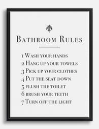
Poster regole del bagno in stile classico
Translation missing: it.products.product.sale_price A partire da €16,95€23,95 -

Poster forme organiche neutre
Translation missing: it.products.product.sale_price A partire da €16,95€23,95 -

Tela disegno a linee yoga minimal in bianco e nero
Translation missing: it.products.product.sale_price A partire da €64,95€92,95 -
Tela promemoria bagno in bianco e nero
Translation missing: it.products.product.sale_price A partire da €64,95€92,95 -

Tela Bauhaus geometrica minimalista
Translation missing: it.products.product.sale_price A partire da €64,95€92,95 -

Poster grazia a righe
Translation missing: it.products.product.sale_price A partire da €16,95€23,95 -

Tela figure minimaliste
Translation missing: it.products.product.sale_price A partire da €64,95€92,95 -

Poster minimalista equilibrio composto
Translation missing: it.products.product.sale_price A partire da €16,95€23,95 -

Tela figura pensierosa in verde
Translation missing: it.products.product.sale_price A partire da €64,95€92,95 -

Tela incontro giocoso
Translation missing: it.products.product.sale_price A partire da €64,95€92,95 -

Tela eleganza naturale
Translation missing: it.products.product.sale_price A partire da €64,95€92,95 -

Tela paesaggio onirico Bauhaus
Translation missing: it.products.product.sale_price A partire da €64,95€92,95 -

Poster/tela geometria Bauhaus verde e crema
Translation missing: it.products.product.sale_price A partire da €64,95€92,95 -

Tela Bauhaus di architettura moderna
Translation missing: it.products.product.sale_price A partire da €64,95€92,95 -

Tela musa davanti a parete di piatti vintage
Translation missing: it.products.product.sale_price A partire da €64,95€92,95 -
Poster stile folk con piatti decorativi
Translation missing: it.products.product.sale_price A partire da €16,95€23,95


Di più da The Frame

9 Sun Wall Art Ideas We Keep Coming Back To
Sun art is one of those motifs that keeps reinventing itself, from terracotta boho suns to clean black line drawings. The trick is matching the style of sun to the...

Best Dog Wall Art for Every Room (Not Just the ...
Dog art has an image problem. For decades it's been treated as something you tolerate in a downstairs loo or tuck behind a coat rack, as if loving your dog...

Small Bathroom Gallery Wall Ideas: How to Make ...
Small bathrooms are the most overlooked walls in your home. They're also the easiest to get right, because the constraints make most of the decisions for you. This guide gives...