Playful Art Gallery Wall or Single Statement Piece: Which Works Best?
The practical rules for hanging quirky prints without your walls looking like a jumble sale.

Most people who buy playful art end up leaving it in the wrapping. Not because they regret the purchase, but because they're worried it'll clash with the sofa, the curtains, or the more grown-up pieces they already own. This guide is the instruction manual: concrete rules for hanging whimsical prints in a way that looks intentional, not chaotic.
Start with one wall, not the whole room
The biggest mistake when decorating with whimsical prints is trying to scatter personality across every surface. You end up with a room that feels jumpy, like every wall is competing for attention.
Pick one wall and commit to it. Ideally a wall that already pulls focus, like the one behind the sofa, the wall opposite the door, or the one at the top of the stairs. Everything else in the room gets to stay calm.
This is also a kindness to your art. A playful print needs space around it to land. If it's surrounded by other busy elements, the joke gets lost. Treat the wall like a stage and let the rest of the room be the audience.
A useful working ratio is 70% calm, 30% playful across an entire room. That might mean one bold gallery wall and three quiet walls, or one statement piece per room rather than per wall. If you're sketching out a whole flat, aim for one playful "moment" per space.

The frame matching rule that makes everything work
Frames are the single biggest cohesion lever you have. Get them right and you can hang almost any combination of art together. Get them wrong and even matching prints will look like a jumble sale.
Here's the decision framework:
Match frames completely when: the artworks themselves are wildly different in style, colour, or subject. Mixing a quirky line drawing, a vintage botanical and a cartoonish portrait? Identical black or natural oak frames will pull them together instantly.
Mix frame finishes when: the artworks already share something obvious, like a colour palette, a subject (all animals, all faces), or a style (all illustrations). The shared thread does the work, so you can play with frame finishes for visual rhythm.
Never mix more than three frame finishes in one arrangement. Two is safer. Black plus natural oak is the most forgiving pairing because both finishes read as neutral.
The frame quality itself matters here too. Cheap frames warp, especially in humid rooms or when the print isn't fitted properly. If your gallery wall has even one frame that's slightly bowed or has a misaligned print, the whole arrangement looks amateur. This is why we fit prints into frames before they ship rather than packing them separately. It's a small thing that prevents the most common gallery wall failure.
What about matting?
Adding a white or off-white mat around a playful print is the fastest way to make it look more grown-up. Matting creates breathing room between the image and the frame edge, and that air space is what reads as "gallery." Without it, quirky prints can lean juvenile, especially in bright colours.
If you're worried a piece looks too childish for a living room or hallway, try a generous mat (5cm minimum) before you decide it doesn't work.
Picking the right size: when to go big and when to cluster small
Playful art has a scale problem most people don't anticipate. Small whimsical prints, hung alone, can look like stickers. Large whimsical prints, hung well, look like art.
The rule of thumb: a single piece should fill roughly two-thirds of the wall space above whatever furniture sits beneath it. Above a 200cm sofa, you want one print around 130cm wide, or a cluster that spans that width. A 30x40cm print floating alone above a three-seater will look stranded.
When to go big with a single piece:
- Above the sofa, the bed, or a console table
- On a tall, narrow wall (think hallway end or staircase)
- In a small room where a gallery wall would feel cramped
When to cluster small pieces:
- Up a staircase, where the eye travels
- On a wall with awkward proportions or doorways breaking it up
- Above a desk or reading nook where you'll see the art up close
For statement walls, our 70x100cm framed prints work hard, and the 100x150cm canvas size genuinely commands a room. Browse the colourful art collection if you're shopping for a single anchor piece.
For clusters, mix at least two sizes. Three or more identical sizes hung in a grid can work, but only if all the prints feel like a deliberate set. Random small prints in matching sizes tend to look like an afterthought.
Colour theory for people who hate colour theory
Forget the colour wheel. Here's what actually works.
The bridging technique. Pick one colour from your playful art and repeat it somewhere else in the room: a cushion, a throw, a vase, a lamp shade. One repetition is enough. The eye sees the connection and reads the art as intentional rather than random.
If your print has a mustard yellow background, you don't need yellow walls. You need one mustard yellow object somewhere within sightline of the art. A single cushion will do.
The neutral envelope. If your room is mostly neutral (white, grey, oatmeal, soft black), you can hang almost any colour of playful art and it'll work. Neutrals act as a frame around the art.
The clash rule. Two strong colours can fight. Three strong colours can sing. If your sofa is teal and your rug is mustard, adding a print with both teal and mustard pulls everything together. Adding a print that's purely red will create tension.
When in doubt, choose playful prints that contain a colour already in the room. The whimsical and playful art collection covers a wide enough range that you'll find something that nods to your existing palette.

Hanging heights that actually make sense for real rooms
The standard advice is to hang art so the centre of the piece sits at 145cm (roughly 57 inches) from the floor. This is the museum standard and it works for most rooms.
But museum walls don't have sofas, sideboards, or radiators. So:
Above furniture: the bottom of the frame should sit 15 to 20cm above the top of the furniture. Closer than that and the art looks pinned down. Further away and it floats off into space, disconnected from the room.
Above a bed: same rule, 15 to 20cm above the headboard. If you have no headboard, treat the top of the mattress as the reference point and aim for the bottom of the art to sit around 75cm above it.
In a hallway: stick to the 145cm centre rule. Hallways are walked through, not sat in, so eye-level is what matters.
Up a staircase: follow the line of the stairs. Each piece should sit at the same height relative to the step it's above, so the arrangement climbs at the same angle as the staircase.
For gallery walls and clusters, the spacing between pieces should be 5 to 8cm. Less than that and the wall looks cramped. More than that and the arrangement falls apart into individual pieces. Use 5cm if your frames are slim, 8cm if they're chunkier.
The paper template method
Before you put a single nail in the wall, cut paper templates the size of each frame and tape them to the wall with masking tape. Live with the arrangement for a day or two. Move things around. Take photos from across the room.
This sounds tedious. It takes 20 minutes and saves you a wall of holes.
Mixing whimsical prints with photography or abstract art
This is where most people freeze. They have a black and white photograph they love, an abstract piece left over from a previous flat, and a new playful print, and they don't know if any of it goes together.
It does, if you follow two rules.
One: shared frame finish. Identical frames across mixed styles are the great equaliser. A line illustration, a moody photograph and a colour-blocked abstract will look like a curated set if they're all in matching black frames with matching mats.
Two: the anchor piece method. Pick one piece to be the visual centre of gravity. This should be the largest, the most neutral, or both. The anchor grounds the arrangement, and the playful pieces orbit around it.
A common winning combination: one large abstract piece (the anchor), one medium photograph (the supporting act), one or two smaller whimsical prints (the personality). Browse the abstract art prints for anchor candidates.
The ratio that works: 60% your anchor style, 40% playful accents. If you have six pieces in a gallery wall, four should feel calm or sophisticated and two should bring the wit.

Three tried-and-tested playful art arrangements you can copy
The grounded gallery wall
Six pieces in matching frames, arranged in a loose rectangle. One large anchor piece (50x70cm) sits slightly off-centre. Around it: two medium prints (30x40cm) and three smaller pieces (20x30cm). Spacing of 6cm between pieces.
Style mix: one abstract, one photograph, two whimsical illustrations, one typographic print, one botanical. All in identical black frames with white mats. The matching frames make the eclectic mix read as deliberate.
Best for: living rooms, dining rooms, home offices.
The single statement above the sofa
One large framed or canvas print, 100cm wide minimum, hung centred above the sofa with the bottom edge 18cm above the cushion line. No other art on the same wall.
The trick: pick a piece bold enough to hold the wall on its own. Playful prints with strong colour or strong composition work better than delicate ones at this scale. Pull one colour from the print into a single cushion or throw.
Best for: open-plan living rooms, small flats, anyone nervous about gallery walls.
The staircase climb
Five small to medium prints climbing the staircase wall, each one stepped up to match the angle of the stairs. All matching frames, all matching mats, but the artworks themselves can be wildly varied.
This works because staircases are seen in motion. You don't stop and analyse, you glance as you walk past. Whimsy lands well here.
Best for: hallways, stairwells, bridging a serious downstairs with a more relaxed upstairs.
For pre-coordinated options, the wall art sets take the guesswork out of choosing pieces that work together.
Lighting and the long game
Two final things. First, lighting. A picture light or a small spotlight angled at your playful art instantly elevates it. Light is what museums use to tell you something matters. The same trick works at home.
Second, you don't have to commit forever. Swap pieces in and out seasonally if you like. Bright, sunny prints in summer, moodier pieces in winter. Frames and fixtures stay on the wall, only the art rotates. This is the easiest way to keep a room feeling fresh without redecorating.
Hang one wall properly, match your frames, mind your spacing, and bridge a colour from the art into the rest of the room. Those four moves cover 90% of what makes playful art look intentional rather than chaotic. The rest is just choosing pieces you actually want to look at every day.


Prodotti Fab presentati in questo blog
-

Poster ritratto moderno e giocoso
Translation missing: it.products.product.sale_price A partire da €16,95€23,95 -

Tela incontro giocoso
Translation missing: it.products.product.sale_price A partire da €64,95€92,95 -

Tela tipografica viola con complimento scherzoso
Translation missing: it.products.product.sale_price A partire da €64,95€92,95 -
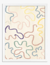
Poster astratto colori pastello
Translation missing: it.products.product.sale_price A partire da €16,95€23,95 -

Tela volto folk giocoso
Translation missing: it.products.product.sale_price A partire da €64,95€92,95 -

Poster pop colorato per il soggiorno
Translation missing: it.products.product.sale_price A partire da €16,95€23,95 -

Poster ritrovo giocoso al parco
Translation missing: it.products.product.sale_price A partire da €16,95€23,95 -

Poster parata giocosa di animali del safari
Translation missing: it.products.product.sale_price A partire da €16,95€23,95 -

Poster paesaggio collinare vivace
Translation missing: it.products.product.sale_price A partire da €16,95€23,95 -
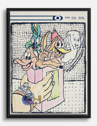
Tela collage di cartoni animati vivace e nostalgico
Translation missing: it.products.product.sale_price A partire da €64,95€92,95 -

Tela ritratto pop giocoso
Translation missing: it.products.product.sale_price A partire da €64,95€92,95 -

Poster musa del tennis vivace
Translation missing: it.products.product.sale_price A partire da €16,95€23,95 -
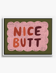
Tela con scritta spiritosa su sfondo rosa
Translation missing: it.products.product.sale_price A partire da €64,95€92,95 -
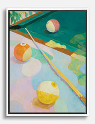
Tela biliardo in colori pastello
Translation missing: it.products.product.sale_price A partire da €64,95€92,95 -

Tela altalene giocose e colorate
Translation missing: it.products.product.sale_price A partire da €64,95€92,95 -

Poster altalena in stile moderno
Translation missing: it.products.product.sale_price A partire da €16,95€23,95 -

Poster cagnolino giocoso in colori pastello
Translation missing: it.products.product.sale_price A partire da €16,95€23,95 -

Poster parata di cagnolini giocosi
Translation missing: it.products.product.sale_price A partire da €16,95€23,95 -

Tela natura morta giocosa con bottiglia di vino e occhiali a cuore
Translation missing: it.products.product.sale_price A partire da €64,95€92,95


Di più da The Frame

Why Dragonflies Mean So Much: Symbolism, Spirit...
Few creatures have captivated artists as consistently as the dragonfly. For 4,000 years, across cultures that never met, they've shown up in tomb carvings, samurai armour, Tiffany lamps and now...

Every William Morris Botanical Design You Shoul...
You know you want a Morris print. You just can't decide which one. This guide walks through his most important botanical designs, what makes each one distinctive, and which rooms...

Monstera, Fern, Palm, or Eucalyptus? Choosing t...
Botanical prints are the safest bet in wall art, which is also why they're so easy to get wrong. The right leaf in the wrong room reads as generic, dated,...