Building a Pop Art Gallery Wall for Your Kitchen-Diner (Step by Step)
A tactical guide to arranging multiple pop art prints in a space that has to feed two rooms at once.

Kitchen-diners are the most underused canvas in the modern home. You spend more waking hours here than anywhere else, the lighting tends to be excellent, and the dual function of the space practically begs for art that's energetic rather than restrained. This guide walks you through building a pop art gallery wall that holds together across both zones, with specific layouts, measurements and frame choices you can actually use.
Why kitchen-diners are the best room for a pop art gallery wall
Pop art was made for spaces with movement. Bold flat colour, repeating motifs and graphic confidence all need a bit of life around them, and a kitchen-diner is the most lived-in room you've got. Morning coffee, dinner parties, kids doing homework at the table while something simmers on the hob. Pop art rewards that energy in a way that subtle landscape prints never will.
The other reason this room works so well is scale. Most kitchen-diners give you at least one long uninterrupted wall, usually opposite the kitchen units or behind the dining table. That's the kind of real estate a single print can't fill on its own. A gallery wall does, and it gives you something interesting to look at from both the cooker and the table.
There's also a colour argument. Kitchens already contain strong visual elements: cabinet fronts, splashbacks, appliances, tiles. Trying to introduce a moody abstract piece into that environment usually fails because the room is already busy. Pop art doesn't compete with kitchen surfaces, it joins the conversation.

Choosing a cohesive colour thread across multiple prints
The single biggest mistake people make with pop art gallery walls is buying prints they each love individually, hanging them together, and ending up with visual noise. A gallery wall is one composition, not several. You need a colour thread.
The simplest approach is to pick one accent colour and make sure it appears in every print. Yellow is the easiest because it's already common in pop art, and it bounces beautifully off white walls and warm wood. Other strong threads include cherry red, electric blue, or hot pink for spaces that already have softer neutrals to balance them.
If you want something more sophisticated than a single repeating colour, work with a restricted palette of three colours that appear in different proportions across each print. For example, every piece contains red, cream and black, but in different ratios. This is harder to shop for but creates a more grown-up result. Browse the pop art collection and pull up a shortlist of ten prints, then ruthlessly cut anything that breaks your palette.
The thread should also relate to something in the room. If your kitchen has brass handles, lean into mustard and warm tones. If you've got a navy island, pull blues forward. The gallery wall should feel like it belongs to the room, not like it was airdropped in from a different house.
The layout that works: our recommended arrangement for 3, 5, and 7 prints
Here are three layouts that genuinely work, with measurements you can replicate. All assume A2 prints (42x59cm) framed, which is the size we'd recommend for most kitchen-diners. Adjust proportionally if you size up.
Three prints: the horizontal row
Hang three prints of identical size in a straight horizontal line, frames touching at the same height across their centres. Leave 5cm between each frame. Total wall space needed: roughly 140cm wide. This works above a sideboard, a dining bench, or along a narrow wall between two doorways. It's the most foolproof layout and the one we'd recommend if you've never done this before.
Five prints: the 2-over-3 grid
Two prints on the top row, three on the bottom row, all the same size, with the top row centred above the bottom row. Use 5cm spacing both horizontally and vertically. Total wall space: around 140cm wide by 130cm tall. This layout works beautifully behind a six-seater dining table because the proportions match the table's footprint.
Seven prints: the anchor-plus-six
One large print (60x80cm) in the centre, with six smaller prints (30x40cm) arranged three on each side in two stacked rows. Spacing stays at 5cm throughout. Total wall: roughly 220cm wide by 100cm tall. This is the most ambitious of the three and the most rewarding, but you need a genuinely long wall to pull it off. Measure twice.
For all three layouts, work out your arrangement on the floor first, take a photo, then transfer to the wall using paper templates cut to size and stuck up with masking tape. Step back. Adjust. Then drill.

Mixing sizes without it looking chaotic (the anchor piece approach)
If you want variety in your gallery wall, the rule is one anchor and supporting cast. Pick one print noticeably larger than the others, ideally double the dimensions, and treat every other piece as a satellite around it. Without an anchor, your eye doesn't know where to land and the wall reads as scattered.
The anchor doesn't have to be in the centre. Off-centre anchors (about a third of the way in from one side) tend to look more contemporary and less symmetrical-living-room. Cluster the smaller pieces on the opposite side, varying their heights slightly so the arrangement breathes.
A common configuration: one 70x100cm anchor on the left, three 30x40cm pieces stacked on the right, with the top of the smallest piece aligned to the top of the anchor and the bottom of the bottom piece aligned to the bottom of the anchor. This creates an invisible rectangular boundary that holds the chaos in.
Avoid mixing more than two sizes in a single gallery wall. Three sizes is possible but you need real confidence and ideally a designer's eye. Two sizes (one anchor, one supporting size) is plenty for a striking result.
Frame colour matters more than you think: our pick for pop art
Frame choice is where most pop art gallery walls go wrong. Bold colours need containment, otherwise the wall starts to feel like a children's playroom. The frame is the punctuation that makes the colour readable.
Our recommendation for pop art is black frames, every time. Black frames sharpen the saturation of the prints, separate each piece cleanly from the wall, and lend a gallery-like seriousness that stops the work from feeling juvenile. Pop art is already a playful style, so the frame's job is to add weight, not more energy.
White frames can work if your kitchen-diner is already heavy on dark tones (matt black cabinets, charcoal floors), where black frames would disappear. But white frames soften pop art's edges and can make prints feel more like decorative posters than collected pieces. Use sparingly.
Avoid natural wood frames for pop art. Oak and ash look beautiful with botanical prints, vintage maps and muted abstracts, but they fight pop art's graphic clarity and pull the work toward a Scandinavian aesthetic that pop art was never meant to occupy. Save wood frames for a different room.
Whatever you choose, every frame should match. Mismatched frames work for eclectic gallery walls of family photos and flea-market finds. They don't work for pop art, where consistency is the whole point. Our framed art prints come with solid FSC-certified wood frames and UV-protective acrylic glaze, which matters more than you think in a kitchen with windows (more on that below).
Hanging height for kitchen-diners (it's different from a living room)
The standard advice is to hang art with its centre at 145cm, which is roughly average eye level. This is correct for living rooms and hallways. It is wrong for kitchen-diners.
In a kitchen-diner, you're rarely looking at the art while standing. You're looking at it sat down at the table, or moving between the kitchen and the table. The viewing angle changes everything. We'd hang the centre of a gallery wall behind a dining table at 135cm to 140cm, slightly lower than standard, so the arrangement reads properly when you're seated.
If your gallery wall is on the kitchen side of the room (above a worktop or behind an island), the rules flip. You're standing here, often working, and you want the bottom of the lowest frame to sit at least 30cm above the worktop to avoid splash and steam. That usually pushes the centre point up to around 155cm.
If you're spanning both zones with one continuous gallery wall, split the difference at 145cm and accept the compromise. The arrangement will look slightly low from the kitchen and slightly high from the table, but the wall will read as one unified composition rather than two arguments.

Bridging two zones: using art to connect your kitchen and dining areas
The opportunity most people miss is using the gallery wall as a visual bridge. Open-plan kitchen-diners often feel like two rooms reluctantly sharing a floorplan. Art can knit them together if you place it right.
The strongest approach is to hang one continuous gallery wall on the longest unbroken wall, running from the kitchen zone into the dining zone. The eye follows the line of frames across the entire space, which makes the room read as one unified environment rather than two functional areas glued together.
If your layout doesn't allow this, the next best thing is twin arrangements: a smaller cluster of three prints in the kitchen zone, a larger arrangement of five or seven in the dining zone, both using identical frames and a shared colour thread. The repetition of frame colour and palette creates a conversation between the two zones even when the arrangements themselves differ. Browse pop art for the kitchen and pop art for the dining room and pick pieces that share a colour thread but differ in subject.
For a dual-zone setup, wall art sets take a lot of the guesswork out, because they're designed to hang together from the start.
Common gallery wall mistakes and how to avoid them
Hanging too high. Most people overshoot. If in doubt, go lower than feels right. Art that's too high makes the ceiling feel lower and disconnects the wall from the furniture.
Spacing too generous. A gallery wall should feel like one piece, not a constellation. Frames spaced 10cm or more apart start to read as separate works. Stick to 5cm.
Buying everything at once without testing. Buy three prints first. Live with them. Then add. A gallery wall built over a few months almost always looks better than one ordered in a single transaction, because you've had time to refine the palette.
Hanging directly above the hob. Don't. Heat, steam and grease are bad news even for prints with UV-protective glazing. Keep prints at least 60cm from any cooking source, and ideally on a different wall entirely. Canvas handles humidity better than framed paper, but neither belongs above a frying pan.
Ignoring lighting. Pop art comes alive under good light. If your kitchen-diner relies heavily on overhead spots, point a couple toward the gallery wall. If you have a pendant over the dining table, check it isn't casting shadows across the prints.
Mixing too many styles. Pop art with abstract expressionism with botanical prints reads as indecision, not eclecticism. Commit to one style per wall.
Using cheap fixings. A framed print isn't light. Use proper picture hooks rated for the weight, into a stud where possible, and a wall plug if not. For renters, heavy-duty adhesive strips can hold a framed A2 print, but check the manufacturer's weight rating before trusting them with anything larger.
The gallery wall you build today doesn't have to be finished today. Start with three prints, get them right, and add more when you find pieces that fit the thread. The best walls are the ones that grow with the room.


Prodotti Fab presentati in questo blog
-

Poster scena pop vivace di cucina e soggiorno
Translation missing: it.products.product.sale_price A partire da €16,95€23,95 -

Tela cucina pop vivace
Translation missing: it.products.product.sale_price A partire da €65,95€93,95 -

Poster cucina pop e giocosa
Translation missing: it.products.product.sale_price A partire da €16,95€23,95 -

Tela cucina colorata con finestra sulla città
Translation missing: it.products.product.sale_price A partire da €65,95€93,95 -

Poster pop colorato per il soggiorno
Translation missing: it.products.product.sale_price A partire da €16,95€23,95 -

Poster olive pop art verde e rosa per cucina moderna
Translation missing: it.products.product.sale_price A partire da €16,95€23,95 -

Tela mosaico pop di olive
Translation missing: it.products.product.sale_price A partire da €65,95€93,95 -

Tela scena di cucina conviviale e colorata
Translation missing: it.products.product.sale_price A partire da €65,95€93,95 -
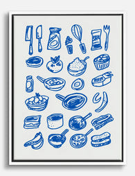
Tela cucina blu con disegno a linee di utensili e ingredienti
Translation missing: it.products.product.sale_price A partire da €65,95€93,95 -

Poster pop colorato per il soggiorno
Translation missing: it.products.product.sale_price A partire da €16,95€23,95 -

Tela pizza pop giocosa
Translation missing: it.products.product.sale_price A partire da €65,95€93,95 -

Tela cucina moderna con linee giocose e colori vivaci
Translation missing: it.products.product.sale_price A partire da €65,95€93,95 -

Tela con utensili e ingredienti da cucina illustrati
Translation missing: it.products.product.sale_price A partire da €65,95€93,95 -

Poster mirtilli pop, musa della cucina
Translation missing: it.products.product.sale_price A partire da €16,95€23,95 -
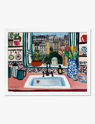
Poster vista di Parigi dalla cucina
Translation missing: it.products.product.sale_price A partire da €16,95€23,95 -
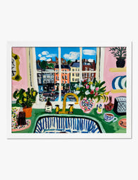
Poster scena di cucina ispirato a Matisse
Translation missing: it.products.product.sale_price A partire da €16,95€23,95 -

Poster cucina moderna vivace
Translation missing: it.products.product.sale_price A partire da €16,95€23,95 -

Tela cucina moderna con linee giocose
Translation missing: it.products.product.sale_price A partire da €65,95€93,95 -

Poster ritrovo in studio accogliente
Translation missing: it.products.product.sale_price A partire da €16,95€23,95 -

Poster lattina di olive verdi pop art
Translation missing: it.products.product.sale_price A partire da €16,95€23,95


Di più da The Frame

The Strawberry Thief: Everything You Need to Kn...
Strawberry Thief is the William Morris design people search for by name. It's also the one most often bought badly: wrong size, wrong colourway for the room, wrong print quality...

Our Favourite Jungle Prints for Every Room: The...
Jungle prints have a reputation problem. Done badly, they tip a room into themed-restaurant territory faster than almost any other trend. Done well, they add depth, movement and a sense...

Thrushes, Hares, and Peacocks: The Animals in W...
Why Morris put animals at the centre of his designs William Morris wasn't decorating walls with cute creatures. He was making a quiet argument. While Victorian factories churned out cheap,...