What Frame Colour Goes with What: A Real Guide
Stop agonising over the swatches. Here's exactly which frame colour to pick for your art, your walls, and your room.

Most frame colour advice is useless because it refuses to commit. You ask "oak or black?" and get a paragraph about undertones. So here's the opposite: a guide that actually makes the decision for you, scenario by scenario, with reasons.
The one rule that matters most
Match the frame to the room, not the artwork.
This is the single most common mistake. People pick a frame that "goes with" the colours in the print, then hang it in a room where it clashes with everything else. The art changes when you swap it out. The walls, floors and furniture don't.
Your frame is part of the room's architecture. Treat it like trim, skirting or door handles: a finish that should sit comfortably with the space it lives in. The artwork inside can be anything.
There's one exception, which we'll get to: black and white photography. That one breaks the rule.
Oak vs black frame: the honest comparison
These are the two frames most people choose between, so let's be specific.
Choose oak when:
- Your room has warm undertones (cream walls, beige sofa, wooden floors, linen, rattan)
- You want the art to feel soft and integrated, not announced
- The print itself is busy or colourful and you don't want to add more visual weight
- Your interior leans Scandi, Japandi, coastal or mid-century
- You're hanging multiple pieces and want them to feel calm together
Choose black when:
- Your room has cooler or higher-contrast finishes (white walls, grey sofa, dark floors, chrome, glass)
- You want the art to feel deliberate and graphic
- The print is minimal, monochrome, or photographic and you want to sharpen it
- Your interior leans modern, industrial, monochrome or formal
- You're hanging a single statement piece and want it to hold the wall
The shortcut: oak softens, black sharpens. If you can't decide which effect you want, look at the rest of the room. If everything else is soft (textiles, wood, warm light), go oak. If everything else is crisp (painted surfaces, metal, cool light), go black.

Frame colour by wall colour
This is where most guides get vague. Here's the direct version.
White walls
The most flexible scenario. Almost anything works, so the question is what effect you want.
- Black frame: Maximum contrast. The art reads as a defined object on the wall. Best for photography, line drawings and graphic prints.
- Oak or natural wood: Warms the room and softens the white. Best if your white walls are bright (not warm white) and you want to take the edge off.
- White frame: The white-on-white question everyone asks. It works, but only if your white frame matches your wall white closely. A bright white frame on a warm white wall looks like a mistake. When done well, the effect is gallery-like and the art appears to float.
- Walnut or dark wood: Brings richness without the harshness of black. Underrated choice for white walls in older properties.
Grey walls
Grey is cooler than people realise, and it eats warm wood tones unless you're careful.
- Black frame: Reliable. Works with every shade of grey from pale dove to deep charcoal.
- Oak: Works on warm or mid greys. Avoid on cool blue-greys, where it can look orange.
- White frame: Excellent on mid to dark greys. Creates definition without the severity of black.
- Walnut: Beautiful on pale grey. Skip on dark grey, where it disappears.
Dark walls (navy, forest green, charcoal, deep terracotta)
Dark walls swallow dark frames. This is where lighter frames earn their place.
- Oak or natural wood: The default choice. The contrast makes the art visible and brings warmth to a moody room.
- White frame: Sharp and gallery-like. Best for photography or abstract prints on navy or charcoal.
- Black frame: Only works if the wall is significantly lighter than the frame, or if the print itself is light enough to carry the piece. Otherwise the whole thing vanishes.
Coloured walls (sage, blush, ochre, dusty blue)
Treat the wall colour as a tinted neutral and pick the frame that doesn't fight it.
- Sage green walls: oak (always) or black (for graphic prints)
- Blush pink walls: oak, walnut, or warm white. Avoid cold black.
- Ochre or mustard walls: black or walnut. Oak can look muddy.
- Dusty blue walls: oak or white. Black works if the print is high-contrast.
What about black and white photography?
This is the exception to the match-the-room rule. Black and white photography almost always looks best in a black frame, regardless of the room.
The reason is simple: the print is already a study in contrast. A black frame extends the deepest tone of the image and presents it as a complete object. Oak softens the effect and makes the photograph feel like a poster rather than a print.
If you have warm-toned interiors and a black frame would feel too cold, walnut is the compromise. Never frame black and white photography in white. It washes the tonal range out.
Browse our black and white photography prints if you want to see this in action.
The most versatile frame colour
If you're buying a frame for a piece you'll move around over the years, oak is the most versatile choice. It works on more wall colours, complements more interior styles, and ages well. Black is more striking but more limited. White is more specific. Walnut is gorgeous but expensive and dominant.
Oak is the answer to "which frame goes with everything." With one caveat: it doesn't go with cool grey or stark monochrome interiors, where it always looks slightly out of place.
Finish matters more than you think
Black frame is not one thing. A matte black frame, a gloss black frame and a black wood-grain frame produce three different rooms.
- Matte black: The default. Quietly modern, photographic, easy to live with.
- Gloss black: Formal, slightly retro. Works in traditional or maximalist interiors. Wrong for Scandi or minimalist rooms.
- Black with visible wood grain: A halfway house between black and oak. Softer than pure black, warmer than painted. Good for transitional interiors.
The same applies to oak. A pale, almost-blond oak reads Scandi. A mid-tone oak with visible grain reads warm and traditional. A lime-washed or whitewashed oak reads coastal. They're not interchangeable.
We use solid FSC-certified wood for our framed art prints, so the grain on the oak frames is real and slightly different on every piece. That's the look you want. Veneered MDF frames have a printed grain that always looks dead.

Mixing frame colours in one room
You can mix frame colours. Most people do it badly because they treat it as a free-for-all. Here's the rule that works.
Pick a dominant frame colour (70%) and a secondary (30%). Don't introduce a third.
If your living room has two oak-framed prints and one black, that's balanced. Three oak and one black, even better. Two oak and two black starts to feel like indecision. Three different frame colours in one room almost always looks unintentional.
The other approach: use the same frame colour throughout a single wall or zone, but vary it between rooms. Black frames in the lounge, oak in the bedroom, white in the bathroom. Each room has its own logic.
Gallery walls: the contrarian advice
Most gallery wall guides tell you to mix frame colours for "visual interest." We disagree. The best gallery walls use one frame colour throughout, and let the artwork provide the variety.
If every frame is oak, the wall reads as a curated collection. If frames are mixed, the wall reads as the contents of a junk drawer. The exception is a deliberately maximalist or salon-style wall, where mismatched frames are part of the aesthetic. If that's not what you're going for, stick to one colour.
What you can vary: frame width, print size, and orientation. A gallery wall of oak frames in three different widths and five different sizes is interesting. A gallery wall of oak, black, white and walnut frames in the same size is chaos.
For more on planning the layout itself, our guide to gallery wall prints covers the spacing and arrangement side.
Frame colour by interior style
Quick reference if you know what look you're after:
- Scandi / Japandi: Pale oak. Occasionally black for accent pieces.
- Mid-century modern: Walnut for richness, or black for graphic prints.
- Industrial: Black, matte finish. Thin profile.
- Hamptons / coastal: White or pale oak. Never black.
- Classic / period property: Walnut, gold, or black gloss. Oak can feel too casual.
- Modern minimalist: Black or white, thin profile, no visible grain.
- Maximalist: Mix. The rules don't apply here. Embrace it.
- Boho: Natural wood, rattan-adjacent tones. Avoid painted frames.
Frame width and colour: a quick note
Wider frames look heavier, which amplifies whatever colour they are. A wide black frame is dramatic. A wide oak frame is country-cottage. A thin black frame is modern. A thin oak frame is barely there.
If you want a strong frame presence, go wide and dark. If you want the art to do the talking, go thin and light. Most people overestimate the frame width they need. When in doubt, go thinner.

Common mistakes (and when NOT to use black)
A few things we see repeatedly:
Using black frames in a room with no other black. Black is an anchor colour. If there's no other black in the room (lamp base, chair legs, hardware, picture rail), a black frame floats and feels disconnected. Either add another black element or switch frames.
Matching the frame to a colour in the print. This sounds clever but rarely works. If the print has a lot of orange and you pick an orange-toned wood frame, the frame stops being a frame and becomes part of the image. The art loses its edge.
Defaulting to black for "modern" interiors. Black isn't the only modern choice. Pale oak with a thin profile is just as contemporary, and warmer to live with.
White frames on dirty white walls. If your walls haven't been freshly painted, a true white frame will make the wall look grey. Either repaint or pick oak.
Mixing too many frame finishes in a small space. A small lounge with three different frame colours feels visually noisy even if you can't articulate why. Simplify.
Wood or metal?
Metal frames have a specific look: thin, cool, very modern. They suit photography, architectural prints, and tight minimalist interiors. They feel cold in warm rooms and clinical in family spaces.
For most homes, wood is the better choice. It softens the wall, ages well, and forgives more decorating decisions around it. Save metal for specific design statements.
The decision, simplified
If you're still hovering between options, this is the order to think in:
- What's the dominant tone of the room: warm or cool? Warm = oak or walnut. Cool = black or white.
- Is the artwork colourful or quiet? Colourful = quieter frame. Quiet = stronger frame.
- Is it a single piece or part of a set? Set = pick one frame colour and stick to it.
- Is it black and white photography? Then it's a black frame. End of decision.
Browse the full range of framed prints once you know which way you're going. Frames arrive properly fitted, with fixtures attached, so you can put the decision into action without sourcing anything separately.

One last thing
Frame colour is a finish, not a feature. The best frame is the one you stop noticing after a week. If you're still looking at the frame instead of the art a month after hanging it, you picked the wrong colour. Swap it. The artwork is what you bought it for.

Prodotti Fab presentati in questo blog
-

Tela cavallo al galoppo multicolore
Translation missing: it.products.product.sale_price A partire da €64,95€92,95 -

Poster cavallo al galoppo vibrante
Translation missing: it.products.product.sale_price A partire da €16,95€23,95 -

Tela partita del sabato mattina
Translation missing: it.products.product.sale_price A partire da €64,95€92,95 -

Tela ritratto audace a blocchi di colore
Translation missing: it.products.product.sale_price A partire da €64,95€92,95 -

Tela taxi gialli tra le strade alberate di Melbourne
Translation missing: it.products.product.sale_price A partire da €64,95€92,95 -

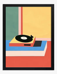
Tela vinile retrò
Translation missing: it.products.product.sale_price A partire da €64,95€92,95 -

Poster partita del sabato mattina
Translation missing: it.products.product.sale_price A partire da €16,95€23,95 -
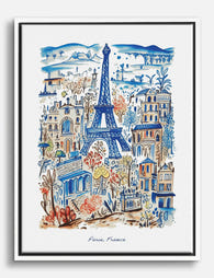
Tela Parigi chic con la Torre Eiffel
Translation missing: it.products.product.sale_price A partire da €64,95€92,95 -

Tela scorcio urbano in toni pastello
Translation missing: it.products.product.sale_price A partire da €64,95€92,95 -
Poster disco in vinile retrò
Translation missing: it.products.product.sale_price A partire da €16,95€23,95 -
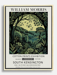
Tela botanica di William Morris
Translation missing: it.products.product.sale_price A partire da €64,95€92,95 -

Poster paesaggio botanico in stile William Morris
Translation missing: it.products.product.sale_price A partire da €16,95€23,95 -

Tela foresta al chiaro di luna di William Morris
Translation missing: it.products.product.sale_price A partire da €64,95€92,95 -

Tela farfalla invernale di William Morris
Translation missing: it.products.product.sale_price A partire da €64,95€92,95 -

Poster foresta al chiaro di luna in stile William Morris
Translation missing: it.products.product.sale_price A partire da €16,95€23,95 -

Tela cavallo blu lunare elegante
Translation missing: it.products.product.sale_price A partire da €64,95€92,95 -

Poster ritratto moderno a blocchi di colore
Translation missing: it.products.product.sale_price A partire da €16,95€23,95 -

Poster scena di strada a Londra in toni pastello
Translation missing: it.products.product.sale_price A partire da €16,95€23,95 -

Tela mattino sulla costa
Translation missing: it.products.product.sale_price A partire da €64,95€92,95 -

Poster farfalla invernale in stile William Morris
Translation missing: it.products.product.sale_price A partire da €16,95€23,95


Di più da The Frame

The Gallery Wall Edit: Curated Layouts That Fee...
There is a specific kind of gallery wall that haunts the internet. Six matching black frames in a perfect grid, a Matisse line drawing, an "abstract neutral", and possibly the...

Glass vs Acrylic Glazing: The Bit Nobody Explains
Every guide to picture frame glazing reads the same way: a tidy pros and cons list, a vague nod to "personal preference," and a recommendation that conveniently aligns with whatever...

Why We Frame with Real Wood (And What Flat-Pack...
Most people buying a framed print never think about the frame itself. That's fair. You're buying the art. But the frame is the structure that protects it, defines it on...