Why Do Most Coastal Gallery Walls Feel So Cluttered?
The logistics-first guide for anyone who's been staring at a blank wall and a saved Pinterest board for months.

Because they're built on inspiration, not logistics. People save twenty beautiful examples, buy seven prints in seven different sizes and three frame finishes, and end up with a wall that feels like a yard sale. This guide hands you the formulas instead.
Gallery wall or single statement print? How to decide for your space
A gallery wall earns its place when you have width to fill and a flat, uncluttered backdrop. If your wall is over 1.5 metres wide, sits above a sofa, sideboard or bed, and doesn't compete with bookshelves or busy wallpaper, you're a candidate.
If the wall is narrower than 1.2 metres, breaks around a doorway, or sits beside a busy architectural feature, do yourself a favour and hang one large piece. A single 70x100cm framed ocean print will always look more considered than four small prints crammed into the same space.
The other deciding factor is your tolerance for measuring. A gallery wall takes around an hour to plan properly. A single print takes five minutes. Be honest with yourself.

The golden rule: pick one frame finish and stick with it
If you take nothing else from this article, take this. Mixed frame finishes are the single biggest reason coastal gallery walls look chaotic. The visual noise of black, gold, white and oak fighting each other on one wall cancels out the calm you were going for.
Pick one finish based on your room:
- Natural oak or ash: the default for coastal style. Warm, casual, pairs with linen, rattan and whitewashed timber. This is the safest choice and works in 80% of homes.
- White: best for bright, airy rooms with pale walls. Disappears into the wall and lets the artwork do all the work. Leans more "Hamptons" than "Cornish cottage."
- Black: only if your space has other strong dark accents (black window frames, a dark sofa, matte black hardware). Looks sharp but reads more modern-coastal than relaxed-coastal.
Whichever you pick, every frame on the wall should match. Same finish, same profile width, same glazing. Our framed prints come with UV-protective acrylic glaze and FSC solid wood frames in consistent profiles, which removes the guesswork.
How many prints you actually need (based on your wall width)
Here's the cheat sheet. Measure your wall width, then pick a print count from the range below.
| Wall width | Print count | Best size combination |
|---|---|---|
| 1.2 to 1.5m | 3 prints | 1 x 50x70cm + 2 x 30x40cm |
| 1.5 to 1.8m | 4 to 5 prints | 1 x 70x100cm + 4 x 30x40cm, or 5 x 40x50cm in a grid |
| 1.8 to 2.4m | 5 to 7 prints | 2 x 50x70cm + 3 x 30x40cm, or 1 x 70x100cm + 4 x 40x50cm |
| 2.4m+ | 7 to 9 prints | 3 x 50x70cm + 4 x 30x40cm |
The total artwork area should cover roughly two-thirds of the wall width. Less than that and the wall looks under-dressed. More than that and you're heading into clutter territory.
A common mistake is buying everything the same size. Five identical 40x50cm prints in a row reads as a calendar, not a gallery. You need at least one anchor piece that's visibly larger than the others.
Two layout templates that work every time
The symmetric grid
Use this when you want calm, ordered and a bit more formal. It suits bedrooms, dining rooms, and anywhere with strong horizontal lines (a long sideboard, a low sofa).
The formula: an even number of identical-sized prints arranged in two rows. Four prints in a 2x2, six prints in a 3x2, eight prints in a 4x2. All the same size, all the same frame, evenly spaced.
Spacing between frames: 5 to 7cm. Any tighter and they read as one chunky block. Any wider and they stop relating to each other.
The grid is foolproof because there's only one decision to make: which prints go where. Put your strongest image top-left (where the eye lands first) and balance the colour weight diagonally.
The organic cluster
Use this when you want it to feel collected over time, casual, slightly bohemian. It suits living rooms, hallways, and walls above stairs.
The formula: one anchor print (the largest), two medium prints, and two to four smaller prints arranged around the anchor. The anchor sits slightly off-centre, usually left of middle. Medium prints flank it diagonally. Smaller prints fill the gaps.
The trick is to imagine a rough rectangle or oval containing the whole arrangement. Every print should sit inside that imaginary boundary. Prints don't need to align with each other, but the outer edges of the cluster should form a clean shape.
Spacing between frames in a cluster: 5cm minimum, 8cm maximum. Vary the spacing slightly so it doesn't look like a grid that's gone wrong.

Mixing subjects without losing the coastal thread
A coastal gallery wall with seven photos of waves is boring. A coastal gallery wall with waves, a flamingo, a vintage car and a quote print is incoherent. The sweet spot lives in between.
Use the 70/30 rule: 70% of your prints should be water and sky subjects (open ocean, breaking waves, horizon lines, beach scenes). 30% should be coastal supporting acts (sea grasses, shells, boats, lighthouses, abstract sandy textures, a single piece of botanical art).
Within that, vary the treatment:
- One or two photographic prints (real ocean, real horizon)
- One or two painterly or abstract pieces (loose watercolour waves, muted colour fields)
- One illustrative or graphic piece (a line drawing of a boat, a vintage-style chart)
The cohesion comes from a tight colour palette. Stick to soft blues, sandy neutrals, off-whites and a single accent colour (terracotta, sage, or warm grey). If a print has bright primary colours, it doesn't belong on this wall. Browse our ocean art prints and beach art prints collections together rather than separately, and you'll see the palette enforce itself.
Sizing cheat sheet: which combinations look balanced
These are the combinations that consistently look right. Memorise two or three.
For 3 prints:
- 1 x 50x70cm anchor + 2 x 30x40cm flanking it
- 3 x 40x50cm in a horizontal row (only if subjects clearly relate)
For 5 prints:
- 1 x 70x100cm anchor + 4 x 30x40cm clustered around it
- 5 x 40x50cm in a 3-over-2 cluster
- 2 x 50x70cm + 3 x 30x40cm in an organic arrangement
For 6 prints:
- 6 x 40x50cm in a 3x2 grid
- 2 x 50x70cm + 4 x 30x40cm asymmetric cluster
For 7 prints:
- 1 x 70x100cm + 2 x 40x50cm + 4 x 30x40cm
- 3 x 50x70cm + 4 x 30x40cm
The rule underneath all these combos: one print should be at least 1.5 times larger than the next size down. Without that scale jump, the arrangement reads as flat and indecisive.
If you want to skip the maths entirely, pre-curated wall art sets come with the size ratios already worked out.
Hanging it straight the first time: tools and tricks
Step one: lay it out on the floor first
Always. Clear a floor space roughly the size of your wall, then arrange the prints face-up exactly as you want them on the wall. Step back. Photograph it from above. Rearrange until you stop wanting to move things.
This twenty-minute exercise prevents 90% of regret. Once the holes are in the wall, they're in the wall.
Step two: trace and tape
Cut out paper templates the exact size of each print. Brown packing paper works well. Tape them to the wall with masking tape in the arrangement you settled on. Live with it for a day. Adjust.
This is where you confirm the centre of your arrangement sits at the right height. The accepted standard: the centre of the overall grouping should land at 145 to 152cm from the floor (eye level for most adults). Above a sofa or sideboard, leave 15 to 20cm of breathing room between the top of the furniture and the bottom of the lowest frame.
Step three: mark and drill
Mark the top-centre of each paper template, then mark where the hanging fixture will sit (usually a few cm below the top of the frame, depending on the hanging hardware). Drill through the paper. Pull the paper down. Hang the prints.
Tools you actually need: a tape measure, a spirit level (or the level app on your phone), a pencil, masking tape, and a drill. Skip the laser level unless you're doing a six-print grid, where it genuinely helps.
Our framed prints arrive with fixtures already attached and the print properly fitted into the frame, so there's no faffing with mounting hardware or worrying about warped backing boards. The frame and print ship together in one box, fitted and ready.

Common mistakes and how to dodge them
Buying all the same size. Creates a calendar wall. Always include one piece that's at least 1.5 times larger than the rest.
Spacing too tightly. Frames need air. 5 to 7cm minimum, even in a tight cluster.
Hanging too high. The most common error in British homes. The centre of the grouping should be at 145 to 152cm, not floating near the ceiling cornice.
Mixing matted and unmatted prints. A mat (the white border inside the frame) changes the visual weight. Either all your prints have mats or none of them do.
Treating it as permanent. It isn't. The beauty of a modular gallery wall is that you can swap one or two prints seasonally without redoing the whole arrangement. Keep the anchor, rotate the supporting pieces.
Matting, canvas, and other choices
Mats add formality and visual breathing room around each image. They suit photographic prints and pull a gallery wall toward "considered" and away from "casual." If your coastal style leans Hamptons or New England, use mats. If it leans Cornwall fisherman's cottage, skip them.
Canvas prints can work in a gallery wall but only if every piece is canvas. Mixing framed prints and canvas in one arrangement almost never works because the depth and edge treatment is different. If you love the soft, frameless look of canvas for a coastal room, commit to it across the whole wall. Canvas also handles humid bathrooms and kitchens better than framed glass, which is worth knowing.
How to decorate with coastal art without it feeling themed
The line between "coastal" and "themed beach house" is thinner than people realise. Themed is anchor motifs, rope-wrapped frames, and sandcastle prints. Coastal is restraint: a horizon line, a wash of pale blue, the suggestion of sea light.
Three rules keep you on the right side of the line:
- No literal text. No "Beach This Way" signs, no GPS coordinates, no driftwood typography.
- No more than one boat. Boats are a strong motif. One is charming. Three is a marina.
- At least one abstract piece. A loose watercolour wash or a muted colour field stops the wall reading as a holiday postcard collection.
Beach house decor ideas tend to fall apart when every single object is themed. The art should be the most coastal thing on the wall. Everything else (cushions, ceramics, lamps) can stay quietly neutral.

Our favourite coastal subjects for gallery walls right now
If you're staring at thousands of options and freezing, narrow yourself to these five categories and pick one print from each:
- A horizon line. The simplest, most calming image you can hang. Sky meeting sea, nothing else.
- A textured close-up. Sand patterns, wet pebbles, a tidal pool. Adds tactile interest.
- A loose abstract. Watercolour waves, a muted colour field, an ink-wash sea.
- A single object. One boat, one shell, one piece of sea grass. Quiet, specific.
- A wider scene. A cliff, a stretch of empty beach, a distant lighthouse.
Five prints, five categories, one frame finish, the right size ratios. That's a gallery wall.
Final word
Coastal gallery walls fail because people approach them as an art project when they're really a logistics project. Pick your frame finish. Pick your size combination from the cheat sheet. Lay it out on the floor. Trace it on the wall with paper. Then drill. The creativity lives in choosing the prints, not in winging the arrangement.

Prodotti Fab presentati in questo blog
-

Tela onde del mare con citazione
Translation missing: it.products.product.sale_price A partire da €64,95€92,95 -

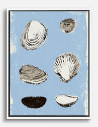
Poster studio di conchiglie del litorale
Translation missing: it.products.product.sale_price A partire da €16,95€23,95 -

Poster conchiglie su fondo blu
Translation missing: it.products.product.sale_price A partire da €16,95€23,95 -

Poster conchiglie marine su sfondo blu
Translation missing: it.products.product.sale_price A partire da €16,95€23,95 -
Tela studio di conchiglie marine
Translation missing: it.products.product.sale_price A partire da €64,95€92,95 -

Tela onde marine calme in blu e beige sabbia
Translation missing: it.products.product.sale_price A partire da €64,95€92,95 -

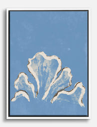
Tela conchiglia a spirale stile costiero
Translation missing: it.products.product.sale_price A partire da €64,95€92,95 -

Poster conchiglia marina beige e azzurro
Translation missing: it.products.product.sale_price A partire da €16,95€23,95 -

Poster onde serene sulla costa
Translation missing: it.products.product.sale_price A partire da €16,95€23,95 -

Tela calma marina
Translation missing: it.products.product.sale_price A partire da €64,95€92,95 -

Tela finestra sul mare con palme
Translation missing: it.products.product.sale_price A partire da €64,95€92,95 -

Tela onde placide del mare
Translation missing: it.products.product.sale_price A partire da €64,95€92,95 -

Poster spiaggia colorata
Translation missing: it.products.product.sale_price A partire da €16,95€23,95 -
Tela con conchiglie blu su fondo azzurro cielo
Translation missing: it.products.product.sale_price A partire da €64,95€92,95 -

Tela falesia costiera di Seurat
Translation missing: it.products.product.sale_price A partire da €64,95€92,95


Di più da The Frame

The Most Distinctive Art Print Styles Right Now...
Most art print guides confuse style with technique, listing lithography next to surrealism as if they're the same kind of thing. They're not. This article is about visual style, the...

The Gold Wall Art Edit: Our Curated Picks for E...
Gold art has a job to do. Done well, it warms a room, catches the light, and pulls a colour scheme together. Done badly, it looks like a hotel lobby...

7 Rules for Hanging Wall Art Prints That Look P...
Most art prints get hung too high, too small, and too far from anything else in the room. The good news: getting it right is more about a handful of...