Cottage vs. Farmhouse Decor: Which One Your Home Actually Wants
Your walls are telling everyone which style you chose, so make sure you've actually chosen one.

Cottage and farmhouse: two styles that get confused constantly
Cottage and farmhouse get lumped together because they share a vocabulary: wood, white, vintage, "rural." But they're aiming at completely different feelings. Cottage is layered, romantic, and a bit overgrown. Farmhouse is pared back, practical, and high-contrast.
The fastest way to commit to one over the other is through your walls. Furniture is expensive to swap, flooring is non-negotiable in a rental, but wall art changes the entire register of a room in an afternoon. Get the prints right and the rest of the room follows.
The colour test: warm, soft, and layered vs. neutral, rustic, and high-contrast
Before you buy anything, take a photo of the room you're styling. Look at it on your phone. Squint. What you're checking for is contrast.
Cottage palettes are low-contrast and warm. Think sage green next to dusty pink next to cream, with maybe a faded cornflower blue thrown in. Nothing shouts. Everything sits one or two shades away from its neighbour, like a faded watercolour. If your room already has pastel walls, painted furniture, or floral textiles, you're leaning cottage whether you knew it or not.
Farmhouse palettes are high-contrast and neutral. Bright whites, deep blacks, weathered wood tones, occasional soft taupe. The drama comes from the gap between light and dark, not from colour itself. Black window frames, white shiplap, a wrought iron pendant: that's the farmhouse signature.

Here's where lighting matters. Cottage pastels need natural light to sing. In a north-facing room with weak afternoon light, those dusty pinks and pale greens turn muddy and sad. Farmhouse high-contrast palettes work fine in dim rooms because the black-and-cream interplay still reads clearly even under a single warm bulb.
So: warm and layered, or neutral and sharp? Pick one. You can't have both without making a mess, which we'll come back to.
Wall art that says 'cottage': florals, garden scenes, and pastoral landscapes
Cottage wall art is unapologetically pretty. It draws from a tradition of botanical illustration, English watercolour landscapes, and 19th-century domestic painting. The subjects are gardens, meadows, hedgerows, country lanes, hens, hares, and bowls of fruit on kitchen tables.
What makes cottage art specifically cottage (rather than just "nature art") is the softness. Edges are blurred. Colours are layered rather than blocked. There's usually a sense of weather: morning mist, late afternoon sun, the kind of light that makes everything look slightly faded. Crisp graphic illustration is not cottage. Loose, painterly, atmospheric work is.
Some reliable categories:
- Loose floral studies: a single peony, a jug of cow parsley, a tangle of sweet peas. Watercolour or oil, never digital-looking.
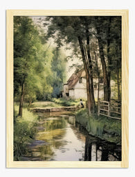
- Pastoral landscapes: rolling fields, distant church spires, sheep in middle distance. Look for misty palettes rather than bright midday colours.
- Garden scenes: walled gardens, vegetable plots, greenhouses with the door ajar.
- Vintage botanical plates: not the crisp scientific kind (that's farmhouse), but softer painted studies of roses, lavender, and herbs.
For cottage style wall decor, frames matter as much as the print itself. Distressed cream, soft gold, faded sage painted wood. Mixing frame finishes is encouraged. A perfectly matched set of black frames will make even the most romantic floral feel wrong. If you're browsing our cottage art prints collection, lean toward pieces with painterly brushwork and avoid anything too sharply defined.
Layout-wise, cottage works in asymmetrical clusters. Mixed sizes, mixed orientations, varied frame colours. The look you're after is "collected over decades," not "ordered in one shipment."
Wall art that says 'farmhouse': botanicals, typography, and muted still lifes
Farmhouse wall art has a completely different posture. Where cottage is romantic, farmhouse is plain-spoken. Where cottage layers, farmhouse simplifies. The art reads from across the room because there's no ambiguity in the composition.
The three dominant categories:
- Crisp vintage botanicals: those classic scientific plates with the latin name printed underneath, a single specimen against an aged cream background. These are the workhorses of farmhouse walls.
- Typography prints: a single word or short phrase in a serif or vintage display font. "Gather", "Fresh Eggs", "Bread" over a kitchen counter. Used sparingly. One per room maximum, or it tips into kitsch.
- Muted still lifes: a single pear on a pewter plate, a stoneware jug, a loaf of bread on a linen cloth. Dutch master energy but stripped back and modern.
- Black and white landscapes: open fields, lone trees, weatherboarded barns. High contrast photography or pen-and-ink illustration.

Frames for farmhouse should be simple. Plain black metal, plain natural oak, plain matte white. No distressing, no gold, no carved detail. If cottage frames are characters in their own right, farmhouse frames are meant to disappear and let the print do the work.
Gallery walls are where the styles diverge most visibly. Farmhouse loves a grid. Four identical frames in a 2x2 arrangement above a sideboard, or six in a 3x2 above a sofa, all the same size, all the same frame, perfectly aligned. That precision is the look. Browse our farmhouse art prints for botanicals and typography that work in this format, and consider a set of four 40x50cm framed prints as a starting point.
Worth noting: a sharp vintage botanical can work in either style depending on how you frame it. The same rose illustration in a distressed cream frame reads cottage. In a black metal frame, it reads farmhouse. Our wider botanical art prints collection straddles both worlds, which is useful if you're still deciding.
Furniture and texture differences that matter
This is where the styles really separate, and it'll help you confirm which one your existing room is already pulling toward.
Cottage furniture is painted, curved, and softened. Think painted dressers in chalky pastels, slip-covered sofas in linen, button-back armchairs, spindle-back chairs around a scrubbed pine table. Textiles are floral, ticking stripe, gingham. Lots of cushions. Layered rugs. Curtains rather than blinds, usually in a small print.
Farmhouse furniture is raw, straight-lined, and heavy. Solid wood tables with thick legs, ladder-back chairs, leather armchairs, iron bed frames. Textiles are plain linen, denim, ticking stripe (the one overlap), and the occasional buffalo check. Minimal cushions. Plain woven rugs in jute or wool. Roman blinds or simple linen curtains.
Walls follow the same logic. Cottage walls are painted in soft colours or papered in small florals. Farmhouse walls are white, off-white, or feature shiplap or exposed brick. Cottage rooms feel filled. Farmhouse rooms feel cleared.
If you already own an oversized wooden coffee table with visible knots and a leather Chesterfield, no amount of floral prints will make that room cottage. You're farmhouse. Lean in. Conversely, if you have a slip-covered sofa, a painted bureau, and three different cushion fabrics, please don't buy a typography print that says "Farmhouse Kitchen." You're cottage.
Can you mix them? Yes, but here's how to do it without a mess
There's a real hybrid trend called "modern cottage" or "farm cottage" that blends the two, and it can look brilliant when done with restraint. It can also look like a confused jumble. The difference is whether you've picked a primary direction.
The rule we'd suggest: 80/20. Eighty percent of the room commits to one style. The other twenty percent borrows from the other to soften any extremes.

So a primarily farmhouse room (white walls, oak table, black frames) might bring in cottage warmth through a single oversized floral painting above the mantelpiece and a couple of soft cushions. A primarily cottage room (painted walls, mixed textiles, gallery wall) might use a simple black-framed botanical above a doorway to keep things from feeling too sweet.
What doesn't work: equal parts. Half the room shiplap and black metal, half painted dresser and floral curtains, with a gallery wall that mixes typography and watercolour florals in mismatched frames. That's not eclectic, that's indecisive. The eye can't settle.
If you genuinely can't decide, default to whichever style your house's architecture suggests. A Victorian terrace wants cottage. A converted barn or new build with high ceilings wants farmhouse. Fighting the bones of the building rarely ends well.
Choosing the right prints for your space: our recommendations for both styles
A few specific suggestions to make this actionable, depending on the room.
For a cottage living room
Build an asymmetrical gallery wall above the sofa using five to seven prints in varied sizes. Mix a large 50x70cm pastoral landscape with three or four smaller 30x40cm floral studies and one small 21x30cm garden scene. Use cream, soft gold, and pale sage frames, not all matching. The framed option works particularly well here because the FSC wood frames hold their colour without yellowing, and the UV-protective glaze means a sunny living room won't bleach your watercolours over time.
If you want one statement piece instead of a wall, go large: a 70x100cm framed pastoral landscape over a fireplace will anchor the entire room. Our landscape art prints collection has plenty of misty, atmospheric options that suit cottage palettes.
For a farmhouse kitchen
Four matching black-framed vintage botanical prints in a 2x2 grid above a sideboard or bench. All the same size (40x50cm works well), all the same frame. The repetition is the point. Single typography prints can work above a doorway or in a narrow strip of wall, but resist the urge to add more than one per room.
For dining areas, a single large 70x100cm muted still life over the table beats a cluster of smaller pieces. Farmhouse rewards confidence and scale.
For a bedroom (either style)
Cottage bedrooms want a soft floral above the bed, ideally horizontal, in a painted cream or pale wood frame. Around 60x90cm to balance a standard double bed, larger for a king. Pair with two small botanical studies on the opposite wall.

Farmhouse bedrooms want a single large piece or a pair of matched botanicals above the bed. Black or natural oak frame, simple subject, plenty of negative space around it. Don't fill the other walls. The restraint is the look.
Practical notes on materials
Canvas suits farmhouse better than cottage in most cases. The unframed canvas look reads slightly more rustic and pares back well with shiplap and exposed wood. Cottage almost always wants a frame because the frame is part of the styling.
In humid rooms (bathrooms, very steamy kitchens), canvas is the safer choice. It's lighter, doesn't trap condensation behind acrylic glaze, and won't warp the way poorly made framed prints sometimes do. That said, if you're going framed, make sure the frame and print ship together properly fitted. Frames shipped separately from prints almost always end up misaligned, warped, or bubbled. It's the single biggest reason people give up on framed wall art.
A final word
Don't try to decide in the abstract. Take a photo of the room, look at the colours and contrast you've already got, and let the room tell you which way it's going. Then commit. The worst cottage and farmhouse rooms are the ones where the owner couldn't choose. The best ones look certain.
Start with one anchor print, get the scale right (most people buy too small), and build outward from there. Everything else is just refinement.

Prodotti Fab presentati in questo blog
-

Poster musa di campagna
Translation missing: it.products.product.sale_price A partire da £11.95£19.95 -

Poster casa colonica in Provenza di Van Gogh
Translation missing: it.products.product.sale_price A partire da £11.95£19.95 -
Poster musa di campagna
Translation missing: it.products.product.sale_price A partire da £11.95£19.95 -
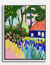
Tela giardino colorato del cottage
Translation missing: it.products.product.sale_price A partire da £44.95£74.95 -

Tela casale in Provenza di Van Gogh
Translation missing: it.products.product.sale_price A partire da £44.95£74.95 -

Poster cottage sereno di Cézanne
Translation missing: it.products.product.sale_price A partire da £11.95£19.95 -
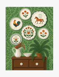
Poster stile folk con piatti decorativi
Translation missing: it.products.product.sale_price A partire da £11.95£19.95 -

Poster paesaggio di campagna in toni pastello
Translation missing: it.products.product.sale_price A partire da £11.95£19.95 -

Poster ghirlanda sempreverde e legna spaccata
Translation missing: it.products.product.sale_price A partire da £11.95£19.95 -

Tela calore rustico delle feste
Translation missing: it.products.product.sale_price A partire da £44.95£74.95 -
Poster paesaggio di campagna sereno
Translation missing: it.products.product.sale_price A partire da £11.95£19.95 -

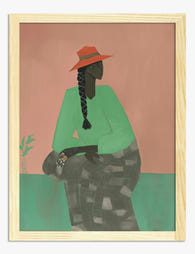
Tela ritratto di donna con cappello corallo, eleganza campestre
Translation missing: it.products.product.sale_price A partire da £44.95£74.95 -

Poster incanto della campagna inglese
Translation missing: it.products.product.sale_price A partire da £11.95£19.95 -

Tela casette da sogno di Van Gogh
Translation missing: it.products.product.sale_price A partire da £44.95£74.95 -

Poster paesaggio toscano con villa rustica
Translation missing: it.products.product.sale_price A partire da £11.95£19.95 -

Poster villaggio francese dai colori vivaci
Translation missing: it.products.product.sale_price A partire da £11.95£19.95 -

Tela fascino rustico delle feste
Translation missing: it.products.product.sale_price A partire da £44.95£74.95 -

Poster ghirlanda natalizia rustica
Translation missing: it.products.product.sale_price A partire da £11.95£19.95 -

Poster finestra natalizia con albero scintillante e pacchi nella neve
Translation missing: it.products.product.sale_price A partire da £11.95£19.95


Di più da The Frame

7 Ways to Style William Morris Tree Prints in Y...
Tree of Life. Woodpecker. The towering, tangled branches that made Morris famous. These prints have a vertical pull and a visual density that other Morris designs don't, which means hanging...

Why Art Prints Make the Most Meaningful Housewa...
Most housewarming gifts get consumed, regifted, or shoved in a cupboard within a month. Art does something different. It hangs on a wall in the new home for years, quietly...

Hosting at Christmas: Three Small Changes That ...
Most Christmas hosting advice asks you to do too much. You don't need a complete seasonal overhaul, you need your rooms to feel finished. The difference between a space that's...