Decorating with Botanical Prints: A Room-by-Room Styling Guide
From oversized lemon prints in the dining room to delicate ferns in the bathroom, here's how to style botanicals without the chaos.

Botanical prints have quietly become one of the most flexible categories in wall art, but mixing them well is harder than it looks. Pile up too many ferns and florals and you're in great-aunt territory; lean too hard on graphic fruit and the kitchen starts to feel like a 1970s tea towel. This guide takes you room by room, with the ratios, frame choices, and mixing rules we actually use.
Why botanical prints are having a serious moment
Botanicals are riding two trends at once. The first is biophilic design, the professional consensus that interiors with natural imagery, plants, and organic materials genuinely make people feel calmer. The second is the grandmillennial and cottagecore swing back toward pattern, prettiness, and personality after a long stretch of grey minimalism.
What makes botanicals work where other trends date is their range. A 19th century Redouté rose engraving and a graphic modern lemon print are both technically botanical, but they pull in completely different directions. That breadth means you can find botanical art for a Georgian terrace and a new-build flat without compromising either.
The category also splits neatly into subjects: florals, foliage, herbs, fungi, and fruit. Fruit prints in particular have moved from kitsch country kitchen territory into serious decorating, partly thanks to the grandmillennial aesthetic and partly because oversized, painterly fruit reads as confident rather than cute.
So yes, if you've been wondering whether botanical prints are still in style, the answer is that they're more in style now than they've been in twenty years. The trick is choosing the right subject for the right room.

Kitchen and dining room: where fruit and food botanicals shine
Kitchens and dining rooms can take bolder, warmer botanical subjects than anywhere else in the house. This is where fruit art earns its place. Lemons, figs, pomegranates, peaches, and pears all bring colour and confidence without needing the room to be styled around them.
For dining rooms specifically, we'd argue oversized is the move. A single 70x100cm fruit print above a sideboard or behind the head of the table does more work than three smaller pieces fighting for attention. Look for painterly, slightly imperfect renderings rather than tight graphic illustrations, which tend to feel decorative in a flat way.
Avoiding the kitsch trap
Fruit art tips into country-cutesy when three things stack up: thin gold frames, primary-colour palettes, and twee subject matter (think baskets, bowls, gingham). Strip out one of those and the whole thing reads as sophisticated.
Our preferred formula for fruit art prints in a dining room: a single oversized print, dark or natural wood frame, and a slightly muted palette (think ochre, terracotta, fig purple, olive green rather than bright yellow and red). A 60x80cm or 70x100cm framed fruit print above a credenza, paired with a ceramic lamp and a stack of books, looks like something a designer chose, not a gift shop.
Kitchens: smaller, in pairs
Wall space in kitchens is usually fragmented by cabinets, splashbacks, and appliances. Smaller prints in pairs or threes tend to suit better. A pair of 30x40cm herb or citrus prints flanking a window, or a row of three above a banquette, gives you the botanical feel without crowding.
Avoid hanging anything directly above a hob or sink where steam and splashing are constant. Even with UV-protective glazing and quality framing, repeated humidity exposure shortens the life of any print. The other side of the kitchen, dining nook, or hallway leading in is fine.
Living room: mixing fruit prints with florals and foliage
The living room is where most people get botanical mixing wrong. They buy a fruit print, a floral, and a leaf print because they all "go together," then end up with a wall that feels like a botanical sampler rather than a designed space.
The fix is to think in terms of one hero subject and one or two supporting subjects. If your hero is a large floral, your supports might be foliage and a single piece of fruit. If your hero is a citrus print, support with foliage and a more abstract floral. Three of each in equal weight almost always feels chaotic.
Colour temperature is the secret
The reason botanical mixes go wrong more often than they go right is colour temperature, not subject matter. Warm-toned fruit (lemons, oranges, peaches, pomegranates) clashes visually with cool-toned florals (blue hydrangeas, lilac, pale pink roses) unless you intentionally bridge them.
To bridge: introduce one piece that contains both temperatures. A fig print with warm fruit and cool green leaves, or a still life with mixed produce, will do this work for you. Or commit fully to one temperature and pick all your botanicals from that side.
For living rooms, we tend to recommend leaning into floral art prints as the dominant subject and using fruit as a single accent. Florals have more visual softness, which suits a room you want to relax in.

Bedroom and bathroom: softer botanical subjects that work
Bedrooms and bathrooms call for quieter botanicals. The brain reads bold fruit and dramatic florals as energising, which is the opposite of what you want above a bed.
For bedrooms, we'd point you toward foliage, single-stem florals, herb studies, and pressed-style botanicals. Subjects with lots of negative space (a single fern frond on cream, one tulip stem) read as restful where a tightly composed bouquet would feel busy. Pale, washed palettes work better than saturated ones here.
A pair of 50x70cm framed prints above a bed, matched in subject and frame, is one of the most reliable bedroom formulas we know. Or a single 70x100cm centred piece if your headboard is wide enough to support the visual weight.
Bathrooms: small, simple, humidity-aware
Bathrooms can take botanicals beautifully, especially herbs, ferns, and seaweed studies, which feel naturally at home with water and tile. Stick to smaller sizes (30x40cm or 40x50cm) and simple frames.
Canvas prints sometimes work better than framed paper in bathrooms because the poly-cotton handles ambient humidity well and there's no glazing to fog up. The trade-off is canvas reads slightly more casual, which most people don't mind in a bathroom anyway. As always, don't hang directly above the bath or shower; the wall opposite the basin is the prime spot.
Building a botanical gallery wall: size ratios and spacing
Gallery walls are where botanicals shine, but they're also where most people overcrowd, mismatch sizes, or space frames awkwardly. Here's the structure we recommend.
The anchor piece rule
Every successful gallery wall has one piece that's clearly the largest. We aim for the anchor to be roughly 1.5 to 2 times the size of the next largest piece. So if your anchor is 70x100cm, your supporting prints sit around 40x50cm or 50x70cm. If everything is similar in size, the eye has nowhere to land and the whole wall flattens.
Spacing
Frames should sit 5 to 8cm apart (around 2 to 3 inches). Closer than that and they read as one cluttered shape; further apart and they stop relating to each other. Keep the spacing consistent across the whole arrangement.
Visual weight distribution
Heavier pieces (darker backgrounds, denser subjects, larger frames) should sit lower and more central. Lighter, airier prints can climb up and toward the edges. If you put a dark, heavy fruit still life in the top right corner, the whole wall will feel like it's tipping that way.
Number of pieces
Odd numbers (3, 5, 7) almost always feel more natural than even numbers, with one exception: a perfectly symmetrical pair flanking a central feature like a fireplace or bed. For a freeform gallery wall, aim for five or seven pieces.
A pre-curated wall art set is genuinely the easiest way to skip this maths if you're starting from scratch. The proportions and palette are already resolved.
The 70/30 rule and how it applies to botanical art in a room
The 70/30 rule is a simple tool we lean on constantly. In any decorated space, around 70% of the visual story should be cohesive (one palette, one mood, one general direction), and 30% should provide contrast or interest.
Applied to botanical art: if your room palette is warm and earthy (terracotta walls, oak furniture, linen), 70% of your botanical prints should sit in that warm family. Fruit, autumnal florals, dried foliage. The remaining 30% can introduce something cooler or more graphic to stop the room feeling like one note.
The same rule applies to subject mixing. If you have five botanical prints in a room, three or four should share a subject family (say, all florals and foliage) and one or two can be the contrast (a fruit print, a fungi study, a more graphic piece). Equal splits feel indecisive.
This is also why a single bold fruit print works so well in an otherwise soft, leafy room. It's the 30% that earns its place by being different.

Choosing frames that unify different botanical subjects
Frame choice is the single biggest lever for making mixed botanicals look intentional rather than accidental. The principle is straightforward: when subjects vary, frames should match. When subjects are tightly coordinated, you can afford more frame variation.
Three frame strategies that work
All-matching frames. The most foolproof option. Every frame is the same wood, same finish, same width. This lets you mix wildly different botanical subjects (a graphic lemon, a vintage rose, a modern fern) and still have the wall read as one collection.
Tonally matching frames. All warm wood (oak, walnut), or all cool tones (black, white, pale ash), but slightly different widths or finishes. More relaxed than all-matching, still cohesive.
Mixed frames with one shared element. All black frames in different widths, or all natural wood with different mount sizes. Use only when your subjects already coordinate strongly.
For botanicals specifically, we'd point you toward solid wood frames in oak, walnut, or black. White frames can work for very soft, airy florals in modern interiors, but they tend to feel a bit bland with fruit and bolder subjects. Solid FSC-certified wood with a proper mount gives you the gallery look that thin metal or veneer frames never quite achieve.
A practical note: when frames arrive separately from prints, you almost always end up with bubbling, warping, or prints that don't sit flat in the mount. Frames and prints fitted together at source, in one box, ready to hang, save you from the most common framing disappointment in this category.
Mounts (the white border)
A generous mount (4 to 6cm of white space around the print before the frame) instantly elevates botanical art. It mimics the convention of museum and library displays, which is where most historical botanical illustrations originally lived. Skipping the mount and going edge-to-edge can work for very modern, graphic botanicals but tends to flatten more traditional subjects.
Our top botanical collections to browse
If you're starting from scratch, here's how we'd suggest navigating the categories.
For pure greenery, ferns, palms, and leaf studies, the broader botanical art prints collection is the natural starting point. Subjects here suit bedrooms, bathrooms, and any room where you want a softer, calmer mood.
For roses, peonies, tulips, wildflowers, and mixed bouquets, the floral art prints collection has the most range. Florals are the safest bet for living rooms and hallways and tend to coordinate easily with existing palettes.
For lemons, figs, pomegranates, and the kind of painterly produce that anchors a dining room, head to fruit art prints. This is the subcategory that most people overlook and that tends to make the biggest impact when used confidently.
And if you want a coordinated gallery wall without doing the curation yourself, the wall art sets collection groups pieces that already work together in subject, palette, and proportion.

Where to start
If you take one thing from this guide, take this: pick a hero subject for each room before you buy anything. Fruit for the dining room, soft foliage for the bedroom, florals for the living room. Then layer in supporting subjects at a 70/30 ratio, match your frames, and let one piece be clearly the largest.
That's the difference between a wall that feels collected and a wall that feels cluttered. The botanicals themselves will do most of the work once you've given them the right structure to live in.

Prodotti Fab presentati in questo blog
-

Poster botanico con piante verdi su sfondo giallo
Translation missing: it.products.product.sale_price A partire da £11.95£19.95 -

Poster veduta botanica inglese
Translation missing: it.products.product.sale_price A partire da £11.95£19.95 -
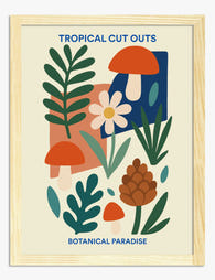
Poster collage botanico tropicale
Translation missing: it.products.product.sale_price A partire da £11.95£19.95 -

Poster vasi e piante boho
Translation missing: it.products.product.sale_price A partire da £11.95£19.95 -

Poster scala botanica eclettica
Translation missing: it.products.product.sale_price A partire da £11.95£19.95 -

Poster botanico con piante in vaso su mensola
Translation missing: it.products.product.sale_price A partire da £11.95£19.95 -

Tela vasi boho botanici
Translation missing: it.products.product.sale_price A partire da £44.95£74.95 -

Poster botanico con mirtilli
Translation missing: it.products.product.sale_price A partire da £11.95£19.95 -

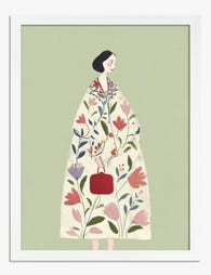
Tela donna chic in stile botanico
Translation missing: it.products.product.sale_price A partire da £44.95£74.95 -

Poster botanico boho
Translation missing: it.products.product.sale_price A partire da £11.95£19.95 -
Poster musa botanica
Translation missing: it.products.product.sale_price A partire da £11.95£19.95 -

Poster botanico astratto in toni pastello, verde e rosa
Translation missing: it.products.product.sale_price A partire da £11.95£19.95 -

Poster forme botaniche boho
Translation missing: it.products.product.sale_price A partire da £11.95£19.95 -

Poster interno botanico luminoso di Matisse
Translation missing: it.products.product.sale_price A partire da £11.95£19.95 -

Tela botanica stile urban jungle eclettica
Translation missing: it.products.product.sale_price A partire da £44.95£74.95 -

Poster botanico viola vintage
Translation missing: it.products.product.sale_price A partire da £11.95£19.95 -

Poster tavola botanica vintage
Translation missing: it.products.product.sale_price A partire da £11.95£19.95 -

Poster botanico vintage con foglie verdi
Translation missing: it.products.product.sale_price A partire da £11.95£19.95 -

Tela botanica di grande impatto
Translation missing: it.products.product.sale_price A partire da £44.95£74.95 -
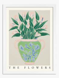
Poster fiori botanici in vaso
Translation missing: it.products.product.sale_price A partire da £11.95£19.95


Di più da The Frame

How to Style Matisse Prints in Every Room: A Pr...
Matisse wanted his art to function like "a good armchair" for the tired mind. That intention is the entire reason his prints work so well at home: they were designed...

How to Style Woman Art Prints So They Look Inte...
You've bought a print you love. Now the wall around it looks slightly empty, slightly off, and you're not sure what to add without the whole thing turning into a...

How to Build a Dog-Themed Gallery Wall That Loo...
Loving dog art is easy. Arranging six pieces of it on one wall without your house looking like a dog-themed gift shop is the hard part. This guide walks you...