
 Ordina oggi, consegna il
 How to Style Vintage City Prints Without Looking Generic
Specific rules, frame finishes and placement formulas to keep your cityscapes from looking like hotel lobby filler.


Vintage city prints are the easiest art category to get wrong. They're widely available, instantly recognisable, and almost designed to read as filler when hung without thought. This guide is the opposite of "follow your heart" advice: specific frames, specific dimensions, specific pairings.
Why most vintage city print arrangements fall flat
The problem is rarely the print itself. It's the defaults: generic landmark, oversized mat, cheap silver frame, hung too small and too high above a sofa nobody sits on. The result reads as airport lounge rather than considered.
Three habits do most of the damage. People buy the most famous view of the most famous city (Eiffel Tower, Manhattan skyline, Big Ben). They size down because a smaller print feels safer. And they default to whatever frame the print came in, which is almost always wrong for the period the artwork is meant to evoke.
If you want vintage cityscape prints to look intentional, you need to make three deliberate choices: which city, which frame, and which scale. Get those right and the rest is forgiving.

The one-city rule: why personal connection beats aesthetic matching
Pick one city that means something to you. Not the most photogenic. Not the one that matches your cushions. The one you have a reason to look at every day.
This is the single biggest difference between art that feels personal and art that feels purchased. A 1962 transit map of the city where you met your partner has more presence than a perfectly composed Parisian street scene you have no relationship with. Guests can tell the difference even when they can't articulate why.
The one-city rule also solves the landmark trap. If the city has personal meaning, you'll naturally gravitate toward less famous angles: a neighbourhood you lived in, the harbour you walked, the bridge you crossed every morning. Those views age better than postcard icons because they don't read as decoration. They read as memory.
If you genuinely love a city you've never been to, fine, but commit. Buy three or four prints of that one city across different eras and styles rather than one print each from five cities you find pretty. Depth beats breadth every time on a wall.
Choosing the right frame finish for vintage cityscapes
Frame finish is where most vintage city print displays quietly fail. The wrong frame can make a beautifully printed 1950s Chicago skyline look like motel art within seconds.
Natural wood (oak, ash, light walnut)
The safest choice for most vintage cityscapes, particularly black and white photography prints and mid-century travel posters. Natural wood reads warm without competing with the artwork. It works in modern, Scandi, and transitional rooms, and it ages alongside the print rather than fighting it.
Use natural wood when your print has warm tones (sepia, cream, ochre) or when the surrounding room is already warm. Avoid it in starkly cool, monochrome rooms where it can look orange.
Matte black
The most flattering choice for graphic, high-contrast vintage prints: 1920s travel posters, bold lithographs, anything with strong typography. Matte black sharpens the composition and makes colour pop without adding weight.
Avoid glossy black. It picks up reflections, looks plasticky in photos, and dates faster than matte. If you're hanging multiple prints, matte black is also the easiest finish to repeat across a wall without it looking heavy.
Brass and warm metallics
Brass works for one specific scenario: a single, hero vintage city print in a formal room with other warm metals already present (lamp bases, hardware, mirrors). On its own, against neutral walls, brass can tip a vintage print into theme-park territory.
If you're tempted by brass, try natural oak first. Nine times out of ten it gives you the same warmth without the risk.
Why frame quality matters more than you'd think
A vintage print is meant to feel substantial. The frame has to hold up its end. Solid FSC-certified wood with proper joinery looks and feels different from veneered MDF, particularly up close. The same goes for the glaze: UV-protective acrylic prevents fading in sunny rooms and won't shatter when you move house, which matters more than most people realise once they've actually moved a glass-fronted print across a city.
Whichever finish you choose, get the frame and print fitted together. Prints shipped separately and assembled at home are the single biggest reason vintage cityscapes look "off": warped paper, gaps at the edges, dust trapped under the glaze. Browse the full vintage art prints range if you want to see how the same print reads in different finishes before committing.
Where to hang a large vintage city print
Specific furniture pairings, with reasoning.
Above a sofa
The standard rule is to hang art at 145-150cm from the floor to the centre of the print. Above a sofa, that often puts it too high. Drop it slightly so the bottom of the frame sits 15-20cm above the back of the sofa. Closer feels grounded, further apart feels disconnected.
The print itself should be roughly two-thirds the width of the sofa. For a standard 220cm three-seater, that means a print around 140-150cm wide. A 100x150cm canvas (landscape orientation) hits this almost exactly and is one of the few times we'd actively recommend a canvas over framed paper, since the scale starts to make framed paper unwieldy.
Above a console table or sideboard
This is where vintage city prints look most at home. Console tables in entryways, hallways, and behind sofas are made for one decisive piece of art. Hang the print so the bottom edge is 15-25cm above the surface, with objects (lamp, vase, stack of books) on the table breaking the gap visually.
For a 120cm console, aim for a print 70-90cm wide. A 70x100cm framed print in portrait orientation is almost always the right answer here.
Above a bed
Vintage city prints work surprisingly well in bedrooms, particularly black and white photography. Same rule as the sofa: bottom of frame 15-20cm above the headboard, print width about two-thirds the width of the bed.
Avoid prints with strong vertical lines (skyscraper-heavy skylines) directly above the bed. They can feel imposing when you're lying down. Horizontal cityscapes, harbour views, and bridge prints sit better.
In a hallway
Long hallways are the most underused canvas in most homes. A single oversized vintage city print at the end of a corridor, lit from above, does more work than three smaller prints along the walls. If the hallway runs 4-5 metres, a 70x100cm print becomes a destination.

Mixing vintage urban art with other styles on a gallery wall
Gallery walls are where vintage city prints either thrive or collapse into chaos. The trick is restraint with a formula.
The 60/30/10 mix
Aim for 60% of pieces in your "anchor" style (in this case, vintage cityscapes), 30% in a complementary style (botanical illustrations, abstract line drawings, vintage typography, black and white portraits), and 10% wildcard (a piece of textile art, a small object, a personal photograph).
For a six-piece wall, that's roughly four city prints, two complementary pieces, and one wildcard. The eye reads it as curated rather than random.
Mixing eras
You can absolutely mix a 1920s travel poster with a 1970s photographic cityscape. The thing they need to share is treatment, not era. If both are framed in matte black with consistent mat widths, the era difference reads as intentional. If one is in brass and the other in raw oak, it reads as accidental.
A simple rule: pick one frame finish for the entire wall. Vary the size and orientation, not the framing. This is how galleries actually hang shows, and it's why their walls always look composed.
Frame all of it, or hang none of it framed
Mixing framed and unframed prints on the same wall almost always looks unfinished. Pick one approach. If you want the casual, gallery-studio look, go with stretched canvas across all pieces. If you want polished, frame everything. Pre-curated wall art sets are a useful starting point if you want the proportions worked out for you.
The mat question
Vintage city prints are one of the few categories where removing the mat can actually make the piece look more authentic. A wide mat reads as gallery formality, which can fight the casual, lived-in quality of a 1960s urban scene. A no-mat, edge-to-edge framed print reads more like the original lithograph or photograph it's referencing.
Our default: no mat for photographic vintage city prints, slim mat for travel posters and illustrations, wide mat only for highly detailed maps or technical drawings.
Sizing it right: why going bigger than you think almost always works
The single most common sizing mistake is buying a 30x40cm print for a wall that needs a 70x100cm. Vintage city prints in particular suffer when undersized because the detail (street signs, building texture, crowds) gets lost.
Quick sizing guide
- Above a 180cm sofa: 80-120cm wide print, or two 60x80cm prints hung side by side with 5cm gap
- Above a 120cm console: 60-80cm wide print
- Above a 150cm bed: 100cm wide print, or 70x100cm in portrait
- Solo wall (no furniture beneath): at least 70x100cm; ideally 100x150cm
- Gallery wall total area: the full arrangement should fill 60-75% of the available wall space, not float in the middle of it
For solo walls and statement pieces, canvas in XL (up to 100x150cm or 150x100cm) is the most cost-effective way to fill scale without the print feeling too precious. For more formal rooms (dining rooms, sitting rooms), framed paper at 70x100cm reads more polished.
If you're truly torn between two sizes, go up. We have not once heard a customer say their print was too big. We hear the opposite weekly.

Three room setups that actually work
Specific dimensions, specific placements.
Setup 1: Modern living room, single statement print
- Wall: 3.5m wide behind a 220cm linen sofa
- Print: 100x150cm framed black and white vintage cityscape (landscape), matte black frame, no mat
- Placement: centre of print at 150cm from floor; bottom of frame 18cm above sofa back
- Why it works: the scale matches the sofa, the matte black frame anchors a soft, neutral room, and the lack of mat keeps the focus on the photograph
Setup 2: Entryway, layered console arrangement
- Wall: 2.4m wide above a 120cm console table
- Print: 70x100cm framed vintage travel poster (portrait), natural oak frame, slim white mat
- Styling beneath: brass table lamp, ceramic bowl, stack of three hardback books
- Placement: bottom of frame 22cm above console
- Why it works: the portrait orientation draws the eye up in a confined space, and oak with brass table objects gives warmth without theme
Setup 3: Bedroom gallery wall
- Wall: 2m wide above a 150cm bed
- Arrangement: five pieces in a loose grid
- - Two 50x70cm vintage city prints (different cities, but matched in tone, both sepia or both black and white)
- - One 40x50cm botanical print
- - One 40x40cm abstract
- - One 30x40cm vintage typography piece
- Frames: all matte black, slim mats
- Placement: bottom row sits 18cm above headboard; whole arrangement spans roughly 160cm wide
- Why it works: unified framing across mixed styles reads as gallery, not jumble; horizontal city prints feel restful above a bed
If you want to see the broader cityscape print range before committing, narrow by tone (black and white vs. colour) before you narrow by city. Tone determines whether the print reads as restful or energetic, and that decision matters more than which city you pick.

A final note on getting it right
Vintage city prints reward specificity. A meaningful city, the right frame finish, the right scale, hung at the right height above the right piece of furniture. None of these decisions is hard on its own, but together they're the difference between a wall that feels like yours and a wall that feels like a showroom.
If you're stuck between options, default to: a city you've actually been to, a natural oak or matte black frame, no mat, and one size larger than you think. That formula will not fail you.

Prodotti Fab presentati in questo blog
-

Poster paesaggio urbano con skyline
Translation missing: it.products.product.sale_price A partire da £11.95£19.95 -

Poster strade cittadine vivaci
Translation missing: it.products.product.sale_price A partire da £13.99£19.99 -

Tela paesaggio urbano colorato
Translation missing: it.products.product.sale_price A partire da £55.99£79.99 -

Poster strada cittadina ad acquerello con taxi gialli e alberi
Translation missing: it.products.product.sale_price A partire da £11.95£19.95 -

Poster Painted Ladies e skyline di San Francisco
Translation missing: it.products.product.sale_price A partire da £11.95£19.95 -

Poster fascino delle vie di Parigi
Translation missing: it.products.product.sale_price A partire da £11.95£19.95 -

Poster skyline urbano vibrante
Translation missing: it.products.product.sale_price A partire da £11.95£19.95 -
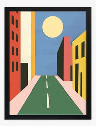
Poster paesaggio urbano al sole
Translation missing: it.products.product.sale_price A partire da £11.95£19.95 -
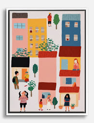
Tela vita di città a colori
Translation missing: it.products.product.sale_price A partire da £44.95£74.95 -

Poster primavera in città
Translation missing: it.products.product.sale_price A partire da £11.95£19.95 -

Tela skyline iconico in bianco e nero
Translation missing: it.products.product.sale_price A partire da £44.95£74.95 -
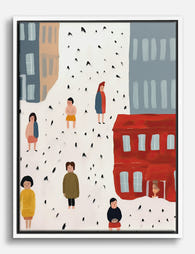
Tela passeggiate in città e piccoli momenti
Translation missing: it.products.product.sale_price A partire da £44.95£74.95 -

Tela veduta elegante di Parigi
Translation missing: it.products.product.sale_price A partire da £44.95£74.95 -
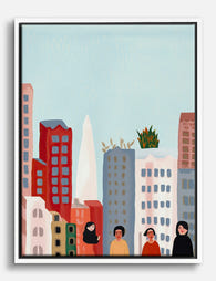
Tela ritrovo urbano vivace
Translation missing: it.products.product.sale_price A partire da £44.95£74.95 -

Poster paesaggio urbano vibrante
Translation missing: it.products.product.sale_price A partire da £13.99£19.99 -

Tela passeggiate in città, San Francisco
Translation missing: it.products.product.sale_price A partire da £44.95£74.95 -

Tela primavera in città
Translation missing: it.products.product.sale_price A partire da £44.95£74.95 -

Poster passeggiata in città dai colori vivaci
Translation missing: it.products.product.sale_price A partire da £13.99£19.99 -

Tela paesaggio urbano vibrante
Translation missing: it.products.product.sale_price A partire da £55.99£79.99 -

Tela passeggiata in città in toni pastello
Translation missing: it.products.product.sale_price A partire da £44.95£74.95


Di più da The Frame

The Best Botanical Prints for Your Conservatory...
Conservatories are sun traps, and most art prints are not built for them. The same light that makes the space so lovely to sit in will cook a poorly made...

Arts and Crafts Cat Art: Victorian Roots, Moder...
Cat art is everywhere right now, and most of it is forgettable. The pieces that actually hold up on a wall borrow from a much older tradition, one that runs...

The Greenhouse Aesthetic: Why Glasshouse Art Is...
There's a particular daydream doing the rounds on mood boards right now: cast iron arches, fogged glass, palms pressing against the panes, a wrought iron table laid for tea. Almost...