Building an India Travel Gallery Wall: Layouts, Sizes, and What to Mix
From Jaipur pinks to Varanasi ghats, how to curate a travel wall that tells a story instead of shouting.

India might be the most photogenic country on earth, which is exactly why most travel gallery walls inspired by it end up feeling like visual chaos. Pink palaces fight with saffron robes, Taj Mahal sunsets clash with Kerala backwaters, and the wall stops being a memory and becomes a mood board. This guide fixes that, with specific print counts, layouts, and spacing measurements you can actually use.
Why India is the perfect subject for a gallery wall
India gives you something most travel themes can't: genuine visual range. You have monumental architecture (the Taj, Hawa Mahal, Mysore Palace), intimate human moments (street vendors, sadhus, women in saris), and pure abstract texture (spice markets, temple carvings, peeling Jodhpur walls). That trifecta is exactly what a strong gallery wall needs.
Most travel themes lean too hard one way. Iceland is all landscape. Paris is all architecture. India lets you mix scale, intimacy, and pattern in a way that keeps your eye moving across the wall instead of scanning past it.
The catch is that India's colour saturation is intense. Marigold, fuchsia, cobalt, and turmeric in a single frame is normal. Put six of those frames next to each other and you've built a wall that vibrates instead of resting. The whole point of curation is taming that energy without losing it.

How many prints you need (hint: fewer than you think)
Most people start planning a gallery wall with twenty photos shortlisted and end up buying twelve. They almost always regret it. The wall feels noisy, the eye has nowhere to rest, and individual prints get lost.
Here are the numbers that actually work:
- Above a sofa (2 to 2.5m wide): 5 to 7 prints
- Hallway (1.5 to 3m of usable wall): 5 prints, sometimes 7
- Staircase wall: 5 to 9 prints stepped up the rise
- Dining room feature wall: 6 to 9 prints
- Small alcove or between windows: 3 prints
The "fewer than you think" rule applies double for India because each print already carries a lot of visual information. A single shot of a Rajasthani doorway has more colour and pattern than three Scandinavian landscapes combined. Treat each print as worth more than it would be in a quieter theme.
If you have a hundred travel photos you love, your job is brutal subtraction. Pick your absolute favourite hero image first. Then build five or six prints around it that complement rather than compete.
Mixing subjects: architecture, people, texture, and colour
The formula we keep coming back to for india travel prints is roughly this:
- 40% architecture (wide shots, façades, monuments)
- 30% people (portraits, street scenes, hands at work)
- 20% texture and detail (spices, fabric, carvings, doorways)
- 10% landscape or wildcard (Kerala backwaters, Himalayan foothills, a tiger)
For a 7-print wall that looks like: 3 architecture, 2 people, 1 texture, 1 landscape. For a 5-print wall: 2 architecture, 2 people, 1 texture. Adjust to taste, but keep architecture as the spine.
Architectural prints anchor the wall because they give the eye something stable to return to. Symmetrical buildings, strong horizontal or vertical lines, and recognisable silhouettes all do this work. Browse architecture art prints and you'll see why the genre carries gallery walls.
People prints add scale and emotion. They tell the viewer this was lived, not just visited. Aim for at least one close portrait (face filling the frame) and one wider street scene where figures are part of the environment.
Texture prints are the seasoning. One macro shot of marigold garlands, painted blue plasterwork, or a stack of spice sacks does more for a wall than three more building shots ever could. They also tend to be the cheapest to source and the most forgiving on smaller frame sizes.
Apply the 60-30-10 colour rule
Borrowed from interior design, this works beautifully for India walls. 60% of your visual area should be a dominant tone (often warm neutrals: sandstone, terracotta, cream temple walls). 30% a secondary tone (deep blues from Jodhpur, greens from Kerala, or rich browns). 10% pure accent (the fuchsia sari, the marigold pile, the red turban).
The mistake is inverting this and making 60% of the wall full-saturation accent colour. The result looks like a souvenir shop. Let the bright moments be the punctuation, not the paragraph.
Choosing a unifying frame finish and why consistency matters
This is the single biggest decision you'll make, and it matters more than which prints you choose. Mixed prints in matching frames will always look more cohesive than perfectly curated prints in mismatched frames.
Three frame finishes work for India themes, and we'd avoid the rest:
- Warm oak or natural wood: Best for warm-toned prints (Rajasthan, Varanasi, golden hour shots). Reads earthy and editorial.
- Black: Best if your prints lean cooler (Kerala, Ladakh, monsoon scenes) or if your room is already minimalist. Sharp, gallery-like.
- Brass or warm metallic: Use sparingly. Beautiful for a 3-print accent wall, overwhelming for a 9-print cluster.
Pick one. Use it across every frame. The temptation to mix oak and black "for visual interest" almost always backfires on travel walls because the prints themselves already provide the variety.
Our framed art prints are built on solid FSC-certified wood with UV-protective acrylic glaze, which matters more than people realise: India prints with strong reds and yellows fade fastest under sunlight, and acrylic glaze with UV protection prevents that. Glass doesn't.

Two proven layouts: the tight grid vs. the salon cluster
You have two real options. Everything else is a variation on these.
The tight grid
Equal-sized prints arranged in a perfect rectangle: 2x2, 3x2, 3x3, or 4x2. Spacing of 5cm (about 2 inches) between frames. Clean, architectural, and very forgiving if your prints vary in style.
Best for: modern interiors, hallways, above sideboards or beds, anyone who finds asymmetry stressful.
A 3x3 grid of 30x40cm prints (portrait orientation) gives you a finished wall area of roughly 100x130cm. A 3x2 grid of 40x50cm prints gives you about 130x110cm. These are the two most useful grid sizes for most rooms.
Grids work especially well when your prints are stylistically varied. The uniformity of the layout calms down what's inside the frames.
The salon cluster
Mixed sizes arranged organically around a central anchor print. Looks curated, lived-in, and considered. Harder to get right, but more rewarding.
Best for: living rooms, dining rooms, period properties, walls where you want personality over precision.
The key to a good salon cluster is one large anchor print (usually 50x70cm or 70x100cm) with smaller prints orbiting it. Keep spacing tight (4 to 6cm) and treat the outer edge as an invisible rectangle: the cluster should fit inside a clean shape even if the individual frames don't.
A common mistake is starting in the middle and working outwards. Don't. Start by deciding the rectangle the whole arrangement will fit inside (say 180x110cm above a sofa), place the anchor first, then fill in.
Size combinations that work for hallways, staircases, and dining rooms
Hallway (5 prints, single row)
Five 30x40cm prints in a horizontal line at eye level, 5cm apart. Total length: about 175cm. Use a mix of 3 architecture, 1 portrait, 1 texture detail. Keep the centre print as your strongest image.
Staircase (5 to 7 prints, stepped)
Follow the angle of the stairs. Bottom edge of each frame should sit roughly 145cm above the stair tread directly below it. Use a single size (30x40cm) for simplicity, or alternate between 30x40cm and 40x50cm for rhythm.
Above a sofa (7 prints, salon style)
One 70x100cm anchor (architecture, ideally a hero shot like the Taj or a wide Jaipur scene), flanked by four 30x40cm prints (two on each side, stacked) and two 40x50cm prints filling the gaps. Total wall area: roughly 220x120cm.
Dining room (3x3 grid)
Nine 30x30cm square prints at 5cm spacing. Square crops work brilliantly for India because they force you to focus on a single subject per frame. Total area: about 100x100cm.
Small alcove (3 prints, vertical)
Three 30x40cm prints stacked vertically with 5cm spacing. Pick one architecture, one portrait, one texture. Looks intentional, takes ten minutes to hang.
For pre-curated combinations, our wall art sets take the guesswork out of size pairing.
Step-by-step hanging guide with spacing measurements
Tools you need: tape measure, spirit level, pencil, masking tape or kraft paper, hammer, picture hooks.
1. Find your centre line. For most walls, the horizontal centre of your gallery should sit at 145 to 150cm from the floor. This is standard gallery hanging height. Above a sofa, drop it so the bottom of the lowest frame sits 15 to 20cm above the sofa back.
2. Mock up on the floor first. Lay all your frames out on the floor in front of the wall. Move them around until the arrangement feels right. Photograph it from above so you don't lose the layout.
3. Cut paper templates. Trace each frame onto kraft paper or newspaper, cut to size, and tape to the wall. Mark where the hanging hook will be on each template.
4. Maintain consistent spacing. 5cm between frames for grids. 4 to 6cm for salon clusters (you can vary slightly, but stay in the range). Anything more than 8cm and the prints stop reading as a group.
5. Check alignment with a level before hammering. Top edges aligned for a row. Centre lines aligned for a vertical stack. For salon clusters, align the outer edges to your invisible rectangle.
6. Hang from the centre outwards. Start with your anchor print or the centre frame in a grid. Work outwards in pairs to keep symmetry honest.
Framed prints from us arrive with fixtures already attached, properly fitted, and shipped in the same box as the print itself. The frame-shipped-separately problem (warping, mis-fitting, prints arriving damaged because they weren't fitted at the point of framing) is the single biggest failure mode in this category, and it's worth avoiding.

Common mistakes to avoid
All Taj Mahal syndrome. One Taj print is iconic. Three is a postcard rack. Limit yourself to one monument per wall.
Clashing regional palettes. Rajasthan's pinks and oranges don't always sit comfortably next to Kerala's deep greens and blues. If you're mixing regions, use neutral architecture or black-and-white portraits as visual buffers.
Too much pattern. Three prints of intricate temple carvings in a row will exhaust the eye. Pattern needs space around it. Pair every busy print with at least one calmer one.
Mismatched print quality. This one's brutal. India's saturated colours and fine architectural detail expose cheap printing immediately. Reds turn muddy, blacks crush, fine carving detail disappears. Museum-grade giclée on thick matte paper handles the colour range without the glare you get from glossy stock.
Hanging too high. The centre of your gallery should be at 145 to 150cm, not at the height of your tallest family member. Most home gallery walls are hung 10 to 20cm too high.
Expanding from a single statement piece
Many people start with one large India print, often a 70x100cm Taj Mahal or Jaipur palace, and want to build out from there. The trick is to treat the existing print as your anchor and add 4 to 6 smaller prints (30x40cm) around it rather than trying to match its scale.
Keep the frame finish identical to your existing piece. If your statement piece is in oak, every new frame is oak. No exceptions. This single rule does more than anything else to make a piecemeal wall look like it was always planned.
Our recommended India gallery wall starter sets
If you want to skip the curation entirely, here are three combinations we'd build:
The Rajasthan 5: Hawa Mahal façade (40x50cm), Jodhpur blue alley (30x40cm), woman in red sari portrait (30x40cm), spice market detail (30x40cm), camel at dusk silhouette (30x40cm). Frame in warm oak.
The North-South 7: Taj Mahal at sunrise as anchor (50x70cm), Varanasi ghat scene (40x50cm), Kerala backwaters (40x50cm), tea picker portrait (30x40cm), Madurai temple carving (30x40cm), marigold garland macro (30x40cm), Mysore palace detail (30x40cm). Frame in black.
The minimalist 3: Single architectural hero (70x100cm), one portrait (40x50cm), one texture detail (40x50cm). Frame in oak or black depending on your room. Fastest route to a finished wall that doesn't look thin.
For wider context across destinations, our travel art prints collection sits alongside the India range if you're building a multi-country wall later.
Start with subtraction, not addition. Pick your favourite seven prints, then take two away. The wall you end up with will say more than the one you almost made.


Prodotti Fab presentati in questo blog
-

Tela portale di Jaipur
Translation missing: it.products.product.sale_price A partire da £44.95£74.95 -

Poster porta indiana incantata con gatto nero
Translation missing: it.products.product.sale_price A partire da £11.95£19.95 -

Tela giungla lussureggiante con foglie giganti
Translation missing: it.products.product.sale_price A partire da £44.95£74.95 -

Tela mercato indiano del mango
Translation missing: it.products.product.sale_price A partire da £44.95£74.95 -

Poster incontro nella giungla
Translation missing: it.products.product.sale_price A partire da £11.95£19.95 -

Poster mango indiano massimalista
Translation missing: it.products.product.sale_price A partire da £11.95£19.95 -

Tela il viaggio ti arricchisce
Translation missing: it.products.product.sale_price A partire da £44.95£74.95 -
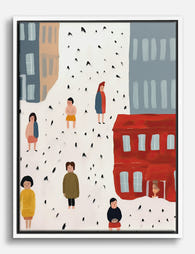
Tela passeggiate in città e piccoli momenti
Translation missing: it.products.product.sale_price A partire da £44.95£74.95 -

Tela astratta neutra dalle forme organiche
Translation missing: it.products.product.sale_price A partire da £44.95£74.95 -

Poster viaggio: arricchisci il tuo mondo
Translation missing: it.products.product.sale_price A partire da £11.95£19.95 -

Poster viaggio tropicale in Thailandia
Translation missing: it.products.product.sale_price A partire da £11.95£19.95 -
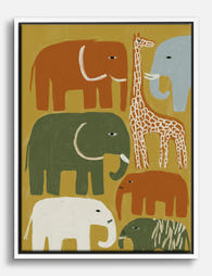
Tela safari giocoso con elefanti e giraffa
Translation missing: it.products.product.sale_price A partire da £44.95£74.95 -

Poster equilibrio geometrico indaco
Translation missing: it.products.product.sale_price A partire da £11.95£19.95 -
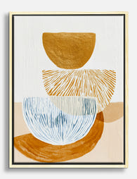
Tela astratta equilibrio moderno ocra e blu
Translation missing: it.products.product.sale_price A partire da £44.95£74.95 -

Tela vista di Parc Güell, Barcellona
Translation missing: it.products.product.sale_price A partire da £44.95£74.95


Di più da The Frame

How to Build a Gallery Wall Around Minimal Line...
Most gallery wall guides treat every print the same. They shouldn't. Building a wall around minimal line art is genuinely easier than building one around bold abstracts or photography, and...

How to Decorate a Home Library That Feels Curat...
Most home libraries fail in the same way. The shelves are gorgeous, the spines are arranged with care, and yet the room feels strangely lifeless, like a set rather than...

How to Build a Travel Gallery Wall That Looks I...
Most travel gallery walls fail for the same reason: they're built one print at a time, with no plan. The result is a mismatched jumble of holiday memories that looks...