Photography or Painting? How to Pick the Right Landscape Print Style for Your Home
A decision framework for choosing between photographic and painted landscapes, based on your room, not your mood.

Most advice on this question stops at "it's personal preference." That's a cop-out. The choice between a photographic landscape and a painted one is driven by architecture, colour temperature, and how formal your space feels, and once you understand the rules, the answer becomes obvious in about a minute.
The real difference between a photography print and a painted landscape on your wall
A landscape photograph and a landscape painting do fundamentally different things to a room, even when they show the same mountain.
Photography reads as a window. Your brain processes it as a real place captured at a real moment, which means it anchors a room in reality. The colour is accurate, the perspective is true, and the detail rewards close inspection. Photography brings the outside in, literally.
Painting reads as interpretation. Even a hyper-realistic oil landscape has brushwork, texture, and colour decisions that signal "this is one human's take on a place." That interpretive quality makes paintings feel warmer, more personal, and more decorative. They sit in a room as objects, not portals.
This single distinction (window versus object) explains nearly every decision that follows. Modern, pared-back rooms tend to want windows. Layered, characterful rooms tend to want objects.

When photography wins: modern, minimal, and Scandi interiors
If your space leans modern, photography almost always wins. Here's the visual logic.
Sharp architectural lines (flush skirting, slim door frames, slab cabinetry) demand sharp imagery to match. The crispness of a high-resolution photograph mirrors that geometric discipline. A painted landscape with visible brushwork can feel fussy against clean architecture, like wearing a velvet jacket to the gym.
Neutral palettes also need colour accuracy. Scandi and modern interiors typically use a tight range of whites, greys, warm woods, and muted greens. Photography's natural colour fidelity slots into these schemes without introducing competing pigments. A painter's interpretation of a Norwegian fjord might add ochres and violets that throw your carefully tuned palette off balance.
Minimalism specifically benefits from realism as an anchor. When a room contains very few objects, each one carries narrative weight. A photograph of a real place (the Lake District, the Dolomites, a Welsh coastline) gives the eye somewhere genuine to land. Abstract or painted landscapes can feel decorative in a way that fights minimalism's "essentials only" logic.
Best applications:
- Open-plan kitchen-diners with white or pale grey walls
- Home offices that need calm without distraction
- Bathrooms and en-suites where moisture-resistant canvas prints work particularly well
- Bedrooms styled in linen, oak, and warm white
Pair photography with thin black or natural oak frames. Heavy or ornate framing fights the medium's quiet precision.
When painting wins: period homes, warm palettes, and eclectic spaces
Painted landscapes earn their keep in rooms with character.
Period homes (Victorian terraces, Georgian townhouses, country cottages) have ornament built into the architecture: cornicing, picture rails, deep skirting, fireplace surrounds. Photography can read as oddly clinical against all that craftsmanship. Painted work, with its visible texture and human warmth, speaks the same language as the moulding around it.
Warm and saturated palettes also lean painted. Rooms styled in terracotta, mustard, sage green, deep burgundy, or rich navy tend to absorb photographic prints awkwardly because photography's accurate colour can clash rather than complement. Painted landscapes have already been "edited" by the artist, with palettes that sit more comfortably alongside bold interior choices.
Eclectic and maximalist spaces (vintage rugs, mismatched furniture, layered textiles, lots of books) reward visual texture. Brushwork adds another layer to the layering. A photograph in this context can feel like a flat sticker on top of a richly built room.
Best applications:
- Lounges with fireplaces, especially with chimney breasts begging for a single statement piece
- Dining rooms where you want atmosphere over precision
- Hallways in older homes with picture rails and dado lines
- Reading nooks and snugs styled for warmth
Painted landscapes also handle ornate or chunky frames beautifully. Where photography needs restraint, a painting can take a deeper moulding, a darker stain, or a soft gilt detail without looking costume.
For a wider sweep of options, the painting art prints collection covers everything from atmospheric oils to looser watercolour work.
How print quality changes the equation (why cheap photography prints look flat)
Here's something most guides won't tell you: at the budget end of the market, a cheap painting print almost always looks better than a cheap photography print. The reason is psychological.
When you look at a photograph, your brain has expectations. You expect deep blacks, accurate skin tones in foliage shadows, sharp foreground detail, and tonal range across the sky. Cheap printing flattens all of this. Skies band, shadows turn muddy, and the whole image looks like a screenshot rather than a window. Photography is unforgiving because reality is unforgiving.
A painting, by contrast, is already an abstraction. Your brain doesn't know exactly how the artist intended that ridge to look, so a slight colour shift or loss of detail reads as part of the artistic style. Painted prints hide their flaws because flaws look like brushwork.
This is why print quality matters more for photography than painting. If you're buying photographic landscapes, you need:
- Giclée printing rather than basic inkjet
- Heavy matte paper that holds detail without glare
- UV protection if the print sits in any natural light (otherwise blacks fade to grey within a couple of years)
- Properly fitted framing with no warping or air bubbles between print and mount
Our art prints are printed using museum-grade giclée onto thick matte paper, with UV-protective acrylic glaze instead of glass. The acrylic prevents fading even in direct sunlight, and because frame and print ship together in a single box already fitted, you avoid the most common failure in this category: prints arriving warped or framed badly after the fact.
If your budget is genuinely tight, lean painted. You'll get more visual impact per pound.

Mixing both in a gallery wall: rules for making it work
Mixing photography and painting in a single gallery wall is harder than it looks, but when it works, it produces the most interesting walls in any home. Here are the rules.
The 60/40 ratio
Pick one medium as the dominant. If you've got six prints, go four photographs and two paintings, or four paintings and two photographs. Equal splits create visual confusion because the eye doesn't know which medium is the "voice" and which is the accent. The 60/40 rule gives you a lead and a supporting cast.
Match your framing religiously
This is the single most important rule. If your media are mixed, your frames must be consistent. Same colour, same profile, same width. The frame becomes the unifying visual element that lets the contents vary.
Black wood frames work brilliantly for mixed walls because they read as neutral against both photography and painting. Natural oak is the second-best default. Avoid mixing black and oak on a single wall unless you're confident; it usually reads as accidental.
Bridge with colour
Choose photographs and paintings that share at least one dominant colour. A misty grey-green forest photograph sits beautifully alongside a sage and ochre painted hillside because the green threads them together. A vibrant tropical photograph next to a moody Scottish oil painting will fight, no matter how well framed.
Pull a colour out of each piece and check they're cousins, not strangers.
Vary scale, not orientation
Mixed-medium gallery walls work best when sizes vary but orientations align. Pick mostly landscape orientation pieces with one or two portrait pieces as anchors, or vice versa. Random mixes of orientation alongside mixed media is one chaos variable too many.
Black and white as a bridge
If you're nervous about mixing, black and white photography is your friend. It reads more like artistic interpretation than colour photography does, which means it sits more comfortably alongside painted work. A black and white coastal photograph next to a painted seascape feels related; a colour version of the same photograph might not.
Pre-curated wall art sets take a lot of this guesswork out if you'd rather not build the gallery from scratch.
Our favourite photography landscapes and our favourite painted landscapes
Some categories that work particularly well in each medium, based on what we see consistently land in homes.
Photography that earns its place
Misty mountain ranges. The tonal gradients in fog and atmospheric haze are where photography genuinely outperforms painting. The detail in real mist is impossible to fake convincingly with a brush.
Coastal long exposures. That silky water effect, where waves blur into mist over rock, is photographic by definition. It looks unreal in the best way and works beautifully in bathrooms and bedrooms.
Aerial and drone landscapes. Patterns in farmland, river deltas, and salt flats from above feel almost abstract while remaining factually real. Brilliant for modern interiors with neutral palettes.
Recognisable destinations. A photograph of a place you've actually been carries different emotional weight than a generic painted scene. The Lake District at dawn, a specific Cornish cove, the Highlands in autumn. These work as conversation pieces in hallways and home offices.
Paintings that earn their place
Atmospheric oils. Stormy skies, low light over fields, the kind of work that owes a debt to Constable and Turner. These belong in lounges and dining rooms with warm lighting.
Loose watercolour landscapes. The softness of watercolour reads beautifully in bedrooms and reading nooks, where you want calm without clinical edges.
Stylised mid-century work. Bold flat colours, simplified shapes, slightly graphic. These bridge surprisingly well into modern interiors when photography feels too literal.
Folk and naive landscapes. Personality-driven work that treats accuracy as optional. Best in eclectic spaces where the room itself has character to spare.

How to decide in 60 seconds: a quick-fire checklist
Run through these. Tally your answers.
1. Is your home built post-2000 or extensively modernised inside?
Yes = photography. No = painting.
2. Does your room have visible architectural ornament (cornicing, picture rails, original fireplace)?
Yes = painting. No = photography.
3. Is your colour palette neutral (whites, greys, oak, black, soft greens)?
Yes = photography. Saturated or warm = painting.
4. Are your furnishings minimal and matched, or layered and eclectic?
Minimal = photography. Layered = painting.
5. Does the room get a lot of natural light?
Yes, with high quality print = either works. Low light = painting tends to glow more under warm artificial light.
6. Is the space formal (lounge, dining) or functional (office, kitchen, bathroom)?
Formal = painting. Functional = photography.
7. What's your budget?
Tight = painting forgives cheaper printing. Generous = photography rewards investment.
8. Are you choosing for a single statement wall or a gallery?
Statement = whichever wins on questions 1-6. Gallery = mix using the 60/40 rule.
If you scored five or more in either column, you have your answer. If it's genuinely split, default to whichever medium your existing furnishings lean towards. A room with a velvet sofa and a vintage rug wants painting. A room with a leather armchair and an oak floor wants photography.

A final note on scale and orientation
Two quick clarifications worth making.
On scale: photography commands attention through realism, so a single large-format photograph (something around 70x100cm or larger on canvas up to 100x150cm) functions as a window and can stand alone. Painted work commands attention through texture and brushwork, which the eye reads at viewing distance, so paintings often want a bit more breathing room around them or pair well in twos.
On orientation: landscape orientation generally makes a room feel wider and calmer, which is why it dominates above sofas and beds. Portrait orientation draws the eye up and works better in narrow walls, between windows, or in stairwells. The medium doesn't change this rule; the wall does.
Pick the medium that matches your architecture and palette, frame it consistently, and don't compromise on print quality if you're going photographic. Everything else is detail.

Prodotti Fab presentati in questo blog
-

Poster paesaggio al chiaro di luna
Translation missing: it.products.product.sale_price A partire da £11.95£19.95 -

Tela colline baciate dal sole
Translation missing: it.products.product.sale_price A partire da £44.95£74.95 -

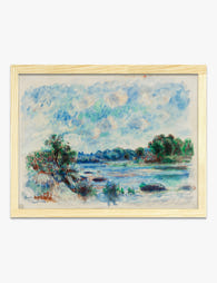
Poster paesaggio tra le tempeste di Renoir
Translation missing: it.products.product.sale_price A partire da £13.99£19.99 -
Poster paesaggio a Pont-Aven di Renoir
Translation missing: it.products.product.sale_price A partire da £13.99£19.99 -

Poster paesaggio a Vétheuil di Renoir
Translation missing: it.products.product.sale_price A partire da £13.99£19.99 -

Poster Painted Ladies e skyline di San Francisco
Translation missing: it.products.product.sale_price A partire da £11.95£19.95 -

Tela paesaggio moderno di colline colorate
Translation missing: it.products.product.sale_price A partire da £55.99£79.99 -

Poster paesaggio di campagna rigogliosa ispirato a Renoir
Translation missing: it.products.product.sale_price A partire da £13.99£19.99 -

Poster paesaggio di valle assolata
Translation missing: it.products.product.sale_price A partire da £11.95£19.95 -

Poster ninfee e riflessi sull’acqua
Translation missing: it.products.product.sale_price A partire da £13.99£19.99 -

Tela paesaggio provenzale impressionista ispirato a Renoir
Translation missing: it.products.product.sale_price A partire da £55.99£79.99 -

Tela paesaggio lussureggiante di Gustav Klimt
Translation missing: it.products.product.sale_price A partire da £44.95£74.95


Di più da The Frame

Why William Morris Prints Look Brilliant in Mod...
William Morris has been quietly miscategorised for decades. His patterns get filed under "country cottage" or "Arts and Crafts revival" and rarely escape, which is a shame because his tree...

Why Arts and Crafts Nature Prints Are the Antid...
The minimalism hangover: why bare walls stopped feeling calming For about a decade, the aspirational interior was a white box with one boucle chair in it. That look has officially...

Botanical Petal Art: Why Close-Up Prints Feel M...
Full florals have had a long run, and they're not going anywhere. But if you've noticed that the botanical art appearing in design magazines, boutique hotel lobbies, and the better-styled...