How to Build a Market-Themed Gallery Wall That Feels Well-Travelled
Curate a wall that reads like a passport stamp collection, without the jet lag or the souvenir clutter.

A gallery wall of market scenes does something a single print never can: it tells a story across cultures. You're not decorating with one image, you're curating a small museum of human life. This guide walks you through the curation, the maths, and the actual nail-in-wall part.
Why market scenes make the best gallery wall subject
Most gallery walls fail because the content is too samey or too random. Five abstract prints in similar palettes feel like a showroom. Five unrelated personal photos feel like a corkboard. Markets sit perfectly between these extremes: each scene is its own world, but the subject (people, produce, stalls, exchange) ties everything together at a deeper level.
Markets also do something abstract art can't: they invite people in. A guest will linger over a flower stall in Nice or a spice pyramid in Marrakech in a way they won't linger over a beige geometric shape. There's human interest in every frame, which means the wall earns its place in a room you actually use.
There's also a practical reason markets work so well. The colour palettes are pre-harmonised by reality itself. Tomatoes, lavender, saffron, indigo textiles, jade vegetables, terracotta pots, these colours appear together in the world because of how light, food, and culture have always interacted. You're borrowing nature's colour theory, which makes the curation job much easier.

Picking your mix: French markets, bazaars, flower stalls, and street vendors
The trick to a well-travelled wall is to choose three to four distinct market "moods" and let them play off each other. Here's the mix we keep coming back to.
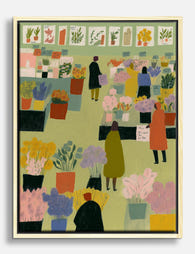
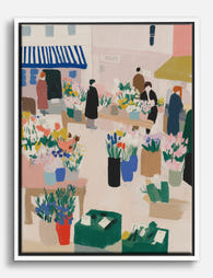
French markets bring the romance: striped awnings, baskets of stone fruit, baguettes, pale stone buildings. Think Provence or a Parisian Sunday. These prints tend to be soft in palette: butter yellow, sage, dusty blue, cream.
Moroccan souks and North African bazaars bring the saturation: deep reds, cobalt, saffron, brass lanterns, piles of spices and rugs. They're the visual heat of the wall.
Asian street markets (Bangkok, Hanoi, Tokyo, Hong Kong) bring graphic energy: neon signage, paper lanterns, dense compositions, motion. They're often more contemporary in feel and lean cooler in palette.
Flower stalls and produce specifics (a single close-up of peonies in buckets, or persimmons stacked in crates) act as palette cleansers. They're quieter, they zoom in, and they let the eye rest between the busier scenes.
The rule of thumb we use: pick one print from at least three of these categories, then weight your choices toward whichever mood matches your room. A muted lounge wants more French and flower stalls with one Moroccan accent. A kitchen with strong colour can take two Moroccan, one Asian, and one French. Browse the full market art prints collection and pull contenders from across the categories before you commit.
Avoiding the catalogue look
The fastest way to ruin this concept is to buy five prints from the same illustrator in the same style. It reads as mass-produced bohemian, not collected-over-time. Mix photography with illustration. Mix vintage-feel prints with contemporary. Use one black-and-white image among colour scenes. The slight inconsistency is the entire point: real travellers don't return home with five matching souvenirs.
Skip the obvious tourist shots too. The Eiffel Tower behind a fruit stall is a postcard, not a print. Look for compositions that feel like someone actually stood there: a vendor's hands weighing tomatoes, the back of a woman in a headscarf choosing oranges, a quiet moment between rushes.
How many prints you actually need (and what sizes to combine)
For most walls, the sweet spot is five to seven prints. Three feels under-committed for a travel theme. Nine starts to feel like a lot of admin. Five is the magic number for storytelling: enough variety to suggest a journey, few enough that each print earns its space.
Here are three combinations that work, all assuming you have roughly 1.8 to 2.2 metres of wall width to play with.
The classic five (compact wall, around 1.5m wide):
- One 50x70cm anchor print (your hero market scene)
- Two 30x40cm prints
- Two 21x30cm prints
The collected seven (medium wall, around 2m wide):
- One 60x80cm anchor
- Two 40x50cm
- Two 30x40cm
- Two 21x30cm
The salon six (square-ish wall, above a sofa or sideboard):
- Two 50x70cm prints side by side as the visual centre
- Four 30x40cm prints arranged around them
The ratio that matters: one large, two medium, two to four small. The large print anchors the eye, the mediums build out the structure, the smalls fill the gaps and add the "souvenir" feel. Skip this ratio and you get either a wall of postage stamps or a wall of competing focal points.
A useful starting move: buy a pre-curated wall art set for the core three or four prints, then add your own one-offs around them over the next few months. The set gives you instant cohesion, the additions give you the lived-in story.

The one frame rule that holds everything together
If you take one thing from this article, take this: when your subject matter is eclectic, your frames must be uniform.
A gallery wall mixing French flower stalls, Moroccan souks, and Tokyo neon will look chaotic if you also mix gold, black, white, and oak frames. The eye needs one consistent visual rule to relax. Identical framing is what turns a pile of unrelated images into a "collection."
Pick one frame finish and commit to it across every print. Our preferred options for a market wall:
- Natural oak: warm, neutral, and lets vibrant Moroccan and Asian scenes breathe without competing.
- Black: graphic, modern, makes vintage French scenes feel curated rather than twee.
- White: best for very colourful walls or busy rooms where you need the gallery to feel calm.
Avoid gold for this theme unless you're going hard into a maximalist, jewel-toned interior. Gold frames pull the wall toward "decorative" when you want it to feel "documentary."
A practical note worth flagging: if you're buying prints separately and framing them yourself later, the wall almost always ends up looking off. Frames vary in depth, mount thickness, and proportion in ways your eye notices even if you can't articulate why. Buying prints already framed in a single style, properly fitted in one box, is the difference between a wall that looks intentional and one that looks improvised. UV-protective glazing matters too if any part of the wall catches sun, otherwise your saffron Moroccan reds will quietly fade to dusty pink within a year or two.
What about mounts?
Generous white mounts (the paper border between the print and the frame) make eclectic content feel gallery-grade. If your prints come unmounted, that's fine, but a 4 to 6cm mount around each image elevates the whole wall by about two price brackets visually.
Step-by-step layout: plan it on the floor before you drill
Never, ever, plan a gallery wall on the wall. Plan it on the floor. Here's the method.
1. Measure the wall. Note the width and height of the area you want to fill. As a rule, the gallery should occupy roughly two-thirds of the width of the furniture beneath it (sofa, sideboard, bed). It should sit with its centre at around 145 to 150cm from the floor for an average ceiling height.
2. Tape out the wall area on the floor. Use masking tape to mark a rectangle on the floor that matches the available wall space exactly. This is your canvas.
3. Place your anchor print first. The largest print goes slightly off-centre, usually about a third of the way in from one side, never dead centre. Dead centre is for symmetrical pairs, not collected gallery walls.
4. Build outward in pairs. Place the two medium prints next, balancing the visual weight around the anchor. If the anchor is left-of-centre, the mediums should pull the eye right.
5. Fill with the small prints. These go in the gaps to soften corners and create rhythm. A small print in the top-right and bottom-left corners almost always works.
6. Photograph the layout. Take a photo from directly above. Walk away for ten minutes. Come back and look at the photo, not the floor. You'll spot imbalances instantly.
7. Cut paper templates. Trace each frame onto craft paper or newspaper, label each one, and tape them to the wall in the same positions. Live with the paper layout for 24 hours before drilling.
This last step is the one most people skip and most people regret. The wall always reads differently than the floor.
Spacing and alignment for a collected, not chaotic, look
The two most common gallery wall mistakes: spacing prints too far apart (they read as separate decisions, not a collection), or aligning everything to a perfect grid (it kills the "collected" charm).
Keep your spacing tight. Five to seven centimetres between frames is the sweet spot. Closer than 5cm feels cramped, wider than 8cm and the wall starts to fall apart visually. Use the same gap throughout.
Align on invisible lines, not edges. Pick one or two horizontal lines that several prints share (top edge, bottom edge, or middle line) and let other prints float around them. This creates structure without rigidity. A common approach: align the bottom edges of the largest two prints, then let the smaller prints stagger above and below.
Mix orientations on purpose. If all your prints are landscape, the wall will feel static. Aim for a roughly 70/30 split of landscape to portrait, or vice versa. One vertical print breaks up a row of horizontals beautifully.
Step back constantly. During hanging, walk to the opposite end of the room every few minutes. Up close, every gap looks wrong. From three metres away, the composition reveals itself.

Where to hang it: the best walls in your home for a market gallery
Markets are about food, energy, and gathering. Hang the wall where those qualities make sense.
Kitchens and dining rooms are the obvious winners. The subject matter is contextually perfect: you're surrounded by produce, herbs, ceramics, the things markets sell. A long wall above a sideboard or behind a dining table is ideal. Pair the wall with a collection of food and drink art prints extending into adjacent walls if you want to commit to the theme fully.
Living rooms work beautifully, especially above a sofa. The energetic, colourful nature of market scenes brings warmth to spaces that otherwise lean neutral. Just make sure the seating below is calm in palette so the wall stays the hero.
Hallways and entryways are an underrated choice. A market gallery is the first thing guests see, which sets a "this person travels and notices things" tone for the whole house. Long narrow walls suit a horizontal market gallery especially well.
Home offices can carry it if your work involves any kind of creativity, food, or travel. The wall doubles as inspiration.
Bedrooms are a harder sell. Market scenes are stimulating: noise, colour, motion. Most bedrooms benefit from quieter art. If you do want a market gallery in a bedroom, lean heavily into French flower stalls and muted produce close-ups. Skip the Bangkok neon.
Building the wall over time
You don't have to buy all seven prints at once. Start with three or four core pieces, hang them, live with them, and add over the following six to twelve months as you find images that genuinely speak to you. Browse travel art prints periodically and add the ones that feel like souvenirs from a trip you wish you'd taken. The wall gets richer the longer you take with it, and the "collected over years" effect becomes real rather than aspirational.

A final practical note
Hang the anchor print first, get it level, and build outward from there. Use proper picture hooks rated for the frame weight, especially for anything 50x70cm or larger. Check the level after every two prints, not at the end. And resist the urge to add a tenth print "just to fill that gap" once the wall is up. The gap is doing structural work. Trust it.

Prodotti Fab presentati in questo blog
-

Poster scena di mercato a Maiorca
Translation missing: it.products.product.sale_price A partire da £11.95£19.95 -
Tela passeggiata al mercato dei fiori
Translation missing: it.products.product.sale_price A partire da £49.95£74.95 -

Tela mercato mattutino di Maiorca
Translation missing: it.products.product.sale_price A partire da £49.95£74.95 -

Tela scena di mercato vivace
Translation missing: it.products.product.sale_price A partire da £49.95£74.95 -

Tela chic del giorno di mercato
Translation missing: it.products.product.sale_price A partire da £49.95£74.95 -

Tela giorno di mercato
Translation missing: it.products.product.sale_price A partire da £49.95£74.95 -

Tela mercato dei fiori di Parigi
Translation missing: it.products.product.sale_price A partire da £49.95£74.95 -

Poster scena animata al mercato dei fiori
Translation missing: it.products.product.sale_price A partire da £11.95£19.95 -

Tela mercato dei fiori di Parigi
Translation missing: it.products.product.sale_price A partire da £49.95£74.95 -
Tela passeggiata al mercato dei fiori
Translation missing: it.products.product.sale_price A partire da £49.95£74.95 -

Tela mercato dei fiori di Parigi
Translation missing: it.products.product.sale_price A partire da £49.95£74.95 -

Poster passeggiata al mercato vivace
Translation missing: it.products.product.sale_price A partire da £11.95£19.95 -

Poster mercato dei fiori
Translation missing: it.products.product.sale_price A partire da £11.95£19.95 -

Poster mercato dei fiori nel fine settimana
Translation missing: it.products.product.sale_price A partire da £11.95£19.95 -

Tela musa del giorno di mercato
Translation missing: it.products.product.sale_price A partire da £49.95£74.95 -

Tela raccolto del mercato notturno di Londra
Translation missing: it.products.product.sale_price A partire da £49.95£74.95


Di più da The Frame

Every Animal in William Morris's Designs: The C...
Most people know the thrush in Strawberry Thief and stop there. But Morris's wider body of work contains foxes, hares, peacocks, ravens, lions, herons, woodpeckers, deer, and doves, often half-buried...

Countryside Decor Ideas: How to Bring Rural Cal...
Countryside art has quietly become one of the most versatile choices in modern interiors. Not the chintz-and-bunting version, but the kind of soft, considered pastoral scenes that bring the outside...

Arts and Crafts Animal Prints: The Victorian De...
The Arts and Crafts revival: why Victorian animal prints are trending again Scroll through any interior design hashtag right now and you'll see them everywhere: hares peering through curling foliage,...