Modern Kitchen Art Trends: What's Actually on Walls Right Now
The clichés to retire, the prints designers are actually hanging, and how to make it all look intentional.

Kitchen art has quietly had a glow-up. The herb prints and "Eat, Drink, Be Merry" signs that defined kitchen walls for the better part of a decade are being replaced by abstract canvases, oversized contemporary stills, and gallery walls that look pulled from a design magazine. Here's what's actually trending, what to skip, and how to choose pieces that won't look dated by 2027.
What's out: the kitchen art clichés worth retiring
Let's be direct. The kitchen art conventions that defined the 2010s are showing their age, and most of them deserve to.
Typography prints are the biggest offender. "But first, coffee." "Bon appétit." "This kitchen is seasoned with love." These were everywhere because they were easy, but they read as decorative shorthand rather than considered design. They date a kitchen instantly.
Chalkboard menu boards belong in the same bin. Whether it's a faux café menu listing espresso drinks you don't make or a hand-lettered weekly meal plan that's been blank for two years, they signal a specific moment in interiors that has passed.
Vintage herb illustrations, botanical labels in apothecary fonts, and Tuscan-style food photography are the third cluster to retire. They're not bad images, but they've been so widely reproduced that they've lost any sense of personality. If your kitchen feels stuck in 2015, these are usually why.
The replacement isn't a different kind of "kitchen art." It's a shift in thinking: treat the kitchen wall the same way you'd treat a wall in your lounge. Hang art you actually like, not art that performs the idea of "kitchen."

Abstract art in the kitchen: why it's the dominant trend and how to pick the right one
Abstract art has become the default for modern kitchens, and the reasoning is practical as much as aesthetic. Unlike themed prints, abstract pieces don't compete with the food, the appliances, or the cabinetry. They sit alongside everything calmly.
They're also remarkably forgiving with colour. A muted abstract in dusty terracotta, sage, and cream will work with white cabinets, sage green cabinets, walnut cabinets, and pretty much everything in between. Themed prints can't do that. Swap your cabinet colour in three years and your herb illustration suddenly looks wrong.
How to pick the right abstract for your kitchen
Start with your dominant cabinet or wall colour and pick a print that contains at least one tone from that palette, plus one contrasting accent. If you have warm oak cabinets and cream walls, look for abstracts with terracotta, ochre, or rust accents. If you have a cooler grey or navy kitchen, lean into abstracts with soft blues, putty, and off-whites.
Scale matters more than you think. Most people choose abstracts that are too small, then wonder why the wall feels empty. A single 70x100cm print over a sideboard or breakfast bar reads as confident. A 30x40cm print in the same spot reads as an afterthought.
For texture, look for prints with visible brushwork, layered washes, or paper-like grain rather than flat digital gradients. The detail is what makes them feel like art rather than wallpaper, which is why we print on thick matte paper using giclée: the surface holds depth and the colours stay true rather than glossing out under spotlights.
Browse abstract art prints for the broadest selection, or narrow down to pieces specifically curated for cooking spaces in contemporary art for kitchen.
Contemporary still life: food art that doesn't look like a restaurant menu
If you do want food themes in the kitchen, the trend has moved decisively away from styled food photography and toward contemporary still life: paintings and illustrations that reference food and domestic objects but treat them as compositional elements rather than menu items.
Think a single ceramic jug rendered in flat blocks of colour. A pair of pears, slightly off-kilter, against a tomato-red background. A bowl of lemons painted with the kind of loose brushwork that wouldn't look out of place in a small gallery. These pieces nod to the kitchen without explaining themselves.
What makes them work is restraint. The palette is tight, usually three to four colours. The composition is simple. There's no text, no flourish, no "FRESH" written across the top. The result is a piece that looks like art first and kitchen art second, which is the order it should be in.
Contemporary still life also pairs better with modern kitchens than vintage food prints because the visual language matches. Flat-front cabinets, integrated appliances, and quartz worktops live happily next to a Matisse-influenced still life. They look slightly absurd next to a sepia-toned baguette photograph.

The minimalist kitchen wall: one bold print instead of a dozen small ones
The clearest shift in kitchen styling over the past two years is the move from many small prints to a single statement piece. Where kitchens used to feature a cluster of three to five A4 prints in matching frames, the current approach is one large print, properly sized to the wall, doing all the work.
There are two reasons this works. Kitchens are already visually busy: cabinets, handles, appliances, splashbacks, open shelving, utensils. Adding a grid of small prints multiplies the visual noise. A single large piece introduces calm.
The second reason is scale. A 60x80cm or 70x100cm print over a console table or banquette reads as architectural. It anchors the wall the way a piece of furniture would. Smaller prints, particularly clustered, never quite achieve that.
For the right size, measure the wall space you're working with and aim for the print to occupy roughly two-thirds of the available width. Over a 120cm sideboard, a 70x100cm print (hung in landscape or portrait) is usually the sweet spot. Over a wider banquette, consider going up to 100x150cm on canvas, which gives you presence without the weight of a large frame.
If a single bold print sounds intimidating, minimalist art is the easiest entry point. The compositions are pared back, the palettes are restrained, and the impact comes from scale rather than busyness.
Gallery walls in kitchen-diners: how to curate a set that reads as intentional
The exception to the single-print rule is the open-plan kitchen-diner, where a gallery wall can do a lot of work bridging the cooking and dining zones. Done well, it makes the space feel considered rather than chopped in half. Done badly, it looks like you couldn't decide.
The difference between a gallery wall that reads as intentional and one that reads as random comes down to three things: a unifying thread, varied scale, and consistent framing.
The unifying thread
Pick one element that ties the set together. It might be a colour palette (everything in warm neutrals plus one accent), a subject (all abstracts, or all botanical, or all architectural photography), or a tone (all muted, or all high-contrast). Without a thread, the wall just looks like a collection of unrelated prints.
Varied scale
Five prints at the same size in a grid reads as a hotel corridor. Mix sizes: one large anchor piece (around 60x80cm), two medium pieces (40x50cm), and two smaller pieces (30x40cm) is a reliable formula. The eye moves around the arrangement instead of skimming over it.
Consistent framing
This is what most people get wrong. Mixed frame finishes, especially in a kitchen, look chaotic. Pick one frame finish across the whole gallery wall: natural oak for warmth, solid black for graphic punch, or white for a softer, lighter feel. Same finish, different sizes, varied content. That's the formula.
For a curated starting point, wall art sets are designed to work together so you don't have to assemble the palette and proportions yourself.

Frame finishes trending now: natural oak, solid black, and why white frames are back
Frame trends used to move slowly. Now they're shifting in step with cabinet finishes, and three options dominate kitchen walls in 2025.
Natural oak is the runaway winner. It pairs effortlessly with the warm wood tones in current kitchens (oak veneer cabinets, walnut breakfast bars, timber flooring) and softens otherwise minimal spaces. It works with cream, sage, navy, and even darker kitchens, and it adds warmth without competing with the art itself. If you're unsure, default to oak.
Solid black has made a serious comeback for kitchens with strong architectural lines: handleless cabinets, black taps, matte black pendants, marble or granite worktops. A black frame ties the art into the hardware language of the room. It's particularly good for graphic prints, monochrome photography, and high-contrast abstracts. Be aware that black frames make small prints look smaller, so go larger than you think.
White frames are quietly back after years in the wilderness. The reason is the rise of softer, gallery-style kitchens with off-white cabinets, plaster-pink walls, and washed timber. A white frame disappears into a light wall and lets the art breathe, which is the opposite of what a black frame does. White frames work especially well with delicate watercolours, pastel abstracts, and contemporary still life.
What we'd avoid: dark walnut (too heavy for most modern kitchens), gold or brass (specific to a maximalist look that's already cooling off), and any frame in a "wood-effect" finish. If you're going to use wood, use real wood. The grain reads, and it ages well. All Fab frames are solid FSC-certified wood, which is also why they don't warp in the slightly humid environment of a kitchen, something cheaper MDF or veneered frames consistently fail at.
A note on glazing: in a kitchen, where splashes and steam are a fact of life, UV-protective acrylic glaze beats glass on every count. It doesn't shatter, it's lighter so it puts less stress on the wall fixings, and it stops the colours fading even if your art ends up in direct sunlight from a south-facing window or above a hob.
How to future-proof your choice so it still looks good in five years
Trends are useful as a sense-check, not a rulebook. The goal isn't to chase whatever's current; it's to choose pieces that will still feel right in five years when your kitchen is slightly older and your taste has shifted.
Choose tone over trend. Muted, layered palettes (terracotta, sage, putty, cream, soft black) have been quietly dominant in interiors for nearly a decade and show no signs of leaving. High-saturation neon, ultra-glossy chrome, and any palette named after a single Pinterest moment will date faster.
Buy bigger than you think. Almost no one regrets buying a print that's slightly too large. Plenty of people regret buying one that's slightly too small. If you're between sizes, go up.
Prioritise composition over subject. A well-composed abstract will outlast a beautifully photographed but trend-specific subject. Composition is what your eye returns to; subject is what catches it the first time.
Invest in framing, not novelty. A solid wood frame on a £40 print will outlast a £200 trend piece in a flimsy frame. The frame is what holds the art on your wall, literally and visually, and a good one will work with three or four different prints over the years if you ever want to swap them.
Trust your kitchen, not the algorithm. What's trending on social media is shot under perfect lighting in a styled space that isn't yours. Stand in your actual kitchen, at the actual time of day you spend most time there, and ask whether the piece works in that light, with that view, next to your kettle. If it does, it'll keep working.
The best kitchen art doesn't announce itself as kitchen art. It's just good art, hung in a room where you happen to cook.


Prodotti Fab presentati in questo blog
-

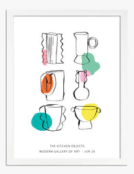
Tela cucina moderna con linee giocose e colori vivaci
Translation missing: it.products.product.sale_price A partire da £44.95£74.95 -

Tela oasi moderna per la cucina
Translation missing: it.products.product.sale_price A partire da £44.95£74.95 -

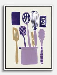
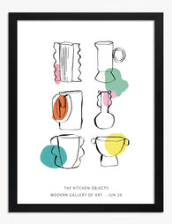
Poster utensili da cucina moderni
Translation missing: it.products.product.sale_price A partire da £11.95£19.95 -

Tela cucina moderna con linee giocose
Translation missing: it.products.product.sale_price A partire da £44.95£74.95 -

Poster utensili da cucina moderni
Translation missing: it.products.product.sale_price A partire da £11.95£19.95 -

Poster natura morta da cucina colorata
Translation missing: it.products.product.sale_price A partire da £11.95£19.95 -

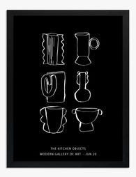
Tela oggetti da cucina a tratto bianco su nero
Translation missing: it.products.product.sale_price A partire da £44.95£74.95 -
Poster cucina line art in bianco e nero
Translation missing: it.products.product.sale_price A partire da £11.95£19.95 -

Tela utensili da cucina moderni
Translation missing: it.products.product.sale_price A partire da £44.95£74.95 -

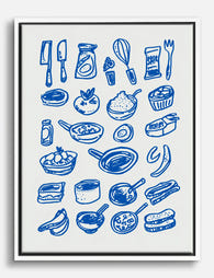
Poster cucina con ingredienti e utensili illustrati
Translation missing: it.products.product.sale_price A partire da £11.95£19.95 -

Poster cucina moderna vivace
Translation missing: it.products.product.sale_price A partire da £11.95£19.95 -
Tela utensili da cucina moderni
Translation missing: it.products.product.sale_price A partire da £44.95£74.95 -

Poster regole della cucina divertenti in bianco e nero
Translation missing: it.products.product.sale_price A partire da £11.95£19.95 -
Tela cucina blu con disegno a linee di utensili e ingredienti
Translation missing: it.products.product.sale_price A partire da £44.95£74.95 -

Poster natura morta in cucina accogliente
Translation missing: it.products.product.sale_price A partire da £11.95£19.95 -

Poster cucina conviviale e vivace
Translation missing: it.products.product.sale_price A partire da £11.95£19.95 -

Poster vaso a tratto libero per la cucina
Translation missing: it.products.product.sale_price A partire da £11.95£19.95 -

Poster cucina urbana a colori vivaci
Translation missing: it.products.product.sale_price A partire da £11.95£19.95 -
Poster linee giocose per la cucina
Translation missing: it.products.product.sale_price A partire da £11.95£19.95 -
Poster utensili da cucina colorati
Translation missing: it.products.product.sale_price A partire da £11.95£19.95


Di più da The Frame

Whimsical Art Isn't Just for Kids: How to Use P...
Somewhere along the way, "playful" became code for "juvenile," and a generation of adults convinced themselves their walls had to be serious to be sophisticated. We disagree. A well-chosen whimsical...

Curated or Collected? Creating Your Equestrian ...
There is a fine line between a gallery wall that reads as considered and one that reads as a horse-mad teenager's bedroom. The difference is not how much you spend...

Curated Tropical Gallery Wall vs Chaotic Jungle...
Tropical prints are the trickiest gallery wall category to pull off. Get it right and your wall feels like a considered Mediterranean villa. Get it wrong and it looks like...