Modern vs Traditional Botanical Prints: Which Style Actually Suits Your Home?
A visual education in two very different plant aesthetics, and how to pick the one your walls actually want.

Botanicals are the most forgiving genre in wall art. They go with almost everything, which is precisely why so many people end up with the wrong ones. This guide will help you spot the difference between traditional and modern botanical prints, work out which suits your home, and commit to a direction with confidence.
A quick visual history: from 18th-century herbarium plates to Instagram-era plant art
Traditional botanical illustration was never decoration. It was science. From the late 1600s through the 1800s, botanists travelled the world cataloguing species, and illustrators like Pierre-Joseph Redouté, Georg Dionysius Ehret, Maria Sibylla Merian and Elizabeth Blackwell turned those specimens into precise visual records. The aim was accuracy: every vein, every stamen, every seed pod, often labelled in Latin and arranged alongside cross-sections and root systems on a single plate.
Those plates were originally painted in watercolour, then reproduced as hand-coloured engravings on heavy rag paper. The muted, slightly chalky palette you associate with "vintage botanicals" is partly the original watercolour technique and partly two centuries of paper yellowing. It's a look that was never designed to be a look. It just aged into one.
Modern botanical art is a deliberate aesthetic choice. It emerged from a few overlapping currents: mid-century graphic design, the wellness and biophilic design movements of the 2010s, and a contemporary art world comfortable with abstraction and oversized scale. The plant is no longer a specimen. It's a shape, a mood, a colour study, a meditation.

The hallmarks of traditional botanical illustration
You can spot a traditional botanical print in under a second once you know what to look for. The clues are all there in the source material.
Scientific completeness. A real herbarium plate shows the whole plant story: flower, leaves, stem, root system, sometimes a seed or a cross-section of the fruit. There's often a small detail study floating in the corner, magnified to show structure. That density of information is what people mean when they say "intricate."
Aged paper backgrounds. Cream, ivory, parchment, very occasionally a soft warm grey. The background is never pure white, because the originals are never on pure white paper.
Muted, earth-toned palettes. Sage, olive, ochre, dusty rose, faded crimson, deep forest. These are watercolour pigments softened by time, not the saturated greens you'd get from a fresh leaf.
Latin nomenclature. Handwritten or set in serif type, usually italic, often with the illustrator's name and a plate number. It signals provenance even when the print is a contemporary reproduction.
Life-sized or smaller scale. Originals were bound into folios, so the plants were drawn at a size that fit a book. This is why traditional botanicals tend to be A4, A3, or arranged in pairs and grids rather than as a single hero piece.
Watercolour and engraving texture. Soft edges, visible brush gradients, fine cross-hatched line work. Nothing is flat or graphic.
If you're drawn to this style, the vintage botanical and natural history prints we curate lean on these conventions deliberately.
What makes modern botanical art feel different
If traditional botanicals are about documentation, contemporary botanicals are about feeling. The same subject, treated as art rather than science.
Bold or radically simplified colour. Sometimes one colour against an off-white ground (a single green palm leaf, a black silhouette of a fern). Sometimes saturated jewel tones that would never appear in nature. Either way, the palette is doing emotional work, not biological reporting.
Scale extremes. Either oversized and cropped (a single monstera leaf at 100x150cm, filling a wall) or pared down to almost nothing. Traditional plants sit politely within their frame. Modern plants tend to push out of it.
Graphic shapes and flat planes. Hard edges, blocked colour, negative space used as a compositional element. This is where mid-century design DNA shows up most clearly.

Abstract interpretation. Line drawings of a leaf reduced to five strokes. A photograph of a fern abstracted into a print. Botanical-adjacent rather than botanically literal.
Contemporary mediums. Digital illustration, photography, screen print influence, ink wash. The medium is part of the message: this is now, not then.
Pure white or deeply coloured grounds. No aged paper. Either clean studio white or a confident dark background (terracotta, charcoal, deep teal) that throws the plant into relief.
So what is modern botanical art, in one sentence? It's plant imagery treated as graphic design or contemporary art rather than as scientific record. Our modern plant art print collection is built around exactly that distinction.
Interior styles where traditional prints shine (and where they fall flat)
Traditional botanicals are a confident match for any interior with historical bones or a layered, collected feel.
English country and French provincial. Aged paper and muted greens echo the patina of antique oak, faded floral upholstery, and lime-washed walls. The visual logic is simple: everything in the room has lived a bit, so the art should too.
Grandmillennial and maximalist interiors. This is where traditional botanicals truly come alive. Pair them with chinoiserie wallpaper, a skirted sofa, brass picture lights, and ruffled lampshades. The detail in the prints holds its own against pattern-heavy surroundings because it operates at a different visual scale.
Transitional and classic interiors. A panelled hallway, a sage green dining room, a study with built-in bookshelves. The scholarly tone of Latin nomenclature reads as quietly intelligent rather than fussy.
Where they fall flat. Ultra-minimalist Scandinavian spaces. A traditional botanical with its busy cross-sections and Latin labels gets visually lost against bare white walls, pale oak, and unornamented forms. The print needs furniture, fabric, or wall colour to anchor it. Plonked alone in a stripped-back room, it looks like it wandered in from another house.
The framing decision matters here. An ornate gilt or dark wood frame doubles down on the traditional reading. A slim black frame can actually pull a traditional print toward something more contemporary, which is useful if you love the imagery but live in a cleaner-lined home.
Interior styles that call for modern plant art prints
Contemporary botanicals do the opposite job. They bring organic life into rooms that might otherwise feel clinical or hard-edged.
Scandinavian and Japandi. A single oversized leaf in soft green against a cream ground gives a pale, restrained space its breath. The plant softens the geometry without cluttering it.
Mid-century modern. Graphic, flat-plane botanicals with confident colour sit naturally alongside teak, tapered legs, and tile-front fireplaces. They share the same design vocabulary.

Minimalist and contemporary apartments. This is where scale becomes a tool. A 100x150cm canvas of a single fig leaf, hung alone on a long wall, does the work of a feature wall without committing to wallpaper or paint. Have a look at our minimalist art prints for the cleaner end of this spectrum.
Industrial loft spaces. Concrete, exposed brick, black metal. A high-contrast botanical (white plant on black, or black silhouette on cream) reads as deliberate and graphic against those materials.
Where they fall flat. Heavily ornamented period rooms. An abstract digital fern next to carved cornicing and a marble mantelpiece looks like an accident. The print needs visual space the room isn't willing to give.
Can you mix the two? (Yes, but here's how to do it without chaos)
Mixing modern and traditional botanicals is genuinely possible. It's also where most people come unstuck. The difference between a curated wall and a confused one comes down to a few rules.
Unify the framing. This is the single highest-leverage move. If every frame is the same (slim black, natural oak, or matte white), wildly different prints start reading as a collection rather than a clash. We frame prints in solid FSC-certified wood with a UV-protective acrylic glaze, and using one frame style across mixed eras is the easiest way to look intentional.
Hold one variable constant. Either match the palette (every print contains sage and ochre, regardless of style) or match the subject (every print is a leaf, regardless of treatment) or match the scale (every print is the same size, regardless of imagery). Mixing across all three at once is what creates chaos.
Use scale as rhythm, not competition. A common technique: one large modern canvas as the anchor, with a tight grid of three or four smaller traditional plates beside it. The modern piece gives the wall its statement; the traditional pieces give it texture. Reverse the proportions and it works too. What doesn't work is two medium-sized prints in different styles fighting for the same attention.
Watch for tonal mismatches. A saturated, jewel-toned modern print will pull all the focus from a muted vintage plate, leaving the traditional piece looking faded and forgotten. If you're mixing, either dial the modern print's saturation down or commit to high contrast as the whole point of the arrangement.
Avoid the common mistake. Don't mix three or four styles. Two is a conversation. Four is a yard sale.
Our picks from each side of the divide
A few honest recommendations, based on what tends to work in real homes rather than styled showrooms.
If you're going traditional, start with a pair. Two matching-format vintage plates, hung side by side above a console, sideboard or bed, is almost impossible to get wrong. It signals confidence without committing you to a full gallery wall. Look for prints with consistent paper tones; varied creams next to each other can look accidental rather than aged.

Go larger than you think for modern. The single biggest mistake with contemporary botanicals is buying them too small. A modern print under 50x70cm in a regular-sized room often reads as tentative. If you love a modern piece, size up. Our canvas prints go to 100x150cm, hand-stretched over solid wood, with mirrored edge wrapping so the image isn't cropped at the sides.
Canvas suits modern; framed paper suits traditional. This isn't a rule, but it holds up most of the time. The smooth matte canvas finish complements graphic, flat-plane modern work. The depth and texture of giclée-printed matte paper, properly framed under acrylic, brings out the fine line work and watercolour gradients in traditional plates. Canvas is also lighter and more forgiving in humid rooms like bathrooms and kitchens, where traditional plates can suit a hallway or study better.
Think about light. Both styles fade in cheap reproductions hung in sunny rooms. Anything you buy should be printed with pigment inks rated for long-term lightfastness and glazed (if framed) with UV-protective acrylic rather than glass. It's the single biggest difference between a print that looks good for six months and one that looks good for decades.
Browse the full botanical art print collection when you've decided which direction you're heading.
Where to land
Pick the style that fights your room a little, but not too much. Traditional botanicals belong in homes that already have layers, history and pattern; they reinforce a mood that's already there. Modern botanicals belong in homes that need organic softness against clean lines; they introduce a mood the room can't generate on its own. If your interior is doing neither, choose based on how you want the space to feel: scholarly and collected, or calm and contemporary. Then size up, frame consistently, and stop second-guessing.

Prodotti Fab presentati in questo blog
-

Poster botanico moderno nei toni neutri
Translation missing: it.products.product.sale_price A partire da £11.95£19.95 -

Poster natura morta botanica moderna con vaso in terracotta
Translation missing: it.products.product.sale_price A partire da £11.95£19.95 -

Poster tavola botanica vintage
Translation missing: it.products.product.sale_price A partire da £11.95£19.95 -

Poster botanico moderno disegnato a mano
Translation missing: it.products.product.sale_price A partire da £11.95£19.95 -

Poster studio botanico della menta
Translation missing: it.products.product.sale_price A partire da £11.95£19.95 -

Poster botanico moderno con petali bianco crema su verde
Translation missing: it.products.product.sale_price A partire da £11.95£19.95 -

Tela silhouette botanica moderna
Translation missing: it.products.product.sale_price A partire da £55.99£79.99 -
Tela botanica vintage con erbe in bianco e nero
Translation missing: it.products.product.sale_price A partire da £55.99£79.99 -

Poster botanico astratto moderno
Translation missing: it.products.product.sale_price A partire da £11.95£19.95 -

Poster botanico verde con maxi foglie
Translation missing: it.products.product.sale_price A partire da £11.95£19.95 -

Tela pianta in vaso a linee moderne
Translation missing: it.products.product.sale_price A partire da £44.95£74.95 -

Poster botanico pop art moderno
Translation missing: it.products.product.sale_price A partire da £11.95£19.95 -

Poster botanico moderno con fiori grafici su verde intenso
Translation missing: it.products.product.sale_price A partire da £11.95£19.95 -

Poster botanico moderno in equilibrio
Translation missing: it.products.product.sale_price A partire da £11.95£19.95 -

Tela oasi botanica vintage
Translation missing: it.products.product.sale_price A partire da £44.95£74.95 -

Tela silhouette di foglie su fondo marrone
Translation missing: it.products.product.sale_price A partire da £55.99£79.99 -

Poster eleganza botanica verde scuro
Translation missing: it.products.product.sale_price A partire da £11.95£19.95 -

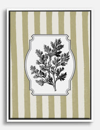
Poster botanico con erba su righe color oliva e beige
Translation missing: it.products.product.sale_price A partire da £11.95£19.95 -

Poster botanico moderno con vaso blu
Translation missing: it.products.product.sale_price A partire da £11.95£19.95


Di più da The Frame

Vintage Art Prints Explained: From Botanical to...
Vintage art is one of the most loved categories in wall decor, and one of the most loosely defined. Botanicals, travel posters, oil portraits and psychedelic 1970s graphics all get...

7 Ways to Style William Morris Tree Prints in Y...
Tree of Life. Woodpecker. The towering, tangled branches that made Morris famous. These prints have a vertical pull and a visual density that other Morris designs don't, which means hanging...

Why Art Prints Make the Most Meaningful Housewa...
Most housewarming gifts get consumed, regifted, or shoved in a cupboard within a month. Art does something different. It hangs on a wall in the new home for years, quietly...