
 Ordina oggi, consegna il
 Nursery Art That Grows with the Room
A strategic guide to choosing nursery art that still earns its place on the wall when your baby turns ten.


Most nursery art gets retired by the time the cot comes down. That's a waste of money, wall space and the chance to build something genuinely meaningful. This guide is about choosing pieces from day one that still look right when your baby is a toddler, a five-year-old, and beyond.
Start with what babies actually see
Newborn vision is famously rubbish. For the first few months, babies see in high contrast and at close range, roughly 20 to 30cm. They respond to bold shapes, strong tonal contrast and slow movement, not delicate pastel illustrations of fawns in a meadow.
This matters because a lot of nursery art is designed for parents, not babies. A soft watercolour rabbit looks lovely on Instagram, but your three-month-old can barely register it from across the room. If you want art that engages your baby in those early months, choose pieces with strong shapes and clear contrast. Abstract geometrics, bold botanical silhouettes and graphic animal portraits all work.
By six to eighteen months, colour perception is fully developed and babies start tracking detail. This is when richer palettes, more complex compositions and illustrated scenes start earning their keep. From eighteen months onward, children begin recognising objects, naming things and inventing stories about what they see. Art becomes a conversation tool.
The practical takeaway: choose pieces that work at every stage rather than swapping the entire room out twice. A graphic mountain landscape engages a newborn with its shapes, a toddler with its colours, and a six-year-old who wants to know where mountains come from.

The timeless test
Everyone promises "timeless" nursery art. Almost no one explains what that actually means. Here's a working framework. If a piece passes three of these four tests, it will likely still feel right in five years.
Is the subject matter age-neutral? A hot air balloon with a smiling face is baby art. A detailed cross-section of a vintage hot air balloon is a piece a ten-year-old would still want on their wall. Nature, architecture, maps, animals drawn with anatomical accuracy and abstract shapes all age well. Anthropomorphised baby animals in bonnets do not.
Is the palette sophisticated? Pastel pink, mint and primary yellow read as nursery palettes. Sage, terracotta, ochre, deep navy, warm cream and forest green read as design palettes. The latter group works in a baby's room and in a teenager's room.
Would you hang it in another room? This is the cleanest test. If you'd happily put the print in your hallway, lounge or study, it has longevity. If it only makes sense surrounded by a cot and a changing table, it's nursery-specific.
Is the illustration style restrained? Cartoonish styles date fastest. Botanical illustration, mid-century graphic design, vintage scientific drawings, line art and abstract painting all have decades of staying power.
Run a piece through these four questions before you buy. It's a more reliable filter than your aesthetic instinct in the haze of late pregnancy.
Themes that age well
A few categories consistently transition from nursery to childhood bedroom to whatever comes next.
Nature and botanicals. Pressed flower studies, mushroom illustrations, leaf prints and landscape scenes work at every age. They're calming for a newborn, educational for a toddler, and stylish for an older child. Look at our botanical prints for pieces that lean illustrative rather than overly decorative.
Animals, drawn with respect. A realistic line drawing of a fox, a graphic study of a whale, a vintage natural history print of a hare. These engage children without infantilising the room. Avoid anything wearing clothes or holding balloons. Our animal prints include both graphic and illustrative options.
Maps and geography. A beautiful world map or a celestial chart will see your child through primary school and probably into university halls. They're conversation pieces from age two onward.
Abstract and geometric. Soft abstract shapes, colour field paintings and gentle geometrics work brilliantly for newborns thanks to their strong contrast, and they slot into any future aesthetic. Our abstract collection leans into the kind of muted, considered palettes that age well.
Vintage-style illustration. Storybook art with genuine craft to it, the kind that feels pulled from a 1950s children's book, has more staying power than contemporary cute. The line is thin but real: think Eric Carle rather than commercial cartoon merchandise.
What to avoid
The "baby aesthetic trap" is real and expensive. A few patterns that consistently disappoint.
Themed rooms. Safari nurseries, nautical nurseries, woodland nurseries. The theme commits you to a narrative your child may have outgrown by age three. Cohesion is good. Theming is a trap. Aim for a palette and a mood rather than a story.
Name signs and birth stat prints as the centrepiece. A subtle name print can be lovely. Making it the largest piece in the room means you're decorating around your child's infancy rather than around design that lasts. If you want personalisation, keep it small and complementary.
Trend-driven palettes. Whatever colour is having a moment when you decorate is the colour that will date your room. Rainbow gradients, millennial dusty pink and very specific shades of mustard all had their year. Choose colours with longer histories.
Overly literal alphabet and numbers art. A beautiful, illustrated alphabet print can work into early primary years. A bright primary-colour ABC poster has a shelf life of about eighteen months.

Placement, sizing and safety
The rules here are simple but get broken constantly.
Above the cot: nothing heavy, nothing breakable. This is the single non-negotiable. Babies stand up, reach and pull. A framed print directly above a cot is a risk you don't need to take. If you want art over the cot area, hang it well clear, or use a piece without glass. Our framed prints use a UV-protective acrylic glaze rather than glass, which removes one major concern, but we'd still recommend keeping anything heavy off the wall directly above where your baby sleeps.
Above the dresser, changing table or reading chair: this is where the main piece goes. The art should span roughly two-thirds to three-quarters the width of the furniture below it. So a 120cm dresser wants art that's around 80 to 90cm wide, whether that's a single large piece or a pair.
Hang the bottom edge 15 to 30cm above the furniture. Closer than 15cm feels cramped. Further than 30cm and the art floats, disconnected from the room.
Eye level means adult eye level. Around 145 to 155cm from the floor to the centre of the piece. Hanging art at "baby eye level" is a mistake. You'll be looking at it for years from a standing position, and your child's eye level changes every month.
Sizing for impact. One large piece almost always beats three small ones. For above a standard cot or dresser, look at 50x70cm at minimum, ideally 70x100cm. Small prints get lost on nursery walls, which tend to have a lot of empty space because the furniture is low.
Framed or unframed
For nurseries, we lean framed. A clean frame in oak, black or white gives a piece presence and makes it feel intentional rather than provisional. It also protects the print from the unique hazards of a baby's room: humidity from baths nearby, sticky toddler hands later, the general chaos.
Canvas is the other strong option, particularly for larger statement pieces. It's lighter, has no glass or acrylic, and reads as soft and tactile. For a big piece above a reading chair or against an accent wall, canvas prints often feel warmer than framed paper.
The thing to avoid is buying a print and a frame separately, hoping they fit. They rarely do perfectly, and prints arrive warped, bubbled or off-centre. Buying art that ships ready-framed, properly fitted in a single box, removes the most common nursery art disappointment.
A flexible gallery system
The best long-term strategy is to build a small gallery rather than commit to a single statement piece. Plan for two or three permanent pieces and one or two "rotational" slots.
Permanent pieces are your investment art. The botanical print, the abstract landscape, the map. These earn their place through years of use. Spend more here.
Rotational pieces are smaller, lower-cost prints that you can swap as your child grows. A favourite illustration from a book they love at age two, a print of a dinosaur at age four, a band poster at age twelve. Treat these spots as flexible and don't get precious about them.
The simplest setup: one large permanent piece above the main furniture, flanked or balanced by a smaller permanent piece, with one rotational slot at toddler eye level for art they can engage with directly. As they grow, the lower piece changes, the main pieces stay.
This approach also makes gifts and family photos easier to integrate. Rather than scrambling for somewhere to hang the watercolour from grandma, you have a slot ready for it.

Colour and light in nurseries
Two practical notes that get overlooked.
Nurseries often have blackout blinds, which means the room shifts dramatically between bright daylight and warm artificial light. Art with very cool palettes can look great in daylight and feel chilly under a bedside lamp. Warmer palettes, ochres, soft terracottas, warm greens, tend to perform across both lighting conditions.
Matte finishes also matter more in nurseries than most rooms. You'll be in there at all hours with overhead lights, lamps, the glow of a baby monitor. Glossy prints and glass-fronted frames bounce light back and create distracting reflections, particularly during night feeds. A matte paper print under acrylic glaze stays readable in any light.
Where to spend, where to save
A sensible budget strategy for a nursery gallery.
Spend on the main piece. The large print above the dresser or reading chair is the one you'll see most often, in photographs, from the doorway, for years. This is where larger sizes and proper framing pay off. A well-made 70x100cm framed print holds its own through redecorations.
Save on the rotational pieces. Smaller unframed prints, swapped every couple of years, don't need investment-level treatment. A simple frame and a 30x40cm print is plenty.
Don't split the difference. Three medium-sized, medium-priced pieces will almost always look worse than one large investment piece plus two small affordable ones. Hierarchy beats uniformity.
When to decorate
The honest answer is whenever you have the energy. There's no developmental window you're missing. Newborns spend most of their time sleeping or staring at faces, not analysing your gallery wall.
If you're nesting late in pregnancy, focus on the permanent pieces. Buy the large piece and the secondary piece, get them on the wall, and leave the rotational spots empty until your baby arrives. Watching what they respond to, what catches their eye in books, what makes them point and laugh, is genuinely useful information for filling those spots later.
The one rule worth remembering
Buy art for the child your baby will become, not just the baby they are now. Sophisticated palettes, considered subjects, proper sizing, decent framing. Get those four things right and the room will quietly evolve with your child rather than needing to be dismantled every two years.


Prodotti Fab presentati in questo blog
-

Poster passeggiata nel bosco d'inverno
Prezzo scontato A partire da £11.95£19.95 -

Poster botanico con foglie verdi e sfumature pastello
Prezzo scontato A partire da £11.95£19.95 -

Tela ritratto di bambino di Van Gogh
Prezzo scontato A partire da £49.95£74.95 -

Poster Il bambino (la culla) di Gustav Klimt
Prezzo scontato A partire da £11.95£19.95 -

Poster sole e fiori sorridenti
Prezzo scontato A partire da £11.95£19.95 -

Poster sentieri silenziosi
Prezzo scontato A partire da £11.95£19.95 -

Tela bambino (culla) di Gustav Klimt
Prezzo scontato A partire da £49.95£74.95 -

Poster zebra con corona di fiori
Prezzo scontato A partire da £11.95£19.95 -
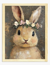
Poster coniglietto con corona di fiori
Prezzo scontato A partire da £11.95£19.95 -

Poster giardino colorato con casetta blu
Prezzo scontato A partire da £11.95£19.95 -

Poster giraffa giocosa
Prezzo scontato A partire da £11.95£19.95 -

Tela passeggiata invernale nel bosco
Prezzo scontato A partire da £49.95£74.95 -

Poster incontro di animali nella foresta
Prezzo scontato A partire da £11.95£19.95 -

Tela sempre più luminosa
Prezzo scontato A partire da £49.95£74.95 -

Poster giraffa al bagnetto per bambini
Prezzo scontato A partire da £11.95£19.95 -

Poster safari con elefante e giraffa
Prezzo scontato A partire da £11.95£19.95 -

Poster bambino astronauta nello spazio
Prezzo scontato A partire da £11.95£19.95 -

Poster paperella felice al bagnetto
Prezzo scontato A partire da £11.95£19.95 -

Poster botanico fiori rosa e gialli
Prezzo scontato A partire da £11.95£19.95 -

Poster bradipo con corona di fiori
Prezzo scontato A partire da £11.95£19.95


Di più da The Frame

The Complete Guide to Decorating with Botanical...
Botanical prints are the closest thing interior design has to a universal donor. They work with almost any style, palette, and period. Almost. This is a room-by-room guide with specific...

Botanical vs Floral Prints: Which Style Actuall...
Botanical and floral prints get lumped together constantly, and it's costing people the chance to get their walls right. They're not the same thing, they don't behave the same way...

The Best Tulip Wall Art for Every Interior Styl...
Tulips are having a proper moment in interiors, and the range of prints available can make choosing feel harder than it should be. Once you understand the four main styles...