How to Build a Pop Art Gallery Wall with Haring, Warhol, and Basquiat
A definitive guide to mixing the three icons of 1980s New York into one cohesive, dynamic gallery wall.

Haring, Warhol, and Basquiat weren't just contemporaries. They were friends, collaborators, and rivals who defined downtown New York in the 1980s. Putting their work together on one wall isn't a stretch, it's almost historically accurate, and done well it creates one of the most energetic gallery walls you can build at home.
Why Haring, Warhol, and Basquiat work together on a gallery wall
These three artists shared a city, a moment, and in many cases a studio. Warhol was the elder statesman, already a global icon by the time Haring was chalking subway drawings and Basquiat was tagging buildings as SAMO. By the early 80s all three were orbiting the same Manhattan scene, and Warhol famously collaborated with Basquiat on a series of joint paintings, while Haring credited Warhol as a personal hero.
That shared DNA is why their work hangs together so well. You're not forcing three random aesthetics into a marriage, you're reuniting a crew. The visual languages are different, but they all came out of the same conversation about consumer culture, mass media, race, sexuality, and the street.
The trick is to lean into the contrast rather than fight it. Haring brings clean graphic energy and primary colours. Warhol brings repetition, commercial imagery, and saturated pop palettes. Basquiat brings raw mark-making, text, and urgency. A wall that uses all three becomes a conversation, not a chorus.

Choosing a colour thread that ties your prints together
The single biggest mistake people make with pop art gallery walls is treating each print as its own island. Pop art is loud by nature. If you don't give the eye something to follow, the wall becomes visual noise.
Pick one or two colours that will repeat across every print on the wall. Red is the easiest, because it appears in Haring's heart motif, Warhol's Campbell's Soup cans, and almost every Basquiat painting. Yellow works similarly well. Black is the silent third, present as outline in Haring, as silkscreen contrast in Warhol, and as raw scrawl in Basquiat.
Once you've chosen your thread, audit every print before you commit. Hold them next to each other, physically or in a mood board. If a print breaks the thread completely, swap it. You're not censoring the artists, you're curating which version of each one shows up on your wall.
A practical rule: aim for around 70% of your prints to share the dominant colour, with the remaining 30% bringing contrast. That ratio keeps the wall coherent without making it monotonous.
Watch out for clashing temperatures
Warhol's commercial palettes can run warm (his Marilyns) or cool (his electric chairs). Basquiat's backgrounds shift from raw canvas beige to acid green. Haring is mostly primary, but Pop Shop variants exist in pastels too. Don't mix warm and cool versions of the same artist on the same wall unless you're confident in what you're doing.
Frame consistency: why matching frames matter more than matching art
With traditional landscape paintings or muted abstracts, mixing frame styles can look considered. With pop art, it almost never does. The work itself is already shouting, and a mix of black wood, oak, and gold instantly tips the wall into chaos.
We think the strongest approach for a Haring, Warhol, and Basquiat wall is identical frames across every print. Same colour, same profile width, same finish. This gives the eye a consistent rhythm and lets the art carry the energy.
Black frames are the safest choice because they pick up Haring's heavy outlines and ground Basquiat's busier compositions. Natural oak works beautifully if your room leans warm and your prints lean primary. White frames can work but tend to disappear against most walls, which removes the framing's structural job.
A note on what you're actually framing. Cheap frames that ship separately from the print, or arrive with warped mounts and bubbled paper, will undo all of this work. Look for framed prints that arrive ready to hang with the print already properly fitted, on solid wood rather than MDF or veneer. UV-protective glazing matters too if any part of the wall catches direct sunlight, because Warhol's pinks and Haring's reds are exactly the pigments that fade fastest.
Mat or no mat?
For graphic pop art, we lean towards no mat. A white border around a Haring Radiant Baby softens the impact and adds a fussiness the work doesn't want. Save matting for fine art prints with delicate compositions. Bold graphic work looks better full-bleed inside the frame.
The ideal layout: how many prints, what sizes, and how to space them
A pop art gallery wall typically lives in one of three sizes: a tight cluster of 3 to 5 prints, a balanced grid of 6 to 9, or a feature wall of 10 or more. Anything in between tends to feel awkward, neither focused nor immersive.
For a first wall, we'd recommend starting with five prints. Three is too sparse for the energy these artists bring, and seven plus is hard to compose without practice. Five gives you a clear hierarchy: one hero piece, two secondary pieces, two supporting pieces.
Sizing should follow a 2:1:1 ratio. Your hero print is roughly twice the area of your secondary prints, and your supporting prints are roughly the same size as your secondaries or slightly smaller. A practical translation: one 70x100cm hero, two 50x70cm secondaries, two 40x50cm supporting prints.
Spacing is non-negotiable. Keep 5 to 10cm between every frame, and stay consistent. Tighter than 5cm reads as cluttered. Wider than 10cm and the prints stop talking to each other. The professional consensus for gallery walls is around 5 to 7cm, and that's the range we'd stick to for pop art specifically.
The centre of the entire arrangement should sit at roughly 145cm from the floor, which is the standard museum eye level. Not the centre of your hero print, the visual centre of the whole composition.

Which Keith Haring prints pair best with other pop art icons
Not every Haring works with every Warhol, and Basquiat brings his own demands. Here's how we'd pair specific Keith Haring pop art prints with other icons of the era.
Radiant Baby
The Radiant Baby is Haring's most recognisable motif and the easiest to pair. Its clean lines and primary palette sit beautifully next to Warhol's Campbell's Soup Cans, which share the same red and white DNA. Avoid pairing it with Basquiat's busiest text-heavy works, the contrast in density becomes uncomfortable. Instead, pair Radiant Baby with a Basquiat crown motif on a clean background. Both are graphic, both are symbolic, both have breathing room.
Barking Dog
The Barking Dog has more aggressive energy and pairs well with Warhol's electric chair series or his more confrontational pieces. It also holds up next to Basquiat's denser figurative work because the dog itself is heavy and graphic enough to compete. Don't pair it with Marilyn or Liz, the energies clash.
Dancing Figures
Multi-figure Haring prints work best as the hero of the wall. They have enough internal composition to anchor a gallery and let smaller Warhol portraits or Basquiat sketches play supporting roles. Pair with Warhol's Flowers for a softer counterweight, or with Basquiat's anatomical sketches for tension.
Pop Shop prints
Pop Shop prints are graphic, commercial, and deeply Haring. They mirror Warhol's commercial pop aesthetic almost perfectly and make natural pairs with his consumer goods imagery (Brillo, Coca-Cola, soup cans). They tend to overpower Basquiat unless you balance with one of his more graphic, less painterly works.
Three Eyed Smiling Face and Heart motifs
The simpler Haring icons (single hearts, faces, angels) work as supporting prints rather than heroes. They're perfect for filling the corners of a five or seven print arrangement and bringing the colour thread through.
For Andy Warhol art prints, our general rule is to pick one Warhol family per wall (portraits, or commercial goods, or flowers, but not all three). Mixing Warhol series on a single wall fragments the visual logic.
Step-by-step hanging guide for a straight, level gallery wall
Don't hang anything until you've planned the layout flat on the floor or on paper. This is the step most people skip and most people regret.
1. Lay it out flat. Arrange all your frames on the floor in front of the wall. Move them around until the composition feels balanced. Take a phone photo from directly above, you'll spot imbalances on screen that you missed in person.
2. Make paper templates. Cut newspaper or kraft paper to the exact size of each frame. Mark where the hanging hardware sits on the back of each one. This is the only reliable way to plan a multi-print wall without putting fifteen unnecessary holes in your plaster.
3. Tape the templates to the wall. Use low-tack painter's tape. Adjust spacing until every gap is consistent (5 to 7cm). Step back. Live with it for a day if you can.
4. Find your centre. The visual centre of the whole arrangement should sit at 145cm from the floor. If the wall is above a sofa or sideboard, drop that to around 20 to 25cm above the furniture instead, the wall and furniture should feel connected.
5. Mark and drill. Push a pencil or pin through each template where the hardware will sit. Drill, plug, and hang in that order. Use a spirit level on every single frame. Phone level apps are fine but a real spirit level is faster.
6. Hang the hero first. Then build outwards. If something feels off when you step back, it usually is. Trust the eye over the measurements at the final stage.
If your prints arrive ready to hang with fixtures already attached, this whole process is significantly faster. You're only measuring for one hook per frame rather than fiddling with wire and D-rings.

Scaling this up or down: from a small hallway cluster to a full feature wall
The same principles apply at every scale, but the execution shifts.
Three-print hallway cluster
For a narrow hallway or small wall, three prints in identical frames work beautifully. Use one 50x70cm hero flanked by two 30x40cm supporting prints, all hung in a horizontal line at 145cm centre height. Stick to two artists rather than three, the eye doesn't have room for a third voice in such a small composition. Haring plus Warhol is the strongest two-artist combination here.
Five to seven print living room wall
This is the sweet spot for most homes and the layout we'd recommend for first-time gallery wall builders. Use the 2:1:1 ratio described above and bring all three artists in. Hang above a sofa, sideboard, or console, keeping 20 to 25cm between the top of the furniture and the bottom of the lowest frame.
Ten plus print feature wall
For a full feature wall in a lounge, dining room, or large hallway, you can move into proper salon-hang territory. Mix sizes more aggressively (90x60cm down to 30x40cm), but keep frames identical and spacing tight. Plan more carefully, the larger the wall, the more punishing layout mistakes become. Curated wall art sets can take some of the guesswork out if you want a coherent starting point.
For rooms specifically: dining rooms suit denser, more energetic walls because you're sitting and looking at them. Home offices benefit from cleaner three or five print arrangements, too much visual energy is distracting when you're trying to work. Living rooms can go either way, depending on whether the wall is the hero of the room or the backdrop.
A final note
Build the wall slowly. The best pop art gallery walls aren't bought in one transaction, they're assembled over months as specific prints catch your eye. Start with a hero, choose your colour thread, lock your frame style, and let the rest grow from there. The wall will feel more personal, and you'll make far better choices than if you tried to buy the whole composition at once.


Prodotti Fab presentati in questo blog
-

Poster onde blu, vibrazioni Hockney
Translation missing: it.products.product.sale_price A partire da £11.95£19.95 -
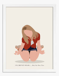
Poster icona pop anni '90 minimalista
Translation missing: it.products.product.sale_price A partire da £11.95£19.95 -

Poster pop colorato per il soggiorno
Translation missing: it.products.product.sale_price A partire da £11.95£19.95 -

Poster sneakers pop art su sfondo rosso
Translation missing: it.products.product.sale_price A partire da £11.95£19.95 -

Poster pop colorato per il soggiorno
Translation missing: it.products.product.sale_price A partire da £11.95£19.95 -

Poster gatto rosa e verde di Warhol
Translation missing: it.products.product.sale_price A partire da £11.95£19.95 -
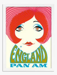
Poster pop retrò britannico
Translation missing: it.products.product.sale_price A partire da £11.95£19.95 -
Tela soggiorno pop colorato
Translation missing: it.products.product.sale_price A partire da £44.95£74.95 -

Poster due gatti giocosi in volo
Translation missing: it.products.product.sale_price A partire da £11.95£19.95 -

Poster bicicletta pop retrò blu e arancione
Translation missing: it.products.product.sale_price A partire da £11.95£19.95 -

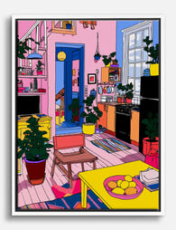
Poster scena pop vivace di cucina e soggiorno
Translation missing: it.products.product.sale_price A partire da £11.95£19.95 -

Tela scorcio urbano di Londra in colori pastello
Translation missing: it.products.product.sale_price A partire da £44.95£74.95 -

Poster bouquet floreale pop stilizzato
Translation missing: it.products.product.sale_price A partire da £11.95£19.95 -

Tela gatto verde in stile Andy Warhol
Translation missing: it.products.product.sale_price A partire da £44.95£74.95 -

Poster pop art con dischi in vinile retrò
Translation missing: it.products.product.sale_price A partire da £11.95£19.95 -

Poster astratto a blocchi di colore vivaci e armoniosi
Translation missing: it.products.product.sale_price A partire da £13.99£19.99 -

Poster pop art con fico dai colori audaci
Translation missing: it.products.product.sale_price A partire da £11.95£19.95 -
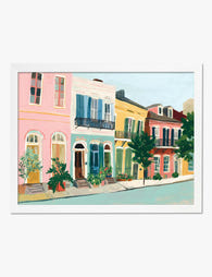
Poster case colorate di New Orleans
Translation missing: it.products.product.sale_price A partire da £11.95£19.95 -

Poster sneakers pop retrò
Translation missing: it.products.product.sale_price A partire da £11.95£19.95


Di più da The Frame

Realist Garden Prints vs Botanical Illustration...
Realist garden prints are some of the most rewarding wall art you can hang, and some of the trickiest to arrange. Get the balance right and you've got a wall...

Wall Art for Your Home Gym That's Actually Wort...
Most home gyms look like an afterthought. Bare walls, a single dusty motivational poster from 2014, maybe a flag pinned up with drawing pins. You spend hours in there every...

Bedroom Wall Art Ideas for Every Style: From Mi...
Most bedroom art advice throws thirty ideas at you and calls it inspiration. What you actually need is a framework: a way to narrow the field based on what's already...