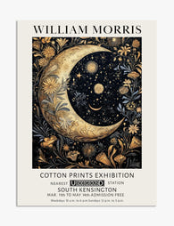
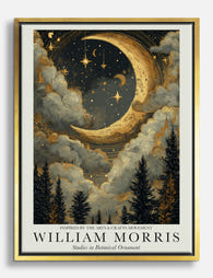
How to Style William Morris Moon Prints in Every Room of Your Home
A room-by-room guide to placing, framing, and pairing your celestial Arts and Crafts print so it looks intentional, not accidental.

Morris's celestial work sits in a strange, lovely place: vintage botanical detail meeting deep indigo skies and burnished gold. That makes it more flexible than most decorative prints, but also easier to get wrong. Here's how to hang yours so it earns its place on the wall.
Bedrooms: Creating a Calm, Moody Focal Point
The bedroom is where a william morris moon print does its best work. The deep blues and golds settle the eye, and the botanical detailing keeps the mood romantic rather than gothic. Hang it above the bed and it becomes the headboard's quieter, more interesting cousin.
For a standard double or queen bed, go to 60x80cm at minimum. A 50x70cm print floats awkwardly above a 140cm or 150cm headboard and looks like an afterthought. For king beds, 70x100cm is the right call, either as a single statement or as the centre of a tight three-piece arrangement.
Hang the centre of the print roughly 20 to 25cm above the headboard. The common mistake is hanging at "eye level," which is a rule for empty walls, not walls with furniture underneath. When there's a bed, sofa, or console below, the art should relate to the furniture, not the ceiling.
Wall colour matters more here than anywhere else. A moon print sings against warm off-white, clay pink, soft sage, or deep teal. It dies on cool grey. If your bedroom walls are pale, lean into the contrast with a black frame. If your walls are already moody (dark green, navy, plaster pink), an oak frame keeps things from getting too heavy.

Living Rooms: Statement Piece vs. Gallery Wall Anchor
Living rooms give you two routes: single statement or gallery wall anchor. Both work. They just need different prints and different commitment levels.
The single statement approach
A large moon print above a sofa is one of the easiest high-impact moves in interior design. The horizontal expanse of a sofa wants something substantial above it, and a 70x100cm portrait or 100x70cm landscape print fills that brief without crowding.
The art should span roughly two-thirds the width of the sofa. A three-seater (around 200cm) wants art that's about 130cm wide, which you can achieve with a single 100x70cm print or two 50x70cm prints hung as a pair with 5cm between them.
The gallery wall anchor
If you're building a gallery wall, the moon print should be the largest piece and sit slightly off-centre. Surround it with smaller botanical or pattern-led william morris art prints at 30x40cm and 40x50cm. Mix portrait and landscape orientations, but keep the frame style consistent across all pieces. Mixed frames on a Morris-themed wall look cluttered fast.
Leave 5 to 8cm between frames. Any more and the wall feels disjointed. Any less and the prints fight each other for attention.
Hallways and Entryways: First Impressions with Depth
Hallways are usually under-lit and under-styled, which is exactly why a decorative moon print works so well here. The deep palette absorbs the lower light gracefully, and the Arts and Crafts detailing rewards a closer look as people pass by.
Narrow hallways need vertical art. A single 50x70cm print, or a tight column of two 30x40cm prints stacked with 8cm between them, makes the space feel taller. Avoid landscape orientations in corridors under 1.2m wide. They visually compress what's already a tight space.
For entryways with a console table, hang the centre of the print 15 to 20cm above whatever sits on the table (a lamp, a vase, a tray). If the table is empty, treat it like a sofa and use the 20 to 25cm rule from the bed section.
Eye level in a hallway runs lower than you'd think, around 145 to 150cm to the centre of the print, because people are usually moving past rather than standing still. Too high and it disappears.

Home Offices and Reading Nooks: Art That Helps You Think
A william morris night sky print above a desk does something subtle: it gives your eyes somewhere restful to land between tasks. The detail invites a slow look, and the deep blues are calming without being sleepy.
For a desk against a wall, hang a 50x70cm print so its centre sits about 30cm above the desk surface. This puts it at natural eye level when you lean back, not when you're typing. If your monitor is large, go landscape so the print doesn't compete with the screen's vertical lines.
Reading nooks are different. Here you want the art at seated eye level, around 110 to 120cm to centre, depending on chair height. A 40x50cm print beside an armchair, hung level with the headrest, creates the kind of intentional little corner that actually gets used.
Avoid hanging celestial prints directly opposite a window in a home office. The contrast between bright daylight and the dark print makes the wall look patchy through the day. Side-light is far better. The UV-protective acrylic glaze on framed prints means you don't need to worry about fading in sunny rooms, but glare from a glossy surface can still be distracting in workspaces. The matte paper used for art prints handles this far better than glass-fronted alternatives.
Choosing the Right Size: From 30x40cm to a 70x100cm Statement
Size is where most people go wrong, and they almost always go too small. Here's the working rule: measure the empty wall space (or the furniture below), then aim for art that fills 60 to 75% of that width.
30x40cm: Gallery wall supporting cast. Stairwell columns. Above bedside tables. Never as the only piece on a large wall.
40x50cm: Reading nook companion. Cluster of three above a sideboard. Small toilet or boot room.
50x70cm: The all-rounder. Above a single bed, beside an armchair, single piece in a hallway, anchor of a small gallery wall.
60x80cm: Above a queen bed, above a two-seater sofa, primary piece in a dining room.
70x100cm: Statement above a king bed or three-seater sofa. Solo in a stairwell. Centre of a generous gallery wall.
When in doubt, go one size up. A print that's slightly too large reads as confident. A print that's slightly too small reads as a mistake.

Frame and Colour Pairings That Actually Work
The Morris celestial palette tends to centre on indigo, midnight blue, antique gold, deep ochre, and soft cream. Your frame and surrounding decor should support that palette, not compete with it.
Frame choices
Black frames suit modern interiors with clean lines. They sharpen the contrast and make the gold elements pop. Best on white, pale grey, or warm-neutral walls. Slightly less successful on already-dark walls, where black frames can feel heavy.
Natural oak frames are the safest choice across the widest range of interiors. The warm wood tone pulls out the gold and ochre in the print and softens the deep blue. Works on almost any wall colour, particularly clay, sage, terracotta, and plaster pink.
White frames lighten the visual weight of the print and work well in Scandinavian or coastal-leaning rooms. Less successful with traditional or maximalist interiors, where they can feel disconnected from the print's vintage character.
Avoid bright pine, gold-coloured metal, or thin black metal frames. None of them respect the Arts and Crafts aesthetic. Solid wood frames with a visible grain or a properly painted matte finish are the right register.
Colour palette pairings
Colours that work alongside Morris moon prints:
- Sage green, olive, forest
- Terracotta, rust, clay
- Warm off-white, oat, bone
- Plaster pink, dusty rose
- Mustard, ochre, antique gold
- Deep teal, navy (for tonal moody schemes)
Colours to avoid:
- Cool grey (deadens the warm golds)
- Pure brilliant white (too clinical)
- Lavender or cool blue (clashes with the indigo)
- Bright primary colours of any kind
For broader inspiration on tonal schemes, a wider range of dark art prints can help you build a cohesive moody palette across multiple rooms.
Common Mistakes to Avoid When Hanging Decorative Prints
Hanging too high
The single most common error. Furniture-anchored art belongs 20 to 25cm above the furniture. Empty-wall art belongs at 145 to 155cm to centre. Most people split the difference and end up with art floating awkwardly between the two.
Choosing too small
A 30x40cm print above a king-size bed is a famous mistake. It happens because people look at the print on a screen, where everything looks bigger than it is. Measure the wall, do the 60 to 75% calculation, and trust the maths.
Mismatching frame styles in a Morris grouping
If you're building a gallery wall of celestial arts and crafts decor, every frame needs to be the same colour and the same approximate profile. Mixing oak and black on a Morris wall fragments the eye. Save mixed-frame gallery walls for more eclectic art collections.
Ignoring the wall colour
A beautiful print on the wrong wall colour just looks unhappy. If you can't repaint, lean harder into the frame choice. Oak on cool grey walls warms things up. Black on beige walls adds the contrast the wall is missing.
Using cheap framing on a good print
This is where the category falls apart most often. Prints arrive separately from frames, the frame warps within a year, the print isn't fitted properly and ripples behind the glass. Buying a print and frame that ship together, properly fitted in one box, removes all of that. Solid FSC wood frames with UV-protective acrylic glaze (lighter than glass and won't shatter if you knock the frame) handle humidity, sunlight, and the slow business of moving house far better than budget alternatives.
Forgetting renters
If you're renting and worried about wall damage, heavy-duty adhesive strips rated for 3 to 4kg will hold prints up to 50x70cm. For 70x100cm statement pieces, you really do need a proper picture hook or a single small nail. The hole is filler-sized and takes thirty seconds to repair when you move out.

Hanging prints in direct, harsh sunlight without thinking about glare
Even with UV-protected glazing keeping the colours stable for decades, a print hung directly opposite a south-facing window will catch glare at certain times of day. Angle matters. If the only available wall is opposite a window, the matte paper finish on unframed canvas or behind non-reflective glazing handles this far more gracefully than glossy options.
Final thoughts
Get the size right, get the height right, get the frame right, and a William Morris moon print will work in almost any room you put it in. The print is doing the heavy lifting. Your job is just to stop getting in its way.
If you're still deciding between rooms, start with the bedroom. It's the lowest-risk, highest-reward placement, and once you see how the indigo and gold settle into a quiet wall above the bed, you'll know exactly where the next one goes.

Prodotti Fab presentati in questo blog
-

Tela luna celestiale in stile William Morris
Translation missing: it.products.product.sale_price A partire da £44.95£74.95 -

Tela notte al chiaro di luna di William Morris
Translation missing: it.products.product.sale_price A partire da £44.95£74.95 -

Poster luna e stelle ispirato a William Morris
Translation missing: it.products.product.sale_price A partire da £11.95£19.95 -
Poster luna e stelle in stile William Morris
Translation missing: it.products.product.sale_price A partire da £11.95£19.95 -

Poster notte al chiaro di luna di William Morris
Translation missing: it.products.product.sale_price A partire da £11.95£19.95 -

Poster bosco al chiaro di luna ispirato a William Morris
Translation missing: it.products.product.sale_price A partire da £11.95£19.95 -

Tela giardino al chiaro di luna stile William Morris
Translation missing: it.products.product.sale_price A partire da £44.95£74.95 -

Tela foresta al chiaro di luna di William Morris
Translation missing: it.products.product.sale_price A partire da £44.95£74.95 -

Tela foresta al chiaro di luna ispirata a William Morris
Translation missing: it.products.product.sale_price A partire da £44.95£74.95 -
Tela notte al chiaro di luna ispirata a William Morris
Translation missing: it.products.product.sale_price A partire da £44.95£74.95


Di più da The Frame

William Morris Gallery Wall Ideas That Actually...
William Morris prints are stunning. They're also dense, intricate, and capable of overwhelming a room if you hang them wrong. Most gallery wall guides ignore this problem entirely, so here's...

How to Decorate with William Morris Prints: Roo...
Most advice on decorating with Morris is about wallpaper. This guide is about prints, framed and canvas, hung on actual walls. Below you'll find specific sizes, hanging heights, frame choices,...

Moon, Stars, and William Morris: The Celestial ...
Most people know Morris for his strawberry thieves and willow boughs. Far fewer know that the Morris & Co. workshop also produced some of the most quietly radical celestial imagery...