Symmetrical or Eclectic? Planning Your Hallway Gallery Wall
A planning guide with copy-paste layouts, exact spacing, and the paper-template trick that removes all the guesswork.

Hallways are the most underused walls in your home, and the most forgiving place to attempt a gallery wall. The narrow sightline does half the design work for you, turning a row of frames into a sequence rather than a static arrangement. This guide gives you specific layouts, measurements, and a no-mistakes planning method so you can commit nails to the wall with actual confidence.
Why hallways are secretly the best room for a gallery wall
Most rooms ask a gallery wall to compete with sofas, TVs, bookshelves, and lighting. A hallway asks it to do one thing: be the main event. That focus is a gift.
Hallways also give you something other rooms can't: a guaranteed linear viewing path. When someone walks past your art, they see it in sequence, like pages of a book. That means you can use a hallway to tell a story (travel photos in chronological order, family portraits across decades, a series of botanicals in seasonal sequence) in a way that feels intentional rather than busy.
The other advantage is forgiveness. In a living room, a wonky frame ruins the whole composition because you're sitting still and staring at it. In a hallway, you're walking past at 3mph. Small spacing imperfections genuinely don't register. This is why hallways are the right place to attempt your first gallery wall, not the last.

Linear vs clustered layouts: which suits your hallway shape
Hallway width is the single biggest factor in choosing your layout. Measure it before you do anything else.
Narrow hallways (under 1m wide)
Go linear. A single horizontal row of same-height frames at eye level is the only layout that works in a tight corridor, because you can never step back far enough to take in a stacked composition. The viewer sees one frame at a time, in sequence, which means rhythm and repetition matter more than variety.
For these spaces, four to eight frames in a single line, all the same size, will look more sophisticated than a "designed" cluster. Resist the urge to mix sizes here. The constraint is the style.
Medium hallways (1 to 1.5m wide)
You have options. A linear row still works beautifully, but you can also do a two-row stacked layout (one row at 145cm centre, one row at 95cm centre) if your ceilings are 2.4m or higher. Stacked layouts give you more art per square metre and feel more residential, less corridor-like.
Wide hallways and landings (over 1.5m wide)
Now you can play. Salon-style clusters, asymmetric grids, and mixed-size compositions all work because viewers can step back and take in the whole arrangement. This is the only hallway type where eclectic genuinely beats symmetrical.
How many prints you actually need (and the sizes to mix)
A simple working formula: one 40x50cm frame per 60cm of usable wall length, or one 50x70cm frame per 90cm. Usable means the wall length minus any doorframes, radiators, or switches you need to plan around.
So a 4m hallway with one doorway eating 90cm of wall gives you roughly 3.1m of usable space, which comfortably hosts five 40x50cm frames in a line, or three 50x70cm frames with breathing room.
Sizes to mix (and when not to)
For linear single-row layouts, don't mix sizes. Pick one (40x50cm is the workhorse hallway size) and repeat it. Consistency is the entire visual effect.
For stacked or clustered layouts, mix in a 2:1 ratio. For every two medium frames (40x50cm), include one larger anchor (50x70cm or 60x80cm). Avoid going smaller than 30x40cm in a hallway. Tiny frames disappear at walking pace.
If you're starting from scratch, pre-curated wall art sets take the size-mixing decision off your plate entirely. The proportions are already worked out, which removes the most fiddly part of the planning process.
Frame consistency: why matching frames matter in a corridor
Frame consistency matters more in a hallway than in any other room, and here's why: you're viewing the art from close range and at an angle as you walk past. Mismatched frames create visual noise that the eye can't ignore at that distance.
In a living room, a viewer sits 3m back and the frame becomes secondary to the image. In a hallway, the frame is often more visible than the print itself because you're looking at it side-on. Inconsistent frames will make the wall feel chaotic even if the art is beautifully curated.
Pick one frame finish and stick to it across every print. Our recommendations:
- Black frames: best for monochrome photography, strong graphic prints, and modern interiors. Creates a confident, gallery-like rhythm.
- Natural oak: warmest option, works with botanicals, illustrations, abstract pastels, and any home with wood floors.
- White frames: best for very narrow or dark hallways where you want the art to feel airy and light rather than weighty.
There's a practical reason consistency is easier to achieve at Fab: every framed print uses the same solid FSC-certified wood frames (no MDF or veneers), so a black frame ordered today will match a black frame ordered next year. Frames and prints ship together properly fitted in one box, so you're not assembling anything or worrying about a frame arriving warped or separate from its print.

Why black and white photography is the safe bet
Look at any hallway gallery wall that genuinely works and there's a high chance it's monochrome photography or a tightly limited colour palette. There's a reason for this. Narrow spaces amplify colour, and a gallery of varied colour palettes can feel restless when viewed at speed.
Black and white photography (or a cohesive palette of, say, sage greens and terracottas, or just dusty pinks and creams) gives the wall a unifying thread that the eye can latch onto as you walk past. It's not boring, it's coherent. Browse hallway-friendly art prints with this in mind: cohesion first, individual print appeal second.
Spacing rules for hallway gallery walls
This is the question that dominates every gallery wall comments section, and it deserves a specific answer.
Standard rooms: 5 to 7cm between frames (frame edge to frame edge, not image to image).
Hallways under 1m wide: tighten this to 4 to 5cm. In a narrow corridor, wider spacing reads as fragmentation rather than breathing room. Frames want to feel like one composition, not eight separate decisions.
Stacked layouts: keep horizontal and vertical spacing identical. If frames are 5cm apart side by side, they should be 5cm apart top to bottom. Different spacing in each axis looks accidental.
Centre height
The standard museum hanging height is 145cm to the centre of the artwork. For hallways, raise this slightly to 150cm because viewers are walking, not seated, and walking eye-level is higher than gallery viewing height. If your hallway is mostly walked through and rarely lingered in, 150 to 152cm is your number.
For stacked rows, treat the entire arrangement as one composition. The midpoint between the top and bottom rows should land at 145 to 150cm, not each individual row.
Spacing at the ends and around obstacles
Leave at least 30cm of bare wall before the gallery starts and ends. Frames running right up to a doorframe or corner look cramped and accidental.
For thermostats, light switches, and other interruptions: don't try to incorporate them into the design. Stop the gallery 15cm before the obstacle and resume 15cm after. The brain reads this as deliberate composition, not a mistake.
Gallery walls on both sides of the hallway
This question comes up constantly: should opposite walls mirror each other? Our answer is no. Centre each wall independently to its own length and obstacles. Mirroring forces compromises on both walls and rarely works because hallways are almost never perfectly symmetrical (one wall has a doorway, the other has a radiator, etc). Independent centring lets each wall look its best.
The paper-template trick for getting placement right first time
This is the single most important step in the entire process, and it's the reason most gallery walls fail. Don't skip it.
What you need
- Brown paper, newspaper, or cheap kraft paper
- Pencil, scissors, masking tape (the low-tack kind that won't pull paint)
- A tape measure and a spirit level
The method
- Cut paper rectangles to the exact dimensions of each frame you've ordered. Label each one with the print it represents.
- Mark the centre point of each rectangle with an X. This is where your nail will go (most frames hang from a single hook at the centre-top of the frame, so your nail position is actually 2-3cm above the centre on the back, but mark the geometric centre of the paper for now).
- Tape the rectangles to the wall in your planned layout. Use the spacing measurements above. Step back, walk past at normal pace, and check from both ends of the hallway.
- Live with it for 24 hours. Walk past it morning and evening. This is when you'll spot the frame that's 2cm too low, or the gap that feels off.
- Once you're happy, hammer the nail straight through the X on each paper template. Tear the paper away. Hang the frames.
This method eliminates the "five extra holes in the wall" problem that haunts every gallery wall horror story. The paper takes 30 minutes to cut and tape. The reassurance it gives you is worth ten times that.

A note on Command strips versus nails
Hallways are high-traffic. Frames get bumped by shoulders, bags, and dogs. Command strips are tempting but they fail under repeated knocks and drift over months. For a gallery wall you want to keep, use proper picture hooks and nails. The wall damage from a single nail is negligible compared to a frame falling off in the night.
Framed prints from Fab arrive ready to hang with fixtures already attached, so once your nails are in the right place there's no extra DIY required.
3 copy-paste gallery wall layouts for common hallway sizes
These are designed to work straight out of the box. All measurements are frame edge to frame edge, with frame centres at 150cm height unless stated.
Layout 1: The short hallway (2 to 2.5m wall length)
Five 40x50cm portrait frames in a single line.
- Frame spacing: 5cm between each
- Total width occupied: 2.2m
- Centre height: 150cm
- Best for: terraced house entryways, flat hallways
A row of five same-size frames is the perfect "starter" gallery wall. It looks decisive, fills the wall confidently, and takes about 90 minutes to hang including paper templating.
Layout 2: The medium hallway (3 to 4m wall length, ceilings 2.4m+)
Stacked layout: six 30x40cm portrait frames in two rows of three.
- Horizontal spacing: 5cm
- Vertical spacing: 5cm
- Top row centre: 165cm
- Bottom row centre: 130cm
- Composition midpoint: 147.5cm
- Best for: Victorian or Edwardian hallways with high ceilings
This layout doubles your art-per-metre and feels more residential than corridor-like. It works especially well with monochrome family photography or a botanical series.
Layout 3: The long hallway (4m+ wall length)
Mixed-size linear: alternating 50x70cm and 40x50cm portrait frames, seven frames total (4 large, 3 small).
- Sequence: large, small, large, small, large, small, large
- Centre line: 150cm (centres of all frames align horizontally even though sizes differ)
- Frame spacing: 6cm
- Best for: long landings, generous hallways, wider corridors over 1.2m
The alternating rhythm prevents the long row from feeling monotonous, and aligning the centres (rather than the tops or bottoms) keeps the visual line clean.
Final word
The reason most people never start a hallway gallery wall is that they're trying to plan it in their head. They can't, and you can't either. Cut the paper templates, tape them up, and the decisions make themselves within an hour. The wall you've been walking past for three years will be transformed by the weekend.


Prodotti Fab presentati in questo blog
-

Poster scala botanica eclettica
Translation missing: it.products.product.sale_price A partire da £11.95£19.95 -

Tela scala con piante d'appartamento
Translation missing: it.products.product.sale_price A partire da £44.95£74.95 -
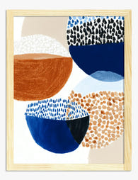
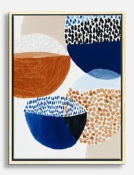
Poster armonia di forme astratte
Translation missing: it.products.product.sale_price A partire da £11.95£19.95 -

Poster minimal in bianco e nero equilibrio armonioso
Translation missing: it.products.product.sale_price A partire da £11.95£19.95 -

Poster armonia a spirale di Hilma af Klint
Translation missing: it.products.product.sale_price A partire da £11.95£19.95 -

Poster colori in spirale
Translation missing: it.products.product.sale_price A partire da £11.95£19.95 -
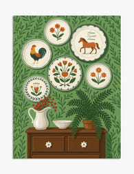
Poster stile folk con piatti decorativi
Translation missing: it.products.product.sale_price A partire da £11.95£19.95 -

Poster flusso neutro in stile scandinavo
Translation missing: it.products.product.sale_price A partire da £11.95£19.95 -
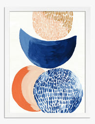
Poster ciotole colorate in stile eclettico
Translation missing: it.products.product.sale_price A partire da £11.95£19.95 -

Tela scala con piante in verde e terracotta
Translation missing: it.products.product.sale_price A partire da £44.95£74.95 -

Poster forme organiche neutre
Translation missing: it.products.product.sale_price A partire da £11.95£19.95 -

Tela linee moderne con arco semicircolare verde e crema
Translation missing: it.products.product.sale_price A partire da £44.95£74.95 -

Poster oasi verde sulla scala
Translation missing: it.products.product.sale_price A partire da £11.95£19.95 -
Tela forme astratte eclettiche
Translation missing: it.products.product.sale_price A partire da £44.95£74.95 -

Tela geometria moderna Bauhaus
Translation missing: it.products.product.sale_price A partire da £44.95£74.95


Di più da The Frame

7 Layout Rules for Vintage London Print Gallery...
A gallery wall of vintage London prints is one of the best ways to add character to a room, but it's also one of the easiest to get wrong. Maps...

Why Portrait Gallery Walls Look Better with Few...
Most gallery wall guides assume you've already chosen your prints. This one starts earlier, at the part where you're staring at hundreds of options and quietly losing your mind. We'll...

You're Overthinking Your Doodle Art Gallery Wall
Doodle prints are the most forgiving art style you can put on a gallery wall. Their casual energy, generous negative space, and hand-drawn imperfection mean small spacing mistakes disappear instead...