Transform Your Kitchen with a Food Gallery Wall That Feels Curated
The difference between a curated kitchen gallery and a cluttered one comes down to six decisions, and most people get them wrong.

Food and drink prints are the most underrated gallery wall subject in the home. They give you instant cohesion (everyone agrees the kitchen is the right place), they invite genuine personality, and they sidestep the "is this art too serious for the room where I make toast" question entirely. The catch is that most kitchen gallery walls end up looking like a Pinterest board exploded onto plasterboard.
Why food and drink prints make surprisingly great gallery walls
Food art has a built-in unifying logic that abstract or landscape prints don't. A botanical illustration of an artichoke, a vintage espresso advert and a moody oil painting of lemons share a subject universe even when they share nothing else. That gives you more freedom to mix styles than you'd get in a lounge gallery wall, where mismatched moods read as chaotic.
Kitchens also tend to have shorter sightlines than living rooms. You're rarely viewing your wall from across a 6-metre room. You're standing at the kettle, three feet away, waiting for it to boil. Food prints reward that closeness, which is exactly what museum-grade giclée printing is built for: sharp detail, real depth, no glare from overhead spots.
There's a practical caveat worth naming early. Kitchens have grease, steam and heat. Don't hang anything directly above a hob or within splash range of a sink. Framed prints with UV-protective acrylic glazing handle ambient kitchen conditions well, and acrylic is safer than glass if it ever takes a knock. Canvas is fine in a breakfast nook or dining area but isn't what we'd choose next to a deep fat fryer.

Choosing a unifying thread: colour palette, era, or medium
The single decision that separates curated from cluttered is your unifying thread. Pick one. Not three. One.
Unite by colour palette
This is the easiest thread to control and the most forgiving. Choose two or three colours that already appear in your kitchen (the cabinetry, the splashback, a recurring tone in your tiles) and only buy prints that work within that palette. A kitchen with sage green cabinets and brass handles wants prints with sage, cream, ochre and warm browns. A monochrome kitchen wants high-contrast black, white and a single accent.
The reason this works is psychological. Your eye reads colour repetition as intent. Five wildly different prints in the same palette look deliberate. Five prints with the same subject in clashing colours look like a charity shop wall.
Unite by era
Pick a decade and stay there. 1950s diner advertising, 1920s French wine labels, 1970s cookbook illustrations. Era-led walls feel like collections, which is exactly the impression you want. The downside is research time. You need to actually look at each print and ask if it belongs.
Unite by medium
All photography. All line drawings. All watercolour. This is the hardest thread to pull off because medium is more subtle than colour or era, but when it works it looks gallery-grade. We'd recommend this approach only if you already have a clear aesthetic in the rest of your kitchen.
Unite by subject
Coffee, only coffee. Citrus, only citrus. A wall of coffee art prints above a coffee station is one of the most satisfying small-wall decisions you can make, and it's almost impossible to mess up because the subject does the unifying work for you.
Three proven gallery wall layouts (with dimensions)
Concept layouts are useless without measurements. Here are three that actually work, with dimensions you can copy.
The 2x3 grid (best for: above a dining table or sideboard)
Six prints, all the same size, arranged in two rows of three. Use 30x40cm prints with 5cm spacing between frames. Total wall footprint: roughly 100cm wide by 85cm tall. This sits beautifully above a 120cm dining table or a 100cm sideboard.
The grid is the most forgiving layout because the structure does the heavy lifting. Even mediocre print choices look composed in a grid. If you've never built a gallery wall before, start here.
The asymmetric anchor (best for: a tall narrow wall or awkward chimney breast)
One large print (60x80cm) positioned slightly left of centre, with three smaller prints (30x40cm) stacked vertically to its right with 5cm spacing. Total footprint: about 105cm wide by 80cm tall.
The anchor draws the eye first, then the smaller prints lead it across the wall. Place the largest print's centre at roughly 150cm from the floor, which puts the visual weight at standing eye level. This layout punches well above its weight in a kitchen because it feels designed, not decorated.
The salon stack (best for: a wide kitchen wall or above a banquette)
Seven prints in mixed sizes: one 50x70cm anchor, two 40x50cm, and four 30x40cm. Arrange them with 5cm to 7cm between frames, with the top edges roughly aligned and the bottom edges varying. Total footprint: around 160cm wide by 100cm tall.
Salon-style is the trickiest of the three because asymmetry is harder than symmetry. The fix is to lay it out on the floor first (more on this below) and to keep your unifying thread strict. Salon walls fail when people see "anything goes" and start adding random prints.

How many prints you actually need (fewer than you think)
Most people overbuy. The optimal number for a kitchen gallery wall is between 3 and 7 prints. We'd push back on anyone going beyond 9.
Here's a working rule:
- Wall under 100cm wide: 3 prints
- Wall 100 to 150cm wide: 4 to 5 prints
- Wall 150 to 200cm wide: 5 to 7 prints
- Wall over 200cm wide: 7 to 9 prints, or split into two smaller groupings
The instinct to fill every inch is the enemy. Negative space (the wall around and between your prints) is what makes the gallery feel curated rather than maximalist. Aim for at least 30cm of clear wall above and below your arrangement.
If you're staring at three prints and feeling like it's "not enough," resist adding a fourth just to bulk it out. A confident trio beats a hesitant five every time. Pre-made wall art sets of three or four are a shortcut here because the curation work is already done.
Frame consistency: why matching frames beats eclectic every time
Eclectic mismatched frames work in maybe one in twenty rooms, and those rooms are usually styled by professionals who know exactly what rule they're breaking. For everyone else, matching frames are the move.
The reason is visual processing. Your brain has to work to parse a wall. Every variable (frame colour, frame width, frame material, mat thickness) is one more thing it has to reconcile. When the frames match, your brain stops processing the frames and starts processing the art. That's the whole point.
Matching frames also create the impression of a collection. A collection looks intentional. A mix of frames you happened to own looks like a mix of frames you happened to own.
For kitchens specifically:
- Black frames for modern, monochrome or industrial kitchens. High contrast, graphic, sharp.
- Solid oak or natural wood for Scandi, farmhouse and country kitchens. Warm, soft, organic.
- White frames for very pale kitchens where black would feel heavy. They recede and let the art lead.
- Metallic (brass or warm gold) for contemporary kitchens with brass hardware. Use sparingly and keep prints simple.
Frame quality matters more than people realise. Cheap frames warp, especially in a room with steam and temperature swings. Solid FSC-certified wood frames with proper fittings hold their shape and arrive ready to hang in one box, fitted properly, no second package, no separate assembly.
Spacing, levelling, and hanging without destroying your wall
This is the section where most gallery walls go wrong, usually because someone got impatient with the drill.
Plan on the floor first
Before any holes, lay your prints out on the floor in the exact arrangement you want. Photograph it from directly above. This is your blueprint. Adjust until you genuinely like it, not until you're sick of looking at it.
Use kraft paper templates
Cut paper rectangles to the exact dimensions of each frame. Tape them to the wall with masking tape. Step back. Live with it for a day if you can. This is the single highest-value step in the whole process and almost everyone skips it.
Mark the hanging point on each paper template (measure from the top of your frame to the hanging fixture, then transfer that measurement to the paper). When you're happy, drive your fixings through the paper, then tear it away.
Spacing measurements that work
- Between frames: 5cm to 7cm. Tighter than 5cm and the wall reads as one chunky block. Wider than 8cm and the prints stop feeling related.
- Above furniture: 15cm to 20cm between the bottom of your lowest frame and the top of any furniture below. Closer feels cramped, further looks disconnected.
- Hanging height: the visual centre of your arrangement should sit at roughly 145cm to 150cm from the floor for a standard kitchen. If you're hanging above a dining table or counter, anchor instead to the furniture (15 to 20cm above the surface).
Levelling
Use a spirit level on every frame. Phone apps are not accurate enough. If you have a long stretch of grid layout, a laser level (the cheap ones are fine) saves a lot of squinting.

The gallery walls we'd build from our food and drink collection
Three specific groupings we'd actually live with, drawn from the food and drink art prints collection.
The Italian trattoria wall
Three 40x50cm prints in matte black frames. A vintage pasta advertisement, a moody still life of tomatoes on the vine, and a hand-drawn lemon study. Unifying thread: warm reds, ochres and deep greens. Hang above a small dining nook or a coffee station. Total footprint: 130cm wide.
This is the easiest food themed wall art inspiration to copy because the palette does almost all the work and three prints is impossible to over-arrange.
The Sunday morning coffee corner
Four 30x40cm prints in oak frames, arranged in a 2x2 grid. Espresso cups, a cafetière study, a vintage roastery label, and a typographic coffee print. Unifying thread: cream, brown and warm black. Hang directly above a coffee machine or beverage cart with the bottom edge 20cm above the work surface.
A grid of coffee art prints is one of the cleanest kitchen wall decor ideas food lovers can execute, and it scales beautifully into smaller kitchens where you don't have a big wall to fill.
The seasonal market salon
Seven prints in mixed sizes, all in white frames, salon-style. One 50x70cm anchor (a vibrant produce market scene), three 30x40cm (citrus, herbs, stone fruit), and three 20x30cm (small botanical studies). Unifying thread: bright, sun-bleached colour photography. Best on a long wall above a banquette or in a breakfast room.
For more directly food art for kitchen ideas in this style, the broader kitchen art prints collection has the building blocks for variations on the same theme.

A final word
The difference between a gallery wall that looks curated and one that looks cluttered is restraint, not budget. Pick one unifying thread. Use matching frames. Lay it out on the floor before you drill. Hang fewer prints than you think you need, with more space between them than feels natural at first.
Do those four things and the wall will look like you knew what you were doing, even if this is the first time you've ever built one.

Prodotti Fab presentati in questo blog
-

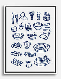
Tela con utensili e ingredienti da cucina illustrati
Translation missing: it.products.product.sale_price A partire da £44.95£74.95 -

Tela ingredienti da cucina giocosi
Translation missing: it.products.product.sale_price A partire da £44.95£74.95 -

Tela cucina moderna con linee giocose
Translation missing: it.products.product.sale_price A partire da £44.95£74.95 -

Poster cucina con ingredienti e utensili illustrati
Translation missing: it.products.product.sale_price A partire da £11.95£19.95 -
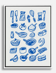
Tela cucina blu con disegno a linee di utensili e ingredienti
Translation missing: it.products.product.sale_price A partire da £44.95£74.95 -

Tela scena conviviale in cucina
Translation missing: it.products.product.sale_price A partire da £44.95£74.95 -
Poster collezione di cibi in stile giocoso
Translation missing: it.products.product.sale_price A partire da £11.95£19.95 -

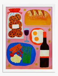
Tela tavola conviviale su sfondo rosa
Translation missing: it.products.product.sale_price A partire da £44.95£74.95 -

Poster celebrazione del cibo in colori vivaci
Translation missing: it.products.product.sale_price A partire da £11.95£19.95 -

Tela elementi essenziali della cucina in blu
Translation missing: it.products.product.sale_price A partire da £44.95£74.95 -

Poster ingredienti di cucina illustrati ad acquerello
Translation missing: it.products.product.sale_price A partire da £11.95£19.95 -

Tela cucina con vista città
Translation missing: it.products.product.sale_price A partire da £44.95£74.95 -

Poster cucina conviviale e vivace
Translation missing: it.products.product.sale_price A partire da £11.95£19.95 -

Tela cucina colorata con finestra sulla città
Translation missing: it.products.product.sale_price A partire da £44.95£74.95 -

Tela per cucina Good Food, Good Mood con cuori
Translation missing: it.products.product.sale_price A partire da £44.95£74.95 -

Poster cucina allegra e luminosa
Translation missing: it.products.product.sale_price A partire da £11.95£19.95 -

Tela scena di cucina conviviale e colorata
Translation missing: it.products.product.sale_price A partire da £44.95£74.95 -
Tela cucina con disegni blu di utensili e ingredienti
Translation missing: it.products.product.sale_price A partire da £44.95£74.95 -

Tela natura morta festosa per cucina e sala da pranzo
Translation missing: it.products.product.sale_price A partire da £44.95£74.95 -

Poster cucina moderna vivace
Translation missing: it.products.product.sale_price A partire da £11.95£19.95


Di più da The Frame

The Abstract Tree Art Edit: 12 Curated Picks fo...
Tree art has a reputation problem. For years it's been associated with rustic cabins, woodland nurseries, and the kind of soft botanical prints that whisper "country kitchen." But abstract tree...

Going Big: How to Use Large Vintage Sea Art Pri...
A large vintage seascape does something a cluster of small prints never can: it stops you at the doorway. The trick is choosing the right print, hanging it at the...

Why Matching Frames Make Botanical Gallery Wall...
Botanical gallery walls have a higher failure rate than almost any other style. Too many leaf varieties, mismatched frames, and guesswork spacing turn what should feel like a calm indoor...