What Interior Stylists Know About Fruit Art in Kitchens
How to style citrus, figs, and botanical fruit prints in your kitchen without ending up with a café menu on the wall.

Fruit art in kitchens is one of those decorating choices that goes wrong more often than it goes right. The difference between a kitchen that feels considered and one that looks like a Tuscan-themed restaurant from 2003 comes down to subject, scale, framing, and placement. Here's how to get all four right.
Why fruit art and kitchens are a natural pairing
Fruit has been a staple of still life painting since the 16th century, partly because it's beautiful and partly because it's a visual shorthand for abundance, hospitality, and the daily ritual of eating. Hanging a lemon print or a fig study in a kitchen isn't kitsch. It's continuing a tradition that runs from Dutch Golden Age painters to Cézanne.
The trick is choosing fruit art that earns its spot on the wall rather than just decorating the theme of the room. A good fruit print should hold up as art first and as kitchen art second. If you'd happily hang it in your hallway, it's probably right for your kitchen too.
There's also a practical case. Kitchens tend to be visually busy: cabinets, appliances, utensils, tiles, the lot. A single strong fruit print acts as a visual full stop, giving your eye somewhere to rest amid the chaos.

The best wall spots in a kitchen (and the ones to avoid)
The safest, most rewarding walls in any kitchen are the ones furthest from heat and water. Think of your kitchen as having three zones: the wet zone (around the sink and dishwasher), the hot zone (around the hob and oven), and everywhere else. Everywhere else is where your art lives.
Best spots:
- Above a breakfast bar or kitchen island, on the wall the seating faces
- The wall above a dining nook or banquette
- The end wall of a galley kitchen, treated as a focal point
- Above open shelving (provided the shelf isn't directly above the hob)
- The wall opposite the cooking zone, where you'll see the art while you work
Spots to avoid:
- Directly above the hob or within about 90cm of it (grease and heat will find their way to anything close)
- The splashback area behind the sink
- The wall directly above a kettle or coffee machine that produces steam at head height
- Any wall that gets blasted with direct afternoon sun through an uncovered window, unless your prints have proper UV protection
A useful rule: if you wouldn't want a paperback book sitting on that wall for a year, don't put art there either.
Choosing the right size: small kitchens vs open-plan spaces
Size is where most people go wrong. Kitchen art tends to be hung too small, leaving prints floating awkwardly between cabinets like postage stamps on a wall.
The general principle is that your art should fill roughly two-thirds of the available wall width. In a kitchen, "available wall" usually means the space between two cabinets, between a cabinet and a window, or above a worktop run.
Galley kitchens and small rentals: A single 30x40cm or 40x50cm framed print works on the end wall. If you have a narrow strip between wall cabinets and worktop (typically 45 to 60cm of vertical space), a horizontal A3 print at around 30x40cm fits beautifully.
L-shaped and standard kitchens: Step up to 50x70cm for breakfast bar walls or above a console. This is the sweet spot for most UK kitchens.
Open-plan kitchens with islands: Go bigger than feels comfortable. 70x100cm or even a canvas at 100x150cm holds its own against the volume of an open-plan space. Anything smaller will look apologetic.
Breakfast nooks: Treat this like a dining area. A 60x80cm or 70x100cm print centred above the table works, or a pair of 40x50cm prints if you want symmetry.
For gallery walls in kitchens, less is more. Three prints maximum, and only if your kitchen has clean, simple cabinetry to balance the busyness. In a kitchen with patterned tiles or open shelving full of crockery, stick to one statement piece.
Citrus, tropical, or botanical? Matching fruit subjects to your kitchen style
Not all fruit art reads the same way. A vintage botanical illustration of a pear sends a very different signal than a graphic, sun-soaked print of sliced oranges. Match the subject to your kitchen's existing personality.
Citrus prints
Lemons, oranges, and limes are the workhorses of kitchen art. They read fresh rather than fussy and pair beautifully with most modern kitchens. Lemon art prints in particular tend to work in white, sage, navy, and pale blue kitchens. They're also forgiving in north-facing rooms because the yellow brings warmth that the light doesn't.
Style match: Modern, coastal, Mediterranean-inspired, Hamptons, Scandi with a warm twist.
Tropical fruit
Pineapples, figs, pomegranates, dragon fruit. These have more drama and work best where they can be the main event. They suit darker, moodier kitchens with deep green or navy cabinets, brass fixtures, and a slightly maximalist sensibility.
Style match: Maximalist, dark and moody, Art Deco, eclectic.
Vintage botanical illustrations
These read more library than kitchen, which is exactly why they work in kitchens that want to feel less themed. A 19th-century-style illustration of an apple or a quince has the same energy as a framed map: educational, considered, quietly handsome. Browse botanical art prints for this look.
Style match: Farmhouse, English country, traditional, period properties, shaker kitchens.
Modern graphic fruit
Bold, flat-colour prints with strong silhouettes. These need a relatively pared-back kitchen to land properly. In a busy kitchen they fight for attention; in a minimal kitchen they bring it to life.
Style match: Modern minimalist, Scandi, mid-century.

Frame colours that work with common kitchen finishes
Frame choice in a kitchen is half practical, half aesthetic. The frame needs to relate to your hardware, your cabinets, and your overall finish palette.
White cabinets, chrome hardware: Black frames give crisp contrast. White frames disappear into the wall (sometimes good, sometimes too safe). Natural oak frames warm everything up.
White cabinets, brass hardware: Natural oak or walnut frames pick up the warmth of the brass. Avoid silver or chrome-tone frames as they fight the hardware.
Sage green, navy, or deep green cabinets: Black frames work universally. Natural oak adds softness. Avoid white frames, which can look clinical against rich cabinet colours.
Wood or wood-effect cabinets: Black frames give definition. Match-wood frames disappear (which can be intentional if you want the art to feel architectural).
Concrete, grey, or industrial finishes: Black frames or natural oak. Steer clear of ornate frame profiles.
A simple rule that rarely fails: pick a frame colour that matches either your darkest cabinet element or your hardware. That gives the print a reason to be there.
If you're unsure, default to a slim black frame. It's the little black dress of kitchen art and it works against almost any backdrop. The frames on Fab prints are solid FSC-certified wood (no MDF or veneer), which matters in a kitchen because cheap composite frames will swell and warp in humid conditions within a year or two.
Dealing with steam, grease, and sunlight: why framing matters here
This is where most kitchen art advice goes vague. "Use durable materials" doesn't tell you anything. Here's what actually matters.
Steam and humidity
The enemy of any framed print is moisture getting between the glazing and the paper. Once that happens you get rippling, foxing (those brown spots), and eventually mould. The fix is a properly sealed frame with the print mounted correctly, not floating loose inside the moulding.
Acrylic glazing has a real advantage over glass in kitchens. It doesn't shatter if it falls, it weighs significantly less (which matters for command strips and adhesive hooks in rentals), and it doesn't fog in the same way glass does when temperatures swing. Fab's framed prints use UV-protective acrylic glaze rather than glass.
Grease
Grease is the silent killer of kitchen surfaces. It settles invisibly on everything within a few metres of cooking. The solution is twofold: keep art out of the direct splash and aerosol range (about 90cm minimum from the hob), and choose a glazed print rather than a bare canvas in heavy-cooking households.
For cleaning, a microfibre cloth lightly dampened with water handles 95% of kitchen grime on acrylic glazing. For heavier grease, a tiny amount of washing-up liquid in warm water on the cloth (not sprayed directly onto the frame) works well. Never use glass cleaner on acrylic, it can craze the surface. Wipe the frame down every few weeks rather than waiting until it visibly needs it.
Sunlight
South-facing kitchens are gorgeous but brutal on art. Standard inks fade within a year or two in direct sunlight. UV-protective glazing combined with archival pigment inks is what you actually need. Fab uses museum-grade giclée printing with inks rated to last hundreds of years even in direct sunlight, paired with UV acrylic. That combination is what makes art viable on a bright kitchen wall.
Can you hang canvas in a kitchen?
Yes, with caveats. Canvas is lighter than framed prints and handles humidity surprisingly well because there's no glazing to trap moisture. It's a good choice for kitchens with a lot of steam (think kettles and pasta water) but a lower-cooking-volume household. In a heavy-frying kitchen, glazed prints win because canvas can't be easily wiped clean of cooking grease over time.

Three real kitchen layouts with specific fruit art recommendations
Layout 1: Narrow galley kitchen in a rental flat
You have two long walls of cabinets and a single end wall, usually with a window or a door. Your art goes on the end wall.
Recommendation: One 40x50cm or 50x70cm framed print, hung at eye level (centre of the print roughly 145cm from the floor). A single lemon or lime print in a black frame works beautifully here, especially if your cabinets are white or pale grey. Use heavy-duty command strips if you can't drill, and avoid hanging directly opposite the hob to keep grease exposure minimal.
Browse kitchen art prints sized for tight spaces.
Layout 2: L-shaped kitchen with breakfast bar in a 1930s semi
You have a worktop run along two walls and a peninsula or breakfast bar. The best wall is usually the one your breakfast bar faces, or the chimney breast if you have one.
Recommendation: A single 60x80cm framed botanical print on the chimney breast, or a pair of 40x50cm prints flanking a window. Natural oak frames warm up white or cream cabinets. If your kitchen has brass hardware, lean into vintage botanical illustrations of pears, apples, or figs. Hang the centre of each print at 150cm from the floor for standing eye level, since you're usually moving through this space rather than sitting in it.
Layout 3: Open-plan kitchen-diner with island
You have a large kitchen that flows into a dining area, with several metres of uninterrupted wall. This is where most people hang art too small.
Recommendation: One large statement piece, ideally 70x100cm framed or a 100x150cm canvas, on the longest uninterrupted wall (often the dining-side wall opposite the kitchen). A tropical fruit study, a large-scale citrus piece, or a botanical illustration scaled up to poster size all work. The art needs to compete with the visual mass of the kitchen, so don't be precious about size. If the wall is over 3 metres wide, you can run a trio of 50x70cm prints in matching frames spaced 8 to 10cm apart.
For seating areas specifically, drop the hanging height to 140cm centre, since you'll be sitting more often than standing here. Explore the full fruit art prints collection for pieces sized for open-plan walls.

A note on seasonal rotation
One of the quiet pleasures of kitchen art is that it's easy to swap. Unlike a sofa-facing gallery wall in a living room, kitchen art tends to be smaller and lighter, which makes rotation realistic.
Some stylists keep two or three prints in circulation: bright citrus for spring and summer, deeper fruits (figs, pomegranates, plums) for autumn, and a vintage botanical that holds up year-round for winter. Store the off-season prints flat in their original packaging or behind a wardrobe. It's a small ritual that keeps the kitchen feeling considered without requiring a full redecoration.
Pick the wall first, measure it properly, then choose the print. Most kitchen art mistakes are made in the other order.

Prodotti Fab presentati in questo blog
-

Poster tavola di frutta vintage
Translation missing: it.products.product.sale_price A partire da £11.95£19.95 -

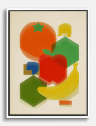
Poster frutta pop art
Translation missing: it.products.product.sale_price A partire da £11.95£19.95 -
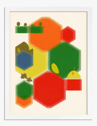
Poster geometrie di frutta moderne
Translation missing: it.products.product.sale_price A partire da £11.95£19.95 -

Tela natura morta con frutta al sole
Translation missing: it.products.product.sale_price A partire da £44.95£74.95 -

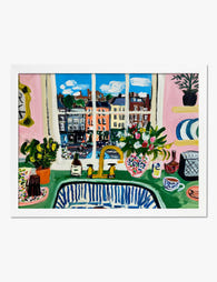
Poster cucina con vista sul mare ispirato a Matisse
Translation missing: it.products.product.sale_price A partire da £11.95£19.95 -
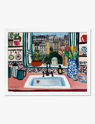
Poster scena di cucina ispirato a Matisse
Translation missing: it.products.product.sale_price A partire da £11.95£19.95 -

Poster William Morris Four Fruits
Translation missing: it.products.product.sale_price A partire da £11.95£19.95 -

Poster natura morta in cucina con pomodori, luce del mattino
Translation missing: it.products.product.sale_price A partire da £13.99£19.99 -

Poster arance pop art
Translation missing: it.products.product.sale_price A partire da £13.99£19.99 -
Poster vista di Parigi dalla cucina
Translation missing: it.products.product.sale_price A partire da £11.95£19.95 -

Poster natura morta agrumi e fiori
Translation missing: it.products.product.sale_price A partire da £13.99£19.99 -

Poster tavola della colazione minimalista in bianco e nero
Translation missing: it.products.product.sale_price A partire da £11.95£19.95 -

Poster crostata di frutta
Translation missing: it.products.product.sale_price A partire da £11.95£19.95 -
Tela forme di frutta colorate e moderne
Translation missing: it.products.product.sale_price A partire da £44.95£74.95 -

Poster motivo Fruit di William Morris con frutti e foglie
Translation missing: it.products.product.sale_price A partire da £11.95£19.95 -

Poster mele e agrumi di Renoir
Translation missing: it.products.product.sale_price A partire da £13.99£19.99 -

Poster natura morta di agrumi con vaso a righe
Translation missing: it.products.product.sale_price A partire da £13.99£19.99 -

Poster mercato della frutta retrò
Translation missing: it.products.product.sale_price A partire da £11.95£19.95 -

Poster natura morta in cucina assolata
Translation missing: it.products.product.sale_price A partire da £13.99£19.99


Di più da The Frame

What to Hang in Awkward Corners
Corners are the dead zones of most homes. Your eye skims past them, furniture refuses to sit flush against them, and you end up with a triangular patch of wall...

Art for Narrow Walls and Hallways
Narrow walls are the most under-decorated surfaces in most homes. Not because they're hard to style, but because most advice treats every awkward space as the same problem when really...

What to Put on a Big Blank Wall
Big blank walls feel impossible because they multiply your options instead of narrowing them. Every idea seems plausible, nothing feels right, and the wall stays empty for another six months....