The 10 Most Famous William Morris Designs and the Stories Behind Them
The garden thrushes, dining room walls, and quiet politics behind the patterns that refuse to go out of style.

Most people can recognise a William Morris pattern at fifty paces without knowing why. The trick of his work is that it feels familiar even on first sight, like a hedgerow you walked past as a child. This guide walks through the patterns worth knowing, where each one came from, and how to actually choose between them when you're picking something for your own wall.
A quick introduction to Morris and the Arts and Crafts movement
William Morris (1834-1896) was a designer, poet, printer, and committed socialist who spent most of his working life trying to undo what he saw as the damage of industrial mass production. He founded Morris & Co. in 1861 with a group of friends including Edward Burne-Jones and Dante Gabriel Rossetti, originally as Morris, Marshall, Faulkner & Co. The firm made furniture, stained glass, textiles, and wallpapers, all designed and produced with a level of craftsmanship the Victorian factory system had largely abandoned.
The Arts and Crafts movement grew out of this work. Its core idea was simple: ordinary objects should be beautifully made by people who enjoyed making them. Morris hated the idea of cheap goods churned out by miserable workers for buyers who didn't care. His designs were, in a real sense, political objects. The fact that they ended up decorating the country houses of the wealthy was an irony he was painfully aware of.
He worked across nearly four decades, and his style evolved significantly. Early patterns like Trellis (1862) and Daisy (1864) are flatter, sparser, almost medieval. By the 1870s and 80s, his designs become denser and more confident, with the layered foliage and rhythmic structures that define the work most people picture when they hear his name.

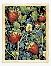
Strawberry Thief: the story of Morris's thrushes
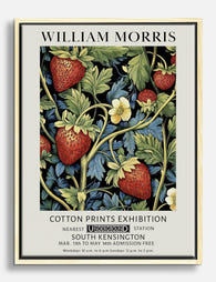
Strawberry Thief (1883) is the pattern almost everyone recognises, and it has a real biographical backstory. Morris designed it after watching song thrushes raid the strawberry beds at Kelmscott Manor, his country house on the upper Thames. Rather than scaring the birds off, he had them immortalised, complete with the stolen berries in their beaks.
The technical achievement is what made it famous in his lifetime. Morris used the indigo-discharge printing method, which involved dyeing the cotton blue, then bleaching out the pattern, then over-printing other colours on top. Each length took roughly three days to produce, with a separate carved woodblock for every shade. The result is a depth of colour, particularly in the indigo background, that synthetic reproductions struggle to match.
It became Morris & Co.'s most expensive printed textile, which Morris (the socialist) found genuinely funny and slightly distressing. He'd hoped it would be affordable. It wasn't.
Where it works on a wall
Strawberry Thief is a dense, dark, busy pattern. It rewards close looking. We think it works best in rooms that are otherwise calm: a plain bedroom with white linen, a hallway with painted woodwork, a dining room with a plain table. Don't hang it alongside other busy patterns. Give it the wall and let it do the work.
A William Morris print of Strawberry Thief at 50x70cm sits well above a bed or sideboard. Go larger, 70x100cm, if you've got a high ceiling or a long expanse of wall to fill.
Pimpernel: why this underrated design deserves wall space
Pimpernel (1876) is the pattern Morris chose for the walls of his own dining room at Kelmscott House in Hammersmith, where he lived from 1878 until his death. That alone should tell you something. Of every pattern he ever designed, this is the one he wanted to look at while he ate.
The pattern's name is worth pausing on. The scarlet pimpernel is a tiny, modest wildflower that opens only in sunshine and closes at the first sign of rain. The pattern itself features bold tulips and flowing acanthus leaves, with the pimpernel almost hidden between them. Morris named it for the smallest, humblest plant in the composition. This was consistent with his politics. He repeatedly chose names that honoured common, overlooked things rather than the showy elements that would have made a better marketing line.
A Pimpernel print works particularly well in rooms where you spend time sitting still. Dining rooms, studies, reading corners. The pattern has movement but no urgency. It's a slow design, made for slow rooms.
Willow Bough, Acanthus, and the green designs that define Morris
Morris produced a whole family of green-dominated patterns that have become the default mental image of his work.
Willow Bough (1887) is the gentlest. It's just willow leaves, repeated in a soft rhythm, with no flowers or birds. Morris loved willows. The Thames at Kelmscott is lined with them. It's the pattern to pick if you want Morris's structure without his density. Willow Bough is genuinely calming in a way most of his other designs are not.
Acanthus (1875) is the opposite. Huge, sculptural acanthus leaves in deep green, ochre, and burgundy, layered so heavily the background almost disappears. It was one of the first wallpapers Morris printed using thirty separate woodblocks. It's a maximalist's pattern and looks magnificent in a high-ceilinged room with proper architectural bones.
Bay Leaf, Larkspur, and Fruit (also called Pomegranate) sit somewhere between these two poles. All use the same plant-based dye palette: madder root for the reds, weld for the yellows, indigo for the blues. These natural pigments read differently than synthetic colour reproductions. They're warmer, slightly chalkier, and they sit together harmoniously in a way modern colour mixes often don't.
If you're decorating a smaller room, Willow Bough or Bay Leaf will give you Morris without overwhelming you. If you've got a big wall and want to commit, Acanthus is the move. Browse more in our floral art prints collection to see how these sit alongside other botanical work.

The bird and animal patterns: Peacock and Dragon, Bird, and beyond
Morris's bird and animal patterns are some of his strangest and most rewarding designs.
Peacock and Dragon (1878) is a heavy woven wool fabric pattern that Morris used in his own drawing room. The peacocks and dragons face each other in mirrored pairs, locked into a symmetrical grid that feels distinctly medieval. It was directly influenced by what Morris called the "treasures from the East", the Persian, Turkish, and Indian textiles he studied obsessively at the South Kensington Museum (now the V&A).
Bird (1878) is a woollen double cloth that hung in the drawing room at Kelmscott House. It's calmer than Peacock and Dragon, with smaller birds repeated in soft heraldic poses. As a print on a wall, it reads almost as a portrait of birds, intimate and quiet.
Brer Rabbit (1882), also called Bro'er Rabbit, features rabbits and birds among foliage. It was inspired by the Uncle Remus stories Morris's daughters loved.
These designs suit different rooms than the floral patterns. They have stronger graphic structure and work well in hallways, studies, and rooms with darker walls. You can see more in our bird art prints collection.
Morris's lesser-known designs that deserve more attention
The famous patterns get the attention, but Morris produced over fifty designs and several of the lesser-known ones are arguably more interesting to live with.
Snakeshead (1876) is named after the fritillary, a delicate spring wildflower with chequered purple petals that grows in damp meadows. The pattern is sparser than most of his work, with the flowers floating against a quieter background. It's a good pick if you love Morris but find the dense patterns too much.
Compton (1896) was one of Morris's last designs, completed shortly before his death and finished by John Henry Dearle, his long-serving studio assistant who often gets less credit than he deserves. Compton is huge, ambitious, and layered, with flowers and foliage at multiple scales. It's a statement pattern.
Honeysuckle (1876) was designed by Morris's daughter May Morris, who took over the embroidery department at Morris & Co. at age 23. May was a serious designer in her own right, and her work has been quietly overlooked for over a century. Honeysuckle has a looser, more naturalistic quality than her father's tighter patterns.
Trellis (1862) was Morris's very first wallpaper, designed for his own home, the Red House. The birds were drawn by his friend Philip Webb because Morris didn't yet feel confident drawing them himself. It's sparse, almost shy, and very different from the dense patterns to come.
These lesser-known designs are often the smarter pick for modern homes. They give you the Morris language without the weight, and they avoid the slightly inevitable feeling that comes with the most reproduced patterns. Our nature art prints collection is a good place to explore quieter botanical work in the same family.

Why these patterns have outlasted every interior trend since the 1860s
Morris designed for the long view, and it shows. His patterns have outlasted Art Nouveau, Art Deco, mid-century modern, Scandi minimalism, and the current maximalist revival. Every couple of decades, someone announces that Morris is back. He never really left.
There are a few reasons for this. The patterns are structurally sound. Morris understood repeat design as a mathematical problem as well as an artistic one, and his patterns flow without visible seams, which is harder than it looks. The natural dye palette ages well because it was never trend-coded to begin with. Madder red and indigo blue don't go out of fashion the way a specific Pantone of the year does.
There's also the sheer density of his designs, which makes them surprisingly compatible with modern interiors. A Morris pattern can hold its own against very plain, minimal furniture. Put a dense Strawberry Thief print on a wall above a flat-fronted, handle-less sideboard and the contrast works.
Recent fashion collaborations with major design houses have brought the patterns back into mainstream visual culture, which has helped a new generation discover them. The trick to using them now is to avoid the heritage gift shop look. One large statement print on a plain wall reads as contemporary. Six small Morris prints in matching gilt frames on floral wallpaper reads as a tea room.
How to choose between them: a practical cheat sheet
If you're trying to decide which pattern actually belongs in your home, here's how we'd think about it.
For a small room with plain walls: Willow Bough, Snakeshead, or Trellis. They have air in them. They don't compete with the room.
For a busy living room with lots going on: A single large statement print works better than several smaller ones. Strawberry Thief or Pimpernel at 70x100cm above a sofa, plain frame, nothing else on that wall.
For a dining room: Pimpernel, because Morris himself made the same call. Acanthus also works if you've got the ceiling height.
For a bedroom: Willow Bough or Bird. Quiet patterns that don't ask anything of you when you're tired.
For a hallway: Peacock and Dragon or Brer Rabbit. Strong graphic patterns that read at a glance as you walk past.
For a study or reading corner: Strawberry Thief or Compton. Patterns that reward close looking, which is what you're doing when you sit still in a chair for two hours.
On framing: oak and walnut frames are the natural pairing for Morris's warm palette. Black frames work for the bird and animal patterns where the graphic structure is doing the heavy lifting, but they can fight with the floral designs. Avoid silver or chrome. They were not invented for this purpose.

One last note worth knowing. Morris's designs are now in the public domain, which means you'll find versions of them everywhere at every quality level. The cheap reproductions tend to lose the depth of the indigo-discharge backgrounds and flatten the colour relationships Morris spent years perfecting. The original patterns were printed slowly, on good paper, with real attention to colour. If you're going to live with one for a decade, it's worth giving it the same treatment now. Pick the pattern that genuinely speaks to your room, print it large enough to do justice to the detail, and frame it properly. Morris would have approved of the care, even if he'd have raised an eyebrow at the price.

Prodotti Fab presentati in questo blog
-

Poster William Morris Strawberry Thief - il ladro di fragole
Translation missing: it.products.product.sale_price A partire da £11.95£19.95 -

Poster Strawberry Thief di William Morris
Translation missing: it.products.product.sale_price A partire da £11.95£19.95 -

Poster Strawberry Thief di William Morris
Translation missing: it.products.product.sale_price A partire da £11.95£19.95 -

Tela 'Strawberry Thief' di William Morris
Translation missing: it.products.product.sale_price A partire da £44.95£74.95 -

Tela 'Strawberry Thief' di William Morris
Translation missing: it.products.product.sale_price A partire da £44.95£74.95 -

Tela Strawberry Thief di William Morris
Translation missing: it.products.product.sale_price A partire da £44.95£74.95 -

Poster fragole vintage in stile William Morris
Translation missing: it.products.product.sale_price A partire da £11.95£19.95 -

Poster motivo Fruit di William Morris con frutti e foglie
Translation missing: it.products.product.sale_price A partire da £11.95£19.95 -

Poster Strawberry Fields di William Morris
Translation missing: it.products.product.sale_price A partire da £11.95£19.95 -
Poster fragole vintage ispirato a William Morris
Translation missing: it.products.product.sale_price A partire da £11.95£19.95 -
Tela fragole botaniche di William Morris
Translation missing: it.products.product.sale_price A partire da £44.95£74.95 -

Poster giardino di frutta di William Morris
Translation missing: it.products.product.sale_price A partire da £11.95£19.95 -

Tela uccellino tra le fragole ispirata a William Morris
Translation missing: it.products.product.sale_price A partire da £44.95£74.95 -

Tela fragole e foglie di William Morris
Translation missing: it.products.product.sale_price A partire da £44.95£74.95 -

Tela motivo a frutti di William Morris
Translation missing: it.products.product.sale_price A partire da £44.95£74.95 -

Poster botanico con uccello ispirato a William Morris
Translation missing: it.products.product.sale_price A partire da £11.95£19.95 -

Poster botanico con uccelli ispirato a William Morris
Translation missing: it.products.product.sale_price A partire da £11.95£19.95 -

Tela con motivo floreale in stile William Morris
Translation missing: it.products.product.sale_price A partire da £44.95£74.95 -

Poster botanico con uccelli, ispirato a William Morris
Translation missing: it.products.product.sale_price A partire da £11.95£19.95 -

Poster motivo botanico ispirato a William Morris
Translation missing: it.products.product.sale_price A partire da £11.95£19.95


Di più da The Frame

7 Ways to Style William Morris Tree Prints in Y...
Tree of Life. Woodpecker. The towering, tangled branches that made Morris famous. These prints have a vertical pull and a visual density that other Morris designs don't, which means hanging...

Why Art Prints Make the Most Meaningful Housewa...
Most housewarming gifts get consumed, regifted, or shoved in a cupboard within a month. Art does something different. It hangs on a wall in the new home for years, quietly...

Hosting at Christmas: Three Small Changes That ...
Most Christmas hosting advice asks you to do too much. You don't need a complete seasonal overhaul, you need your rooms to feel finished. The difference between a space that's...