Yellow Botanical and Flower Prints: The Timeless Subject That Works Everywhere
Why florals in yellow feel current rather than chintzy, and how to style them so they actually look considered.

Botanical art has been hanging on walls for over four centuries, and yellow flowers have been the quiet star of the genre for almost as long. The reason is simple: yellow florals carry warmth without weight, and botanical subjects feel grounded without ever feeling fussy. Done well, they're the rare wall art that works in a Georgian terrace, a new-build flat, or a kitchen extension with equal confidence.
Why yellow botanicals and flower prints never really go out of style
Yellow occupies a strange and useful place in interior design. It reads as warmth, optimism and morning light, but unlike orange or red it doesn't dominate a room. Pair that with botanical subject matter, which has been considered timeless since the earliest scientific illustrations of the 1600s, and you get something genuinely trend-proof.
The reason floral prints in yellow age so well is that they reference nature rather than a particular decade. A sunflower study or a tulip illustration doesn't lock you into a style era the way an abstract from a specific design movement might. You can hang the same print above a mid-century sideboard or a freshly plastered cottage wall and it earns its place in both.
There's also a practical psychology at play. Yellow tones reflect light, which makes them ideal for rooms that don't get a flood of natural sun. A pale buttery yellow in a north-facing dining room does what no spotlight can: it tricks the space into feeling brighter without overwhelming it. That's why yellow art prints are so often recommended for rooms that need lifting rather than calming.

Vintage vs modern botanical illustration: which suits your space
Botanical art splits broadly into two camps, and knowing which you're drawn to saves a lot of indecision. Vintage botanical illustrations, the kind associated with 18th and 19th century scientific journals, are detailed, layered and slightly muted. They typically feature a single specimen with roots and seed heads visible, often labelled in handwritten Latin, on aged ivory or parchment-coloured backgrounds.
Modern botanicals strip most of that away. You're looking at clean line work, blocks of flat colour, generous negative space and a sense of restraint. The yellow is usually purer, the composition more graphic, and the overall effect calmer.
How to tell which suits your home
If your interiors lean traditional, layered or maximalist (think antique rugs, brass fittings, lots of books), vintage botanical illustrations sit naturally. The detail rewards close looking, and the aged backgrounds soften busy walls.
If your space is more pared back (white walls, oak floors, simple linen, a few well-chosen objects), modern minimalist botanicals are the smarter call. They give you the warmth of yellow and the softness of a floral subject without competing with the discipline of the rest of the room. Both styles sit happily within our botanical art prints collection, and we'd argue the worst thing you can do is mix them in the same arrangement. Pick a lane.
The most popular yellow flower subjects (sunflowers, ranunculus, and beyond)
Not all yellow flowers read the same on a wall. The species you choose carries a tone, and matching it to the room is the difference between a print that disappears into the background and one that becomes the thing guests comment on.
Sunflowers are the most casual of the lot. They're generous, friendly and slightly rustic, which makes them perfect for kitchens, garden rooms and family spaces. They don't suit a formal dining room, and they don't pretend to.
Ranunculus are the sophisticated cousin. The layered petals and softer yellows feel more refined, particularly in modern illustration styles. They sit beautifully in bedrooms, dressing areas and quieter corners of a living room.
Tulips are graphic and architectural. A single tulip stem on a clean background reads almost like a piece of mid-century design, and they pair particularly well with contemporary furniture.
Daffodils carry a specific seasonal energy (early spring, fresh starts) which can be either charming or limiting depending on whether you want art that feels evergreen. We'd lean towards them for hallways and entryways rather than main living spaces.
Marigolds and mimosa are the underused choices. Marigolds bring a deeper, warmer yellow that works well in rooms with terracotta or burnt orange accents. Mimosa, with its tiny clustered blooms, has a delicacy that suits softer, more romantic interiors.
Styling yellow botanicals as a pair or set of three
Single prints work, but yellow botanicals genuinely come into their own in pairs and trios. There's something about the repetition that turns a piece of art into a deliberate design moment.
The pair
Two prints side by side is the most forgiving formula in wall art. Hang them at the same height, with roughly 5 to 10cm of space between them, and centre the pair on whatever sits below (a sofa, a bed, a console). For a pair, we like prints that are clearly related but not identical: two different flowers in the same illustration style, or the same flower at two different stages.
A vertical stack of two works equally well in narrow spaces, particularly between windows or beside a doorway. Keep the same gap (5 to 10cm) and align them precisely on a vertical axis. This arrangement draws the eye up, which is useful in rooms with low ceilings.
The set of three
Three prints introduces rhythm. The classic arrangement is horizontal, equally spaced, with all three the same size. For botanicals, we'd suggest 40x50cm or 50x70cm prints, framed, hung 6 to 8cm apart.
If you want something less symmetrical, try one large central print flanked by two smaller ones. The eye reads this as a deliberate composition rather than a row, and it gives you more flexibility on the wall behind a sofa or sideboard. Pre-arranged wall art sets take the guesswork out of this entirely, since the proportions and palette are already balanced.

Building a gallery wall around yellow flower prints
A gallery wall is where most people get stuck, partly because there's a lot of bad advice about doing it "organically." Organic gallery walls usually look like clutter. Considered ones look like a magazine.
The trick with yellow botanicals is to use one as your anchor. Pick the largest piece (60x80cm or 70x100cm works well as an anchor) and treat it as the gravitational centre. Everything else arranges around it.
Mixing yellow botanicals with other colours and subjects
A wall of only yellow florals reads as monotonous. To stop a gallery wall feeling too one-note, balance your yellow pieces with:
- One or two black-and-white prints (line drawings, photography, architectural sketches) for visual rest
- A single piece in a complementary colour: deep navy, sage green, terracotta or warm cream
- A typographic or abstract piece to break up the realism
The ratio we'd recommend is roughly 50% botanical, 30% neutral, 20% accent colour or contrast. Lay everything out on the floor first, photograph it, then adjust before you start hammering anything into a wall.
Spacing and layout
Keep gaps consistent: 5cm for tightly grouped walls, up to 10cm for more breathing room. The bottom edges of your lowest pieces should sit roughly 15 to 20cm above any furniture. Mix orientations (portraits and landscapes) but keep frame styles consistent. Mismatched frames in a gallery wall almost always look like a mistake rather than a choice.
Frame and mount choices that elevate botanical art
Framing is where most botanical prints fail. A beautiful print in a flimsy frame, or a frame shipped separately and assembled at home, undoes everything the artwork is trying to do. The single best upgrade you can make to a botanical print is a properly fitted frame in solid wood, ready to hang out of the box.
Frame colour and yellow tones
Frame colour genuinely changes how the yellow in a print reads. Here's how it breaks down:
Natural oak or light wood softens the yellow, pulling out the warmer, honeyed tones. Best for vintage botanicals on aged backgrounds, and for any room with wooden floors or furniture.
Black frames sharpen yellow, making it look more graphic and modern. Excellent for contemporary illustrations and for rooms with strong architectural lines.
White frames feel light and airy, and they work particularly well in bedrooms and bathrooms. They can wash out very pale yellows, so save white frames for prints with stronger pigment.
Walnut or dark wood gives botanical prints a slightly antique, library feel. Beautiful with vintage illustration styles in studies, dining rooms and traditional living rooms.
The mount question
A mount (the border of paper between print and frame) gives botanical art room to breathe. For yellow florals, we'd recommend:
- Cream or off-white mounts for vintage botanicals, since pure white can make aged backgrounds look dirty by comparison
- Bright white mounts for modern illustrations, where the contrast is the point
- Avoid coloured mounts for botanicals. They almost always cheapen the print
A mount of 5 to 8cm is the sweet spot. Too thin looks accidental, too thick looks pretentious. Our framed prints arrive with the print, mount and frame properly fitted in one box, with UV-protective acrylic glaze that stops yellow tones fading even in direct sun. That last point matters more than people realise: yellow pigments are historically the first to fade, and a UV glaze is the difference between a print that looks brilliant for decades and one that looks tired in five years.

Where to hang them: rooms where yellow botanicals thrive
Yellow botanicals are versatile, but they're not infinitely flexible. Some rooms make them sing, others make them feel out of place.
Kitchens and dining rooms
These are the natural homes for yellow florals. The colour echoes food, light and gathering, and the botanical subject feels appropriate to spaces where things grow and are eaten. Sunflowers and marigolds work particularly well here. Hang prints at eye level when seated at a dining table, not standing, since that's where you'll be looking at them.
Living rooms
Yellow botanicals work in living rooms when they're balanced by enough neutral space. A pair above a sofa, or a gallery wall on a feature wall, both work. Avoid hanging them on the same wall as a strongly patterned curtain or rug. The botanical needs to be the pattern in the room, not one of three.
Bedrooms
Yellow can read as too energetic for a bedroom, which is why subject and tone matter. Stick to softer yellows (ranunculus, mimosa, pale tulips) rather than punchy ones, and lean towards modern minimalist styles rather than busy vintage illustrations. A single large print above the bed, or a quiet pair, is more restful than a gallery wall.
Hallways, landings and home offices
These transitional spaces benefit enormously from yellow. Hallways are usually under-lit and under-decorated, and a vertical pair of yellow botanicals genuinely transforms them. Home offices are another good fit, since yellow is associated with focus and optimism in equal measure.
Bathrooms
Canvas is the better call here, since the poly-cotton handles humidity better than paper-based prints. A single botanical canvas in a bathroom feels considered without being precious about it. Browse flower art prints for canvas-friendly compositions.
Lighting considerations
A final note on light. Warm yellows (honey, mustard, ochre) glow under incandescent and warm LED lighting, but can look muddy under cool daylight bulbs. Cool yellows (lemon, pale buttery yellow) hold up better under daylight LEDs and in north-facing rooms. If your room has a mix of natural and artificial light, choose prints with mid-range yellows that read well in both.
A final thought
Yellow botanicals work because they refuse to commit to a trend. They reference something older and more permanent than interior fashion, and the colour gives them just enough lift to feel current. Pick the subject that suits the room (casual sunflowers, refined ranunculus, graphic tulips), frame them properly in solid wood, and hang them where you'll actually look at them. That's the whole formula.


Prodotti Fab presentati in questo blog
-

Poster botanico viola vintage
Translation missing: it.products.product.sale_price A partire da £11.95£19.95 -

Poster botanico con piante verdi su sfondo giallo
Translation missing: it.products.product.sale_price A partire da £11.95£19.95 -
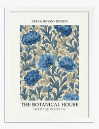
Poster floreale blu heritage
Translation missing: it.products.product.sale_price A partire da £11.95£19.95 -

Poster vasi floreali vivaci
Translation missing: it.products.product.sale_price A partire da £13.99£19.99 -

Tela bouquet floreale vintage
Translation missing: it.products.product.sale_price A partire da £44.95£74.95 -

Tela fiori botanici a tratto rosa e giallo
Translation missing: it.products.product.sale_price A partire da £44.95£74.95 -

Poster botanico fiori rosa e gialli
Translation missing: it.products.product.sale_price A partire da £11.95£19.95 -

Poster botanico con piante in vaso su mensola
Translation missing: it.products.product.sale_price A partire da £11.95£19.95 -

Poster bouquet botanico vintage
Translation missing: it.products.product.sale_price A partire da £11.95£19.95 -

Tela vasi floreali moderni
Translation missing: it.products.product.sale_price A partire da £55.99£79.99 -

Poster botanico astratto moderno
Translation missing: it.products.product.sale_price A partire da £11.95£19.95 -

Poster tavola botanica vintage
Translation missing: it.products.product.sale_price A partire da £11.95£19.95 -

Poster musa del tennis tra foglie
Translation missing: it.products.product.sale_price A partire da £11.95£19.95 -

Poster fiori vintage da giardino
Translation missing: it.products.product.sale_price A partire da £11.95£19.95 -

Poster botanico peonie su sfondo viola
Translation missing: it.products.product.sale_price A partire da £11.95£19.95 -

Tela fiori gialli dorati e bianchi su sfondo blu
Translation missing: it.products.product.sale_price A partire da £44.95£74.95 -

Poster botanico pop art moderno
Translation missing: it.products.product.sale_price A partire da £11.95£19.95 -

Poster eleganza botanica con donna avvolta nei fiori su verde pastello
Translation missing: it.products.product.sale_price A partire da £11.95£19.95


Di più da The Frame

How to Build a Sea Life Gallery Wall That Actua...
Most gallery wall guides assume you already own the art. This one helps you choose the right combination of marine prints from the start, so you end up with something...

How to Hang Abstract Art Prints: Sizing, Spacin...
Most art looks wrong on the wall because it's hung too high, sized wrong for the furniture below it, or spaced like an accident. The rules below fix all three....

How to Choose Art Prints You Won't Regret: A Pr...
You don't need good taste to buy good art. You need a system. This guide replaces vague advice like "trust your gut" with a concrete checklist that takes you from...