Coffee Art for Cafés: How to Choose Wall Art That Sets the Tone
A practical guide to choosing prints that define your café's character, hold up to daily wear, and skip every coffee-shop cliché.

Walk into any new café and you can read its personality in under five seconds. Most of that signal comes from the walls. This is a working guide for café owners and designers who want to use art to define their space, not decorate it as an afterthought.
Why wall art is the fastest way to give your café a personality
Furniture takes weeks to source and tens of thousands to replace. Paint colours read flat without something layered on top. Wall art is the one design lever you can pull in a single afternoon that changes how customers feel about the room.
It also does work that nothing else does. A well-chosen print communicates your taste, your reference points, and your seriousness about the craft before a customer has tasted anything. It sets expectations for the coffee, the food, and the price point. A wall of cheap, generic prints tells a customer to expect cheap, generic coffee, even if the espresso is excellent.
The opposite is also true. Strong art elevates an average build-out. We've seen modest fit-outs in railway arches read as premium because the owner spent properly on a small number of considered pieces. Walls do this lifting better than tiles, lighting, or branded crockery.

Matching print style to your café's vibe: specialty, neighbourhood, or brunch spot
Before you look at a single print, decide which of these three buckets you sit in. Most cafés are one of them, and trying to be all three is the most common reason a space ends up looking confused.
Specialty and third-wave
You're focused on origin, process, and brewing method. The aesthetic that matches this is restrained: editorial typography, abstract studies in muted tones, architectural photography, or single-subject botanical prints relating to coffee origins (think single coffee cherry studies, not stylised coffee cups). Avoid anything that reads as nostalgic or whimsical. Your customers are paying £5 for a filter and they expect the walls to take coffee as seriously as you do.
One large, confident piece tends to work better here than a gallery wall. Look at coffee art prints that lean towards illustration or fine art photography rather than novelty.
Neighbourhood and community
You're the local. People come for the regular flat white and the staff who know their name. Your art can be warmer, more personal, and more playful. Vintage advertising, framed travel prints, illustrated maps of your area, and botanical work all sit well here. A mixed gallery wall is appropriate because it mirrors the lived-in, layered feel of a long-standing local spot.
Brunch and all-day
You're trading on appetite, daylight, and Instagram. Your walls need to photograph well from a phone held over a plate of eggs. Bolder colour, larger scale, food-related illustration, citrus and produce studies, and saturated travel imagery all earn their place. This is the one café type where a properly used statement wall actually pays back commercially through customer photography. Browse food and drink art prints for the broader category.
Size and placement for different café layouts
The biggest sizing mistake in cafés is buying too small. Domestic instincts don't translate. A 30x40cm print that looks generous above your sofa at home will look apologetic above a four-seater table.
Behind the counter
This is your hero wall. Customers stare at it while they queue, and it sits in the background of every transaction photo and Instagram story. Go large: 70x100cm minimum for a single piece, or a tight pair of 50x70cm prints if the wall is broken up by shelving and bottles.
Consider sight lines. The bottom of the artwork should sit at least 30cm above the highest piece of counter equipment so it reads as art rather than clutter. If you have a tall espresso machine, that often means hanging the centre of the artwork at 180cm rather than the standard 145-150cm eye level.
Seating area walls
Scale to the seating. Above a banquette or long bench, run a horizontal series: three 50x70cm prints, or two 70x100cm pieces, evenly spaced with around 8-10cm between frames. Above individual tables, single prints work better than pairs to avoid the symmetrical hotel-lobby look. 60x80cm is the sweet spot here.
For larger empty walls in a 30+ cover seating area, don't be afraid of canvas at 100x150cm. Canvas earns its place in seating areas because it's lighter, easier to hang on tricky walls, and forgiving in rooms with steam and humidity from the coffee machine.
Bathrooms
Bathrooms are the most underused wall in any café. A customer is alone with your brand for two minutes and you're showing them tile grout. One well-chosen 40x50cm or 50x70cm framed print transforms the room and gets quietly photographed more often than you'd expect. Lean weird, funny, or unexpected here. Bathrooms are where you can take a small aesthetic risk that would feel jarring in the main space.
Entrance and corridor walls
Treat these as a preview of the main room. One strong piece at the door, ideally visible through the window from outside, doubles as passive marketing. If pedestrians walking past can see something interesting on your back wall, they're more likely to come in.

Why framing quality matters even more in high-traffic commercial spaces
Domestic art lives a quiet life. Café art doesn't. It deals with steam, temperature swings, sunlight through south-facing windows, the occasional brushed shoulder from a stranger carrying a tray, and ten years of being looked at by tens of thousands of people. The framing has to earn that.
A few practical things to insist on:
Solid wood frames, not MDF or veneer. MDF swells in humid environments and any café with an espresso machine is humid. Solid FSC-certified wood holds shape over years. You'll feel the difference in weight when the box arrives.
Acrylic glaze, not glass. Glass in a café is a health and safety liability. A tray clips a frame, the glass falls, and you've got broken glass near food. UV-protective acrylic is lighter, doesn't shatter, and doesn't fade the print underneath even if it's hung opposite a sunny window. This matters because café art often hangs in the brightest spots in the building.
Pigment-based giclée inks. Cheap prints fade visibly within a year in a sunlit café. Museum-grade giclée inks hold colour for decades even in direct sunlight, which means you're not replacing artwork every spring.
Properly fitted on arrival. The most common failure in this category is prints arriving in one box and frames in another, then being assembled badly on site by a stressed café owner the day before opening. Look for prints that ship fully assembled, ready to hang, with fixtures attached. It saves a morning of swearing.
These aren't premium nice-to-haves in a café. They're the difference between art that still looks crisp in year five and art you're embarrassed by in month nine.
Building a cohesive look: curating multiple prints without it feeling random
The Pinterest-board problem: ten prints you each individually love, hung together, that collectively look like a charity shop. Cohesion comes from constraint. Choose two of the following three to hold constant across every piece in the room:
Palette. All your prints sit within the same three or four colours. This is the easiest constraint to enforce and the most forgiving.
Subject matter. Everything is botanical, or everything is mid-century travel, or everything is abstract. Subjects can vary in execution but stay in the same family.
Frame finish. All natural oak, all black, or all white. Don't mix three frame finishes in one room unless you're a confident designer doing it deliberately.
If you hold two of those three constant, you can vary the third without the room falling apart. Hold all three and you risk looking like a hotel chain. Hold none and you look like you couldn't decide.
A useful rule for gallery walls: odd numbers (3, 5, 7) feel intentional, even numbers feel decorative. Asymmetric arrangements feel curated, perfectly symmetrical arrangements feel corporate. Both have their place depending on your café type.

Vintage advertising, botanical, or abstract: picking a direction and committing
The three directions that work most reliably in cafés, and the trade-offs of each.
Vintage advertising
Old coffee posters, mid-century travel prints, original European grocery and produce advertising. Warm, characterful, and instantly readable. Works brilliantly in neighbourhood cafés and brunch spots. The risk is cliché: if you pick the first five Italian espresso posters that come up in a search, your café will look identical to the one three streets over. Dig deeper. Look at lesser-known regional advertising, vintage tea and chocolate posters, old citrus crate labels. A well-edited collection of vintage art prints can carry a whole room.
Botanical
Reliable, calming, and almost impossible to get wrong if you commit to it fully. Works in any café type but particularly suits specialty and brunch. Botanical prints also age extremely well, so you're unlikely to look at them in three years and cringe. The trick is going beyond the obvious monstera leaf and exploring coffee plant studies, citrus, herbs, or regional plant illustrations from the countries your beans come from. The botanical art prints category has more depth than most owners realise.
Abstract
The most flexible and the easiest to misjudge. Strong abstract art makes a specialty café feel like a gallery. Weak abstract art makes a café feel like a corporate breakout room. If you're not confident, hire a designer for an afternoon or stick with botanical or vintage. If you are confident, abstract gives you the most freedom to build a singular identity that no one can copy.
Pick one direction and commit across the whole space. Mixing directions across rooms (vintage in the seating area, abstract behind the counter) almost never works.
Ordering for a café: sizes, quantities, and what to expect
A practical breakdown of what an average independent café actually needs.
How many pieces
A 40-cover café typically needs between 6 and 12 pieces of art across all walls. Less than 6 and the room feels under-dressed. More than 12 and you start competing with yourself. Plan zones first (counter wall, seating area, corridor, bathroom) and assign one to three pieces per zone.
Sizing checklist
- Counter hero wall: one 70x100cm or two 50x70cm
- Seating area feature wall: 60x80cm singles, or 50x70cm triptychs
- Large empty walls: 100x150cm canvas
- Bathroom: 40x50cm or 50x70cm
- Corridors and entrance: 50x70cm
Framed or canvas
Framed prints look more polished and signal investment, which suits specialty and brunch. Canvas is lighter, easier to hang on uneven walls, more forgiving in humid zones, and gives a softer, less formal read that suits neighbourhood spots. Many café owners mix: framed for the hero pieces, canvas for the larger seating area pieces. There's no purity test here, just pick what suits each wall.
Budget reality
A commercial-grade framed print at 70x100cm is not a £30 purchase. Expect to spend properly per piece if you want frames that won't warp, inks that won't fade, and prints that arrive properly fitted in one box. Budget for the full set up front. Buying three good pieces now and "filling in the rest later" almost always leads to mismatched additions twelve months down the line.
Rotation versus permanent
If you're a community-focused café, rotating local artist work on one designated wall is a genuine differentiator and worth the admin. The other walls should stay permanent so the room has a stable visual anchor. Specialty and brunch spots are usually better off with a fully permanent collection chosen at fit-out.

A final note
Walk into your own café tomorrow morning before you open. Sit at the worst table. Look at the wall opposite you for thirty seconds. If you feel nothing, your customers feel nothing. Fix that wall first, then work outwards. The rest of the room follows.

Fab-producten in dit blog
-

Poster koffiesfeer met mokapot en koffiebonen
Translation missing: nl.products.product.sale_price Vanaf €19,95€33,25 -

Canvas koffiesfeer met speelse koffie-iconen
Translation missing: nl.products.product.sale_price Vanaf €64,95€92,95 -

Canvas Italiaans koffiecitaat in zwart-wit voor de keuken
Translation missing: nl.products.product.sale_price Vanaf €64,95€92,95 -
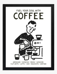
Poster barista koffieritueel in zwart-wit
Translation missing: nl.products.product.sale_price Vanaf €19,95€33,25 -

Canvas speelse koffievrienden met oranje mokken
Translation missing: nl.products.product.sale_price Vanaf €64,95€92,95 -
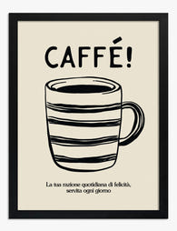
Poster Italiaanse koffie 'CAFFÉ!'
Translation missing: nl.products.product.sale_price Vanaf €19,95€33,25 -

Canvas caféschets met koffie in zwart-wit
Translation missing: nl.products.product.sale_price Vanaf €64,95€92,95 -

Canvas koffiequote in zwart-wit
Translation missing: nl.products.product.sale_price Vanaf €64,95€92,95 -

Poster Colosseum in Rome, tijdloze charme
Translation missing: nl.products.product.sale_price Vanaf €19,95€33,25 -

Poster koffiemok met retrolook voor de keuken
Translation missing: nl.products.product.sale_price Vanaf €19,95€33,25 -

Poster kleurrijke koffiekopjes
Translation missing: nl.products.product.sale_price Vanaf €19,95€33,25 -

Poster ochtendkoffierituelen
Translation missing: nl.products.product.sale_price Vanaf €19,95€33,25 -

Canvas koffiestemming voor keuken of kantoor
Translation missing: nl.products.product.sale_price Vanaf €64,95€92,95 -

Poster café-typografie met grote letters in zwart-grijs
Translation missing: nl.products.product.sale_price Vanaf €19,95€33,25 -

Canvas charme van koffietijd
Translation missing: nl.products.product.sale_price Vanaf €64,95€92,95 -
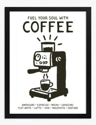
Poster koffiemachine in zwart-wit
Translation missing: nl.products.product.sale_price Vanaf €19,95€33,25 -

Poster speelse koffiemokken en cafetière
Translation missing: nl.products.product.sale_price Vanaf €16,95€23,95 -

Canvas vrolijke koffiemokken
Translation missing: nl.products.product.sale_price Vanaf €64,95€92,95 -

Canvas gezellig koffiemoment
Translation missing: nl.products.product.sale_price Vanaf €64,95€92,95 -

Poster ontbijt in het café, lijntekening zwart-wit
Translation missing: nl.products.product.sale_price Vanaf €19,95€33,25


Meer van The Frame

Art for Green Walls: What Works, What Fights
You painted the walls green. Maybe sage, maybe forest, maybe something in between. Now the room feels half-finished and the art you owned before suddenly looks wrong against it. Green...

What to Put in a Stairwell: The Hardest Wall in...
Stairwells are the wall everyone postpones. The ceiling is too high, the angle is wrong, the lighting is bad, and every nail hole feels like a permanent mistake on a...

Art at the Top and Bottom of a Staircase
Staircases are the most overlooked walls in the house. They are also the trickiest, because the top of the stairs, the bottom of the stairs, and the landing in between...