Whimsical vs Realistic Botanical Art: How to Mix Both on One Wall
A practical framework for pairing scientific botanical plates with playful plant illustrations without your wall looking like a mood board accident.

Most botanical art collections start the same way: a vintage fern print, maybe a pressed flower study, something dignified. Then you spot a grinning monstera or a wonky illustrated cactus and freeze, certain it'll ruin everything. It won't, if you mix the two with intent.
What makes botanical art 'whimsical' vs 'traditional'
Traditional botanical art comes from a scientific lineage. Think 18th and 19th century plates by illustrators working alongside botanists: precise stems, accurate leaf venation, labelled Latin names, muted natural pigments. The hallmarks are careful linework, scientific accuracy, restrained palettes (sage, ochre, faded coral, parchment cream), and a quiet, archival quality. Look at Pierre-Joseph Redouté's roses or Maria Sibylla Merian's insects on plants and you'll see the template.
Whimsical botanical art breaks every one of those rules on purpose. It might give a fiddle leaf fig a face, render a tulip in hot pink gouache, or reduce a houseplant to three flat colour blocks and a smile. The signatures are loose brushwork, anthropomorphic touches, saturated or unnatural colour (cobalt cacti, lavender ferns), illustrated rather than observed forms, and an unmistakable lightness of tone. The plant is still the subject, but the rules of accuracy aren't.
There's also a spectrum in between worth naming. A watercolour fern that's botanically correct but slightly stylised sits in the middle. So does a modern line drawing of a pothos. These transitional pieces are the secret to mixing styles well, and we'll come back to them.

Why mixing styles creates a more interesting wall
A wall of nothing but vintage botanical plates can read as a doctor's waiting room. A wall of nothing but quirky illustrated plants can read as a nursery. Neither is wrong, but both flatten the room into a single register. Mixing creates a productive tension: the eye moves between precision and play, between the archival and the contemporary, and the wall starts to feel curated rather than purchased.
The psychology behind this is simple. Visual interest comes from contrast within unity. Sameness creates background. Total contrast creates chaos. Mixed botanical styles give you contrast (subject treatment, mood, era) inside a unifying theme (plants), which is exactly the ratio of difference-to-sameness the eye reads as 'intentional'.
There's a practical benefit too. Most homes already have furniture, textiles, and colour choices that span different moods. A linen sofa and a brass lamp don't agree on much. A mixed botanical wall actually mirrors how real rooms look, and slots in more naturally than a single-style collection ever will.
The one rule that makes mixed styles look intentional
Consistent framing. That's it. That's the rule.
If every print on your wall sits in the same frame profile, the same colour, and the same mount style, you can mix wildly different art and the wall still reads as a set. Mismatch the frames and even two near-identical prints will look like they wandered in from different rooms.
We'd suggest picking one frame system and committing. Black solid wood with a white mount is the most forgiving across both whimsical and traditional pieces. Natural oak works beautifully if your room leans warm or Scandinavian. White frames disappear and let the art do all the work, which suits busier, more colourful whimsical prints. The point isn't which frame, it's that every frame matches.
This is also where framing quality matters more than people realise. The biggest reason a gallery wall looks 'off' isn't the art choice, it's prints that have warped behind glass, mounts cut slightly differently, or frames in vaguely similar but not identical shades of black. Our framed art prints ship ready to hang in solid FSC wood frames with UV-protective acrylic glaze, so a print bought today will match one bought next year. That consistency is what makes the mixed-style approach actually work.
A small caveat: if you genuinely want a more eclectic, salvaged look, mixed frames can be charming. But you need to commit fully (vintage gilt, chipped wood, ornate plaster) rather than ending up with three slightly different blacks. Half-mismatched always looks like a mistake. Fully mismatched looks like a choice.
How to anchor a gallery wall with a traditional piece and cluster whimsical prints
The most reliable structural move for mixed botanical walls is the anchor-and-cluster: one large traditional piece holds the centre of gravity, smaller whimsical pieces orbit around it.
Here's why it works. The traditional print, with its quiet palette and scientific precision, reads as the 'serious' voice on the wall. It gives the arrangement weight and credibility. The whimsical prints, smaller and more playful, become accents. Reverse the proportions (large whimsical anchor, small traditional accents) and the wall flips into a children's space, which may or may not be what you want.
Practical sizing: your anchor should be the largest piece on the wall by a clear margin. A 70x100cm framed botanical plate works as an anchor in most living rooms. Cluster three to five smaller whimsical prints around it at 30x40cm or 40x50cm. The size jump between anchor and cluster needs to be obvious, not subtle, or the hierarchy collapses.
Positioning matters too. Centre the anchor at roughly eye level (around 145-150cm from the floor to the centre of the print). Then arrange the cluster off to one side rather than symmetrically around the anchor. Asymmetry feels more contemporary and gives the whimsical pieces room to breathe without competing with the anchor for attention.
If you're starting from a collection of vintage botanical art prints you already love, this is the easiest entry point. Pick your favourite as the anchor, size up if it's currently small, and build the whimsical cluster around it.

Colour cohesion: keeping mixed prints feeling like a set
Frames give you structural unity. Colour gives you emotional unity. Without a shared palette, even perfectly framed prints will feel like they're shouting over each other.
The trick is identifying a colour bridge between your traditional and whimsical pieces. Traditional botanical art tends toward muted greens, warm browns, faded reds, and parchment backgrounds. Whimsical prints can go anywhere, which is the problem. Your job is to pick whimsical pieces that share at least one colour with the traditional anchor.
A working method: pull two or three colours from your anchor print. Not the dominant green (that's a given, every botanical print has green) but the secondary tones. Is there a dusty coral in the flower? A burnt sienna in the stem? A specific cream in the background? Those are your bridge colours. Choose whimsical prints that also feature those tones, even in small amounts, and the cluster will instantly feel related.
Two palette directions tend to work best for mixed botanical walls:
The earthy palette. Sage, terracotta, mustard, cream, soft black. This keeps whimsical pieces feeling grown-up and stops them from reading as childish. Even a cartoon cactus, rendered in mustard and terracotta, will sit happily next to a 19th century fern.
The fresh palette. Crisp white backgrounds, multiple greens, one accent colour (blush pink, sky blue, or buttery yellow) running through every piece. This works especially well in bright, modern rooms and gives the wall a gallery-shop polish.
Avoid palettes that mix warm and cool whimsy in the same cluster (a hot pink print next to an icy turquoise print next to a vintage sepia plate). Pick a temperature and hold the line.
Three gallery wall layouts that blend both styles beautifully
Layout 1: The classical anchor with playful satellites
One large traditional botanical plate (60x80cm or 70x100cm) hung slightly left of centre. Three whimsical prints (30x40cm each) arranged in a loose vertical column to the right. The traditional piece does the heavy lifting; the whimsical column adds rhythm and a contemporary edge.
Best for: living rooms, hallways, above a console table. Works particularly well with mid-century or Scandinavian furniture.
Layout 2: The grid with one wildcard
A clean 2x3 grid of six prints, all the same size (40x50cm), all in matching frames. Five are traditional botanical studies. One, ideally in the bottom-left or top-right position, is a whimsical piece sharing the same palette. The grid's formality makes the single wildcard feel like a wink rather than a clash.
Best for: bedrooms, home offices, dining rooms. This is the most forgiving layout for first-time mixers because the grid does most of the work.
Layout 3: The salon-style asymmetric cluster
Six to nine prints in mixed sizes, hung tightly together with consistent 5-7cm gaps between frames. Roughly 60% traditional, 40% whimsical, with the largest piece (a traditional plate) positioned slightly off-centre. Sizes range from 30x40cm up to 50x70cm. The looseness lets you blend styles aggressively as long as the framing and palette stay locked.
Best for: larger walls, stairwells, statement walls behind a sofa. This is also the easiest layout to grow over time, which suits people who buy art slowly. Browsing pre-coordinated wall art sets is a shortcut if you want a salon-style cluster without having to colour-match everything yourself.

Where whimsy works best, and where it doesn't
Not every room wants the same dose of whimsy. A formal dining room or a panelled study will struggle to hold more than one or two playful pieces before the room starts feeling confused about itself. Keep the ratio heavily traditional, maybe 80/20.
Kitchens, kids' rooms, and breakfast nooks can absorb much more whimsy. Here you can flip the ratio: 70% whimsical plant prints anchored by one or two traditional pieces to stop it feeling juvenile. Bedrooms sit in the middle, around 50/50, depending on whether you want the room to feel restful (lean traditional) or cheerful (lean whimsical).
The 'maturity dial' is worth thinking about too. Whimsy ranges from gently stylised watercolours (low whimsy) to full-on faces-on-plants illustrations (high whimsy). If you're nervous, start with low-whimsy pieces: loose watercolour florals, simple line drawings, modern minimalist plant studies. These mix with traditional art almost invisibly. Save the high-whimsy pieces for rooms that can carry them.
Common mistakes to avoid
Too much whimsy. More than half your wall in playful illustrations and the room reads as a child's space, regardless of how sophisticated the individual prints are.
Clashing subject matter. A vintage botanical plate of a rose paired with a cartoon cactus can feel disjointed, not because of the styles but because the subjects feel unrelated. Try to keep botanical families loosely connected (florals with florals, foliage with foliage, succulents with succulents) at least within each cluster.
Inconsistent print quality. A crisp giclée print next to a pixelated downloaded poster will always look wrong, even in matching frames. Stick to one quality level across the wall.
Skipping the mock-up. Before drilling, lay every print on the floor in your planned arrangement. Photograph it from above. Cut paper templates to your exact frame sizes and tape them to the wall. Live with the arrangement for a day. This catches problems while they're still free to fix.
Final thought
Mixing whimsical and traditional botanical art isn't a balancing act between two opposites. It's a single, coherent style that uses contrast to feel alive. Pick your anchor, lock your frames, hold your palette, and trust that the playful pieces won't undermine the elegant ones. They'll make them look more deliberate.


Fab-producten in dit blog
-

Poster botanisch abstract in pasteltinten groen en roze
Translation missing: nl.products.product.sale_price Vanaf €19,95€33,25 -

Poster groene botanische vormen
Translation missing: nl.products.product.sale_price Vanaf €19,95€33,25 -

Canvas botanische vormen in zachte tinten
Translation missing: nl.products.product.sale_price Vanaf €64,95€91,95 -

Poster botanisch met blauwe en groene bladeren
Translation missing: nl.products.product.sale_price Vanaf €19,95€33,25 -

Poster botanische collage met groene bladeren en witte bloemen
Translation missing: nl.products.product.sale_price Vanaf €19,95€33,25 -

Poster botanische trap met weelderig groen
Translation missing: nl.products.product.sale_price Vanaf €19,95€33,25 -

Poster botanische potplanten op plank, gele achtergrond
Translation missing: nl.products.product.sale_price Vanaf €19,95€33,25 -

Poster botanisch boho in warme aardetinten
Translation missing: nl.products.product.sale_price Vanaf €19,95€33,25 -

Poster boho vazen met kamerplanten
Translation missing: nl.products.product.sale_price Vanaf €19,95€33,25 -
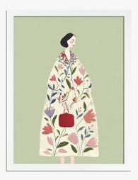
Poster botanische muze, vrouw in bloemenjas
Translation missing: nl.products.product.sale_price Vanaf €19,95€33,25 -

Poster boho botanisch met bloemen en aardse bogen
Translation missing: nl.products.product.sale_price Vanaf €19,95€33,25 -
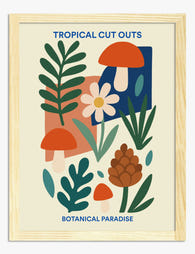
Poster botanische collage in tropische stijl
Translation missing: nl.products.product.sale_price Vanaf €19,95€33,25 -

Canvas botanische lijnen in roze
Translation missing: nl.products.product.sale_price Vanaf €64,95€91,95 -

Poster botanische lijntekening collectie
Translation missing: nl.products.product.sale_price Vanaf €19,95€33,25 -

Poster speelse botanische lijntekening
Translation missing: nl.products.product.sale_price Vanaf €19,95€33,25 -

Canvas moderne botanische lijntekening van kamerplant
Translation missing: nl.products.product.sale_price Vanaf €64,95€91,95 -

Canvas botanische vazen in boho-stijl
Translation missing: nl.products.product.sale_price Vanaf €64,95€91,95 -

Poster botanisch stilleven met terracotta vaas
Translation missing: nl.products.product.sale_price Vanaf €16,95€22,95 -

Poster moderne botanische lijntekening
Translation missing: nl.products.product.sale_price Vanaf €19,95€33,25


Meer van The Frame

The Biggest Bedroom Artwork Mistake and How to ...
The mistake is this: treating your master bedroom like a passageway instead of a room. Most people invest in the bed, the linen, the lighting, then hang whatever poster they...

What Interior Designers Know About Butterfly Wa...
Butterfly prints have a reputation problem, and most people styling them make the same handful of mistakes. The motif itself is genuinely beautiful, with centuries of scientific illustration and fine...

Living Room Art Trends Worth Paying Attention T...
Living room art has changed more in the last two years than in the previous ten. The gallery wall is fading, single oversized pieces are taking over, and the warm,...