Best Vibrant Art Prints for Small Rooms (and Exactly How to Hang Them)
Why bold, colourful prints actually make compact rooms feel more spacious, and the exact sizes to hang where.

The advice you've been given about small rooms is mostly wrong. Beige walls and timid little prints don't make a compact bedroom feel bigger, they make it feel like a waiting area. A confident, colourful piece of art is often the thing that turns a small room from cramped to considered.
Why small rooms and vibrant art are a better match than you think
Designers have repeated the "keep it neutral and tiny" rule for so long that it's become received wisdom. The reasoning sounds sensible: less colour, less clutter, more space. The reality is that scattering small neutral prints across multiple walls creates more visual noise than a single bold piece, because your eye has nowhere to land.
Small rooms benefit from a clear focal point. A vibrant print gives the eye somewhere to settle, which paradoxically makes the rest of the room feel calmer and more spacious. The trick is not to avoid colour, it's to commit to it on one wall and let the rest of the space breathe.
There's also a perception trick at play. Saturated colour adds depth, particularly cool tones with atmospheric quality (think a deep teal seascape or a print with a hazy purple horizon). Depth in art reads as depth in the room. A pale, washed-out print on a pale wall flattens everything.

The ideal print size for small bedrooms, hallways, and bathrooms
The two-thirds rule (art should be roughly two-thirds the width of the furniture below it) is a good starting point, but it doesn't help if you don't know what that translates to in centimetres. Here's how it actually shakes out.
Small bedrooms (around 9 to 12 square metres)
Above a standard double bed (135cm wide), you want a print 90cm to 100cm wide. That's a single 70x100cm framed piece hung in landscape, or a 60x90cm canvas. Above a single bed or a 90cm chest of drawers, drop to 50x70cm. If your ceiling is under 2.4 metres, go landscape rather than portrait to avoid crowding the vertical space.
For a queen bed (150cm) in a snug room, a 70x100cm print in portrait hung centrally above the headboard is the sweet spot. Anything smaller starts to look like a postage stamp on a wall.
Hallways
Hallways reward vertical prints. The walls are usually narrow and the eye travels along them rather than stopping. A 50x70cm or 70x100cm portrait print at the end of a hallway gives you a destination. Along the length, a pair of 30x40cm prints spaced 15cm apart looks intentional. Avoid hanging anything wider than 60cm in a hallway under 1 metre across, your shoulders will graze it.
Bathrooms
Bathrooms are the one place where smaller does work better, but not because of size anxiety. It's because wall space is genuinely limited around mirrors, tiling, and fixtures. Stick to 30x40cm or 40x50cm prints, and frame them properly to handle the humidity. Canvas can actually be a smart choice here because there's no glazing to fog up.
One statement vs. a gallery wall: what works in tight spaces
The decision is simpler than most guides make it. If your room is under 10 square metres, you almost always want one statement piece. Gallery walls need breathing room around each piece to read as a composition rather than a jumble, and small rooms rarely have it.
The exception is a deliberate, tightly grouped gallery of three prints maximum, hung above a single piece of furniture (a bed, a sofa, a console). Three 30x40cm prints, identically framed, spaced 5cm apart, can work above a double bed in a small bedroom. Four or more, and you've crossed into chaos.
For hallways, a run of three to five identically-sized prints down one wall works because the eye moves through them sequentially. This isn't really a gallery wall, it's a procession. Different rules apply.
If you're still torn, default to the single statement piece. It's almost impossible to get wrong, and it gives a small room the kind of confident anchor it needs. Browse vibrant art prints with this in mind: look for one piece you genuinely love rather than three you sort-of like.
Placement rules: height, spacing, and the focal wall trick
The 145cm rule (and when to break it)
Centre your art at 145cm from the floor. This is roughly eye level for the average adult standing, and it's the height galleries use. The most common mistake in bedrooms is hanging art too high, leaving a vast gap between the top of the headboard and the bottom of the frame.
Above furniture, the bottom of the frame should sit 15cm to 25cm above the top of the headboard, sofa, or console. Any higher and the art floats. Any lower and it looks like it's resting on the furniture.
The focal wall trick
Pick one wall. Usually the wall you see first when you walk into the room, or the wall opposite the door. That wall gets the vibrant statement print. Every other wall stays quiet (a small print, a mirror, or nothing).
This isn't a compromise, it's how the colour gets to do its job. If three walls have bold art, none of them register as the focal point and the room feels busy. One focal wall, three calm walls, and the small room reads as intentional.
In a bedroom, the focal wall is almost always the one behind the headboard. In a hallway, it's the wall at the end. In a bathroom, it's whichever wall isn't tiled.

Bold colourful prints that open up a room (and ones that close it in)
Not all vibrant colours behave the same way in small spaces. This is the bit most guides skip, and it matters more than the size question.
Colours that open up a room
Cool tones recede visually. Deep teal, cobalt blue, sage green, dusty purple, and soft turquoise all push the wall backwards in the viewer's perception. A print dominated by these tones, even at full saturation, makes the wall it hangs on feel further away.
Prints with atmospheric depth (skies, seascapes, distant landscapes, abstract pieces with gradient or fog) reinforce this effect. The eye reads the implied distance in the image and projects it onto the room.
Colours that close a room in
Warm reds, hot oranges, and bright yellows advance towards the viewer. A wall of bright red art will feel closer than a bare wall. This isn't a reason to avoid these colours, it's a reason to use them deliberately. A warm-toned print works beautifully in a small room if you want it to feel cocooning (a bedroom, a snug). It works against you in a room you want to feel airy (a bathroom, a narrow hallway).
The fix when you love a warm-toned print: choose one with depth and shadow. A botanical print with deep coral flowers against dark green foliage has the warmth you want without the flattening effect of solid warm blocks. The botanical art prints collection is worth looking through with this in mind.
The saturation question
Saturation is not the enemy. Flatness is. A highly saturated print with tonal range (highlights, shadows, varied hues within the same colour family) reads as sophisticated. A highly saturated print that's basically one flat colour reads as a poster. When you're looking at vibrant prints, look for tonal complexity.
Frame and mount choices that keep small spaces feeling light
Frame choice matters more in small rooms than large ones, because the frame takes up a higher percentage of the visual field.
Frame profile
Stick to slim profiles, around 1cm to 2cm wide. Chunky frames eat visual space and make the print feel hemmed in. Solid wood frames in their natural pale finish (oak, ash) or in white add the least visual weight. Black frames can work but only for prints with strong graphic contrast. For soft, painterly, vibrant prints, black frames often fight the image.
This is where the structural quality of the frame matters. Cheap frames warp, particularly in humid rooms like bathrooms, and badly fitted frames let the print bubble or shift behind the glazing. Fab's framed prints arrive in one box with the print already fitted into a solid FSC-certified wood frame, no separate assembly, no warping a month later.
Mounts and mats
White mounts give vibrant prints room to breathe and stop the colour from feeling crowded. A 4cm to 6cm white border around a 50x70cm print pushes the visual size of the framed piece up without making the colour overwhelming.
That said, skip the mount entirely if your print already has built-in negative space, or if you want the colour to fill the frame and dominate. Mounted prints feel more formal, unmounted prints feel more contemporary.
Glazing
UV-protective acrylic glazing (rather than glass) is lighter, doesn't shatter, and prevents fading. In a small room with direct light, this matters: vibrant prints lose their punch fast when the inks aren't UV-stable. Anything claiming to last for centuries in direct sun should be using proper archival inks and protective glazing. Fab's prints use both.

Five small-space setups with vibrant prints to steal
1. The cobalt bedroom anchor
A 70x100cm portrait print, abstract or seascape, in deep cobalt and white, hung centrally above a double bed. Slim oak frame, no mount. Walls in warm off-white. Bedding in cream linen. The blue does all the work, and the room feels twice its actual size.
2. The hallway destination piece
A single 50x70cm vertical print at the end of a 4-metre hallway. Vibrant botanical, lots of green with a hit of magenta or coral. White frame, white mount. Walls left bare on both sides. Look at more options in the hallway art collection if this is the route you're taking.
3. The three-print headboard run
Above a single bed in a child's room or guest room: three 30x40cm prints in matching slim white frames, identical mounts, hung 5cm apart in a horizontal row. Same colour palette across all three (think dusty pink, terracotta, and mustard). The grid format keeps it tidy, the colour keeps it alive.
4. The bathroom pair
Two 30x40cm prints in saturated tropical greens and pinks, hung side by side above the towel rail. Canvas works well here because there's no glare from the bathroom lights and no glazing to fog. The mirrored edge wrap means no part of the image is lost at the frame.
5. The bedroom focal canvas
A 100x70cm landscape canvas, unframed, hand-stretched, hung above a queen bed. Abstract, painterly, dominated by sage and burnt orange. The lack of frame keeps the silhouette soft and the wall feels uninterrupted. Cheaper than framed, and in a small bedroom the minimal look earns its keep. The bedroom art edit has more in this register.

Test before you commit
If you're nervous, cut a piece of brown paper or newspaper to the exact print size and tape it to the wall for a few days. Live with it. Look at it in morning light, evening light, with the curtains open and closed. This is the single best way to avoid a sizing mistake, and it takes ten minutes.
Then trust the colour. Small rooms don't need to be timid to feel good. They need one confident decision, hung at the right height, on the right wall.

Fab-producten in dit blog
-

Poster abstracte kleurvlakken in harmonie
Translation missing: nl.products.product.sale_price Vanaf €16,95€23,95 -

Poster kleurrijk heuvelachtig landschap
Translation missing: nl.products.product.sale_price Vanaf €16,95€23,95 -

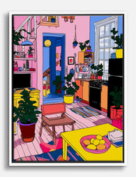
Poster kleurrijke pop art woonkamer
Translation missing: nl.products.product.sale_price Vanaf €19,95€33,25 -
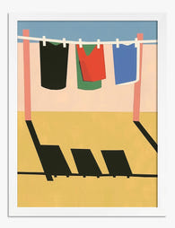
Poster kleurrijke wasdag
Translation missing: nl.products.product.sale_price Vanaf €19,95€33,25 -

Poster kleurrijk stadsgezicht
Translation missing: nl.products.product.sale_price Vanaf €16,95€23,95 -
Canvas kleurrijke popart-woonruimte
Translation missing: nl.products.product.sale_price Vanaf €64,95€92,95 -

Poster zonnebloemen in zomers heuvellandschap
Translation missing: nl.products.product.sale_price Vanaf €19,95€33,25 -

Poster kleurrijke regenbooggolven
Translation missing: nl.products.product.sale_price Vanaf €19,95€33,25 -
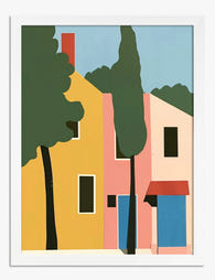
Poster levendige dorpssfeer
Translation missing: nl.products.product.sale_price Vanaf €19,95€33,25 -

Canvas kleurrijke stedelijke droom
Translation missing: nl.products.product.sale_price Vanaf €64,95€92,95 -

Canvas levendige pastelblokken
Translation missing: nl.products.product.sale_price Vanaf €64,95€92,95 -
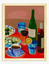
Poster levendige tafelscène met wijn, koffie en citrus
Translation missing: nl.products.product.sale_price Vanaf €19,95€33,25 -

Poster volkskunstportret in levendige kleuren
Translation missing: nl.products.product.sale_price Vanaf €19,95€33,25 -

Poster kleurrijke wilde tijger
Translation missing: nl.products.product.sale_price Vanaf €16,95€23,95 -

Canvas woonruimte in kleurrijke pop art
Translation missing: nl.products.product.sale_price Vanaf €64,95€92,95 -

Poster kleurrijke bloemensymfonie
Translation missing: nl.products.product.sale_price Vanaf €19,95€33,25 -

Poster kleurrijke kat van Warhol
Translation missing: nl.products.product.sale_price Vanaf €19,95€33,25 -

Poster zonnige kust van de Middellandse Zee
Translation missing: nl.products.product.sale_price Vanaf €16,95€23,95 -

Canvas kleurrijke boekenkast met strakke lijnen
Translation missing: nl.products.product.sale_price Vanaf €64,95€92,95


Meer van The Frame

Art for Pink Walls
Pink walls are the most misunderstood backdrop in interiors. People assume they're tricky, twee, or only for nurseries, when in fact pink is one of the most flattering colours you...

Art for Blue Walls: Sage, Navy, and Powder
Blue walls are one of the most rewarding paint decisions you can make, and one of the trickiest to style. Navy swallows light, powder blue can wash out, and sage...

Art for Dark Walls: Going Bolder or Quieter
Dark walls are not a problem to solve. They are an opportunity that most people approach with one tired piece of advice: just add contrast. The truth is there are...