Botanical vs Floral Art: What's the Difference and Which Suits Your Space?
One is scientific precision, the other is painterly mood. Knowing the difference changes how you shop for wall art.

Botanical and floral prints often end up in the same Pinterest board, but they're doing very different things on your walls. One is descended from scientific documentation, the other from still life painting. Once you can spot the difference, you'll start choosing prints that actually suit your rooms instead of guessing.
A quick history: from scientific plates to contemporary wall art
Botanical illustration began as a working tool. Before photography, scientists needed accurate visual records of plants for identification, medicine, and exploration. Artists like Maria Sibylla Merian in the 1600s, the team behind Curtis's Botanical Magazine from 1787 onward, and the great Victorian fern illustrators were producing reference material first and art second. The aesthetic we now love (clean backgrounds, full plant anatomy, neat labels) was function, not style.
Floral painting comes from a completely different lineage. Dutch Golden Age still lifes in the 1600s used flowers as symbols of beauty, wealth, and the passage of time. Later movements, from Impressionism to Georgia O'Keeffe's monumental close-ups, treated flowers as a subject for emotional and formal experimentation. Floral art has always been about interpretation, mood, and atmosphere.
Both traditions now sit side by side in contemporary wall art, but they carry that history with them. A botanical print still feels studied and ordered. A floral print still feels expressive and atmospheric. That's the core distinction worth holding onto.

Botanical prints: the structured, detail-driven style
If you're looking at a print and can identify the species, count the petals, see the root system, or spot a Latin name tucked into the corner, you're looking at botanical art. The hallmarks are clarity, precision, and a sense that the artist has been observing very closely.
How to spot a botanical print
Look for these visual cues:
- Full plant anatomy. Leaves, stem, roots, sometimes a cross-section of the flower or seed pod.
- Neutral, often cream or off-white backgrounds. Nothing competes with the specimen.
- Fine linework or watercolour rendering. Confident, controlled, never loose.
- Labels, plate numbers, or handwritten notation. Even modern reproductions often keep these.
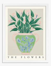
- A single specimen, isolated. No vases, no arrangements, no context.
This style reads as ordered and intellectual. It suggests curiosity and care. That's why it works so well in spaces where you want a sense of calm focus, and why our botanical art prints lean into that quiet, considered aesthetic.
The vintage scientific look
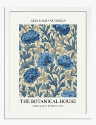
Most botanical prints you'll see today reference the great natural history publications of the 1700s and 1800s: Audubon's American flora, Curtis's Botanical Magazine, Pierre-Joseph Redouté's roses and lilies, the Victorian fern craze. These reproductions are popular because they carry weight. They look like something you might find in an old library, which makes them feel rooted and considered rather than trend-driven.
Floral prints: expressive, painterly, and wide-ranging
Floral art is a much bigger tent. It covers everything from loose watercolour bouquets to bold abstract close-ups, from moody Dutch-style still lifes to bright modern graphic prints. The unifying quality is that flowers are being interpreted, not documented.
How to spot a floral print
The tells are almost the opposite of botanical:
- Loose brushwork or stylised shapes. The artist's hand is visible.
- Arrangements, vases, or compositions. Flowers grouped, cut, scattered.
- Atmospheric backgrounds. Washes of colour, dark moody tones, abstract textures.
- Cropping and scale play. A single oversized bloom, a partial view, a graphic silhouette.
- Colour as mood. Saturated, muted, monochrome. The palette is doing emotional work.
Floral prints feel softer and more personal. They're decorative in the proper sense of the word: they create atmosphere. Our floral designs art prints collection spans this whole range, from quiet sketches to confident, colour-rich pieces.
Where they overlap (and why that's fine)
Plenty of prints sit somewhere in the middle. A watercolour of a peony with no background but visible brushwork is technically floral in style but botanical in composition. A precise ink drawing of a single rose arranged in a small glass bottle borrows from both traditions.
Think of it as a spectrum rather than a binary. On one end, you have a Victorian scientific plate of a fern with Latin labels. On the other end, you have a loose abstract painting where you can just about tell it's a poppy. Most prints sit somewhere between, and that's where personal taste does the real work.
The practical takeaway: when you're shopping, ask yourself which end of the spectrum a print leans toward. That tells you more about how it'll behave in a room than the subject matter does. A rose can be quiet and academic or loud and emotional depending entirely on how it's rendered.

Room-by-room guide: which style works best where
This is where the distinction actually pays off. Different rooms ask for different emotional registers, and matching the style to the function of the space gives you a much better result than just picking flowers you like.
Home office and study: botanical
The structured, documentary quality of botanical art suits rooms where you want to feel focused. There's something about a precise plant illustration that signals "this is a space for thinking." A pair or trio of botanical prints in matching frames above a desk creates a quiet visual rhythm that doesn't demand attention but rewards a closer look.
Go for ferns, herbs, or anything monochrome if you want minimal distraction. Audubon-style bird and botanical pairings work brilliantly here too.
Kitchen and dining room: botanical (mostly)
Kitchens love botanical prints. Herbs, citrus fruits, vegetables, and culinary plants tie directly to the function of the room without being twee. A set of three small framed botanical prints of rosemary, thyme, and sage above a kitchen counter is a near-foolproof move. Dining rooms can go either way, but botanical leans more formal.
Bedroom: floral
Bedrooms are emotional spaces, and floral art delivers. Soft watercolours, romantic peonies, dreamy abstract florals, all of these create the atmosphere you actually want when you're winding down. Botanical prints can feel a bit clinical above a bed.
If you do want botanical in a bedroom, choose something soft: a muted fern, a single delicate stem, nothing too anatomical.
Living room: floral, or a confident mix
The living room is where you have the most freedom, and where floral art tends to shine. A large painterly floral above the sofa anchors the room and sets the mood. If the rest of your decor is restrained, a bold floral piece can do all the heavy lifting. Have a browse through living room art prints to see how scale and tone shift the feel of a space.
That said, large-scale botanical prints can work beautifully in a living room if your style is more library-meets-conservatory than soft and atmospheric.
Bathroom: either, but mind the size
Both styles work in bathrooms. Botanical prints of tropical leaves or ferns lean into the spa-like associations. Floral prints add softness. Just be realistic about humidity. Our framed prints use UV-protective acrylic glaze rather than glass, which helps with longevity, but a steamy bathroom isn't an ideal forever home for any paper print. Canvas tends to handle humid rooms slightly better.
Hallway and entryway: botanical
Hallways suit the rhythmic, gallery-like quality of botanical sets. A run of four or five matching botanical prints down a long wall feels considered without being precious. It also gives you something to look at as you move through, rather than asking you to stop and engage emotionally.
Vintage botanical prints: why they're having a moment
Vintage botanical reproductions have been quietly dominating wall art for a few years now, and the reasons are worth understanding before you buy one.
First, they're a counterweight to digital fatigue. There's something deeply settling about a hand-drawn fern from 1850 in a world of algorithmic imagery. The aesthetic feels human, slow, observed.
Second, they carry instant character without feeling forced. A vintage botanical print suggests a certain kind of taste (curious, literate, slightly old-school) without you having to commit to a full period style. You can hang an 1820s rose plate in a very modern flat and it works.
Third, they're flexible. Vintage botanicals play well with almost any other style of art, with both warm and cool palettes, and with both traditional and contemporary furniture. Our vintage art prints collection includes a lot of botanical material precisely because it's so versatile.
Worth knowing when shopping: a good vintage botanical reproduction should preserve the texture, paper tone, and any original labelling of the source plate. Muddy, oversaturated reprints lose what makes the originals special. Look for prints on thick matte paper that show fine detail clearly, which is exactly what museum-grade giclée printing is designed to do.

How to tell if a floral print will work in a minimal space
This is the question that trips most people up. Floral prints have a reputation for being soft, decorative, even a bit traditional, which can feel at odds with a stripped-back modern interior. But florals absolutely can work in minimal spaces. You just need to choose carefully.
What to look for
Restraint in the palette. Monochrome florals (black ink on white, single-colour washes, soft grey watercolours) sit easily in minimal rooms. Saturated multicolour bouquets are much harder.
Negative space in the composition. A single stem against a large empty background reads as minimal regardless of subject matter. A dense, full-frame bouquet reads as maximalist.
Graphic clarity. Simplified shapes, clean lines, and confident composition all translate well to modern interiors. Fussy detail tends not to.
Scale. Counterintuitively, going large often works better in minimal spaces than going small. One big floral print at 70x100cm or a canvas at 100x150cm feels deliberate. A cluster of small florals can feel busy.
Framing choices matter
For minimal spaces, a thin black or natural oak frame with a generous white mat reads as gallery-modern. Avoid ornate or heavily coloured frames if your room is restrained. For canvas, the unframed hand-stretched look works particularly well in modern interiors because it sits flush to the wall with no visual fuss.
The same logic applies to botanical prints. A vintage-style fern plate in a thin black frame with a wide white mat is essentially the uniform of the modern minimalist wall. It works because the structure of the image (centred specimen, clean background) is already inherently minimal.
When in doubt, single subject
If you're nervous about whether a print will work in a pared-back room, the safest move is to choose something with a single clear subject and a calm background. One flower, one stem, one specimen. That formula works across botanical and floral styles, and across almost every kind of modern interior.

The short version
Botanical prints are structured, detailed, and rooted in scientific observation. They suit spaces where you want focus and order: offices, kitchens, hallways, libraries. Floral prints are expressive, painterly, and emotionally warmer. They suit spaces for relaxation and atmosphere: bedrooms and living rooms most of all.
Most prints live somewhere on the spectrum between the two, and once you can place a piece on that spectrum, you can predict how it'll behave in a room. Match the mood of the print to the function of the space, pay attention to scale and framing, and trust that a confident single choice almost always beats a hesitant collection of small ones.

Fab-producten in dit blog
-

Poster paarse botanische vintage bloemen
Aanbiedingsprijs Vanaf €19,95€33,25 -
Poster botanische vaas met bloemen
Aanbiedingsprijs Vanaf €19,95€33,25 -

Poster botanische vazen met bloemen
Aanbiedingsprijs Vanaf €16,95€23,95 -

Poster botanische elegantie
Aanbiedingsprijs Vanaf €19,95€33,25 -

Poster botanische bloem in modern groen en wit
Aanbiedingsprijs Vanaf €19,95€33,25 -

Poster abstracte botanische vormen
Aanbiedingsprijs Vanaf €19,95€33,25 -

Poster botanische bloemen in krachtige, moderne stijl
Aanbiedingsprijs Vanaf €19,95€33,25 -
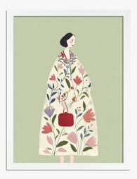
Poster botanische muze, vrouw in bloemenjas
Aanbiedingsprijs Vanaf €19,95€33,25 -

Poster botanische potplanten op plank, gele achtergrond
Aanbiedingsprijs Vanaf €19,95€33,25 -

Poster vrouw met weelderige bloemenjas
Aanbiedingsprijs Vanaf €19,95€33,25 -

Poster boho botanisch met bloemen en aardse bogen
Aanbiedingsprijs Vanaf €19,95€33,25 -

Poster botanisch abstract in pasteltinten groen en roze
Aanbiedingsprijs Vanaf €19,95€33,25 -
Poster blauwe botanische bloemen
Aanbiedingsprijs Vanaf €19,95€33,25 -

Poster vintage botanische studieplaat
Aanbiedingsprijs Vanaf €19,95€33,25 -

Poster botanische lijntekening collectie
Aanbiedingsprijs Vanaf €19,95€33,25 -

Poster surrealistische bloem met zwart-wit schaakbord
Aanbiedingsprijs Vanaf €16,95€23,95 -

Poster moderne botanische bloem op groen
Aanbiedingsprijs Vanaf €19,95€33,25 -

Poster botanische bloemen in vintage stijl
Aanbiedingsprijs Vanaf €19,95€33,25 -

Poster moderne botanische popart
Aanbiedingsprijs Vanaf €19,95€33,25


Meer van The Frame

Tulip Art for Bedrooms: The Best Colours, Sizes...
Tulips are one of the few florals that feel equally at home in a minimalist bedroom and a maximalist one. Their soft, sculptural forms and huge colour range mean you...

William Morris Animal Designs: The Complete Sto...
Animals in William Morris's original work: what he actually designed William Morris designed a surprising number of animals, but not the ones most people assume. His original wallpapers, textiles and...

Why Vintage Fish Prints Work in Modern Homes Wh...
Vintage fish prints have quietly become one of the most useful things you can put on a wall. Not because they're trendy, but because their scientific origins make them work...