Five Characteristics of Impressionism and How to Spot Them in Art Prints
A buyer's guide to recognising real impressionist character in a print, and spotting the reproductions that flatten it.

Impressionism is one of the most reproduced movements in the world, which means it's also one of the most badly reproduced. A flat, oversaturated print of a Monet looks nothing like the painting it borrowed from. This guide walks you through the five visual hallmarks of impressionism and shows you exactly how reproduction quality either preserves them or destroys them.
The five hallmarks of impressionist art
Before you can judge a print, you need to know what the original was doing. Impressionism, born in 1870s Paris with Monet, Renoir, Pissarro, Morisot and their circle, broke nearly every rule of academic painting. Five characteristics define the movement, and all five depend on reproduction quality to survive the journey from canvas to your wall.
Visible brushwork
Impressionists left their brushstrokes on the canvas. Where academic painters smoothed every transition into invisibility, Monet and his peers used short, broken, often unblended strokes that you can see clearly when you stand close. The texture is the point. Each stroke is a deliberate dab of colour that your eye assembles into a coherent image at viewing distance.
This is also the first thing to vanish in a poor reproduction. If brushwork looks soft, smudgy, or compressed into a uniform texture, the print has lost the movement's signature.
Light as the real subject
Impressionists were obsessed with how light behaves. Monet painted the same haystack in fog, frost, midday sun and dusk because the subject was never really the haystack. It was the light falling on it. Look for high-key passages sitting next to deep shadow, with surprising colour temperature shifts across surfaces that should logically be a single tone.
Pure, unmixed colour
The impressionists largely abandoned black and avoided pre-mixing their pigments on the palette. Shadows are violet, blue, or deep green rather than grey. Colours are placed next to each other on the canvas rather than blended together, so the eye does the mixing optically. This produces a vibrating, luminous quality that flat printing cannot fake.
Movement and immediacy
These paintings feel alive. Wind in the trees, ripples on water, steam from a locomotive, a crowd in motion. The loose handling and visible speed of execution communicate that the artist was working in the present tense. Many were painted en plein air, outdoors, often in a single sitting before the light changed.
Atmosphere over detail
Impressionism doesn't tell you what every leaf looks like. It tells you what the entire scene felt like at one specific moment. Backgrounds dissolve. Edges soften. Whole figures resolve into a few suggestive marks. This is why the question of how to tell if a painting is impressionism often comes down to atmosphere: if the scene feels caught rather than constructed, you're probably looking at the real thing.

Why cheap reproductions kill the impressionist effect
Every cost-cutting measure in print production attacks one of the five hallmarks above. This is not a coincidence. Impressionism is uniquely vulnerable because it depends on subtleties that mass production tends to flatten.
Four-colour CMYK printing on thin paper compresses the tonal range. Subtle shifts between two close violets become a single muddy purple. The vibration between adjacent unmixed colours, the entire optical engine of impressionism, collapses into a flat field.
Low-resolution source files turn visible brushwork into pixel mush or, worse, get artificially sharpened to compensate. Either way the texture you should be seeing is replaced by something the printer invented to fill the gap. The result looks like a photograph of a painting taken through a slightly dirty window.
Glossy finishes and dye-based inks add their own problems, which we'll get to. The takeaway: if you're shopping for the best impressionist moon artwork you can hang at home, the print's technical specifications matter as much as the painting it reproduces.
The viewing distance test
Real impressionism resolves at a distance. Walk up close and you should see broken strokes, exposed canvas, individual dabs of colour. Step back and the image snaps into focus. A good print preserves this dual reading. A poor print fails at one end or both. Either it looks acceptable from across the room but reveals a flat, lifeless surface up close, or it looks reasonable nearby but never coheres into a satisfying image at any distance.
Matte vs. glossy: which finish actually works for impressionist prints
We'll save you the suspense. Matte, every time, for impressionist work.
Glossy paper was designed to mimic the surface of a photograph. It produces a hard reflective sheen that bounces light off the print before your eye can read what's underneath. For a high-contrast photograph or a graphic illustration, that punch can be useful. For an impressionist moon painting, where the entire effect depends on soft tonal shifts and the eye reading texture across the surface, glossy is fatal.
Three reasons matte wins.
First, matte paper diffuses light evenly across the surface, so you see the image rather than the reflections of your overhead lights. This matters most for a moon painting impressionist style, where dark passages dominate and any glossy reflection becomes a distracting white smear across half the print.
Second, a textured matte surface visually approximates the tooth of canvas or the slight roughness of paper that an original impressionist sketch would have had. Glossy paper looks like glossy paper. There is no painting it can be from.
Third, matte preserves shadow detail. Glossy compresses dark tones into a uniform black because the surface gloss reflects too much ambient light to let your eye distinguish a deep blue from a deep violet. Impressionists were the painters who pulled colour out of shadow. A glossy print throws that work away.
Our art prints are printed on thick matte paper for exactly this reason. No glare, natural colour, and the kind of surface that lets the painting do its job.

How giclée printing preserves the texture and tonal range of impressionist originals
Giclée is a French word that essentially means "sprayed," and it refers to a class of high-resolution inkjet printing that uses pigment-based inks and archival paper. The category covers a lot of ground, so the word alone is not a quality guarantee. What matters is what's happening underneath.
Pigment inks vs. dye inks
Dye-based inks sit in a liquid solution that soaks into the paper. They're cheap, they fade fast, and they tend toward oversaturation because that's what makes them look impressive on a screen-style image. Pigment inks use solid colour particles suspended in liquid that sit on the paper surface. They produce more accurate colour, far better archival life, and crucially for impressionism, they preserve subtle tonal differences between similar hues.
For a Monet moonrise, this is the difference between seeing seven distinct blues in the night sky and seeing one approximated blue with some darker patches.
Wider colour gamuts
Standard four-colour CMYK printing covers a limited range of the visible spectrum. Higher-end giclée systems use eight, ten, or twelve inks including light cyan, light magenta, multiple greys, and sometimes orange or green. The effect on impressionist work is dramatic. Those wider gamuts can actually print the violets in a shadow and the warm yellow-greens in a sunlit leaf without compromising one to render the other.
Resolution that matches the brushwork
Impressionism needs resolution because brushwork is fine, varied, and irregular. A 300 DPI giclée print on a properly prepared file will preserve individual stroke edges, the texture of the canvas weave, and the slight relief where paint built up thicker. Lower resolutions blur all of this into a generic painted-look smear.
When you're browsing impressionism art prints, the question to ask is not "is it giclée" but "what's the paper, what are the inks, and what's the source resolution." All three need to be right.
What to look for when buying impressionist moon art prints online
Impressionism moon paintings are a particular case. Nocturnal scenes push reproduction harder than daylight ones because the tonal range is compressed into the dark end, where any printing weakness becomes immediately visible. A muddy shadow in a sunlit haystack reads as atmosphere. A muddy shadow in a moonlit harbour reads as a printer error.
Here's a working checklist for evaluating impressionist moon prints before you buy.
Paper specification. Look for thick, uncoated or lightly coated matte paper. If the listing doesn't tell you the paper weight or finish, that's a flag.
Ink type. Pigment-based, archival, fade-resistant. The phrase "museum quality" can mean a lot of things, but it should at minimum mean pigment inks rated for archival lifespan.
Source resolution. A serious seller will be working from high-resolution scans or files. Zoom into the product image. If you can zoom in close enough to see brushwork detail, that's a good sign. If zooming reveals a soft, blurry mess or pixelation, the source file isn't sufficient and the print won't be either.
UV protection. Moon paintings often live in bedrooms and lounges where they catch some indirect daylight. UV-protective glazing (acrylic rather than glass on framed prints) prevents the colour shift that turns a deep midnight blue into a faded slate grey over five years.
How it ships. This is where many sellers fall apart. Frames shipped separately from prints almost always result in a misaligned final assembly. Look for prints that arrive properly fitted in their frame, ready to hang. Our framed prints ship as one piece in one box for this reason.
Frame material. Solid wood holds its shape. MDF and veneer warp, especially in humid rooms. The frame should be solid wood, FSC-certified ideally, with proper joinery.
If you're also browsing vintage art prints from the broader 19th and early 20th century period, the same principles apply. Tonal subtlety, paper finish, and ink quality matter more than the era depicted.

Red flags: prints that look oversharpened, oversaturated, or plasticky
Some failures are more common than others. Here's what to scan for in product photography before you commit.
Oversaturated colour
Cheap prints push colour to maximum because that's what looks punchy on a phone screen. The result is a Monet in which the poppies are radioactive red and the sky is a uniform postcard blue. Impressionism uses high-chroma colour, but it earns it through contrast with subtle adjacent tones. A print that screams from across the room is almost always wrong.
Oversharpened edges
Look for unnatural haloes around figures, trees, or the moon itself. Sharpening algorithms add a thin band of contrast along edges to make a low-resolution image look crisper. Done lightly it's invisible. Done aggressively, which is standard for cheap reproductions, it produces a plastic, cut-out quality where forms feel pasted onto the background instead of emerging from it. Impressionism specifically resists this because its edges are meant to be soft.
Plasticky surface
If the surface in product photos looks like a phone screen protector, it's a glossy print and it will read that way on your wall. Look for surface photography that shows the paper texture clearly.
Flattened tonal range
Hold the product image up next to a museum photograph of the original painting (Google Arts and Culture is good for this). If the print version has lost the subtle mid-tones, particularly in skies and shadows, the reproduction has been compressed. This is the single most common failure mode for impressionist prints and the hardest to undo with framing or lighting.
Inconsistent reviews mentioning colour
Read reviews specifically for colour-accuracy comments. "Looks just like the original" is a useful signal. "A bit darker than expected" or "more orange than the photo" suggests calibration problems at the print stage.

A short checklist before you buy
When you find a print you like, run through these in order.
- Is the paper matte? Is the weight specified?
- Are the inks pigment-based and archival?
- Can you zoom into the product image and still see brushwork detail?
- Does the frame ship attached to the print, ready to hang?
- Is the frame solid wood, not MDF or veneer?
- Is there UV protection on the glazing?
- Do the colours in the product photo match a reference image of the original?
- Do reviews mention colour accuracy positively?
If a print clears all eight, you're looking at something that will preserve what makes impressionism worth hanging in the first place. If it fails three or more, keep looking. The painting deserves better, and so does your wall.

Fab-producten in dit blog
-

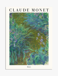
Poster irissen van Claude Monet
Aanbiedingsprijs Vanaf €19,95€33,25 -

Poster maanverlicht landschap
Aanbiedingsprijs Vanaf €19,95€33,25 -

Canvas het pad door de irissen van Monet
Aanbiedingsprijs Vanaf €65,95€94,95 -

Poster artistieke reflectie van Van Gogh
Aanbiedingsprijs Vanaf €19,95€33,25 -

Poster maan en sterren in Biarritz-stijl
Aanbiedingsprijs Vanaf €19,95€33,25 -

Poster impressionistisch landschap in Renoir-stijl
Aanbiedingsprijs Vanaf €16,95€23,95 -

Poster kleurrijke skyline
Aanbiedingsprijs Vanaf €19,95€33,25 -

Poster maan en sterren – Biarritz
Aanbiedingsprijs Vanaf €19,95€33,25 -

Poster Jeanne Samary van Renoir
Aanbiedingsprijs Vanaf €16,95€23,95 -

Poster maanverlichte kust met palmen
Aanbiedingsprijs Vanaf €19,95€33,25 -
Poster Monets irissen in de tuin
Aanbiedingsprijs Vanaf €19,95€33,25 -

Poster volle maan boven mistige heuvels
Aanbiedingsprijs Vanaf €19,95€33,25 -

Canvas zonsondergang op zee van Renoir
Aanbiedingsprijs Vanaf €65,95€94,95 -
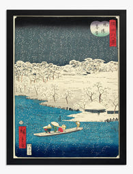
Poster maanlicht en sneeuw van Hiroshige
Aanbiedingsprijs Vanaf €19,95€33,25 -

Canvas kamperen onder volle maan
Aanbiedingsprijs Vanaf €65,95€94,95 -

Poster pad door de irissen van Monet
Aanbiedingsprijs Vanaf €19,95€33,25 -

Canvas provençaals landschap geïnspireerd door Renoir
Aanbiedingsprijs Vanaf €65,95€94,95 -

Poster maanlicht aan de Middellandse Zee
Aanbiedingsprijs Vanaf €19,95€33,25 -

Poster Bois de la Chaise van Pierre-Auguste Renoir
Aanbiedingsprijs Vanaf €16,95€23,95


Meer van The Frame

Beyond the Fruit Bowl: Kitchen Wall Art Ideas T...
The kitchen is the most photographed, most lived-in room in your home, and yet it's usually decorated like an afterthought. A print of lemons here, a chalkboard-style coffee poster there,...

Vintage Botanical Prints in Modern Homes: How t...
Botanical prints have a reputation problem. Done badly, they read as chintzy, twee, or straight out of a 1980s guest bedroom. Done well, they're one of the most timeless things...

The Complete Guide to Decorating with Botanical...
Botanical prints are the closest thing interior design has to a universal donor. They work with almost any style, palette, and period. Almost. This is a room-by-room guide with specific...