Lyrics Wall Art Ideas: How to Style Song Words in Every Room
The post-purchase styling guide for making song lyrics on your wall look intentional, not like a Pinterest accident.

Lyrics prints are the trickiest piece of wall art to style well. Unlike a landscape or abstract, text needs to be read, which means size, distance, and lighting all matter more than they do for regular art. Get those right and a lyrics print becomes the most personal thing in your home. Get them wrong and it looks like a printout you taped up.
Why lyrics prints need more thought than regular art
Text-based art has one thing image-based art doesn't: a readability threshold. If your guests can't comfortably read the words from where they'd naturally stand or sit, the print stops working. It becomes visual noise.
The professional rule of thumb is that text should be readable from roughly 1.5 times the longest dimension of the print. A 50x70cm print should read clearly from about a metre away. Smaller than that and the lyrics fade into pattern. Larger and you've miscalculated the room.
This is why sizing matters more for lyrics art prints than for any other category. You're not just decorating a wall, you're publishing something that needs to be legible. Three things wreck readability faster than anything else: prints hung too high, prints hung too small for the wall, and lighting that bounces glare off the surface. We'll fix all three.
A quick word on glazing before we go further. Glass on lyrics prints is a problem because it reflects ceiling lights and windows directly onto the words. UV-protective acrylic, which is what we use, cuts that glare significantly and stops the ink fading even in bright rooms. If you've bought a lyrics print elsewhere with glass framing, hang it on a wall that doesn't face a window.

Above the bed: sizing, centring, and choosing the right verse
The bedroom is where most lyrics prints end up, and it's also where most of them get hung wrong. The two mistakes we see constantly: too small, and too high.
Sizing above the bed
For a standard double bed (135cm wide), the print should occupy roughly two thirds of the headboard width. That puts you around 60x80cm minimum, ideally framed. For a king (150cm) or super king (180cm), step up to 70x100cm or hang a pair side by side. Anything smaller than 50x70cm above a double bed will look apologetic.
Centre the print on the bed, not on the wall. Beds are rarely perfectly centred between walls and your eye reads the bed as the anchor. The bottom edge of the frame should sit roughly 15-25cm above the headboard or pillow line, close enough that the two pieces feel connected.
Choosing which verse to display
This is the editing decision people agonise over and it's worth slowing down for. A lyrics poster for bedroom use should feel intimate without being a journal entry. The chorus is usually the worst choice because it's the most repeated and therefore the least specific. The verse that made you love the song in the first place is usually the right one.
Avoid lyrics that mention the listener directly ("you broke my heart") if guests will see the room often. They tend to read as either accusations or oversharing. Lyrics that describe a scene, a feeling, or a place tend to age better than lyrics that describe a relationship.
For shared bedrooms, pick a song you both genuinely love rather than a song one of you tolerates. First dance lyrics work above the bed precisely because the agreement is already baked in.
Living room statement wall: going big with a single framed lyrics print
The living room is where lyrics prints earn their keep. One large, well-framed lyrics print on a feature wall does more work than three medium pieces fighting for attention.
For a statement wall behind a sofa, go big. Minimum 70x100cm, ideally larger if the wall allows. The print should span roughly two thirds of the sofa width, hung so the centre sits at average eye level, around 145-150cm from the floor. Sofa, then 20cm of breathing room, then frame.
Canvas works beautifully here if you want a softer, less formal feel. The matte poly-cotton surface absorbs light rather than reflecting it, which makes lyrics genuinely easier to read from across the room. Framed prints feel more polished and architectural, which suits more formal living rooms with structured furniture.
The trade-off is honest: canvas is lighter, more forgiving in humid rooms, and reads less precious. Framed prints look more considered but weigh more and need proper fixings into the wall, not just a picture hook into plaster.
If your living room has a fireplace, the chimney breast is often the best home for a single large lyrics print. Centre it on the chimney breast, not the room. The mantel becomes a natural shelf for objects that echo the song's mood without being literal about it.

Gallery walls with lyrics: mixing text with complementary artwork
Lyrics prints can absolutely sit in a gallery wall, but they need careful pairing. The rule we follow: one piece of text per gallery wall, maximum. Two competing lyrics prints turn a wall into a noticeboard.
What pairs well
Lyrics prints look best alongside artwork that's quiet rather than loud. Black and white photography, botanical illustrations, abstract line drawings, and muted landscapes all give the eye somewhere restful to land between reading. The text becomes the focal point because everything around it whispers.
Avoid pairing lyrics with other typographic art (quote prints, posters with slogans, vintage advertising). Two competing fonts on one wall feels chaotic even when the design pedigree is good.
Colour-wise, pull one or two tones from the lyrics print and repeat them in surrounding pieces. If your lyrics print is black ink on cream paper, surround it with pieces in warm neutrals, soft black, and one accent colour. Repetition creates calm.
Layout formulas that work
For a 6-piece gallery wall with one lyrics print, place the lyrics centre-left or centre-right, never bottom corner where it gets ignored. Make the lyrics print the largest piece in the arrangement so the eye lands there first.
A useful approach for any gallery: lay everything on the floor first, photograph it from directly above, then rearrange in the photo before you put a single nail in the wall. Browse pre-curated wall art sets if you want a shortcut to a coherent palette.
Hallways and staircases: using lyrics to fill awkward narrow spaces
Hallways are where lyrics prints quietly outperform almost any other art form. They're narrow, often poorly lit, and rarely viewed from far away, all of which suits text. You read a hallway print as you walk past it. That changes the maths completely.
Hallway sizing
In a narrow corridor, prints under 40x50cm get lost and prints over 70x100cm feel claustrophobic. The sweet spot is 50x70cm in portrait orientation, hung at proper eye level (around 145cm to centre). A run of three identically framed lyrics prints down a long hallway, evenly spaced, gives a corridor a sense of rhythm and intention that a single piece can't.
For hallway wall art, portrait orientation almost always works better than landscape. Hallways are tall, narrow spaces and the art should echo that geometry.
Staircase walls
Staircases are the trickiest wall in any home and lyrics prints are one of the few art forms that solve them well. Follow the line of the stairs, not the floor. Imagine a parallel line running about 145cm above each step at its midpoint and centre your prints on that diagonal.
Three to five prints in matching frames, stepping up the wall, beat any single piece. Mix lyrics with photography or simple botanical prints rather than running five lyrics prints in a row.

Nurseries and kids' rooms: playful lyrics that grow with them
Nursery lyrics prints get a bad reputation because people pick lyrics that sound twee written down. "You are my sunshine" works as a lullaby and looks slightly grim on a wall. The trick is choosing lyrics that feel like a gift to a future teenager, not a cot-side decoration.
Pick songs you actually want your child to know about. Lyrics from a song you love, in a frame that won't look out of place when they're 14, will outlast every nursery trend. Avoid anything that explicitly references a baby or being little. Those phrases age out fast.
Sizing in kids' rooms
Above a cot, keep prints small to medium (40x50cm or 50x70cm) and hang them outside the cot footprint, ideally on an adjacent wall. Nothing should be hangable into the cot itself.
For older kids' rooms, a single 60x80cm framed lyrics print above a desk or bed creates a focal point without overwhelming a smaller room. Frames should be solid wood, properly fitted, with no chance of glass shattering. Acrylic glazing is genuinely the right call in any room a child uses.
Frame colour and finish: how to match lyrics prints to your interior
The frame is doing more work on a lyrics print than on any other type of art, because the frame is the only "image" surrounding the text. Wrong frame and the words feel orphaned.
Black frames
Black frames suit modern, minimalist, and industrial interiors. They're the safest choice for monochrome lyrics prints and they make text pop hard against white walls. The trade-off is that black frames can feel heavy in a room with a lot of soft furnishings or pastel walls. If your interior is warm and textural, black often fights it.
White frames
White frames disappear into white walls, which is either a feature or a bug depending on what you want. They work brilliantly when the lyrics print itself has a coloured background or strong illustration. On a cream-paper lyrics print against a white wall, a white frame can look like the print is floating with no boundary. Sometimes that's the point.
Natural wood frames
Oak, ash, and walnut frames are the most flexible choice and the one we'd reach for first if you're unsure. Wood softens text-heavy art, which can otherwise feel clinical. Natural wood works in Scandinavian, mid-century, country, and warm-modern interiors. It struggles in very high-contrast monochrome rooms, where black is usually better.
Pay attention to the wood already in your room. Match the frame to your floors, your bed frame, or your shelving rather than introducing a third wood tone. Three different woods in one room reads as accidental.
A note on frame quality
Cheap frames are the single biggest reason lyrics prints look budget. Thin profiles, MDF construction, and prints that bow inside the mount give the whole piece away. Solid wood frames with the print properly fitted and shipped in one box (not the print and frame separately, to be assembled at home) make a significant visible difference. This is most of the difference between a £20-looking print and a £200-looking one, and it's why we don't sell anything else.

A few more decisions worth making
Test before you commit. Cut a piece of paper to the exact size of your print and tape it to the wall for 48 hours. Live with it. You'll know within a day if it's wrong.
Light it properly. Lyrics need ambient light, not direct overhead spots that bounce off the surface. A floor lamp positioned to the side works better than a ceiling spot directly above.
Rotate seasonally if you want. A more upbeat lyric in summer, something quieter in winter. Just don't switch so often the wall feels unsettled. Twice a year is plenty. Browse the full bedroom wall art range if you're building a small rotation.
Don't be too personal. Lyrics that mean something only to you and one other person can feel like a private joke on the wall. The best lyrics prints work because the song is loved widely and the verse is specific. Lean toward songs other people will recognise even if the meaning is yours alone.
Get the size right, get the frame right, hang it where light won't fight it, and a lyrics print will outlast every other piece of art in your home. The words are the easy part. Everything else is what makes it look intentional.

Fab-producten in dit blog
-

Canvas Wonderwall songtekst typografie in zwart-wit
Aanbiedingsprijs Vanaf €65,95€93,95 -

Poster Wonderwall songtekst
Aanbiedingsprijs Vanaf €19,95€33,25 -

Canvas Vogue songtekst in zwart-wit
Aanbiedingsprijs Vanaf €65,95€93,95 -

Canvas 'Music Is the Answer'
Aanbiedingsprijs Vanaf €65,95€93,95 -

Poster hiphop songtekst in zwart-wit
Aanbiedingsprijs Vanaf €19,95€33,25 -
Canvas songtekst typografie, zwart-wit met geel accent
Aanbiedingsprijs Vanaf €65,95€93,95 -

Poster muziek is mijn muze
Aanbiedingsprijs Vanaf €19,95€33,25 -

Canvas hiphop-typografie met songteksten in zwart-wit
Aanbiedingsprijs Vanaf €65,95€93,95 -

Canvas Here Comes the Sun songtekst
Aanbiedingsprijs Vanaf €65,95€93,95 -

Poster klassieke hiphop songteksten in zwart-wit
Aanbiedingsprijs Vanaf €19,95€33,25 -
Poster Shine Together songtekst in zwart-wit
Aanbiedingsprijs Vanaf €19,95€33,25 -

Canvas hiphop songtekst typografie in zwart-wit
Aanbiedingsprijs Vanaf €65,95€93,95 -

Poster let's dance songtekst
Aanbiedingsprijs Vanaf €19,95€33,25 -

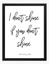
Canvas ‘Shine Together’ songtekst
Aanbiedingsprijs Vanaf €65,95€93,95 -

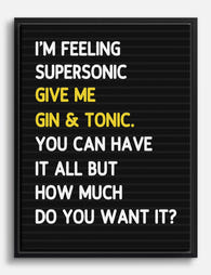
Canvas Supersonic songtekst
Aanbiedingsprijs Vanaf €65,95€93,95 -

Canvas hiphop-anthem songtekst
Aanbiedingsprijs Vanaf €65,95€93,95 -

Poster zangvogels en wilde bloemen
Aanbiedingsprijs Vanaf €19,95€33,25 -
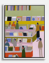
Canvas platenzaak met vinyl in pasteltinten
Aanbiedingsprijs Vanaf €65,95€93,95 -

Canvas klinkt beter met jou
Aanbiedingsprijs Vanaf €65,95€93,95 -

Poster Here Comes the Sun songtekst
Aanbiedingsprijs Vanaf €19,95€33,25


Meer van The Frame

Why Water Lily Art Is Having a Moment in Calm, ...
The loudest botanical prints have had their run. Monstera leaves, banana palms, oversized ferns in stark black frames all shouted "nature" in a way that now feels slightly performative. Water...

The Best Water Lily Prints for Every Room (And ...
Water lily art has a rare quality: it slots into almost any room without asking the rest of the decor to change around it. The tricky part is knowing which...

The Best Wall Art for Plant Lovers (That Doesn'...
You already have too many plants. You know it, your partner knows it, the fiddle leaf fig blocking the window knows it. But your walls are still bare, and there's...