Modern Art Prints: What They Actually Are and How to Style Them at Home
A plain-English guide to what "modern" actually means in art prints, and how to style them room by room.

"Modern" is one of the most overused words in interiors, and one of the most confusing when you're shopping for art. This guide untangles the terminology, then gives you specific, room-by-room formulas for hanging modern art prints at home. No vague "make it a statement" advice.
What 'modern art print' actually means (and what it doesn't)
In art history, "modern art" refers to a specific period roughly between the 1860s and 1970s: think Matisse, Rothko, Mondrian, Pollock. "Contemporary art" technically means anything made now, by living artists. But when most people search for modern art prints, they don't mean a Picasso reproduction. They mean prints that look current, clean, and uncluttered. Modern as an aesthetic, not a museum wing.
Both definitions are useful. A reproduction of a 1950s Bauhaus poster is a modern art print in the historical sense. A 2024 abstract by an emerging artist is a modern art print in the aesthetic sense. The good news is they often share the same visual language: strong forms, confident colour, restraint. So you can mix them on the same wall without it looking off.
There's also "mid-century modern", which is narrower again. That's the postwar look (roughly 1945 to 1969) of warm neutrals, organic curves, mustard, teal, and soft geometry. If you live in a 1960s house or own teak furniture, that's probably what you want. If your flat is white walls and a grey sofa, you're likely shopping for contemporary.

Abstract, minimalist, and graphic: the three main lanes
Almost every modern art print falls into one of three aesthetic lanes. Knowing which one you're drawn to makes shopping ten times easier.
Abstract
Abstract prints don't depict anything literal. They use shape, colour and texture to create mood. This includes painterly abstracts (loose brushwork, layered colour), hard-edge abstracts (clean geometric blocks), and organic abstracts (soft, blobby forms). Abstracts are the most forgiving lane because they don't compete with anything else in the room. They add atmosphere rather than narrative.
Abstract art prints work best when you want a piece to feel emotional or atmospheric without being literal. They're the right choice if your interior is already busy with pattern or texture and you don't want art that adds another layer of "stuff to look at".
Minimalist
Minimalist prints lean on negative space. Single line drawings, one shape on a cream background, a single horizon line. The print's power comes from what's left out. These work brilliantly in small rooms, narrow hallways, and anywhere you want the wall to feel calm rather than busy.
The trade-off: minimalist prints can look thin if the frame and paper quality aren't up to it. Cheap paper and a flimsy frame turn a minimalist print into a bare wall with a sticker on it. This is the lane where print quality matters most.
Graphic
Graphic prints sit between abstract and illustration. Bold typography, retro travel poster styles, contemporary collage, Bauhaus-inspired geometry. They have more personality than minimalist prints and more clarity than abstracts. They're the right choice if you want a print to actually be the focal point of a room rather than a supporting player.
Living rooms: bold abstract prints that anchor a neutral space
The living room is where you can be boldest. It's the room with the most wall space, the most furniture to balance against, and the most forgiving sightlines.
The classic formula: a neutral sofa (grey, oatmeal, deep navy, forest green) with one large abstract print hung above it. The 2/3 width rule applies here. Your art should be roughly two-thirds the width of the sofa beneath it. So a 220cm sofa wants a print around 140 to 150cm wide. That usually means our largest framed size of 70x100cm in landscape, or a canvas at 100x150cm if you want maximum impact.
Hang the bottom edge of the frame around 20 to 25cm above the back of the sofa. Closer than that feels cramped; further away and the print floats off into nothing.
For palette: if your sofa is a cool grey, lean into prints with warm counterpoints (terracotta, ochre, dusty pink). If your sofa is warm beige or oatmeal, cool abstracts in slate, ink blue, or sage green will stop the room feeling beige-on-beige. Avoid matching the print to your sofa exactly. The point is contrast.
If you don't want one giant piece, a triptych of three medium prints (50x70cm each, hung 5cm apart) gives you the same width with more rhythm. Keep all three in the same palette family.

Bedrooms: why muted contemporary prints work better than you'd think
Bedrooms are the one place where the "go bold" advice falls apart. You wake up looking at this art every morning. A high-contrast abstract you loved in the showroom can feel aggressive at 7am.
We almost always recommend muted contemporary art prints for bedrooms: soft abstracts in dusty palettes, minimalist line work, gentle landscapes. Think of it as art that lowers your heart rate rather than raising it.
For colour temperature, lean warm. Soft peach, blush, warm grey, oat, terracotta, sage. Cool blues and stark whites can read as clinical in a room that should feel cocooning. The exception is north-facing bedrooms with already-cool light, where a warm palette becomes essential rather than optional.
Sizing above a bed follows the same 2/3 rule. A standard UK double (135cm wide) wants art around 90cm wide. A king (150cm) wants around 100cm. Either go for one large landscape print (70x100cm framed works beautifully) or a pair of portrait prints (50x70cm each) hung side by side with about 8cm between them. Hang the bottom edge 15 to 20cm above the headboard.
Skip gallery walls above the bed. They date faster than single pieces and tend to look cluttered in a room that should feel restful.
Home offices and studios: energising colour and geometric forms
Home offices want the opposite energy of bedrooms. Stronger colour, sharper forms, a bit of visual caffeine. This is where graphic prints earn their keep.
Geometric abstracts in primary or saturated secondary colours (cobalt, mustard, vermilion) wake up a workspace without being distracting. Bauhaus-style compositions, mid-century geometric prints, bold typography. The trick is to put the energy on the wall behind you (visible on video calls, motivating when you turn around) rather than directly in your eyeline, where it can pull focus from screen work.
Above a desk, go smaller and more curated. A 30x40cm or 40x50cm framed print directly above a monitor is enough. Anything larger competes with the screen. If you have a longer wall to fill, a row of three small prints in matching frames creates rhythm without overwhelming.
For creative studios where you want maximum energy, scale up. A single 100x150cm canvas of a saturated abstract turns a spare room into somewhere you actually want to spend Saturday afternoons.
Pairing modern prints with vintage or traditional interiors
Most styling advice assumes you have a modern home. Most people don't. You might have inherited oak furniture, a Victorian fireplace, floral curtains you can't be bothered to replace. Modern prints can work brilliantly in these rooms. They just need different rules.
The principle is contrast as conversation. A clean abstract print above a carved wooden sideboard creates productive tension; both pieces look better for being near each other. A minimalist line drawing on a wall papered in something florid stops the wallpaper feeling overwhelming and gives the eye somewhere to rest.
Three rules that consistently work:
Match the frame to the room, not the print. In a traditional interior, a thin black or natural oak frame on a modern print bridges old and new better than a frameless canvas. The frame is doing the diplomatic work.
Echo one colour. Pick one colour from your existing room (a cushion, a rug, the curtain trim) and choose a modern print that contains that exact tone somewhere. The repetition tells the eye these things belong together, even if the styles couldn't be more different.
Keep scale honest. Don't shrink a modern print to "fit in" with a traditional room. Modern art holds its own at scale. Hanging a tiny abstract on a big period wall makes it look apologetic.

Size and framing recommendations for modern art prints
Modern prints, more than any other style, depend on framing decisions to land. A great abstract in the wrong frame looks amateur. The same print in the right frame looks gallery.
Paper or canvas
Paper prints feel more contemporary and gallery-like. The matte finish and crisp edges suit minimalist and graphic work especially well. Museum-grade giclée on thick matte paper holds detail beautifully and doesn't reflect light back at you, which matters for prints with subtle tonal work.
Canvas suits painterly abstracts and larger pieces. The texture flatters loose brushwork and the depth of the stretched frame gives big prints physical presence. Canvas is also lighter than framed paper, easier to hang on plasterboard, and works in humid rooms (bathrooms, kitchens) where framed prints can struggle long-term.
If you're torn: paper for minimalist and graphic, canvas for painterly and oversized.
Frame colour
For modern prints in modern interiors, three frame choices cover almost every scenario:
- Natural oak for warm, soft, or earthy palettes. Reads contemporary without being cold.
- Black for high-contrast graphic prints, monochrome work, and architectural lines. Sharpens the image.
- White for minimalist prints in already-busy rooms, where you want the frame to disappear.
Skip ornate frames, gold, and anything with visible mouldings. They fight the print.
When to skip the frame entirely
Canvas hung unframed gives a clean, casual, studio feel that suits modern abstracts well. It's the right call for rental flats (lighter, less fuss with fixings), bathrooms and kitchens, and any room where the rest of the décor is already polished and the art can afford to feel relaxed.
The honest trade-off: framed prints look more finished and tend to age better. Unframed canvas can start to look slightly tired over years if the room around it is very crisp.
A practical sizing cheat sheet
- Above a 2-seater sofa or sideboard: 60x80cm or 70x100cm
- Above a 3-seater sofa: 70x100cm framed, or 100x150cm canvas
- Above a double bed: 70x100cm landscape, or pair of 50x70cm portraits
- Above a desk: 30x40cm or 40x50cm
- Hallway gallery wall: mix 30x40cm and 40x50cm in matching frames
- Stairwell statement: 70x100cm portrait, hung on the largest blank wall
Our favourite modern art prints right now (and why we chose them)
A few categories we keep coming back to.
Soft-edge abstracts in earth palettes. Terracotta, oat, sage, charcoal. These are the workhorses of affordable art prints: they suit almost any room, age slowly, and play nicely with both modern and traditional furniture. If you're nervous about commitment, start here.
Bold single-shape graphic prints. One arch, one circle, one block of colour on a cream ground. They look more expensive than they are, frame brilliantly in oak or black, and give a room instant composition.
Contemporary line drawings. Faces, figures, plants reduced to a single continuous line. Best in small to medium sizes (30x40cm, 40x50cm), grouped or solo. They feel current without screaming about it.
Saturated geometric abstracts. For people who actually want colour. Cobalt and ochre, vermilion and pink, deep green and mustard. These are not for every room, but in the right spot (a hallway, a home office, above a record player) they make a house feel alive.
A note on quality, since this is where modern prints especially tend to fail. Look for giclée printing on thick matte paper, FSC-certified solid wood frames (not MDF or veneer), and UV-protective glazing if the print will sit in direct sunlight. Frame and print should ship together, properly fitted in one box. A modern print is mostly empty space and clean colour, which means any flaw (a warped mount, a misaligned print, a cheap frame) shows immediately.

The takeaway
If you remember three things: figure out which lane you're in (abstract, minimalist, or graphic) before you start shopping; size to two-thirds the width of whatever the art sits above; and let the frame do diplomatic work between the print and the room around it. Modern art prints aren't difficult to style. They just reward specificity.

Fab-producten in dit blog
-
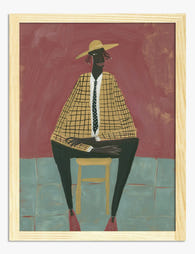
Poster modern portret in aardetinten
Translation missing: nl.products.product.sale_price Vanaf €19,95€33,25 -

Poster Bauhaus minimalistisch geometrisch in zwart en crème
Translation missing: nl.products.product.sale_price Vanaf €19,95€33,25 -

Poster Bauhaus modern-minimalistisch in zwart en beige
Translation missing: nl.products.product.sale_price Vanaf €19,95€33,25 -

Poster abstracte penseelstreken in diep groen en zwart-wit
Translation missing: nl.products.product.sale_price Vanaf €19,95€33,25 -

Poster moderne geometrische vormen in warm geel en diep groen
Translation missing: nl.products.product.sale_price Vanaf €19,95€33,25 -

Poster moderne penseelstreken in neutrale tinten zwart en beige
Translation missing: nl.products.product.sale_price Vanaf €19,95€33,25 -

Poster kleurrijke moderne kunst
Translation missing: nl.products.product.sale_price Vanaf €19,95€33,25 -

Poster zeilboot bij zonsondergang aan zee
Translation missing: nl.products.product.sale_price Vanaf €19,95€33,25 -

Poster Bauhaus modern minimalistisch in groen en crème
Translation missing: nl.products.product.sale_price Vanaf €19,95€33,25 -

Poster minimalistische balans in zwart en beige
Translation missing: nl.products.product.sale_price Vanaf €19,95€33,25 -

Poster moderne geometrische vormen in neutrale tinten
Translation missing: nl.products.product.sale_price Vanaf €19,95€33,25 -

Poster moderne geometrische vormen
Translation missing: nl.products.product.sale_price Vanaf €19,95€33,25 -

Poster moderne Bauhaus oase van rust
Translation missing: nl.products.product.sale_price Vanaf €19,95€33,25 -

Poster kleurrijk modern interieur
Translation missing: nl.products.product.sale_price Vanaf €19,95€33,25 -

Canvas Bauhaus minimalistisch en modern
Translation missing: nl.products.product.sale_price Vanaf €65,95€93,95 -

Poster cactussen in de woestijn, rood en blauw
Translation missing: nl.products.product.sale_price Vanaf €19,95€33,25 -

Poster minimalistische roos in rood en blauw
Translation missing: nl.products.product.sale_price Vanaf €19,95€33,25 -

Poster abstracte, organische vormen met moderne uitstraling
Translation missing: nl.products.product.sale_price Vanaf €16,95€23,95 -

Poster mid-century modern huis met zwembad
Translation missing: nl.products.product.sale_price Vanaf €19,95€33,25 -

Poster modern kubistisch portret in zachte aardetinten
Translation missing: nl.products.product.sale_price Vanaf €19,95€33,25


Meer van The Frame

Our Favourite Jungle Prints for Every Room: The...
Jungle prints have a reputation problem. Done badly, they tip a room into themed-restaurant territory faster than almost any other trend. Done well, they add depth, movement and a sense...

Thrushes, Hares, and Peacocks: The Animals in W...
Why Morris put animals at the centre of his designs William Morris wasn't decorating walls with cute creatures. He was making a quiet argument. While Victorian factories churned out cheap,...

From Dutch Masters to Modern Minimalism: The Ke...
Search "types of flower bouquet art" and you'll get wedding centrepieces, posy guides, and cascading bridal arrangements. Useful if you're getting married. Useless if you're trying to choose what goes...