What Colours Go With Tropical Art? A No-Nonsense Pairing Guide
Start with the art on your wall, then work backwards to a palette that actually flatters it.

Most tropical decor guides tell you to design a whole room from scratch. This one assumes the opposite: you've found a tropical print you love, and now you need to know what won't fight it. We'll work backwards from the art to the walls, furniture, and textiles around it.
The simple rule: let the print lead, and keep everything else quieter
Tropical art is loud by design. Saturated greens, hot corals, electric birds of paradise, deep monstera shadows. That's the appeal. The mistake is treating the room like another competing voice instead of a backdrop.
Think of it as the "one star" principle. Your print is the headliner. Everything else, walls, sofa, cushions, rug, should sit a few notches below in intensity. If the room and the art are both shouting, neither one wins.
Before you pick a single paint chip, look at your print and answer two questions. First, what's the dominant colour temperature: warm (golden greens, coral, terracotta, mustard) or cool (blue-greens, teal, deep emerald, indigo)? Second, what's the intensity: high contrast and saturated, or softer and more painterly? Your answers decide everything that follows.

Wall colours that make tropical prints pop
The safest, most flattering backdrop for nearly any tropical print is a soft, slightly warm neutral. Not stark white (it makes saturated prints look harsh and cuts off the edges visually) and not cool grey (it dulls the greens).
Warm whites and off-whites
For warm-leaning prints with golden greens, coral, or sunset tones, try Farrow & Ball School House White or Pointing. Both have a soft yellow base that flatters warm tropical palettes without competing. Dulux Natural Calico is a cheaper alternative with a similar undertone.
For cooler tropical prints with blue-greens and deep teals, Farrow & Ball Strong White or Wimborne White work beautifully. They're warm enough to feel inviting but neutral enough not to clash with cool pigments in the art.
Greiges and warm beiges
If plain white feels too bare, a soft greige adds depth without intensity. Farrow & Ball Skimming Stone, Little Greene Slaked Lime, and Dulux Egyptian Cotton all sit in the sweet spot: warm enough for golden greens, soft enough not to muddy cool ones.
These shades work especially well behind detailed, painterly prints where you want the artwork to read as a window rather than a graphic statement.
Soft sage and muted green
This is the unexpected winner for tropical art. A pale, dusty sage on the walls picks up the greens in your print and creates a sense of the foliage extending into the room. Farrow & Ball Mizzle and Little Greene French Grey Pale are both excellent. Avoid anything too saturated, you want the wall reading as a whisper of green, not a statement.
Browse our green art prints for pieces that lean into this approach.
Soft blue
For prints featuring ocean, sky, or coastal tropical scenes, a pale, slightly grey-blue does the same trick. Farrow & Ball Borrowed Light or Pavilion Blue both work. They echo the cool tones in the art without trying to compete with them.
The bold move: dark accent walls behind tropical art
Dark walls behind tropical prints can be spectacular, but only with the right print. Get this wrong and the art disappears. Get it right and you've created something that looks like a private gallery.
When dark walls work
Dark backgrounds work brilliantly when your print has:
- High contrast (bright botanicals against a dark or neutral ground)
- A pale border or generous white margin around the artwork
- Bold, graphic shapes rather than fine detail
- A framed format that physically separates the art from the wall
The classic combination is a deep emerald or forest green wall behind a botanical print with cream or white negative space. Try Farrow & Ball Studio Green, Green Smoke, or Little Greene Puck. The wall reads as luxurious foliage, the print reads as a botanical specimen pinned against it.
Navy and deep teal
For prints with strong blues, corals, or pinks, a deep navy like Farrow & Ball Hague Blue or Railings creates real drama. Coral pops against navy in a way it never will against beige. Same with white-feathered birds, palm silhouettes, and flamingos.
Charcoal and near-black
Reserve this for prints with extremely high internal contrast and bold subject matter. A single large palm leaf on a pale background, framed in black, hung on a charcoal wall, is a confident look. A delicate watercolour botanical on charcoal will vanish.
When dark walls don't work
Skip the dark wall if your print is itself dark and moody, if the background of the print is already deep green or navy, or if the artwork is small. Dark walls swallow small prints. Below 50x70cm, stick to lighter backdrops or cluster smaller pieces into a gallery wall.

Furniture and textiles: materials and tones that work
Once the wall is sorted, the rest of the room needs to reinforce the "one star" rule. Textures do a lot of heavy lifting here, because they add interest without adding colour competition.
Natural materials are your best friend
Rattan, cane, jute, linen, raw oak, light terracotta. These materials have visual texture but live in a quiet, earthy colour range. They feel of-a-piece with tropical art without trying to outshine it.
A rattan armchair, a jute rug, and a linen sofa in oatmeal or warm white will sit beautifully under almost any tropical print. The textures echo the organic quality of the artwork. The neutral colours stay out of the way.
Wood tones
Stick to one wood family per room. Mid-toned oak, warm walnut, or pale ash all work. Avoid mixing orange-toned pine with cool grey-washed wood: it creates visual noise that distracts from the art.
For warm-leaning prints, lean into warmer woods (walnut, teak, oak with a honey finish). For cool-leaning prints, paler woods (ash, light oak, lime-washed finishes) feel more cohesive.
Textiles: 70/20/10
A useful proportion to keep in mind: about 70% of your soft furnishings should be in neutral or quiet tones, 20% in a secondary colour drawn from the print, and 10% in a small accent that picks up the print's brightest note.
So if your print features deep green palms, coral flowers, and a cream background: 70% cream and oatmeal cushions and throws, 20% in soft sage or olive, 10% in a small coral cushion or a single coral ceramic. That's it. Don't repeat the coral six times.
What to put on the sofa
Linen, cotton, and washed canvas in cream, oatmeal, sand, or warm grey. Avoid bright tropical-print upholstery if you've got tropical art on the wall. Two competing tropical patterns in one room is exhausting.
If you want pattern, keep it small-scale and quiet: a subtle weave, a fine stripe, a textural slub. Save the bold print for the art.
What to avoid: colour clashes that kill the vibe
Most tropical art failures come down to a few specific mistakes.
Cool grey walls
The biggest one. Cool grey, especially the blue-grey shades that were everywhere a decade ago, makes warm tropical prints look dirty and cool ones look icy. The greens go olive, the corals turn brown, the whole palette feels off. If you've got cool grey walls already, your tropical print will fight you every day.
Competing saturated colours
A bright turquoise wall behind a bright tropical print is a clash, not a coordination. Two saturated colours of similar intensity will battle each other. Pick one to be loud.
Burnt orange and mustard with cool prints
Warm, autumnal accents can look brilliant with golden-green tropical prints. They look badly mismatched against cool blue-green prints. Match temperatures.
Pink-toned beiges with green prints
Some beiges have a pink undertone that turns greens muddy. Always test paint samples against your actual print, ideally at three times of day: morning, midday, and evening under lamps. What looks neutral at 11am can read pink by 7pm.
Mixing too many bold accent colours
Pick two accent colours pulled from the print, maximum. Three or more and the room starts to look like a souvenir shop.
Glossy finishes everywhere
High-gloss walls, glass-topped tables, mirrored cabinets, all reflecting the art. Tropical prints have depth and texture, they want matte and natural surfaces around them to breathe. This is one reason we use a matte UV-protective acrylic glaze on framed prints rather than glass: no reflections fighting the artwork, no glare under a window.

Three real room palettes built around tropical prints
Here are three complete palettes, each built from the print outward. Steal them whole or use them as a starting point.
Palette 1: Warm botanical lounge
Built around: A large framed print of layered monstera and palm leaves with golden-green tones and a cream background. Browse botanical art prints for this style.
- Walls: Farrow & Ball Skimming Stone (warm greige)
- Sofa: Oatmeal linen
- Rug: Natural jute
- Wood: Warm oak or walnut
- Accents: Sage cushions, a single terracotta ceramic, brass picture light
- Plants: A real Swiss cheese plant or fiddle leaf fig in a textured terracotta pot
Why it works: everything is warm-toned and quiet. The print is the only saturated element. The textures (linen, jute, terracotta, wood) all pull in the same earthy direction.
Palette 2: Coastal-tropical bedroom
Built around: A medium tropical art print featuring palm fronds against a soft blue or pale ocean background, framed in natural oak.
- Walls: Farrow & Ball Borrowed Light (soft pale blue)
- Bedding: White cotton with a single sand-coloured throw
- Headboard: Natural rattan or pale oak
- Wood: Light ash or whitewashed
- Accents: Pale aqua ceramic lamp base, linen cushions in cream, a single deep teal cushion
- Floor: Pale wood or natural sisal
Why it works: the cool blue wall lifts the cool tones in the print without competing. The textures stay coastal and natural. The single deep teal cushion pulls the eye and ties back to the deepest pigment in the artwork.
Palette 3: Dramatic dining room
Built around: A large canvas of bold tropical foliage with high contrast and a near-black background, or a framed print of a single graphic palm leaf against pale ground.
- Walls: Farrow & Ball Studio Green (deep emerald)
- Table: Solid walnut or dark oak
- Chairs: Cane-backed dining chairs with cream linen seats
- Lighting: Woven rattan pendant or brass
- Textiles: Cream linen table runner, no patterned napkins
- Accents: Brass candlesticks, ceramic vases in cream and olive
Why it works: the dark wall makes the print feel like it's in a gallery. The natural materials (cane, walnut, rattan) keep the room from feeling stiff. Cream textiles reflect light and stop the dark walls from feeling oppressive.
For prints that anchor either of the cooler palettes above, our blue art prints section has plenty of options that play well with these schemes.

A quick word on testing
Before you commit to any paint colour, get sample pots and paint A3-sized squares directly next to where the art will hang. Look at them in morning light, afternoon light, and lamplight. A colour that looks perfect at noon can turn yellow under warm bulbs or grey on a cloudy morning.
If you can't paint samples, tape large painted pieces of cardboard to the wall instead. Move them around. Live with them for at least three days.
The bottom line
Pick your tropical print first. Identify whether it's warm or cool, soft or saturated. Then build a quiet backdrop around it using warm neutrals, natural materials, and a maximum of two accent colours pulled directly from the artwork. Reserve dark walls for high-contrast prints with breathing room around them. Skip cool grey, competing patterns, and mismatched temperatures.
Tropical art is meant to feel like a window onto somewhere lush. Your job is to build the wall around the window, not another window.

Fab-producten in dit blog
-

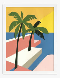
Poster tropische oase
Translation missing: nl.products.product.sale_price Vanaf €19,95€33,25 -
Poster tropische oase in geometrische stijl
Translation missing: nl.products.product.sale_price Vanaf €19,95€33,25 -

Poster broodsoorten – minimalistische lijntekening
Translation missing: nl.products.product.sale_price Vanaf €19,95€33,25 -

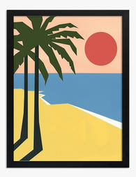
Poster tropisch strandparadijs
Translation missing: nl.products.product.sale_price Vanaf €19,95€33,25 -

Canvas tropische sfeer met palmbomen en geometrisch patroon
Translation missing: nl.products.product.sale_price Vanaf €64,95€92,95 -

Canvas tropische oase
Translation missing: nl.products.product.sale_price Vanaf €64,95€92,95 -

Canvas tropisch pad
Translation missing: nl.products.product.sale_price Vanaf €64,95€92,95 -
Poster tropisch strand met palmbomen
Translation missing: nl.products.product.sale_price Vanaf €19,95€33,25 -

Poster portret van een tropische muze
Translation missing: nl.products.product.sale_price Vanaf €16,95€23,95 -

Poster tijger in de jungle met tropische bloemen
Translation missing: nl.products.product.sale_price Vanaf €19,95€33,25 -

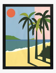
Poster tropisch strand met zachte pastelkleuren
Translation missing: nl.products.product.sale_price Vanaf €19,95€33,25 -
Poster tropisch strand in zonlicht
Translation missing: nl.products.product.sale_price Vanaf €19,95€33,25 -

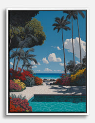
Canvas tropisch zwembad
Translation missing: nl.products.product.sale_price Vanaf €64,95€92,95 -

Poster tropische oase met pad
Translation missing: nl.products.product.sale_price Vanaf €19,95€33,25 -

Poster tropisch strand met palmbomen
Translation missing: nl.products.product.sale_price Vanaf €19,95€33,25 -

Poster tropische oase met waterval
Translation missing: nl.products.product.sale_price Vanaf €19,95€33,25 -

Canvas tropisch strand in blauw en groen
Translation missing: nl.products.product.sale_price Vanaf €64,95€92,95 -

Canvas tropische oase met palmen en tijgers
Translation missing: nl.products.product.sale_price Vanaf €64,95€92,95 -
Canvas tropisch zwembad met palmen en bloemen
Translation missing: nl.products.product.sale_price Vanaf €64,95€92,95


Meer van The Frame

What to Hang in Awkward Corners
Corners are the dead zones of most homes. Your eye skims past them, furniture refuses to sit flush against them, and you end up with a triangular patch of wall...

Art for Narrow Walls and Hallways
Narrow walls are the most under-decorated surfaces in most homes. Not because they're hard to style, but because most advice treats every awkward space as the same problem when really...

What to Put on a Big Blank Wall
Big blank walls feel impossible because they multiply your options instead of narrowing them. Every idea seems plausible, nothing feels right, and the wall stays empty for another six months....