
 Bestel vandaag, levering vóór
 Culinaire posters
Food art verdient z’n plek in de keuken: het laat de ruimte voelen als bewoond in plaats van alleen maar ingericht. Hier vind je alles, van citroenen en vijgen in rustige stilleven Poster met eten tot luide popart-food Poster die dwars door een smalle keuken heen knallen. Mogen je muren wat zachter, dan passen schilderachtige food Poster perfect naast een tafel waar echt wordt gegeten en nagetafeld.


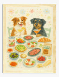
Cozy Canine Feast Art Print

Poster feestelijk banket van Matisse

Poster pizzapunt met tuinkruiden

Poster schijfjes bloedsinaasappel

Poster stilleven met narcissen en brunch

Poster nigiri sushi – voor keuken of eetkamer

Poster kleurrijk eten op roze - keuken & eethoek

Poster Biarritz met frisse marktsfeer

Poster zonnige spiegelei-bloemen

Poster typografie voor pastaliefhebbers

Poster levendig tafelstilleven met kaars, bloemen en wijn

Poster fauvistische dinerscène vol kleur

Poster pastel diner voor twee met tulpen en wijn

Poster zonnige brunch aan zee

Poster gouden kaasselectie

Poster kleurrijk fauvistisch feest aan tafel

Poster stilleven met peren van Pierre-Auguste Renoir

Poster regenboogtaart voor keuken of eethoek

Poster mozaïek watermeloenpartje

Poster speelse paddenstoelen op de markt

Poster proost op pasta-avonden

Poster citroenen op wit bord

Poster kleurrijke pop art woonkamer

Poster pastel pizzapunt in popart-stijl
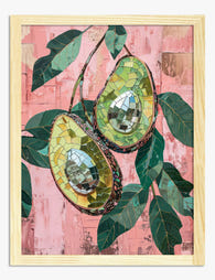
Poster avocado-mozaïek in roze en groen

Poster katten en paard bij de brunch

Poster aardbei in disco-look

Poster pasta la vista baby typografie

Poster kleurrijke zomertafel

Global Dumpling Delights Art Print

Poster kreeftenfeest in warm beige en koraal

Poster pasta la vista

Poster retro kaasfiguur voor keuken

Poster aardbeientaart

Poster citroenen in popart-stijl

Poster kleurrijke Japanse sushi voor de keuken

Poster fiets met kiwi-wielen

Delicious Hummus Delight Art Print

Poster Italiaanse keuken: pizza, pasta en meer

Poster zwarte kat bij zomerse picknick

Poster garnaal met citroen in mid-century-stijl

Poster tomaat in pop-art stijl

Sushi Art Delight Art Print

Poster feestelijke gebakstafel

Poster sardientjes in witte pot met blauwe strepen

Poster trio glinsterende gummibeertjes

Poster Italiaanse tomatentros

Poster gezellig diner in pastel
Meer Fab kunstcollecties






Hangt in meer dan 100.000 huizen
Wat mensen zeggen over Culinaire posters
Automatisch gegenereerdLevendige, verzadigde kleuren laten keukens en thema-ruimtes stralen, en speelse ontwerpen geven er een vrolijke, leuke touch aan.
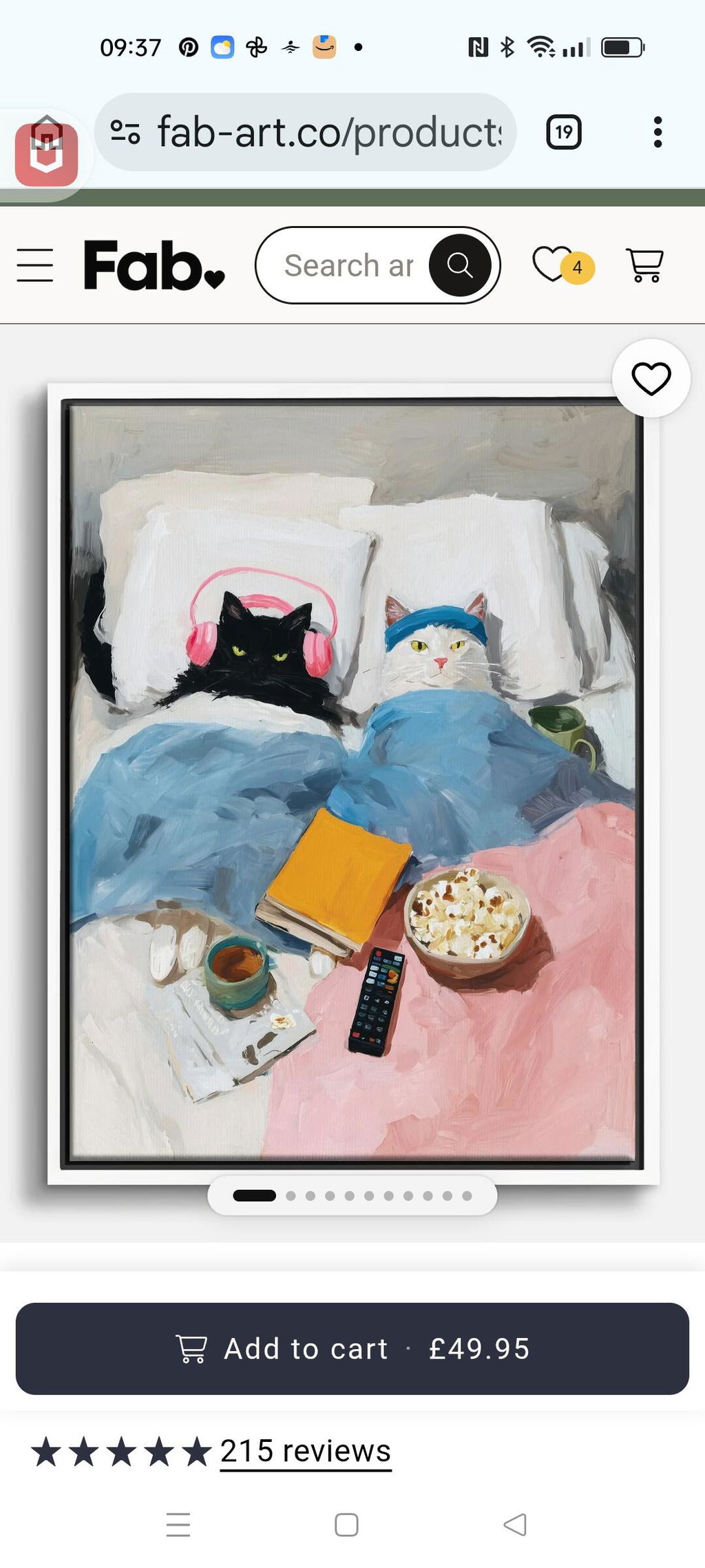
Gezellige kattenfilmnacht
Ik vind het geweldig.😻 De kunstenaar heeft echt gevoel voor humor. Zo erg dat ik al twee extra bestellingen geplaatst heb. ❤️🐾
 Beoordeeld
Poster knusse filmavond met twee katten →
Beoordeeld
Poster knusse filmavond met twee katten →
Hou van de print - levendig
Hou van de print - levendige kleuren!
 Beoordeeld
Poster mediterrane tafel van Matisse →
Beoordeeld
Poster mediterrane tafel van Matisse →
Prachtig
Prachtige, verzadigde kleuren. Ik vind het geweldig!
 Beoordeeld
Poster roze oesters op koelblauw →
Beoordeeld
Poster roze oesters op koelblauw →
Keukenwanden, geregeld: uit The Frame
Meer over hoe je kunst met eten afstemt op kasten, tegels en eettafels from The Frame, Fab's blog.

Welke kunst werkt echt in de keuken (en wat je ...
De meeste keukenkunst oogt alsof het als laatste, gehaast, van de woonafdeling is meegenomen. Dat hoeft niet. Met de juiste materialen en een beetje terughoudendheid kan je keuken kunst net...

De Kitchen Gallery Wall Edit: zorgvuldig sameng...
De meeste keuken-galerijwanden mislukken om dezelfde reden: mensen kiezen prints die ze los van elkaar mooi vinden, hangen ze min of meer op gevoel op en hopen op het beste....

Transformeer je keukenmuren met kunst die net z...
Het meeste advies over kunst voor de keuken is hetzelfde gerecyclede lijstje: citroenen, kruiden, een typografieprint die je vertelt “Eat, Drink, Be Merry”. Jij verdient beter, en je muren ook....
 Wat hang je in de keuken?



Korte antwoorden over inlijsten, de plek bij kookplekken, kleuren afstemmen en een formaat kiezen dat past