Bedroom Wall Art Ideas for Every Style: From Minimal to Maximalist
A practical framework for choosing bedroom art that actually suits your space, starting with the one thing most guides ignore.

Most bedroom art advice throws thirty ideas at you and calls it inspiration. What you actually need is a framework: a way to narrow the field based on what's already in your room. This guide starts with your headboard and works outwards, because that's how the decision actually gets made.
Start with your headboard: it dictates everything
Your headboard is the largest single object on your bedroom wall, and whatever you hang above it has to negotiate with it. Get this relationship right and the rest is easy. Get it wrong and no amount of expensive art will save you.
The rule we use: art above the bed should be roughly two-thirds the width of your headboard, give or take. For a standard UK double (135cm wide), that means a single print around 90cm wide, or a pair/trio that spans about the same. For a king (150cm), aim for 100cm of art width. For a super king (180cm), 120cm or more.
Then there's the headboard style itself. A tall upholstered headboard in cream or beige is forgiving and works with almost anything. A dark wood or rattan headboard wants either deep contrast (a moody print with strong blacks) or quiet tonal harmony (botanicals in muted greens and browns). A metal frame with no headboard at all gives you maximum freedom but also the most pressure, because the art is doing all the visual work.
If you have a divan with no headboard, treat the wall as your headboard. This means your art needs to sit lower than feels natural, around 15-20cm above the pillows, so it visually anchors the bed.

The single statement print: when less is genuinely more
One large print, properly sized, beats three small ones nine times out of ten. It's the simplest move in interior design and the hardest to get wrong, provided you go big enough.
A single statement print works when your bedroom is already busy: patterned bedding, a textured rug, curtains with personality, a chair in the corner. Adding a gallery wall on top of all that turns a calm room into a noisy one. One generous piece, hung centrally, gives the eye somewhere to land.
It also works in the opposite scenario: a pared-back room with white walls, plain linen, and minimal furniture. Here, the print becomes the focal point and you can lean into something with real presence. Abstract shapes in ochre and black, a high-contrast architectural photograph, or a single botanical study at 70x100cm.
Where it falls flat: when the print is too small. A 30x40cm print floating above a king bed looks like a stamp on an envelope. If you only want one piece, commit to scale. Anything from our bed art prints collection at 70x100cm or canvas at 100x150cm will hold its own above a double or king.
A practical note on framing here. A statement print needs to look properly considered, which means the frame itself matters. Solid wood frames with UV-protective acrylic glaze hold up better than the alternatives, especially in bedrooms with morning sun directly hitting the wall. Acrylic also weighs less than glass, which makes it a more sensible choice for hanging above where you sleep.
Gallery wall above the bed: a layout that works every time
Gallery walls fail when people treat them as a free-form arrangement. They succeed when you follow a formula. Here's one we trust.
The three-piece horizontal: Two prints of equal size flanking one larger central print, all aligned along a single horizontal axis. The central piece should be roughly 50% wider than each side piece. Spacing between frames: 5-8cm, no more. This layout reads as one composition, not three separate things.
The asymmetric four: One large vertical print on the left (around 50x70cm), a stack of two smaller squares on the right (around 30x30cm each), and one horizontal piece tucked underneath. This works when you want movement without chaos. The trick is to keep the outer edges of the arrangement aligned to an invisible rectangle.
The salon hang: Six to nine pieces of varying sizes, hung close together (4-5cm spacing), with the overall arrangement forming a roughly rectangular shape. This is maximalist and demands commitment. It works best above a low, simple bed with plain bedding so the wall can do all the talking.
For all of these, the bottom edge of the lowest piece should sit 20-25cm above the headboard. Any higher and the art floats off into space. Any lower and you're knocking it with pillows.
Mix orientations within a gallery wall but keep the frame finishes consistent. Three different wood tones plus two metal frames is the fastest way to make a gallery wall look like a charity shop window. Pick one frame finish and stick to it. Our wall art sets are designed to work together for exactly this reason.

Bedroom wall art for men: darker tones, graphic lines, and architectural subjects
The "bedroom art for men" search term exists because plenty of men want art and don't know where to start, and most inspiration content defaults to soft pastels and cursive quotes. So here's an honest take.
Men's bedrooms (and we're generalising broadly here) tend to lean towards darker palettes, less pattern, and a preference for art that doesn't feel decorative for its own sake. That suggests a few directions worth exploring:
Architectural photography. Brutalist buildings, bridge structures, urban geometry. Black and white works particularly well because it strips out colour decisions entirely. A single 70x100cm framed print of something like the Barbican or a Brooklyn fire escape gives a room presence without softness.
Graphic abstracts. Strong shapes, limited palette, no fussiness. Think bold blocks of charcoal, oxblood, and cream rather than watercolour washes. These pair well with linen bedding in deep navy or olive.
Landscape photography with weather. Stormy seas, mountain ridges, foggy forests. The drama does the heavy lifting, so you don't need a busy room around it.
The photography art prints collection is a good starting point if any of this lands. Stick to one or two pieces, hung large, rather than trying to fill every wall.
Bedroom wall art for women: why the gendered approach is mostly wrong
The flip side of the previous section: most "bedroom art for women" content is patronising. Florals, soft pinks, "live laugh love" energy. The actual data on what people buy doesn't break down so neatly along gender lines, and treating it like it does is how you end up with a bedroom that looks like it was decorated by an algorithm.
A more useful question: what mood do you want the room to hold? A sleep sanctuary calls for low-contrast art in muted tones, abstract forms, nothing that demands attention. A romantic retreat can take richer colours, figurative work, more emotional weight. A multi-functional bedroom that doubles as a reading or working space benefits from art with more energy: graphic prints, bolder colour, work that wakes you up rather than soothes you.
If you've been served soft botanicals and watercolour florals for years and they don't feel like you, it's worth looking at the modern art prints collection instead. Bold abstracts, contemporary illustration, and graphic work all sit comfortably in a bedroom without veering into masculine cliché.
The honest answer to "what art should I put in my bedroom" isn't gendered. It's: art you genuinely want to look at first thing in the morning and last thing at night.

Small bedroom wall art: making a compact room feel considered, not cramped
Small bedrooms have a specific problem: every choice is amplified. Get the art wrong and the room feels claustrophobic. Get it right and the same square footage feels intentional and grown-up.
The biggest mistake in small bedrooms is going too small with the art. People assume tiny rooms need tiny prints. The opposite is usually true. One piece at 50x70cm above the bed reads as decisive and makes the wall feel taller. Six little prints scattered around make the room feel like a junk drawer.
Place art where you actually see it. In a small bedroom, you spend most of your time in bed looking at the opposite wall, not at the wall behind your head. So consider hanging the bigger statement piece on the wall you wake up facing. Above the bed itself, a smaller print or even nothing at all can work, particularly if your headboard already has visual weight.
For prints for bedroom walls in tight spaces, vertical orientations work harder than horizontal ones. A 50x70cm portrait-format print draws the eye upward, which makes ceilings feel higher. Horizontal prints emphasise width, which is what you don't want when you're already short on it.
Canvas is worth considering here too. Without a frame around it, a canvas reads as slightly less visually heavy than a framed print, which matters when wall space is limited. The mirrored edge wrap also means you don't lose any of the image to cropping.
How to make your bedroom walls more interesting without repainting
Renting, or just not ready to commit to a colour change, doesn't mean you're stuck with bland walls. Here are the moves that actually shift how a bedroom feels.
Anchor the bed wall, then the opposite wall, in that order. These are the two walls that matter most. The third and fourth walls can stay quiet. Trying to decorate every wall equally is how bedrooms end up feeling cluttered.
Layer in different scales. One large piece above the bed, one medium piece on the opposite wall above a dresser, and one small piece propped (not hung) on a shelf or nightstand. This creates visual hierarchy without effort.
Use the wall above your dresser or chest of drawers. This is prime real estate that most people ignore. A horizontal print here, sized to roughly match the width of the furniture below, instantly makes the dresser look styled rather than functional.
Consider the wake-up wall. Whatever's directly opposite your pillow is the first thing you see every morning. Make it count. This is a good place for something you genuinely love rather than something that just "matches."
Mix personal photos with purchased art carefully. One framed personal photo within a gallery wall of purchased prints can ground the arrangement. A whole wall of personal photos in mismatched frames looks like a memorial. If you're including personal images, frame them in the same style and size as your art prints so they sit as equals.
Think about lighting. A picture light above a single statement print transforms it after dark. If you can't hardwire one, battery-operated picture lights now exist and are genuinely good. Wall sconces flanking the bed also draw attention upward and frame whatever art is hanging there.
Rotate seasonally if you get bored. Two or three prints on heavy rotation, swapped every few months, costs nothing once you own them and keeps a bedroom feeling fresh. Store the off-duty prints flat under the bed.

A final thought on getting it right
The reason bedroom walls go wrong isn't usually bad taste. It's hesitation: buying small because you're worried about commitment, hanging things too high because you're guessing, picking five things because you can't decide on one. Pick the layout that fits your headboard, commit to the scale, and trust that one well-chosen piece beats a wall of compromises every time.

Fab-producten in dit blog
-

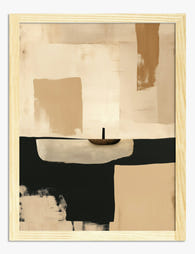
Poster minimalistisch bed in oranje en blauw
Translation missing: nl.products.product.sale_price Vanaf £11.95£19.95 -

Poster Van Goghs slaapkamer
Translation missing: nl.products.product.sale_price Vanaf £13.99£19.99 -

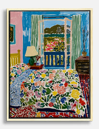
Poster slaapkamer met uitzicht op bergen in Matisse-stijl
Translation missing: nl.products.product.sale_price Vanaf £11.95£19.95 -

Canvas minimalistische bedscene in blauw en oranje
Translation missing: nl.products.product.sale_price Vanaf £44.95£74.95 -

Canvas onopgemaakt bed in oranje en blauw
Translation missing: nl.products.product.sale_price Vanaf £44.95£74.95 -

Canvas slaapkamer met uitzicht in Matisse-stijl
Translation missing: nl.products.product.sale_price Vanaf £44.95£74.95 -

Canvas minimalistische quote 'All a Dream' zwart-wit
Translation missing: nl.products.product.sale_price Vanaf £44.95£74.95 -

Poster kleurrijke slaapkamer met open raam – Matisse-stijl
Translation missing: nl.products.product.sale_price Vanaf £11.95£19.95 -

Poster zonnige mediterrane oase in Matisse-stijl
Translation missing: nl.products.product.sale_price Vanaf £11.95£19.95 -

Poster gestreept bed met oranje accent
Translation missing: nl.products.product.sale_price Vanaf £11.95£19.95 -
Canvas Matisse-geïnspireerd voor de slaapkamer
Translation missing: nl.products.product.sale_price Vanaf £44.95£74.95 -

Poster minimalistische mensen in rij
Translation missing: nl.products.product.sale_price Vanaf £11.95£19.95 -

Canvas minimalistische figuren
Translation missing: nl.products.product.sale_price Vanaf £44.95£74.95 -

Poster Matisse-geïnspireerde oase aan zee
Translation missing: nl.products.product.sale_price Vanaf £11.95£19.95 -
Poster warm minimalistisch abstract bij schemering in beige en bruin
Translation missing: nl.products.product.sale_price Vanaf £11.95£19.95


Meer van The Frame

Chagall Art Prints for Every Room: A Styling Gu...
Marc Chagall's work spans dreamy blue lovers, vivid village scenes, circus performers and stained-glass-bright still lifes. That range is exactly what makes his art so useful at home, and exactly...

7 Steps to a Pink Gallery Wall That Looks Inten...
Pink gets a bad rap in interiors, mostly because it's the easiest colour to execute badly. A pink gallery wall done well looks like a curated collection in a Copenhagen...

Building a Gallery Wall Around a Rothko Print
Rothko prints are seductive and unforgiving in equal measure. Get the styling right and you have a gallery wall that feels like a small private museum. Get it wrong and...