How to Build a Coastal Gallery Wall That Doesn't Look Like a Gift Shop
A working framework for choosing, pairing, and hanging coastal prints that feel collected, not kitsch.

Coastal art has a reputation problem. Done badly, it veers straight into seaside tat: rope-bordered anchor signs, watercolour seagulls, "Live Laugh Lobster". Done well, it's one of the most calming, atmospheric directions you can take a room, and a gallery wall is the best way to get there without committing to a single hero piece.
The difference between a curated coastal wall and a seaside souvenir collection
The souvenir look is built on literal symbols. Anchors, starfish, ship wheels, lobsters, lighthouses, words like "BEACH" in driftwood lettering. Each piece announces its theme loudly, and when you stack five of them on a wall, the room starts to feel like a holiday let in Cornwall circa 2008.
A curated coastal wall does the opposite. It evokes the sea through colour, atmosphere and abstraction rather than naming it. Think a moody horizon line, a close-up of wet sand, a botanical study of sea kelp, a muted pastel of a swimmer. The viewer's eye fills in the story.
The shorthand: if every print could be captioned "this is the beach", you've built a souvenir wall. If the prints suggest the sea without spelling it out, you've built a gallery.
A few specific cues that drag coastal decor downmarket: bright primary navy (go for ink, slate or faded denim instead), perfectly matching sets sold as quartets, anything with a rope border, and word art of any kind. Cues that lift it: muted palettes, varied print styles, generous negative space, and at least one piece that isn't obviously coastal at all.

Choosing a unifying thread: colour, frame, or tone
Every gallery wall needs one thing holding it together. Pick a single unifying thread and let everything else vary. The three that work best for coastal walls:
Colour palette. Choose three or four tones and stick to them ruthlessly. A reliable starting point: a deep anchor colour (ink blue, charcoal, forest), a mid tone (sage, sea glass, dusty terracotta), and two neutrals (warm sand, off-white). Every print should contain at least two of these.
Frame finish. If your prints vary wildly in style, lock down the framing. All natural oak, or all matte black, instantly creates cohesion across photography, abstract and illustration.
Tonal mood. This is the subtler option. All prints share the same light quality, hazy and overcast, sun-bleached midday, golden hour, regardless of subject or colour.
You only need one of these three threads to hold strong. Trying to control all three produces the matching-set look that reads as flat and showroom-y. Pick your thread, then deliberately vary the other two.
A useful exercise before you buy anything: choose your "anchor" print first. The one piece you genuinely love. Pull two or three colours from it and use those as your palette across everything else. This stops you accumulating a rainbow of pretty things that don't speak to each other.
How to mix ocean photography, abstract, and illustrative sea prints
The single biggest mistake on coastal gallery walls is using prints from only one category. Four ocean photographs in a row looks like a calendar. Four abstract blue washes looks like a paint chart. Mixing print types is what makes a wall feel collected over time.
A formula that works for a four-piece wall:
- 2 photography prints for grounding and realism (a horizon, a close-up of waves, a detail of rocks or sand)
- 1 abstract piece for visual rest and looseness (colour fields, gestural brushwork, painterly washes)
- 1 illustrative or graphic piece for personality (a vintage swim poster, a botanical study, a line drawing of a swimmer or boat)
For a six-piece wall, scale to 3-2-1 in the same ratio. For a triptych, go 1-1-1, one of each.
This works because each category does a different job. Photography gives the wall a sense of place. Abstraction stops it feeling literal. Illustration adds character and a touch of human handiwork. Together they read as a considered collection, not a themed pack.
If you're folding in your own beach photography, edit it consistently before printing. Pull saturation back, lift the shadows slightly, and bring all images to a similar warmth. Print on the same paper stock as the rest of the wall and frame it the same way as everything else. The amateur tell is usually inconsistent processing, not subject matter.
A good place to browse if you're building from scratch is the coastal art prints collection, which leans atmospheric rather than literal, and the broader sea art prints edit for more abstract and photographic options.
Layout templates that work: grids, salon walls, and triptychs
Three layouts cover almost every coastal gallery wall situation.
The grid
Two by two, three by three, or two by three. All prints the same size, equal spacing, perfectly aligned. Calm, architectural, very easy to get right. Best for modern interiors, above beds, or anywhere you want the wall itself to feel quiet.
A grid demands tighter cohesion in the prints themselves. Because the layout is so regular, you can't hide a weak pairing. This is the layout where the 2+1+1 mixing formula really earns its keep.
The salon wall
Mixed sizes, mixed orientations, asymmetric but balanced. Six to nine pieces is the sweet spot. Looks collected and gathered over time. Best for living rooms, hallways, and stairwells.
The trick to a salon wall not looking like a jumble: pick one strong horizontal line and align several pieces along it. Either the bottoms of the top row, or the tops of the bottom row. The rest can sit freely around that anchor line.
The triptych
Three prints, equal size, hung in a horizontal or vertical row. The most underrated layout for coastal art because it suits horizon-based imagery so well. Best above sofas, beds and consoles where you want one strong horizontal gesture.
Triptychs work hardest when the three prints share a continuous element: a horizon line that flows across all three, a colour gradient from light to dark, or three studies of the same subject from different angles.

Which frame finishes to stick with (and which to avoid mixing)
Frames make or break a coastal gallery wall. Four finishes work for the aesthetic:
- Natural oak. The default. Warm, casual, suits almost any coastal palette.
- White wood. Light, airy, leans Scandinavian-coastal. Best with photography and pale abstracts.
- Matte black. Sharpens up softer imagery and stops the wall feeling too pretty. Excellent for moody, stormy palettes.
- Brass or warm gold. Used sparingly, lifts a coastal wall into something more grown-up. One brass frame among three oak frames is a power move. Four brass frames is a hotel lobby.
Mixing rules: you can absolutely mix two finishes if you do it deliberately. Natural oak with black is a strong combination. White wood with brass works for lighter, more feminine schemes. What never works is mixing three or more finishes, or mixing warm and cool woods (oak with grey-stained wood, for example).
Avoid ornate frames, distressed "driftwood" frames, anything with a rope or shell border, and high-gloss finishes that throw glare across the print. Worth noting that prints with UV-protective acrylic glaze rather than glass cut reflections substantially, which matters in coastal rooms where you usually have a lot of natural light.
The other thing to think about is mat width. Wider mats (5-7cm) buy your prints space to breathe and instantly read as more gallery, less gift shop. Narrow or no-mat framing works for photography and graphic prints but can make busy illustrations feel cramped.
Sizing combinations for hallways, bedrooms, and living rooms
Sizing is where most gallery walls go wrong. Too small and the wall looks underdressed. Too big and it overwhelms the furniture.
Hallways
Hallways are narrow, so go vertical. A column of three 30x40cm prints stacked with 5cm gaps, or a tight 2x3 grid of A4-sized prints. Hang at average eye level (around 145-150cm to centre) since people are walking past, not sitting.
Above the bed
For a standard double, aim for an arrangement that spans roughly two-thirds the width of the headboard. A horizontal triptych of 40x50cm prints, or a 2x2 grid of 50x70cm prints, both land well. For a king-size bed, scale up to 60x80cm prints or add a fifth piece.
Living room focal wall
This is where you can go big. Above a three-seater sofa, a salon wall spanning 180-220cm wide, or a single statement triptych of 70x100cm prints. Canvas works beautifully at this scale because the larger sizes (up to 100x150cm) stay light and don't dominate the room with frame weight.
Above a console or sideboard
A horizontal arrangement is non-negotiable here. Two 50x70cm prints side by side, or a triptych of 30x40cm prints, sitting 15-20cm above the surface so the art and the styling on the console read as one composition.
A general rule: your gallery wall should be wider than two-thirds of the furniture beneath it, and never narrower than half. Anything less and the proportions go wrong.
For pre-curated combinations sized to specific walls, the wall art sets collection takes the guesswork out of pairing.

Hanging it all: tools, spacing, and getting it level first time
The professional consensus on gallery wall hanging holds up well for coastal walls:
- Centre line at 145-152cm from the floor. This is gallery eye level. The centre of the whole arrangement, not the centre of any one piece, sits at this height.
- Above furniture, leave 15-20cm of clearance. Closer than that and the art looks like it's resting on the sofa back. Further and it floats away from the composition.
- Spacing between frames: 5-7cm. Closer for grids, slightly wider for salon walls. Consistent spacing matters more than exact distance.
The single best thing you can do before drilling anything: lay the entire arrangement out on the floor first. Photograph it from directly above. Adjust until it works. Then cut sheets of paper to the size of each frame, tape them to the wall using the photo as a guide, and live with it for a day or two before committing.
When you're ready to hang, mark the nail position on each paper template, drill through the paper, then tear it away. Frames that arrive ready to hang with fixtures already attached save you a real headache here, especially with heavier framed prints.
For renters: heavy-duty Command strips comfortably hold prints up to around 3kg, which covers most framed prints up to 50x70cm. For anything larger or in canvas, you'll want proper fixings.
Our favourite gallery wall sets from the sea art collection
A few pairings we keep coming back to.
The moody horizon set. Three black-framed photography prints of grey, overcast sea. Hung as a horizontal triptych above a linen sofa. Works year-round because the palette is wintry, not sunny.
The sand and sage salon. Six prints mixing soft abstracts in sand and sage, one botanical study of sea kelp, and a small graphic illustration of a swimmer. All in natural oak. Best for a living room or large bedroom wall.
The clean grid. Four prints in a 2x2 formation: two horizon photographs, one pale abstract, one minimal line drawing of a boat. White wood frames, wide white mats. Suits a contemporary bedroom.
The single brass accent. Five oak frames and one brass frame in a salon arrangement. The brass frame holds your most graphic or characterful piece. Quietly elevates the whole wall.
For more direction on pieces with a slightly more traditional maritime feel, the nautical art prints collection sits at the more illustrative end of the spectrum and pairs well as the "personality" piece in any of the formulas above.

A final word on seasonality
Coastal gallery walls have a habit of getting taken down in October. They shouldn't. The fix is simply to weight your selection toward the moodier end of the palette: greys, inks, charcoals, stormy horizons, winter beaches. A wall built around atmosphere rather than sunshine works as hard in November as it does in July.
Build slowly. Start with one anchor print you genuinely love, add pieces over months rather than in a single order, and resist the urge to fill every gap immediately. The wall will get better the longer you live with it.

Fab-producten in dit blog
-
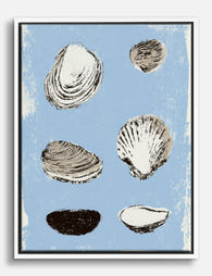
Canvas schelpenstudie op zeeblauwe achtergrond
Translation missing: nl.products.product.sale_price Vanaf £49.95£74.95 -

Poster schelpillustratie met blauwe achtergrond
Translation missing: nl.products.product.sale_price Vanaf £11.95£19.95 -

Canvas zeegolven met quote in koele blauwtinten
Translation missing: nl.products.product.sale_price Vanaf £49.95£74.95 -

Poster blauwe schelpen
Translation missing: nl.products.product.sale_price Vanaf £11.95£19.95 -

Poster schelpen op blauwe achtergrond
Translation missing: nl.products.product.sale_price Vanaf £11.95£19.95 -

Canvas abstract schelpmotief in blauw, beige en wit
Translation missing: nl.products.product.sale_price Vanaf £49.95£74.95 -

Canvas rustige golven in blauw en zandbeige
Translation missing: nl.products.product.sale_price Vanaf £49.95£74.95 -

Poster schelp in zachtblauw en zandbeige
Translation missing: nl.products.product.sale_price Vanaf £11.95£19.95 -

Canvas rustige zeegolven in blauw
Translation missing: nl.products.product.sale_price Vanaf £49.95£74.95 -

Canvas zeeschelpen collectie
Translation missing: nl.products.product.sale_price Vanaf £49.95£74.95 -

Canvas strandzicht vanuit het raam
Translation missing: nl.products.product.sale_price Vanaf £49.95£74.95 -

Canvas rij surfplanken aan de kust in zongewassen tinten
Translation missing: nl.products.product.sale_price Vanaf £49.95£74.95 -

Poster rustige golven aan de kust
Translation missing: nl.products.product.sale_price Vanaf £11.95£19.95 -

Canvas rustgevende zeegolven in blauw
Translation missing: nl.products.product.sale_price Vanaf £49.95£74.95 -

Canvas mediterrane stranddroom
Translation missing: nl.products.product.sale_price Vanaf £49.95£74.95


Meer van The Frame

You're Overthinking Your Arts and Crafts Galler...
Most gallery wall advice assumes you're working with clean, simple imagery. Photographs. Line drawings. Quiet little prints with breathing room baked in. Arts and Crafts prints are the opposite of...

Watercolor Painting Styles Explained: From Bota...
A quick primer on why watercolour looks the way it does Watercolour behaves unlike any other medium. Pigment suspended in water, applied to absorbent paper, with the artist controlling roughly...

What Gallerists Know About Framing Watercolour ...
Watercolour is the most delicate medium in your home, and most people frame it like a poster. The result is fading, warping, condensation rings, and paper fused to glass within...