Large Botanical Prints: How to Make a Single Print Do All the Work
Why one well-chosen botanical print at scale beats a wall of small ones, with the measurements to prove it.

A single large botanical print, chosen well and hung properly, will do more for a room than three small ones ever could. It reads as a deliberate design choice rather than an afterthought, and it spares you the geometry headache of aligning multiple frames. Here is how to choose one that actually carries the wall.
Why one large print beats three small ones (most of the time)
Three small prints clustered together create visual noise. Your eye moves between them, comparing edges and gaps, and the wall ends up feeling busy without feeling full. One large print does the opposite. It commands attention, anchors the room, and gives the rest of your furniture something to relate to.
There is also a practical case. A trio of 30x40cm framed prints, by the time you have bought all three and hung them with matching spacing, often costs more than a single 70x100cm piece. You also get more usable wall coverage from the large print, and you only have one set of fixtures to worry about, one print to dust, and one composition to get right.
The exception is a genuine gallery wall with mixed sizes, mixed subjects, and intentional asymmetry. That can work brilliantly. But three matching botanicals in a row is rarely the answer to a statement wall. If you have the space for impact, use it.

What size print for what size wall: a real-world guide
The professional rule of thumb is that art above furniture should span roughly two-thirds to three-quarters of the furniture's width. This is the single most useful measurement in wall art, and it works almost every time. Get out a tape measure before you do anything else.
Above a sofa
- A 180cm sofa (a standard three-seater) wants a print between 120cm and 135cm wide. That puts you at 100x150cm or close to it.
- A 200cm to 220cm sofa wants something around 140cm to 165cm wide. A horizontal canvas at 100x150cm works, or a generously proportioned framed print at 70x100cm if you accept it will read slightly smaller.
- A compact 150cm two-seater is happy with a 100x70cm print landscape, or a 70x100cm print portrait centred above it.
Above a sideboard, console or credenza
Sideboards are usually 140cm to 180cm wide. A 70x100cm print in portrait orientation, hung centrally, will read beautifully. If you want to lean a print rather than hang it, go larger so the bottom edge can rest behind objects without disappearing.
On a blank statement wall
If you have an empty wall taller than 2.4m and wider than 2m with no furniture beneath it, you need to go big or the print will look stranded. 100x150cm is the minimum for genuine impact. Anything smaller turns into a postage stamp.
Above a bed
A king-size headboard is around 160cm wide. Aim for a print 110cm to 120cm wide above it. A horizontal 100x150cm canvas centred over a king-size bed is one of the most reliable bedroom moves there is.
Botanical subjects that look best at large scale
Not every botanical holds up when you blow it up. A delicate watercolour posy that looks charming at 30x40cm can look thin and uncertain at 70x100cm. The subjects that scale well share a few characteristics: strong structure, high contrast, a clear focal point, and enough complexity to reward close inspection.
What works
- Single statement leaves. Monstera, banana leaf, fan palm, philodendron, fiddle leaf fig. The graphic shape of a single leaf, photographed or illustrated against a clean background, is essentially designed for scale. The negative space does as much work as the leaf itself.
- Ferns and detailed foliage. Ferns reward going large because the fractal detail of the fronds only becomes visible at size. At 70x100cm a fern print becomes almost architectural.
- Vintage botanical illustrations. Nineteenth-century scientific drawings with labelled specimens, root systems and Latin names hold up beautifully at scale because they were originally drawn with precision. The detail justifies the size.
- Pressed botanicals on dark backgrounds. High contrast carries a wall. A pale stem on a charcoal or deep green ground reads as confident and graphic from across the room.
What struggles
- All-over floral patterns without a focal point. They turn into wallpaper.
- Soft, pale watercolours with low contrast. At large size they look washed out.
- Tiny repeating motifs. The eye has nothing to land on.
- Photo-realistic flower close-ups with shallow depth of field. They can read as stock photography when scaled up.
The test is simple. If you squint at the print thumbnail and can still tell what it is, it will scale. If it dissolves into a blur, it will not.

Framed vs unframed at this size: what we recommend
At 70x100cm and above, the framed-versus-unframed question becomes more consequential than it does at smaller sizes. There is more weight, more cost, and more visual presence at stake.
When to frame
A framed print looks more polished, more finished, and more like a considered investment. The frame gives the composition a defined edge, which matters more on a large wall where the print needs to hold its own perimeter. For formal rooms, dining rooms, and any space with traditional furniture, frame it.
Our framed art prints use solid FSC-certified wood (no MDF, no veneer) with a UV-protective acrylic glaze rather than glass. The acrylic matters at this size. Glass on a 70x100cm print is heavy, fragile, and creates glare. Acrylic is lighter, safer, and blocks the UV that would otherwise fade the inks over years of sunlight exposure.
When to leave it unframed
Canvas prints work beautifully unframed at large scale. The hand-stretched edge gives the print structure without adding weight, and the matte finish reads as relaxed rather than formal. For bedrooms, kitchens, bathrooms (away from direct splash zones), and informal living spaces, unframed canvas often suits the room better than a framed paper print.
Canvas also handles humidity better than framed paper, which matters in kitchens and bathrooms. And at the largest sizes (up to 100x150cm), a canvas is significantly lighter on the wall than a framed paper print of the same dimensions.
The honest trade-off
Framed prints look more deliberate but cost more and weigh more. Canvas prints feel more modern and casual but lack the crispness of a paper print behind glaze. Neither is wrong. Choose based on the room.
Colour and composition: choosing a print that won't overwhelm
The bigger the print, the more the colours in it will influence the rest of the room. A 100x150cm botanical with a deep navy background will essentially function as a fifth wall. Plan accordingly.
Pull two colours from the room
The most reliable way to choose a large botanical is to identify two colours already in the room (a wall colour and a sofa colour, say) and find a print that contains both. Not necessarily as dominant tones, but present somewhere in the composition. This is what makes the print feel like it belongs rather than like it was airlifted in.
Watch the background
The background colour of a botanical print does more work than the botanical itself. A monstera leaf on cream reads completely differently from the same monstera leaf on black. Cream backgrounds open the room and recede. Dark backgrounds advance and ground. Neither is better. They do different jobs.
Composition weight
Botanicals are rarely centred compositions. A trailing vine might weight the top-left of the frame, leaving the bottom-right almost empty. A standing fern might be vertically symmetrical but bottom-heavy. Look at where the visual weight sits before you commit, because it affects where the print's "centre" appears to be on the wall.
You can browse our full botanical art prints collection to see how different backgrounds and compositions sit alongside each other.

Hanging a large print: positioning height and practical tips
The standard advice is that the centre of the artwork should sit at 145cm to 152cm from the floor, which is roughly average human eye level. This holds for most rooms. But there are botanical-specific adjustments worth making.
Adjust for visual centre, not geometric centre
If your print is bottom-heavy (a vase composition, a potted plant, a rooted illustration), the geometric centre of the frame and the visual centre are not the same thing. Hang it so the visual centre sits at eye level, which usually means hanging the frame slightly higher than the rule suggests.
Above furniture, ignore the eye-level rule
When you are hanging above a sofa or sideboard, the print should relate to the furniture, not to the floor. Leave a gap of 15cm to 25cm between the top of the furniture and the bottom of the frame. Any closer and they look glued together. Any further and the print floats away from the room.
Practical hanging notes
A 70x100cm framed print is genuinely heavy. Use proper wall fixings rated for the weight, and find a stud if you can. Two fixings spaced apart are more stable than one. Our framed prints arrive with fixtures already attached, which removes one variable from the process.
If you are nervous about commitment, cut a piece of brown paper or newspaper to the exact dimensions of the print and tape it to the wall for a day or two. You will know almost immediately whether the size and position are right.
Lighting
Large botanicals benefit from a wash of light. A wall-mounted picture light, an angled spotlight in the ceiling, or just a nearby table lamp will lift the print considerably in the evening. Without light, large prints can disappear into the wall after dark.
Our favourite large botanical prints right now
Rather than name specific products that may go out of stock, here are the four directions we would point you in if you came to us with a statement wall to fill.
For a modern living room with neutral furniture: a single oversized monstera or banana leaf on a cream or sage ground, in canvas at 100x150cm. It reads as architectural, suits almost any sofa, and never feels dated. Worth browsing alongside the rest of our living room wall art.
For a period property or formal dining room: a vintage botanical illustration, framed in dark wood, at 70x100cm. The labelled specimen style suits traditional joinery and high ceilings, and the detail rewards close looking.
For a bedroom: a soft-edged fern or eucalyptus on a pale background, unframed canvas at 100x150cm horizontal, hung above the bed. Calm, generous, and forgiving of imperfect hanging.
For a hallway or stairwell: a high-contrast pressed botanical on a dark ground, framed, in portrait orientation. Hallways often have less natural light, so contrast and a clear focal point matter more than subtle tonal work.
You can see more options at scale in our large wall art collection.

Where to land
If you are filling a statement wall, resist the temptation to hedge with a trio. Measure your furniture, take two-thirds of its width, and find one botanical with strong structure and a colour palette that talks to your room. Frame it if the space is formal, leave it as canvas if it is not, hang it 15cm to 25cm above the furniture, and live with it. One good print, at the right size, will outwork a wall of small ones every time.

Fab-producten in dit blog
-

Poster botanische bloemen in krachtige, moderne stijl
Translation missing: nl.products.product.sale_price Vanaf £11.95£19.95 -

Poster botanische collage met groene bladeren en witte bloemen
Translation missing: nl.products.product.sale_price Vanaf £11.95£19.95 -
Canvas moderne jungle met botanische vormen
Translation missing: nl.products.product.sale_price Vanaf £44.95£74.95 -

Poster botanische potplanten op plank, gele achtergrond
Translation missing: nl.products.product.sale_price Vanaf £11.95£19.95 -

Canvas groene botanische bladeren
Translation missing: nl.products.product.sale_price Vanaf £44.95£74.95 -

Canvas botanische trap met kamerplanten
Translation missing: nl.products.product.sale_price Vanaf £44.95£74.95 -

Canvas levendige kamerplanten
Translation missing: nl.products.product.sale_price Vanaf £44.95£74.95 -

Poster vintage botanische studieplaat
Translation missing: nl.products.product.sale_price Vanaf £11.95£19.95 -

Poster botanische bloem in modern groen en wit
Translation missing: nl.products.product.sale_price Vanaf £11.95£19.95 -

Poster moderne botanische vorm in neutrale tinten
Translation missing: nl.products.product.sale_price Vanaf £13.99£19.99 -

Poster botanische trap met weelderig groen
Translation missing: nl.products.product.sale_price Vanaf £11.95£19.95 -

Poster moderne botanische bladeren in groen
Translation missing: nl.products.product.sale_price Vanaf £11.95£19.95 -

Poster boho vazen met kamerplanten
Translation missing: nl.products.product.sale_price Vanaf £11.95£19.95 -

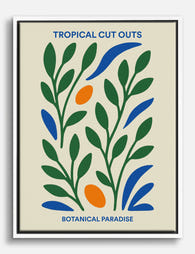
Canvas tropisch paradijs met botanische knipsels
Translation missing: nl.products.product.sale_price Vanaf £44.95£74.95 -

Canvas vrouw met bloemrijke jas
Translation missing: nl.products.product.sale_price Vanaf £44.95£74.95 -
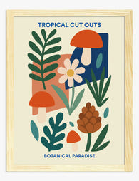
Poster botanische collage in tropische stijl
Translation missing: nl.products.product.sale_price Vanaf £11.95£19.95 -
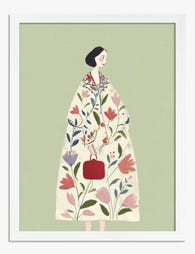
Poster botanische muze, vrouw in bloemenjas
Translation missing: nl.products.product.sale_price Vanaf £11.95£19.95 -

Poster botanisch paradijs in cut-out stijl
Translation missing: nl.products.product.sale_price Vanaf £11.95£19.95 -

Poster blauwe bloem op ruitjes
Translation missing: nl.products.product.sale_price Vanaf £13.99£19.99


Meer van The Frame

Kids' Room Art: Playful Without Childish
Most kids' room art falls into two camps: aggressively cute (rainbows, cartoon animals, alphabet posters) or weirdly adult (minimal black and white prints that could hang in a dentist's office)....

Nursery Art That Grows with the Room
Most nursery art gets retired by the time the cot comes down. That's a waste of money, wall space and the chance to build something genuinely meaningful. This guide is...

Office and Study: Art That Helps You Focus or A...
The art you hang in a workspace isn't neutral decoration. It either supports the kind of thinking you do at your desk, or it quietly works against it. The trick...