Pink Gallery Wall Ideas: 7 Looks from Soft and Minimal to Bold and Eclectic
Seven distinct pink gallery wall looks, each with the prints, frames, and rooms they belong in.

Pink is having a long moment, and a gallery wall is the most flexible way to commit to it without painting your walls. The trouble is that "pink gallery wall" covers everything from a whisper-quiet blush grid to a salon wall packed with hot pink abstracts. This guide breaks the look into seven distinct styles so you can pick one and actually finish the project.
1. The tonal blush grid
A 2x2 grid of four prints in the same blush palette, hung in a perfect square. It is the calmest, most architectural way to do pink, and it works because the repetition does the heavy lifting.
The prints: Four abstract or minimal prints sharing one or two pink tones, ideally blush and dusty rose with a warm off-white background. Avoid anything with strong contrast or hot pink accents, it will break the calm.
The frames: Natural oak or warm wood, all matching. Black frames work but pull the look slightly more graphic. Stay away from gold here, it fights the softness.
Sizing and spacing: Four 30x40cm prints in portrait orientation, spaced exactly 5cm apart. Consistency is the whole point, so measure twice.
Where it belongs: Above a bed, behind a sofa, or in a home office. The grid format suits rooms where you want art to feel intentional but quiet, so it is ideal for spaces you spend a lot of focused time in.

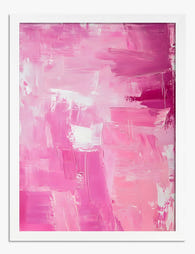
2. The abstract statement
One large pink abstract, hung alone, doing all the work. Technically not a gallery wall, but the most underrated alternative when the idea of arranging multiple frames makes you want to lie down.
The print: A bold abstract in dusty rose, terracotta-pink, or deep magenta. Look for movement, large brushstrokes, organic shapes, or colour fields. Detail matters here because you will be looking at this print up close every day, which is where giclée printing on thick matte paper actually pays off.
The frame: Go large or go unframed canvas. A framed 70x100cm print in black or natural oak feels gallery-grade. A 100x150cm canvas hung unframed feels more relaxed and contemporary. Both work, the choice is about formality.
Where it belongs: Living rooms with high ceilings, hallway end-walls, dining rooms above a sideboard. Anywhere a gallery wall would feel busy. One large piece holds a big space far better than four small ones spread thin.
A note on canvas versus framed for a piece this size: canvas is lighter, easier to hang on plasterboard, and forgiving in humid rooms. Framed prints under UV-protective acrylic glaze look more polished and protect the colour for decades, but they are heavier. Choose based on the wall and the room.
Browse abstract art prints if this is your direction.
3. The botanical row
Three pink florals in a perfectly aligned horizontal line. The most timeless of the seven, and the easiest to get right.
The prints: Three botanical illustrations or photographs featuring pink blooms, peonies, magnolias, cherry blossom, or anemones. Stick to one style across all three. Three illustrations together work. Three photographs together work. Mixing illustration and photography in a row of three usually does not.
The frames: White frames for a fresh, classic feel. Brass or warm gold for something more traditional. Avoid black, it makes botanicals feel heavier than they should.
Sizing and spacing: Three 40x50cm prints, 8cm apart, centred horizontally above your furniture. The row should be roughly two-thirds the width of whatever sits beneath it.
Where it belongs: Above a console in an entryway, above a bed, or in a dining room. Botanical rows suit rooms with traditional or country-leaning furniture, panelling, or any space already leaning into a soft, English-cottage feel.
Our floral art prints collection has the strongest pink selection if you are going this route.

4. The mixed media cluster
Photography, illustration, and abstract combined in a tight cluster of five or six prints. The most personality-driven of the styles, and the one that rewards a bit of editing.
The prints: One pink-toned photograph (a sunset, a flower close-up, a figure), one or two abstracts in matching pinks, one line drawing or illustration, and one typographic or graphic print. The trick to making mixed media work is a shared colour palette. If every print contains some shade of pink, plus a shared accent colour like sage green or cream, the eye reads it as cohesive even though the styles are different.
The frames: Two frame colours maximum, three is the absolute limit. Black and natural oak together is the most reliable combination. White and brass is the prettier option for softer pinks. Mixing four or more frame finishes is the single most common mistake people make and it turns a curated cluster into visual chaos.
Sizing and spacing: Mix sizes deliberately. One 50x70cm anchor print, two 30x40cm mediums, and two or three 21x30cm smaller prints. Keep spacing consistent at 5cm between every frame, even though the sizes vary.
Where it belongs: Living rooms, studies, creative spaces. Anywhere you want art to feel collected rather than coordinated. It suits people whose Instagram saves are all over the place stylistically, and that is meant kindly.
5. The nursery trio
Three soft pink prints with a playful edge. The most specific brief on this list, but worth its own category because nurseries have rules the rest of the house does not.
The prints: Soft watercolour animals, gentle abstract shapes, hand-drawn illustrations, or a mix of one alphabet print and two illustrations. Stick to blush, peach, and cream. Hot pink reads as overstimulating in a room designed for sleep.
The frames: White, always. Light oak as a second option. Acrylic glazing rather than glass matters here for obvious reasons, our framed prints use UV-protective acrylic which is also lighter and shatter-resistant, both useful in a child's room.
Sizing and spacing: Three 30x40cm prints in a horizontal row, or a triangle arrangement with one larger 40x50cm print on top and two 30x40cm beneath. Hang lower than you think, around 140cm to the centre of the arrangement, so it works from a chair while feeding.
Where it belongs: Nurseries, obviously, but also kids' rooms up to about age seven. After that, let them choose their own.

6. The maximalist salon wall
Seven or more prints, varied sizes, varied styles, hung floor-to-ceiling adjacent. The boldest commitment on this list and the one with the highest reward when you get it right.
The prints: A real mix. Bold pink abstracts, vintage-style botanicals, a couple of pink-toned photographs, maybe one figurative illustration and one typographic piece. The trick is to anchor the wall with two large pieces (50x70cm or 70x100cm) and build outward with smaller prints around them.
The frames: Three frame finishes maximum. A successful salon wall often uses black, natural oak, and brass in roughly a 50/30/20 split, with black as the dominant frame colour. The repetition of black creates a visual rhythm even when everything else varies.
Layout method: Lay every print on the floor first and arrange the layout there before touching the wall. Or use the paper template trick, cut newspaper or kraft paper to the exact size of each frame, tape them to the wall with masking tape, rearrange until it feels right, then hammer the nails through the paper. It saves about a hundred pinholes.
Spacing: 5 to 7cm between frames. Tighter spacing makes a salon wall feel intentional rather than scattered.
Colour pairing: This is where pink needs friends. The most reliable proportions are 60% pink and pink-adjacent tones, 25% neutrals (cream, off-white, warm beige), and 15% one accent colour. Sage green, navy, or warm gold all work. Pick one and commit, two accent colours competing inside a salon wall is too much.
Where it belongs: Living rooms, dining rooms, stairwells, long hallways. It suits rooms with character, panelling, picture rails, dark walls, or strong architectural features. In a minimal box room, a salon wall fights the architecture rather than enhancing it.
The pink gallery wall collection groups together prints designed to layer like this.
7. How to choose the right style for your space
If you have read all six and still cannot decide, run through these questions.
How much pink do you actually want? If you flinched reading "hot pink magenta," you are a tonal blush grid or botanical row person. If you got excited, you are a salon wall person.
How much wall do you have? Under one metre wide, do an abstract statement or a tight trio. One to two metres, do a botanical row, blush grid, or mixed media cluster. Over two metres, salon wall or large statement piece.
What is the room for? Rooms for resting (bedrooms, nurseries) want calmer, more tonal arrangements. Rooms for entertaining (living rooms, dining rooms) can take more visual energy. Rooms for working (studies, home offices) usually do best with structured grids or one bold piece, less to distract you.
What is your existing furniture? Traditional or country furniture pairs best with botanical rows and tonal grids. Mid-century or contemporary furniture handles abstract statements and mixed media clusters well. Eclectic, vintage, or layered interiors are the natural home for a salon wall.
A note on pink intensity. Blush and dusty rose are the most flexible and pair with almost any room. Hot pink and magenta need cooler, more contemporary surroundings to avoid feeling theme-park. Terracotta-pink and clay pink lean warm and work beautifully with wood tones, cream walls, and natural fibres.

Common mistakes worth avoiding
Too many frame colours. Two is best, three is the maximum, four turns curated into cluttered.
Inconsistent spacing. Pick one spacing measurement (5cm, 7cm, 8cm) and use it for every gap. Your eye notices inconsistency even when you cannot name what is wrong.
Hanging too high. The centre of your gallery wall should sit at roughly 145 to 150cm from the floor, which is gallery-standard eye level. Most people hang 10 to 15cm too high.
Skimping on print quality. Pink is a notoriously difficult colour to print well. Cheap prints turn out either too peachy, too orange, or too cold. Giclée printing on matte paper holds pink tones accurately, which matters more in a gallery wall where four or more prints need to share a palette.
Frames shipped separately from prints. A familiar disaster. When the frame arrives in one box and the print in another, you end up fitting it yourself, often badly. Our framed prints arrive ready-fitted in one box, with fixtures attached, which removes the most annoying part of this entire project.
Getting started: our most popular pink gallery wall sets
Once you have picked your style, the fastest route is a pre-curated set rather than choosing prints individually. Sets remove the colour-matching headache, every print has been chosen to work with the others, and you know the proportions are right before you order.
For tonal blush grids and botanical rows, look for matching pink wall prints sold as a set of three or four. For mixed media clusters and salon walls, a wall art set gives you an anchor of coordinated prints which you can then expand with one or two extra pieces for personality.
A few practical notes. All our framed prints arrive ready to hang with fixtures attached, in one box, properly fitted, so the print is flush in the frame with no warping. The acrylic glaze is UV-protective, which means even prints hung in a sunny living room will hold their colour for decades. Returns run for 99 days, which is long enough to live with a layout, change your mind, and try again.
Pick the style first. Buy the prints second. Plan the layout on the floor before the wall. In that order, a pink gallery wall takes an afternoon, not a month of indecision.

Fab-producten in dit blog
-

Canvas portret van moderne muze in roze
Translation missing: nl.products.product.sale_price Vanaf £49.95£74.95 -

Poster harmonie in koraalrood en poederroze
Translation missing: nl.products.product.sale_price Vanaf £11.95£19.95 -
Poster roze gloed
Translation missing: nl.products.product.sale_price Vanaf £11.95£19.95 -

Poster abstracte roze blokken
Translation missing: nl.products.product.sale_price Vanaf £11.95£19.95 -

Poster abstracte roze penseelstreken
Translation missing: nl.products.product.sale_price Vanaf £11.95£19.95 -

Poster pastelroze herenhuis in Londen
Translation missing: nl.products.product.sale_price Vanaf £11.95£19.95 -

Canvas minimalistische roze tennisbaan
Translation missing: nl.products.product.sale_price Vanaf £49.95£74.95 -

Poster witte wolk in roze lucht
Translation missing: nl.products.product.sale_price Vanaf £11.95£19.95 -

Canvas zachtroze boog met poederblauwe deur
Translation missing: nl.products.product.sale_price Vanaf £49.95£74.95 -

Poster levendige roze golf
Translation missing: nl.products.product.sale_price Vanaf £11.95£19.95 -

Canvas grafische bloemen in roze vaas
Translation missing: nl.products.product.sale_price Vanaf £49.95£74.95 -

Canvas roze stadsgevel
Translation missing: nl.products.product.sale_price Vanaf £49.95£74.95 -
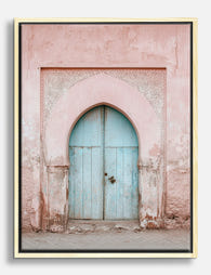
Canvas boogdoorgang in poederroze en blauw
Translation missing: nl.products.product.sale_price Vanaf £49.95£74.95 -

Canvas roze gloed
Translation missing: nl.products.product.sale_price Vanaf £49.95£74.95 -

Poster abstracte bloemen op blushroze achtergrond
Translation missing: nl.products.product.sale_price Vanaf £11.95£19.95 -

Canvas wolk in roze lucht
Translation missing: nl.products.product.sale_price Vanaf £49.95£74.95 -

Canvas stralende kleurvlakken
Translation missing: nl.products.product.sale_price Vanaf £49.95£74.95 -

Canvas roze wilde rozen in bloei
Translation missing: nl.products.product.sale_price Vanaf £49.95£74.95 -

Canvas Bauhaus roze geometrische vormen
Translation missing: nl.products.product.sale_price Vanaf £49.95£74.95 -

Poster met pastelkleurige vlakken
Translation missing: nl.products.product.sale_price Vanaf £11.95£19.95


Meer van The Frame

From Dutch Masters to Modern Minimalism: The Ke...
Search "types of flower bouquet art" and you'll get wedding centrepieces, posy guides, and cascading bridal arrangements. Useful if you're getting married. Useless if you're trying to choose what goes...

Every Flower in William Morris's World: A Guide...
William Morris designed roughly 50 wallpapers and around 30 chintzes across his career, and almost every single one features a plant. If you've ever stood in front of a Morris...

What Colours Go With Bouquet Prints? Pairings I...
You've found a bouquet print you love. Now you need to know if it will actually work above your sofa, opposite that mustard armchair, next to the curtains you spent...