
 Bestel vandaag, levering vóór
 The Complete Guide to Decorating with Botanical Prints
Room-by-room advice with actual measurements, honest colour pairings, and the one place botanicals genuinely don't belong.


Botanical prints are the closest thing interior design has to a universal donor. They work with almost any style, palette, and period. Almost.
This is a room-by-room guide with specific sizes, real paint colour pairings, and strong opinions on what to avoid, because "consider your space" is not advice.
Why botanical prints work in almost every room (and the one where they don't)
Botanical illustrations have been quietly winning for two hundred years. The Victorians turned them into a national obsession, pressing ferns and cataloguing orchids with the same energy we now reserve for skincare routines. That heritage is why botanical prints feel timeless. They sit comfortably alongside a mid-century sideboard, a Georgian fireplace, or a flat-pack sofa without looking dated.
They also do something rare: they bring the visual softness of nature indoors without committing you to keeping a real plant alive. Green tones lower the visual temperature of a room. Organic shapes counterbalance the hard lines of modern furniture. And unlike abstract art, botanicals give the eye something specific to land on.
The exception? A busy, pattern-heavy room. If your walls are already William Morris, your sofa is floral, and your curtains have a print, adding botanical art will tip the room into visual chaos. Botanicals need at least one plain surface to breathe against. If every surface is competing, they lose.

Living room: go big or create a curated botanical gallery wall
The most common mistake in living rooms is scale. A 30x40cm print floating above a three-seater sofa looks like a postage stamp on a fridge.
Above a standard three-seater sofa (roughly 200-220cm wide): the art should span 60-75% of the sofa's width. That means a single print at 70x100cm, or a pair of 50x70cm prints hung side by side with a 5cm gap. Anything smaller and the wall will swallow it.
For a gallery wall approach: commit to it properly. Use 4-6 prints in matching frames (mixing frame colours is where most gallery walls fall apart). Space them 5cm apart, no more. Hang the centre point of the whole arrangement at 145cm from the floor, which is the standard gallery eye-line. Mix orientations, but keep the botanical subject matter loosely themed. Six different fern studies works. A fern, a bird of paradise, a lemon tree, and an abstract mushroom does not.
The botanical art prints collection is a good starting point if you want prints that sit tonally together without being identical.
One more living room rule: if your sofa is a bold colour, keep the botanical prints monochrome or muted. A jewel-green velvet sofa plus vivid tropical prints is too much for one room to carry.
Hallway: the overlooked space that botanical prints were made for
Hallways are usually narrow, often windowless, and almost always underdressed. Botanical prints solve all three problems in one hang.
The narrowness helps. In a corridor, you view art from a metre or two away, which means smaller prints (30x40cm or 40x50cm) actually work here. This is one of the few rooms where you can use the smaller sizes without them looking timid.
Do this: hang a row of 3-5 prints in identical frames along one wall, spaced 4-6cm apart, centred at 150cm from the floor. A series of Victorian-style fern or seaweed studies is ideal because the format is consistent (single specimen, cream background, detailed line work) and the repetition creates rhythm as you walk past.
The Victorian era produced staggering amounts of botanical illustration, from Anna Atkins' cyanotypes to the plates commissioned for Kew's herbarium. That British botanical garden aesthetic (think Kew Gardens' Palm House, brass labels, glass display cases) translates beautifully into hallways because the format is inherently linear and archival.
Avoid: putting a single small print halfway down a long hallway. It looks like you gave up.

Bedroom: calming greens and the case for a single statement piece
Bedrooms benefit from restraint. This is a room where you close your eyes for eight hours, and busy walls work against that.
Skip the gallery wall here. Instead, hang one large statement print above the bed.
Above a double bed (135cm wide): aim for a print 90-100cm wide. That's a 70x100cm framed print in landscape orientation, hung with the bottom edge 20-25cm above the headboard.
Above a king (150cm wide): go to 100x150cm canvas if you can. This is where the XL canvas sizes earn their keep.
Colour matters more in bedrooms than anywhere else. Choose botanicals with cool, muted greens (eucalyptus, sage, olive) rather than saturated tropical hues. You want the print to lower your heart rate, not raise it. Palm leaves and monstera work in a living room. In a bedroom, they can feel too energetic.
If your bedroom leans dark and moody, a single Victorian-style botanical print on a cream ground actually works against a deep green or navy wall because the pale background of the print becomes a light source of its own. Browse the green art prints collection for pieces that lean toward the calmer end of the spectrum.
Kitchen and dining: pairing botanical art with natural materials
Kitchens and dining rooms want texture, and botanical prints look best when the surrounding materials share their organic quality. Oak, walnut, linen, stoneware, unglazed terracotta. These all amplify botanical art. Glossy lacquer and chrome fight it.
In a kitchen with open wall space (above a breakfast bar or between cabinets): a pair of 40x50cm framed prints works well. Choose culinary botanicals: citrus, herbs, figs, olives. There's something satisfying about a lemon study above a countertop that has actual lemons on it.
In the dining room: the wall opposite the table is your gallery wall opportunity. Diners spend an hour or more looking at it, so make it worth their attention. Six 40x50cm prints in a 2x3 grid, 5cm apart, in matching oak frames. This gives you a strong architectural block that reads as one piece from across the room.
Keep prints at least 1.5 metres from the hob. Cooking grease and steam are not friends of paper, framed or otherwise. UV-protective acrylic glazing helps, but the smart move is placement, not damage control.

Bathroom: yes, you can hang art prints here (with one caveat)
Bathroom art has been unfairly banned for years by people who don't understand humidity.
The reality: a well-ventilated bathroom, meaning one with an extractor fan or a window that gets opened, is fine for framed prints. The moisture level after a shower is genuinely not that different from a humid summer day.
The caveat is unframed prints and canvases in poorly ventilated bathrooms. Bare paper will warp. Canvas is actually more forgiving here because the poly-cotton weave and stretched frame handle moisture fluctuations better than paper does. If your bathroom has no window and no fan, canvas is the safer choice.
What to hang: vintage-style botanical prints look particularly good in bathrooms. There's a Victorian conservatory quality to a well-framed fern in a white-tiled room. Keep prints at least 1 metre from the shower head and don't hang directly above a bath.
Size: bathrooms are usually small, so 30x40cm or 40x50cm is right. Two prints stacked vertically above a towel rail or toilet is a classic move that works.
Framed prints with UV-protective acrylic glazing (not glass) are the right choice here. Acrylic won't shatter if it falls, which matters in a room full of hard surfaces.
Colour pairing cheat sheet: what wall colours make botanical prints sing
Vague advice about "neutral walls" has helped nobody. Here's the actual guidance.
Warm off-whites (think Farrow & Ball's Slipper Satin, or any white with a yellow or pink undertone): the safest possible pairing. These backgrounds let the greens read as fresh without competing. Good for almost any botanical style.
Cool whites and light greys: work with cool-toned botanicals (blue-greens, silvery eucalyptus) but can make warm botanicals (olive, sage) look muddy. Match undertone to undertone.
Sage green walls (Farrow & Ball's Vert de Terre or similar): brilliant with Victorian-style prints on cream grounds because the cream pops against the sage. Avoid pairing sage walls with prints that also have sage as the dominant colour. You'll lose the whole image.
Deep green walls (think Studio Green, Duck Green): a strong choice. Botanical prints in gold or brass frames look genuinely spectacular here. This is the "old library" aesthetic and it's back for good reason.
Navy and dark blue walls: work beautifully with warm-toned botanicals. The contrast makes yellows, oranges, and warm greens sing.
Terracotta, clay, and warm pinks: pair with prints featuring wildflowers, poppies, or dried grasses. Avoid tropical greens against these tones, they clash.
Avoid: mustard yellow walls (fights green), lavender or lilac (compresses botanical greens into looking grey), and any high-gloss painted wall (creates too much reflection to read the art properly).
The nature art prints collection includes pieces across the warm-cool spectrum, which helps if you're matching to an existing wall colour.
Choosing between framed prints and canvas for botanical art
Most articles ignore this question. It matters.
Framed prints win for: detailed botanical illustrations, Victorian reproductions, anything with fine line work, and any room where you want a polished, curated look. Museum-grade giclée on thick matte paper renders the delicate detail of botanical illustration better than any other format. The matte finish means no glare, which matters because botanical prints are typically viewed at close range. Framed prints also feel more "considered", which suits formal rooms.
Canvas wins for: larger scale pieces (anything above 80x100cm), bathrooms and kitchens where humidity is a factor, painterly botanical styles rather than illustrative ones, and modern interiors where you want a more relaxed, gallery-like feel. Canvas is also lighter, which matters if you're hanging XL sizes on plasterboard walls.
The honest trade-off: framed prints look more premium and last better, but they're heavier and cost more. Canvas is lighter, more forgiving, and looks less formal. Neither is objectively better. Match the format to the room and the style of the artwork.
One thing worth flagging: the biggest problem with framed prints from most sellers is that the frame ships separately or arrives poorly fitted, with the print bubbling or misaligned inside. This is a genuine issue. When you buy a framed print, it should arrive as one properly assembled object, with fixtures already attached, ready to hang. That's the standard, and anything less is a problem.

A quick note on style: modern illustration vs Victorian reproduction
These two styles are not interchangeable.
Victorian botanical style: single specimens, cream or ivory backgrounds, fine ink linework, often with Latin nomenclature. Perfect for traditional rooms, period properties, and anywhere you want a scholarly, archival feel. Explore the Kew Gardens art prints collection if this is the direction you're leaning.
Modern botanical illustration: looser lines, sometimes coloured backgrounds, more graphic, often more stylised. Works better in contemporary interiors, apartments, and rooms with mid-century furniture.
Don't mix them in the same room. A Victorian fern next to a graphic minimalist palm will make both look worse.
The short version
Get the scale right first. Match undertones between print and wall. Commit to a single style within one room. Give botanical prints one plain surface to sit against. And if a room already has three patterns fighting for attention, don't add a fourth, even a leafy one.

Fab-producten in dit blog
-

Poster botanische Kew-oase
Aanbiedingsprijs Vanaf £11.95£19.95 -

Poster wilde veldbloemen
Aanbiedingsprijs Vanaf £11.95£19.95 -

Poster botanische vlinder geïnspireerd op William Morris
Aanbiedingsprijs Vanaf £11.95£19.95 -

Canvas tropische rust in Kew Gardens
Aanbiedingsprijs Vanaf £49.95£74.95 -
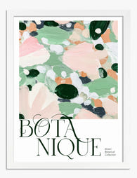
Poster botanisch groen met speelse roze spatten
Aanbiedingsprijs Vanaf £11.95£19.95 -

Poster tuinpad in Edinburgh
Aanbiedingsprijs Vanaf £11.95£19.95 -

Poster botanische witte bloemen in lichtgroen
Aanbiedingsprijs Vanaf £11.95£19.95 -

Poster botanische bloemen in donkergroen, vintage
Aanbiedingsprijs Vanaf £11.95£19.95 -

Poster botanische kas van Kew Gardens
Aanbiedingsprijs Vanaf £11.95£19.95 -

Poster botanische vogel in William Morris-stijl
Aanbiedingsprijs Vanaf £11.95£19.95 -

Poster botanische vlinder in William Morris-stijl
Aanbiedingsprijs Vanaf £11.95£19.95 -

Poster Brits botanisch landschap
Aanbiedingsprijs Vanaf £11.95£19.95 -

Poster Morris botanisch groen op beige
Aanbiedingsprijs Vanaf £11.95£19.95 -

Poster botanische vogels in William Morris-stijl
Aanbiedingsprijs Vanaf £11.95£19.95 -

Poster Kew Gardens rustgevende glazen kas
Aanbiedingsprijs Vanaf £11.95£19.95 -

Poster betoverde tuin
Aanbiedingsprijs Vanaf £11.95£19.95 -

Poster botanische bladeren, geïnspireerd door William Morris
Aanbiedingsprijs Vanaf £11.95£19.95 -

Poster botanische harmonie in groen
Aanbiedingsprijs Vanaf £11.95£19.95 -

Poster botanische bladeren van William Morris
Aanbiedingsprijs Vanaf £11.95£19.95 -

Canvas abstract in zachte botanische kleuren
Aanbiedingsprijs Vanaf £49.95£74.95


Meer van The Frame

Botanical vs Floral Prints: Which Style Actuall...
Botanical and floral prints get lumped together constantly, and it's costing people the chance to get their walls right. They're not the same thing, they don't behave the same way...

The Best Tulip Wall Art for Every Interior Styl...
Tulips are having a proper moment in interiors, and the range of prints available can make choosing feel harder than it should be. Once you understand the four main styles...

What Do Tulips Symbolise in Art? From Dutch Sti...
Tulips carry more baggage than any other flower in art history. They've been religious symbols, financial weapons, moral warnings, and quiet objects of beauty. Understanding that lineage changes how you...