
 Bestel vandaag, levering vóór
 What Art Actually Looks Good in a Kitchen (Specific Ideas, Not Vague Inspiration)
A practical framework for choosing kitchen wall art that actually belongs there, not just decorates the space.


Most kitchen art advice tells you to "choose what speaks to you." That's useless. You need a framework for elimination, specific subjects that work with the function of the room, and honest guidance on sizing and materials in a space that deals with steam, splashes, and daily traffic.
The three subjects that consistently look great on kitchen walls
After years of watching what works and what quietly gets taken down after six months, we're confident in three categories: beverage prints, botanical prints, and food illustration. Everything else is either fighting the room or trying too hard.
Beverage prints (coffee, tea, wine, cocktails) work because they mirror what actually happens in the room. Botanicals work because kitchens are already sensory spaces full of herbs, produce and organic textures, and botanical art extends that language onto the walls. Food illustration works when it's genuinely well-drawn, not stock-photo pasta on a chalkboard.
You can browse everything we group under kitchen art prints to see how these three categories tend to dominate, and for good reason. They belong.

Why beverage and food prints feel natural in kitchens (without being cheesy)
There's a psychological reason drink themed wall art works so well in kitchens: the subject and the space share a purpose. A print of a slow pour-over next to your actual coffee machine creates a small visual echo. It's the same reason cookbooks look good on kitchen shelves and terrible in bedrooms. Context matters.
The cheesy version of this is the problem. Kitsch script that says "But first, coffee" over a mug silhouette. A wine glass with "It's wine o'clock somewhere." These aren't bad because they're about drinks. They're bad because they're literal, low-effort, and treat the viewer like they need the joke explained.
The sophisticated version relies on illustration quality, restrained typography (or none at all), and a point of view. A well-drawn espresso cup with soft shadows and a limited palette reads as art. A stylised botanical study of a coffee plant reads as art. A vintage-inspired travel poster for a wine region reads as art. The subject isn't the problem, the execution is.
If you want to go deeper into this category, our beverage art prints collection is where we put everything that clears that bar.
Sizing art for above the counter, between cabinets, and on feature walls
Kitchens are the trickiest room in the house for sizing because you're rarely working with a clean, uninterrupted wall. You've got upper cabinets, extractor hoods, tiled splashbacks, plug sockets, shelves and awkward strips of paint between all of them. Here's how we think about the three main scenarios.
Above the counter, between wall units
This is the classic kitchen art spot: a horizontal strip of wall roughly 40-60cm tall, sitting above the worktop and below the wall cabinets. You want something that respects those boundaries. A single 30x40cm framed print centred in that gap looks intentional. A 50x70cm print jammed in there looks trapped.
For longer stretches, two smaller prints (say, two 21x30cm) spaced evenly can create rhythm without crowding. Keep the bottom edge of the frame at least 15-20cm above the worktop so it clears the splash zone.
Between cabinets (narrow vertical strips)
You know the spot: that awkward vertical column of wall next to the fridge or beside a run of tall cabinets. A single portrait-orientation print, something like 30x40cm or 40x50cm, sized to leave 5-8cm of breathing room on either side, will transform this dead space. This is where a slim botanical study or a vertical beverage illustration earns its keep.
Feature walls (a full uninterrupted wall)
If you have a proper feature wall (behind a dining table, opposite the cooking zone, above a banquette), size up. A 70x100cm framed print or a 100x150cm canvas is not too big here. Undersized art on a big wall is the single most common kitchen mistake we see. More on that later.

The 2/3 rule applied to real kitchen layouts
The professional guideline is that art should occupy roughly two-thirds of the width of the furniture or wall segment it sits above. In a living room this is straightforward: measure the sofa, multiply by 0.66, that's your target print width. Kitchens complicate this because "the furniture below" is often a worktop that runs the length of the wall.
Apply the rule to zones, not the whole room. If you have a coffee station with a machine and a grinder sitting on a 120cm stretch of worktop, the art above it should be roughly 80cm wide. That could be one 70x100cm framed print or two 30x40cm prints hung with a 5cm gap.
Above a dining table in a breakfast nook, measure the table. A 140cm table wants art around 90-100cm wide. That's a single 70x100cm framed print, or two 50x70cm prints, or three 30x40cm prints in a row. All of these read as intentional, because they respect the proportion.
Where the 2/3 rule breaks down is on genuinely awkward walls: narrow vertical strips, weirdly proportioned alcoves, walls broken up by a boiler cupboard. Here, use the rule as a starting point and adjust down. Better to have art that looks slightly small than art that crowds the space.
Why framing quality matters more in kitchens than any other room
Kitchens are brutal on art. Steam rises from the hob. Warm, humid air lingers after cooking. Sunlight hits from windows above the sink. Cooking oil creates a fine mist that settles on every surface, and yes, that includes your walls. This is why cheap framing fails here first.
Three things matter more in a kitchen than anywhere else.
The frame material itself. MDF and veneer frames warp when they absorb humidity. Solid wood doesn't. Every framed print we sell uses FSC-certified solid wood, which is not a coincidence, it's the only material we'd trust in a kitchen long-term.
The glazing. Traditional glass is heavy, fragile, and creates glare that fights kitchen lighting. UV-protective acrylic glaze does two jobs at once: it prevents fading from the natural light most kitchens get in abundance, and it's safer if it ever comes off the wall. Our prints use acrylic, not glass, and the UV protection means colours stay true even in a south-facing kitchen.
How the print sits inside the frame. The most common kitchen art failure is a print that bubbles, warps or shifts inside its frame after a few months of humidity cycles. This happens when frames are shipped separately from prints and assembled at home, or when the print isn't properly mounted. Our framed prints ship pre-fitted in a single box, arrive ready to hang, and stay flat.
None of this is glamorous, but it's the difference between art that still looks good in three years and art that quietly gets replaced.

Tea prints, coffee prints, or wine prints: matching the vibe of your kitchen
The choice between tea, coffee and wine art isn't aesthetic. It's about how you actually use your kitchen. Match the art to your real habits and the room will feel coherent.
Coffee prints suit kitchens that are morning-focused: family kitchens, breakfast bars, kitchens where the espresso machine gets more attention than the wine fridge. Coffee illustration tends toward warm palettes (browns, creams, terracotta) and pairs well with wood, cream, and warm-toned worktops.
Tea prints for a kitchen wall work beautifully in calmer, more considered kitchens: cottage kitchens, homes where tea is a ritual rather than a caffeine delivery system, kitchens with softer colour schemes. Tea art often features botanical elements (tea plants, herbal blends, citrus), which is why it doubles as a bridge between beverage and botanical categories. If your kitchen leans sage green, dusty blue, or soft cream, tea prints will sit into it naturally.
Wine prints belong in kitchens that lean toward entertaining: open-plan kitchens with a dining zone, kitchens with a serious wine fridge, homes where dinner parties happen. Vintage wine region posters, considered still lifes of glasses and bottles, or typographic labels done well all suit this mood. Wine art skews slightly more formal, so it tends to work better in kitchens with darker cabinets, marble, or brass detailing.
If your kitchen is genuinely all three (morning coffee, afternoon tea, evening wine), you can absolutely mix them, but keep the illustration style consistent so it reads as a collection rather than a jumble.
What to avoid: the kitchen art mistakes we see most often
Some of these are obvious. Others catch out people who otherwise have good taste.
Prints that are too small. A 21x30cm print floating on a large wall looks apologetic. If your wall is big, your art needs to be big. This is the single most common mistake.
Literal food quotes. "Eat, drink, be merry." "The kitchen is the heart of the home." "Bless this mess." These date badly and they date fast.
Hanging in the splash zone. Directly behind the hob or immediately above the sink is a bad idea, even with acrylic glazing. Grease and steam will find the frame's edges. Give art at least 30cm of clearance from active cooking and washing zones.
Ignoring eye level. The centre of the artwork should sit around 145-150cm from the floor, which is standard gallery eye level. In kitchens, people misjudge this because they hang art relative to cabinets rather than to the humans in the room. Hang it for the humans.
Matching too literally to cabinet colour. If your cabinets are sage green, art doesn't need to feature sage green. It needs to sit comfortably beside sage green. There's a difference. Contrast, complement, or ignore. Don't match.
Unprotected paper prints in exposed positions. An unframed art print pinned to a kitchen wall will yellow within a year. If you want the minimal, frameless look in a kitchen, canvas is the better choice. Poly-cotton canvas with a matte finish holds up to humidity far better than exposed paper, which is why some of our food art prints are worth considering as canvas rather than framed paper for high-splash areas.
Pulling together a cohesive kitchen wall with two or three prints
Single statement pieces are great above a dining table. But most kitchen walls benefit from two or three prints working together, because kitchens themselves are collections of small objects (utensils, jars, ingredients) and the art can echo that rhythm.
Three principles for combining prints:
Consistent framing. Same frame colour, same frame profile, across every piece. This is what separates a curated wall from a chaotic one. Black frames throughout, or natural oak throughout, but not both.
Related but not identical subjects. Three coffee prints in a row is boring. One coffee print, one botanical featuring a coffee plant, and one abstract in the same palette is a collection. Aim for variety within a theme.
Balanced sizing, not identical sizing. Two prints of identical size hung side by side reads as safe but static. A larger central print flanked by two smaller ones creates hierarchy. Or three prints of different sizes arranged with their centres aligned. This is where kitchen walls with awkward proportions actually give you an advantage: the constraint forces more interesting arrangements.
If you're building a set around plants and produce rather than drinks, our botanical art prints work particularly well in threes, because botanical illustration has such a clear visual language that variations within the category feel like a considered series rather than a random mix.

The short version
Pick a subject that reflects how you actually use the room. Size the art to two-thirds of the zone below it. Hang it at 145-150cm centre, at least 15cm clear of worktops and 30cm clear of splash zones. Insist on solid wood frames and UV-protective acrylic, because kitchens punish cheap materials faster than any other room. And if you're combining pieces, keep the framing consistent and let the subjects do the varying.
Do that, and your kitchen walls will look considered rather than decorated.

Fab-producten in dit blog
-
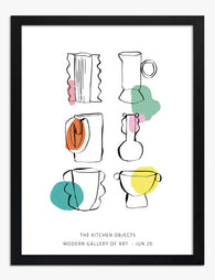
Poster kleurrijk keukengerei
Aanbiedingsprijs Vanaf £11.95£19.95 -

Poster zonnige keuken in Matisse-stijl
Aanbiedingsprijs Vanaf £11.95£19.95 -
Poster speelse lijntekening van keukenspullen in pastel
Aanbiedingsprijs Vanaf £11.95£19.95 -

Poster speelse keukenillustratie
Aanbiedingsprijs Vanaf £11.95£19.95 -

Poster speelse keukenillustratie met ingrediënten
Aanbiedingsprijs Vanaf £11.95£19.95 -

Poster kleurrijke keukenscène
Aanbiedingsprijs Vanaf £11.95£19.95 -

Poster speelse moderne keukensfeer
Aanbiedingsprijs Vanaf £11.95£19.95 -

Poster smaakmakers voor de keuken
Aanbiedingsprijs Vanaf £11.95£19.95 -

Poster speelse keukenschetsen blauw op wit
Aanbiedingsprijs Vanaf £11.95£19.95 -

Poster minimalistische schets van glas in saliegroen
Aanbiedingsprijs Vanaf £11.95£19.95 -
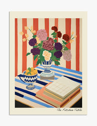
Poster bloemen op gestreepte tafel
Aanbiedingsprijs Vanaf £11.95£19.95 -
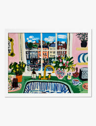
Poster kleurrijke keuken met stadszicht in Matisse-stijl
Aanbiedingsprijs Vanaf £11.95£19.95 -
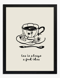
Poster theetijd inspiratie - zwart-wit
Aanbiedingsprijs Vanaf £11.95£19.95 -

Canvas speelse keukenillustratie met kleuraccenten
Aanbiedingsprijs Vanaf £49.95£74.95 -
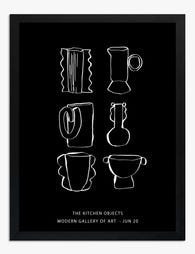
Poster chique keuken lijntekening in zwart-wit
Aanbiedingsprijs Vanaf £11.95£19.95 -

Canvas keuken in moderne lijntekening
Aanbiedingsprijs Vanaf £49.95£74.95 -

Poster vintage keukentafereel in zonlicht
Aanbiedingsprijs Vanaf £11.95£19.95 -

Italian Kitchen Things Art Print
Aanbiedingsprijs Vanaf £11.95£19.95 -

Poster kleurrijke keuken met warme gloed
Aanbiedingsprijs Vanaf £11.95£19.95 -
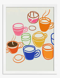
Poster kleurrijke koffiemokken
Aanbiedingsprijs Vanaf £11.95£19.95


Meer van The Frame

Coffee Prints for the Kitchen: Exactly Where to...
Coffee art has a bad reputation, and it's mostly earned. Too many kitchens end up looking like a rustic cafe theme park, with three "But First, Coffee" signs and a...

Botanical Bedroom Ideas: How to Use Plant Print...
Botanical prints belong in bedrooms more than any other room in the house. The trick is choosing the right subjects, sizing them properly, and understanding how a printed leaf on...

Why Kew Gardens Became the World's Most Famous ...
Kew Gardens holds around 200,000 botanical illustrations, the largest collection of its kind anywhere. Behind that number is a story of royal ambition, global exploration, and artists sent to the...