What to Hang in Awkward Corners
The dead zones where two walls meet are the easiest spaces to transform, if you know how to plan them.

Corners are the dead zones of most homes. Your eye skims past them, furniture refuses to sit flush against them, and you end up with a triangular patch of wall that feels both too small to matter and too obvious to ignore. Art fixes this faster than any plant, lamp or accent chair, but only if you treat the corner as a single space rather than two separate walls.
Why corners feel awkward in the first place
Corners disrupt the way your eye travels around a room. On a flat wall, your gaze moves horizontally with nothing to interrupt it. At a corner, that flow breaks against a 90-degree angle, which your brain reads as a stop sign. If there's nothing to carry your attention through the turn, the corner registers as a visual gap.
Art solves this in a way that furniture can't. A well-placed pair of prints, or a gallery that wraps from one wall onto the next, tricks the eye into reading both planes as continuous surface. The room feels larger, the layout feels intentional, and the corner stops being something you tolerate.
The trick is treating the corner as one composition split across two surfaces, not two unrelated walls that happen to meet.
Planning before you hang anything
Most corner art fails because people buy first and plan second. Reverse the order and the rest gets easy.
Measure both walls properly
Grab a tape measure and record the width of each wall from the corner outward, the height from floor to ceiling, and the height of any furniture sitting beneath the space. Then mark the obstacles: light switches, radiators, vents, skirting board details, door frames, window edges. These dictate what will actually fit.
For tight corners where each wall offers less than 30cm of usable space, you're looking at a vertical pairing of small prints. For wider corners with 60cm or more on each side, you have room for proper statement pieces or a gallery wrap.
Find your centre line
The museum standard for hanging art is 145cm from the floor to the centre of the piece. That puts the middle of the artwork at average eye level. Adjust down if you're hanging above a sofa, sideboard or bed, where the rule shifts to roughly 15-20cm above the furniture, with the bottom of the frame just clearing the top of the piece below.
For corner arrangements, the centre line should match across both walls. If your left-hand print sits at 145cm centre, the right-hand print should too. Inconsistent heights at a corner look worse than inconsistent heights on flat walls because the eye is comparing them directly.
Plan the spacing
Keep 5-7cm between frames on the same wall and 10-15cm between the inner edges of prints on either side of the corner itself. Any tighter and the frames look like they're crashing into the angle. Any wider and the corner reads as empty again.

The five corner arrangements that actually work
There are dozens of ways to hang art in a corner, but most are variations on five core layouts. Pick the one that suits your wall measurements and stick to it.
The mirrored pair
Two prints of identical size, one on each wall, hung at the same height with matching frames. Simple, symmetrical, and almost impossible to get wrong. Works beautifully for botanical pairs, abstract diptychs, or anything with a clear left/right relationship.
This is the safest option for tight corners and the best starting point if you've never decorated a corner before. A pair of 40x50cm framed prints with 10cm between their inner edges fills the space without overwhelming it.
The wrap-around gallery
A cluster of prints that starts on one wall, turns the corner, and continues onto the next. The trick here is keeping your spacing consistent across the corner and choosing a unifying element: a colour palette, a frame style, or a subject matter that ties everything together.
Aim for an odd number of pieces (five or seven works well) with one anchor piece on each wall and smaller satellites filling in. Lay it out on the floor first.
The angled statement
A single large piece hung directly across the corner itself, bridging both walls. Requires the right hardware and a wall surface that allows it, but the effect is dramatic in a room with high ceilings or a deep alcove. Best reserved for canvas pieces, which are lighter and easier to angle without strain on the wall fixings.
The cascading asymmetric
One large anchor print on the wider wall, with two or three smaller prints descending diagonally onto the adjacent wall. The cascade creates downward movement, which is useful when the corner sits above a piece of furniture like a sideboard or reading chair.
This works particularly well in living room corners where a sectional creates a natural focal area but the wall behind it is split.
Shelf plus print
A floating shelf installed across the corner (or two shelves, one on each wall at the same height) with leaning prints and small objects. The shelf adds depth, the prints provide colour, and you can rotate pieces without making new holes. Renters, take note.
Matching art to corner type
Not all corners are the same. The arrangement that works in a bright living room won't suit a tight hallway turn.
Tight corners
If each wall gives you less than 30cm of clear space, scale down. A pair of 30x40cm prints, vertically oriented, hung at matching heights, will fill the space without crowding. Avoid anything horizontal, which makes tight corners feel even tighter.
Wide corners
For wide corners with 70cm or more on each side, you have room to think bigger. A wrap-around gallery, a mirrored pair of 50x70cm pieces, or a single 70x100cm statement on each wall all work. The risk here is going too small, which leaves the corner feeling underdressed.
Corners with windows or doors
If a window or door sits within 30cm of the corner, treat the available wall as the entire canvas. Don't try to balance both sides. Hang a single vertical piece on whichever wall offers more space and let the corner breathe.
High-ceiling corners
Tall corners (over 3m) demand vertical art. A 70x100cm portrait-oriented print, or a stacked pair, draws the eye upward and uses the height. Hanging small art in a high corner is the most common scale mistake we see.
Corner nooks
Reading nooks, window seats, and built-in corners benefit from a single quiet piece rather than a busy gallery. Something tonal, soft, and personal. This is where abstract art earns its keep, because it adds atmosphere without demanding attention.

Room-by-room corner strategy
The same corner principles apply differently depending on the room.
Living room corners
Most living room corners sit either behind a sectional or beside a window. Behind a sectional, hang lower than usual (centre line around 120cm) and lean towards horizontal arrangements that echo the line of the sofa. Beside a window, treat the window edge as one boundary and centre your art between the window and the corner.
Bedroom corners
Bedroom corners usually sit above a nightstand or beside a wardrobe. Keep the palette calmer than the rest of the house. Botanical prints, soft landscapes, and muted abstracts work better than bold graphic pieces. Take a look at botanical wall art for options that bring quiet without being dull.
Entryway corners
The first thing anyone sees when they walk in. Go bold. A single statement piece on the wider wall, or a mirrored pair if both walls are visible from the door, sets the tone for the rest of the home.
Dining room corners
Dining corners can take more visual weight because you're sitting still and looking at them for longer. A larger gallery wrap works here, especially with consistent framing. Match the frame finish to other wood tones in the room.
Home office corners
Behind a desk or beside a bookshelf, corner art should be something you genuinely want to look at for hours. Avoid anything frantic. Minimalist line drawings, tonal abstracts, and architectural prints all work.
Frame choices for corners
Frame consistency matters more in corners than anywhere else, because the eye compares the two pieces directly across the angle.
Match frame style and finish across the corner unless you're deliberately going eclectic. Oak with oak, black with black, white with white. Mixed metals or mixed wood tones across a corner usually reads as a mistake rather than a choice.
Frame thickness also matters. A chunky 3cm frame next to a slim 1cm frame at a corner looks unbalanced. Pick one profile and use it on both walls.
If you want to avoid frames altogether, canvas prints sit flat against the wall and wrap around their own edges, giving you a cleaner line at the corner. They're also lighter, which matters if you're hanging across a difficult surface. Browse canvas prints if frameless minimalism is your direction.
For framed pieces, the UV-protective acrylic glaze on our prints is worth flagging here because corners near windows often get hit with direct sunlight, and acrylic prevents the fade you'd get with standard glass over years of exposure.

The mistakes that ruin corner art
A few patterns come up again and again.
Hanging too high. Corner art often ends up higher than flat-wall art because people instinctively centre it on the wall rather than at eye level. Stick to the 145cm centre rule.
Decorating only one wall. A single print on one side of a corner with nothing on the other emphasises the gap rather than filling it. Either commit to both walls or move the print to a flat surface.
Inconsistent spacing across the turn. Prints sitting 5cm from the corner on one wall and 25cm from the corner on the other will always look wrong. Measure from the corner outward and keep the inner edges equidistant.
Scale problems. A 30x40cm print floating alone in a corner with two metres of wall on either side looks lost. Match scale to the space, not to what you happen to own.
Clashing styles at the meeting point. A bold pop-art print on one wall and a delicate watercolour on the other will fight at the corner. Pick one mood and let both walls share it.
Keeping corner art fresh
Corners are the easiest place to rotate work seasonally because the arrangement is usually small. Swap in warmer tones for autumn, lighter pieces for spring, and keep the frames in place so you're not making new holes.
If you want to expand a corner gallery over time, plan the eventual layout from the start. Decide where the final pieces will sit, then add one or two at a time. Trying to retrofit a fifth print into an arrangement of four almost always means rehanging everything.
Command strips and picture rails are your friend if you're renting or commitment-averse. Both work well for prints up to about 50x70cm, though anything larger or heavier needs proper fixings.
The shortcut
If you're staring at an awkward corner right now and don't know where to start, do this. Measure both walls. Pick two prints of the same size in matching frames. Hang them at 145cm centre, with 10cm between their inner edges and the corner. That single move solves 80 per cent of corner problems and gives you a base to build from later.
Corners reward planning more than any other space in your home. Get the geometry right and the art does the rest.


Fab-producten in dit blog
-

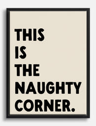
Poster strafhoek, zwarte tekst op beige
Translation missing: nl.products.product.sale_price Vanaf £11.95£19.95 -
Canvas ondeugende hoek typografie – zwart op beige
Translation missing: nl.products.product.sale_price Vanaf £44.95£74.95 -

Poster zwarte kat die om het hoekje kijkt
Translation missing: nl.products.product.sale_price Vanaf £11.95£19.95 -

Poster betekenisvolle verbindingen – handgeschreven quote
Translation missing: nl.products.product.sale_price Vanaf £11.95£19.95 -

Poster cyperse kat op oranje bank in boho stijl
Translation missing: nl.products.product.sale_price Vanaf £11.95£19.95 -

Poster gezellige leeshoek in de bibliotheek
Translation missing: nl.products.product.sale_price Vanaf £11.95£19.95 -

Poster Origami Garden Patchwork nr. 9
Translation missing: nl.products.product.sale_price Vanaf £13.99£19.99 -

Canvas niet de spullen, maar de mensen
Translation missing: nl.products.product.sale_price Vanaf £44.95£74.95 -

Poster roze bloemen met turquoise schaduw
Translation missing: nl.products.product.sale_price Vanaf £13.99£19.99 -

Poster twee kolen, heel en gehalveerd
Translation missing: nl.products.product.sale_price Vanaf £13.99£19.99 -

Canvas stadswandeling en groene hoekjes
Translation missing: nl.products.product.sale_price Vanaf £44.95£74.95 -
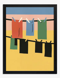
Poster kleurrijke waslijn
Translation missing: nl.products.product.sale_price Vanaf £11.95£19.95 -

Poster kleurrijke schoenenhoek
Translation missing: nl.products.product.sale_price Vanaf £11.95£19.95 -

Poster harmonie in koraalrood en poederroze
Translation missing: nl.products.product.sale_price Vanaf £13.99£19.99 -

Poster Parijse caféhoek in aquarel
Translation missing: nl.products.product.sale_price Vanaf £11.95£19.95 -

Poster glurende zwarte kat
Translation missing: nl.products.product.sale_price Vanaf £11.95£19.95 -

Poster gestreepte rust in blauw-wit
Translation missing: nl.products.product.sale_price Vanaf £11.95£19.95 -

Poster losse veren in crème en olijfgroen
Translation missing: nl.products.product.sale_price Vanaf £11.95£19.95 -

Canvas nieuwsgierige kat gluurt om de hoek in zwart-wit
Translation missing: nl.products.product.sale_price Vanaf £44.95£74.95 -

Poster uil tussen bladeren en fruit – William Morris geïnspireerd
Translation missing: nl.products.product.sale_price Vanaf £11.95£19.95


Meer van The Frame

Art for Narrow Walls and Hallways
Narrow walls are the most under-decorated surfaces in most homes. Not because they're hard to style, but because most advice treats every awkward space as the same problem when really...

What to Put on a Big Blank Wall
Big blank walls feel impossible because they multiply your options instead of narrowing them. Every idea seems plausible, nothing feels right, and the wall stays empty for another six months....

Art for Above a Console Table
A console table without art on the wall above it always looks unfinished. Get the art right and the whole vignette clicks into place. Get it wrong (too small, too...