


Poster Rothko rode en oranje gloed

Bold Abstracts Gallery Wall Art Print Set

Poster abstracte balans in blauw en rood

Poster abstracte horizon in diepblauw en rood

Poster rood en oranje harmonie in Rothko-stijl

Poster abstracte kleurvlakken in bordeauxrood en oker

Poster met pastelkleurige vlakken

Poster stralende pastelblokken in koraal, roze en aqua

Poster oranje gloed van Rothko

Poster abstracte roze gloed

Poster abstracte kleurvlakken in harmonie

Poster abstracte stedelijke rust in zwart en beige

Poster abstract neon droomlandschap in zwart, beige en roze

Poster zonnestraal in geel - minimalistisch design

Poster abstracte roze blokken

Poster pastelgloed - abstract in roze, koraal en geel

Poster Rothko harmonie in rood en roze

Poster met twee moderne kleurvlakken in bordeauxrood en oker
Meer Fab kunstcollecties
Mark Rothko posters Print Articles From The Frame
How-to guides, styling inspiration, and design ideas for mark rothko posters in your home from The Frame, Fab's blog.

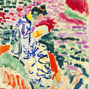
Building a Gallery Wall Around a Rothko Print
Rothko prints are seductive and unforgiving in equal measure. Get the styling right and you have a gallery wall that feels like a small private museum. Get it wrong and...
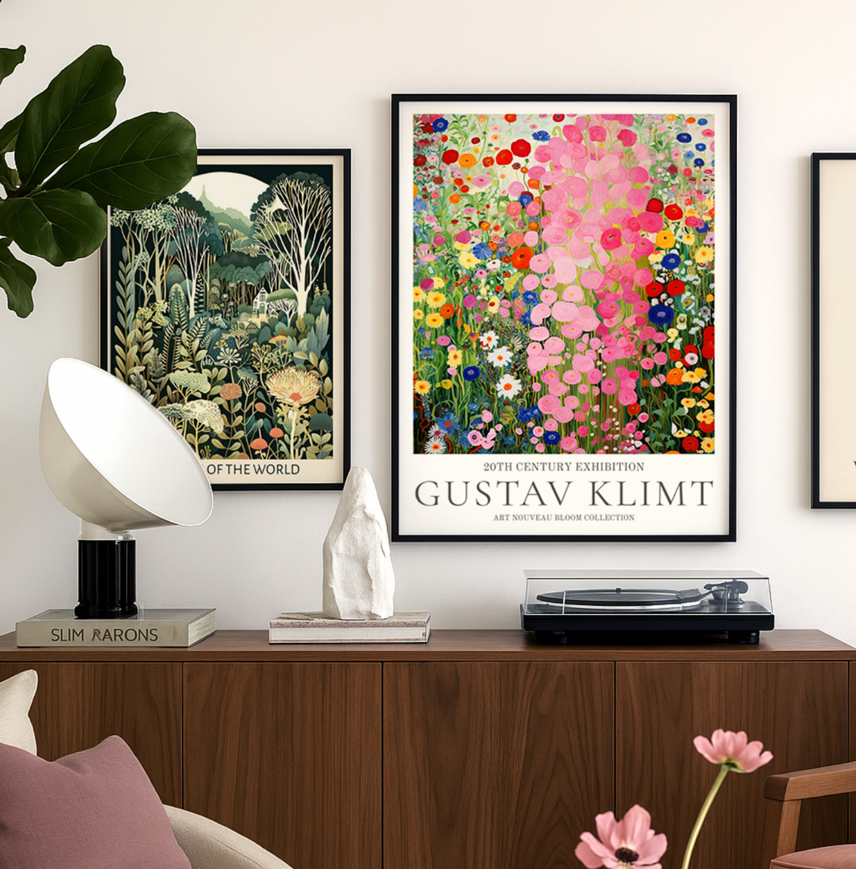
Discover Gustav Klimt Art Prints with Fab
Gustav Klimt wasn’t just an artist — he was a master of seduction through pattern, color, and symbolism. At Fab, we celebrate his work not just as art history, but...
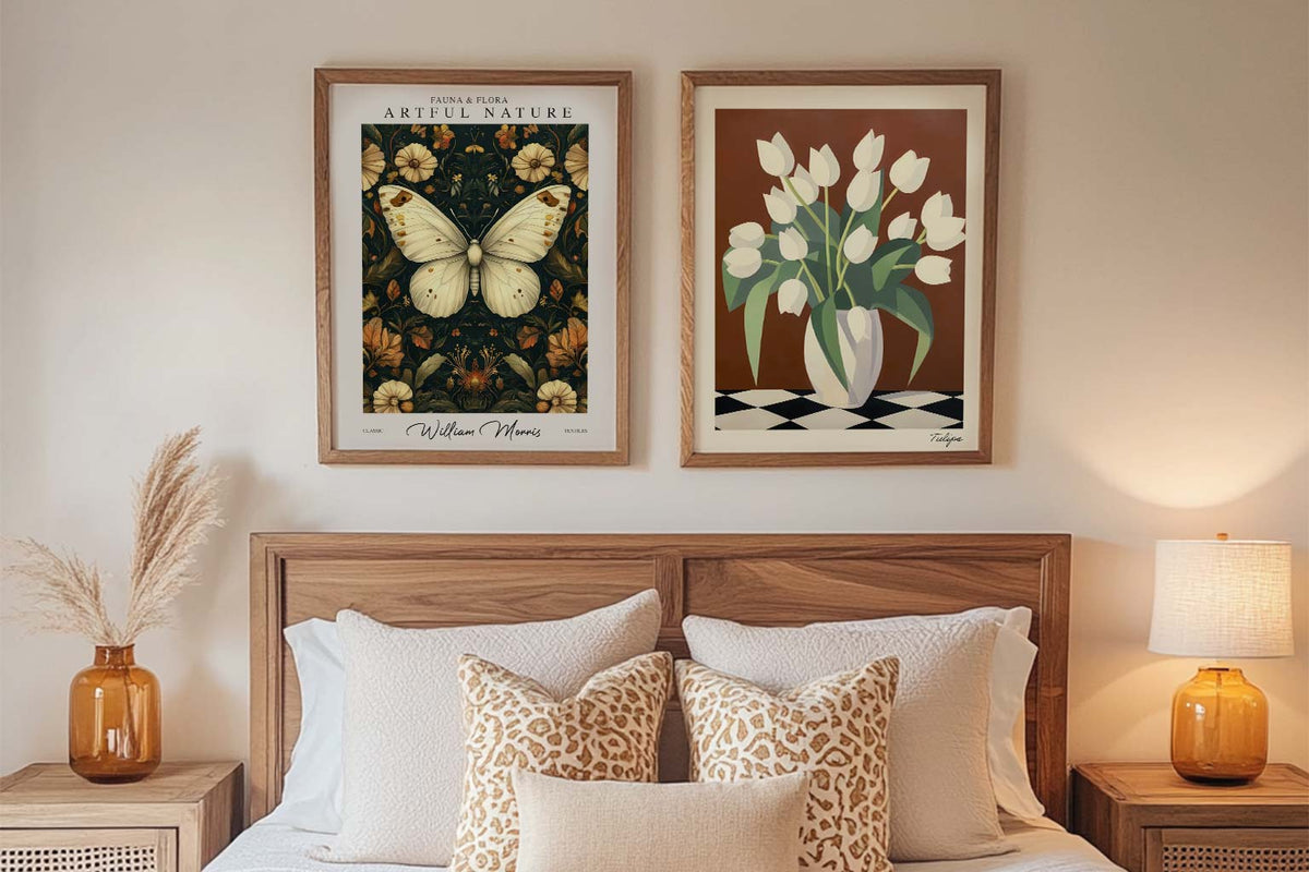
Starter Art Prints for First-Time Buyers
A blank wall can be intimidating. You know you want art, but where do you even start? You scroll through endless options online, walk through galleries feeling lost, or stare...
 Wij nemen kunst serieus – vraag maar raak


Van formaat tot inlijsting en printkwaliteit – de kunstexperts van Fab leggen het allemaal uit, zodat je het perfecte kunstwerk voor jouw ruimte vindt.