


Poster italiensk landsbygd från Piceno

Poster Retiroparken i Madrid – grönska och arkitektur

Poster Parma i solsken – medelhavskänsla i orange och grönt

Poster pasta – svartvit linjeteckning för köket

Poster onigiri – lekfull japansk köksillustration

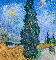
Poster månbelyst stig i siennatoner

Poster blomstermarknad i Alberta

Poster chilisåser

Poster pizza margherita

Poster Roms färgstarka charm

Poster tropisk oas – Gardens by the Bay, Singapore

Poster promenad i Schönbrunns slottspark, Wien

Poster trädgårdarna vid Blenheim Palace

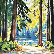
Poster solbelyst skogsstig

Poster solbelyst skogsstig

Poster livligt kafétorg

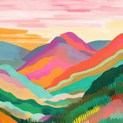
Poster pastellkullar i lugnt landskap

Poster Paris i pastell med Eiffeltornet

Poster pastellvy från Amalfi

Vibrant Fauvist Forest Art Print

Tranquil Rolling Hills Art Print

Tranquil Rolling Vineyards Art Print

Soft Pastel Hillside Art Print

Serene Rolling Fields Art Print

Tuscan Rolling Hills Glow Art Print

Misty Tuscan Hills Art Print

Serene Rolling Landscape Art Print

Poster Klimt-inspirerad skogsstig

Poster gyllene skogsstig – inspirerad av Klimt

Poster skogsstig inspirerad av Klimt

Poster skogsstig inspirerad av Gustav Klimt

Autumn Radiance Tree Art Print

Poster glödande skog i Klimt-stil

Klimt-Inspired Golden Forest Art Print
Fler Fab konstkureringar
Konsttryck med impressionistiska träd Print Articles From The Frame
How-to guides, styling inspiration, and design ideas for konsttryck med impressionistiska träd in your home from The Frame, Fab's blog.
Starter Art Prints for First-Time Buyers
A blank wall can be intimidating. You know you want art, but where do you even start? You scroll through endless options online, walk through galleries feeling lost, or stare...
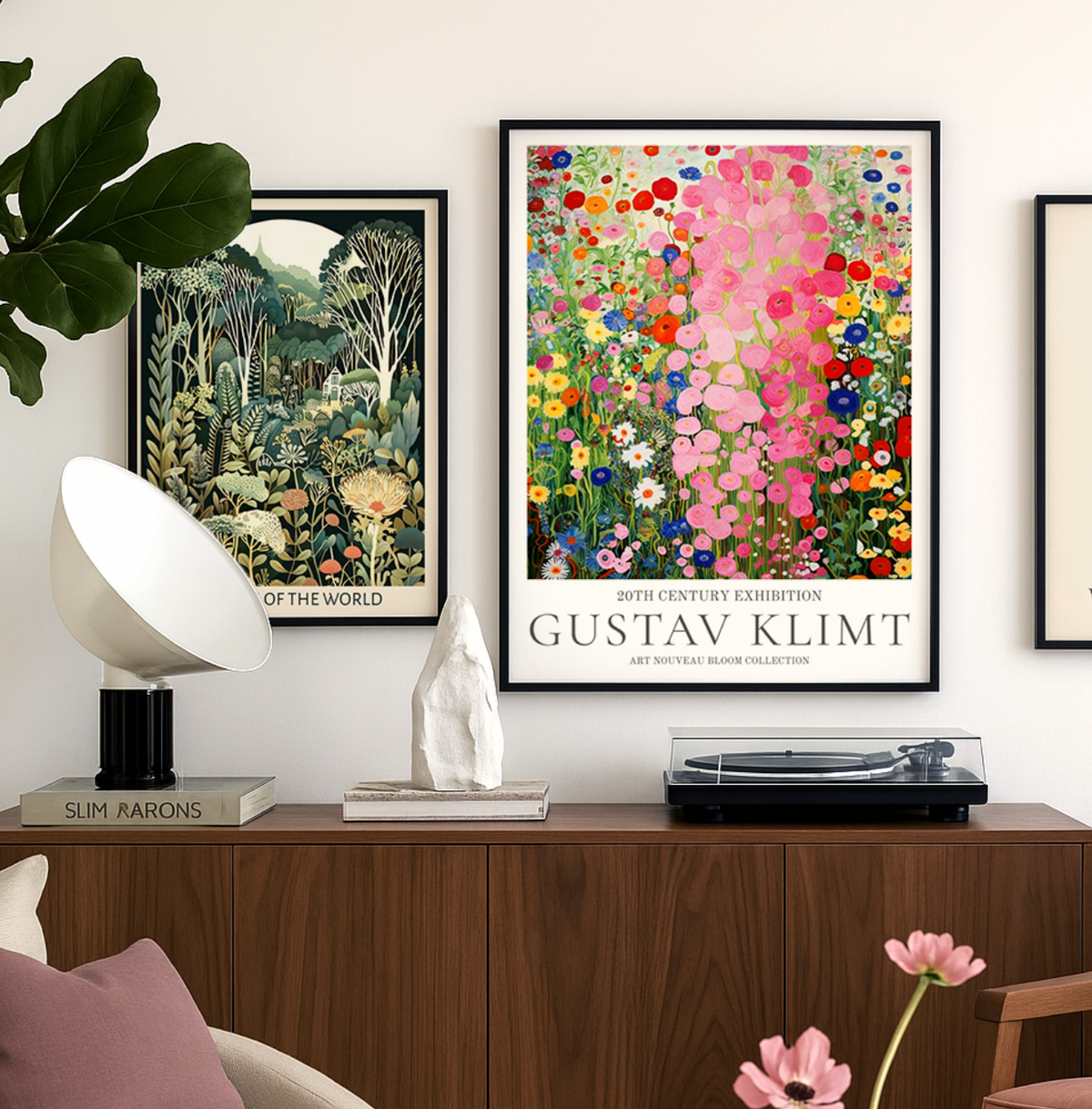
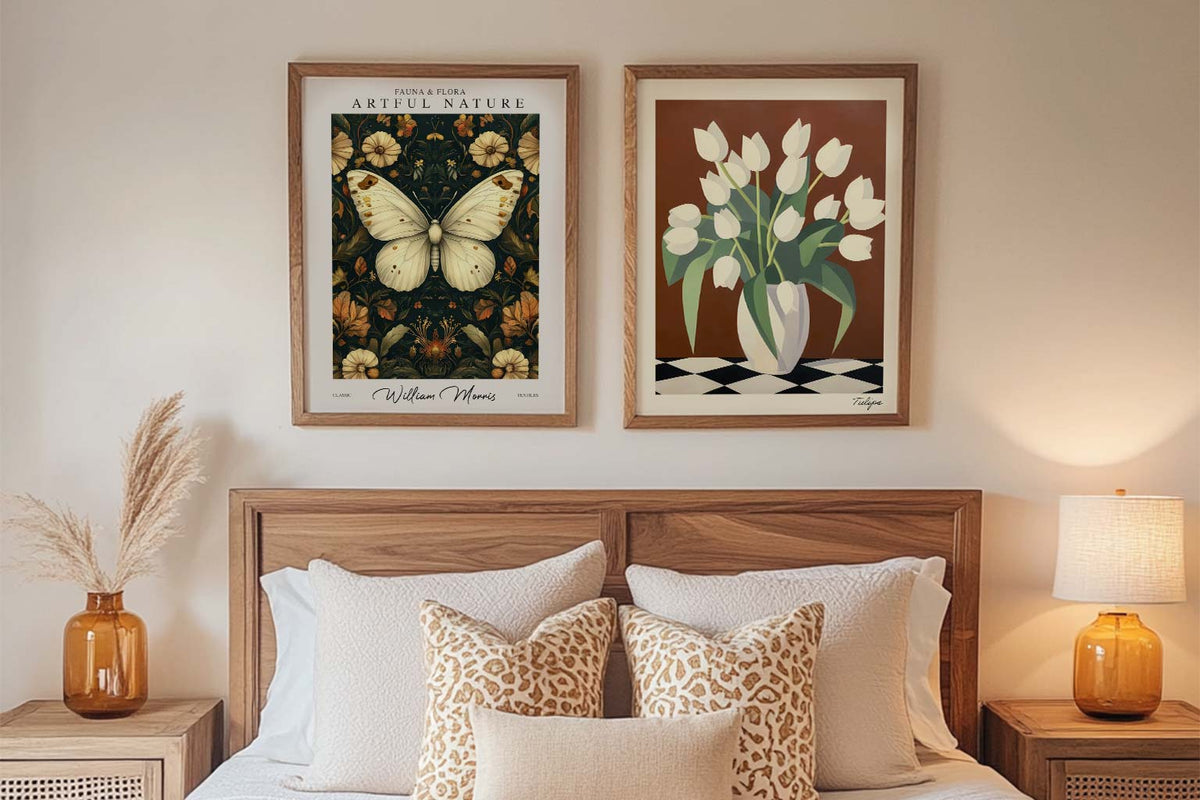
Discover Gustav Klimt Art Prints with Fab
Gustav Klimt wasn’t just an artist — he was a master of seduction through pattern, color, and symbolism. At Fab, we celebrate his work not just as art history, but...
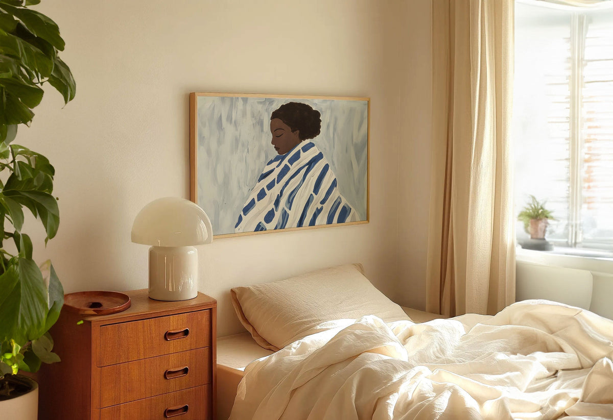
Art for Bedrooms: Calm, Romantic, or Bold?
Your bedroom is the most personal room in your home. It's where you start and end each day, where you retreat when you need space, where you go to feel...
 Vi tar konst på allvar – fråga på


Från storlek till inramning och tryckkvalitet – Fabs konstexperter förklarar allt så att du hittar rätt konst för ditt hem.