
 Beställ idag, leverans senast
 Konsttryck med sardiner
Silverkroppar, blå skuggor och lite oljig glans – sardiner är ett litet motiv med mycket färg. Här dyker de upp staplade i burkar, upplagda på fat, målade fritt i olja eller tecknade platt och grafiskt för köksväggen. Varma paletter i marknadsstil trivs fint bredvid medelhavsposters med fisk och skaldjur, medan tystare, svalare studier drar åt posters med fiskstilleben. Välj utan ram eller inramad och färdig att hänga.


Inga produkter hittades
Fler Fab konstkureringar



Fisk och skaldjur på väggen – från The Frame
Mer om att hänga konst i köket, välja rätt format och bygga små grupper from The Frame, Fab's blog.
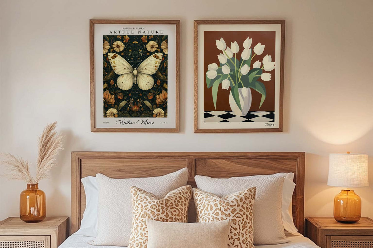
Starta med konsttryck: guide för förstagångsköpare
En enkel guide till hur du väljer dina första konsttryck – färg, motiv, storlek, placering och budget – så att ditt hem börjar kännas som ditt.
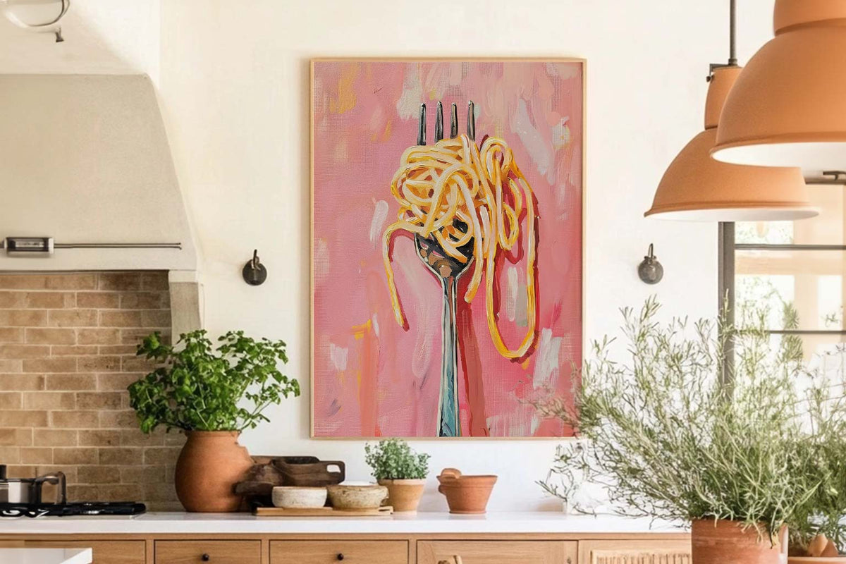
Den bästa väggkonsten för kök och matplatser
Välj konst till kök och matplats som speglar din relation till mat och umgänge. Färg, placering, storlek och ramar – här är tipsen som gör rummen varma, praktiska och personliga.
Så gör du en hyresbostad personlig med väggkonst
Få din hyresbostad att kännas som din – med väggkonst som går att flytta, hänga utan borr och styla smart utan att riskera depositionen.
 Vilken sardinposter passar din vägg?



Korta svar om inramning, placering i kök och matrum, leverans och hur du skickar tillbaka något.