


Poster glassstrut med tre kulor

Poster handritad syltburk med jordgubbe

Poster stilleben med blommor av Monet

Poster Amsterdams kanaler i höstfärger

Poster modern ökenretreat

Poster röd orm och pioner i vintagestil

Poster retro minibuss vid havet

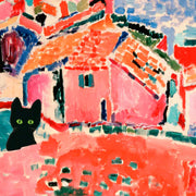
Poster svart katt med inlagd gurka i pop art-stil

Poster get och rosor – lunaråret

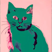
Poster Matisses livfulla musa
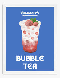
Poster jordgubbs-bubble tea

Poster tomat i pop art-stil

Poster gemenskap vid middagsbordet

Poster röd apa bland blommor – William Morris-inspirerad

Iconic London Bridge Art Print

Poster röd katt – Nine Lives

Poster ökenlandskap i solnedgång

Poster färgglad stadsvy

Poster bukett med anemoner av Henri Matisse

Enchanted Garden Retreat Art Print

Poster vinterfjäril i William Morris-stil
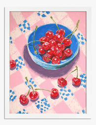
Poster körsbär på rosa- och vitrutig duk

Poster nyplockade äpplen

Poster hummer för köket och matsalen

Poster kanin med solglasögon och solhatt, svartvit med röda detaljer

Poster röda vallmor i skandinavisk stil

Poster lekfull skiss av röd hummer

Poster italienska tomater på kvist

Poster hummer i lekfull skiss

Poster skandinaviska blommor i modern stil
Fler Fab konstkureringar
Röda posters Print Articles From The Frame
How-to guides, styling inspiration, and design ideas for röda posters in your home from The Frame, Fab's blog.
How to Personalise a Rented Home with Wall Art
You're staring at beige walls that scream "rental property" and wondering how to make this place feel like you actually live here. You love art, but the lease says no...

How to Arrange Art Above Furniture
You've got the perfect piece picked out, but now you're staring at your sofa wondering exactly where it should go. Too high and it floats awkwardly. Too low and it...

Framed vs Unframed Art: What's Right for You?
You're ready to buy that print you've been thinking about for weeks. But then you see the options: framed or unframed. The framed version looks polished and ready to hang....
 We’re serious about art, ask away


From sizing to framing and print quality, Fab's art experts break it all down—so you can find the right art for your space.