Choose the Art First: Why Starting Your Room Design With a Print Is the Best Decision You'll Make
The designer trick that turns a Pinterest-perfect room into one that actually feels like yours.

Most people buy a sofa, paint the walls, agonise over a rug, and then, months later, scroll for "art that goes with grey." This is the wrong order. Designers do the opposite, and it's why their rooms feel cohesive while yours feels close but not quite right.
The backwards way most people decorate
Here's the typical sequence. You buy the big-ticket items first because they cost the most and feel the most permanent. The sofa, the bed, the dining table. Then you build outward into paint, curtains, and rugs, picking shades that "go" with the furniture. Art arrives last, often as an afterthought, and it has to thread an impossible needle: complementing five or six pre-existing decisions made by past-you, who hadn't yet figured out what the room was actually for.
This is why so many rooms look catalogue-correct but feel soulless. Everything matches. Nothing relates. The art on the wall is a polite guest at a dinner party where it doesn't know anyone.
The Pinterest version of your room is the worst offender. It has the right tones, the right textures, the right plant in the right corner. But strip away the styling and there's no point of view. No piece in the room is leading. No piece is saying anything. That's what art-last decorating produces: a room that's competent but quiet.

How designers actually do it: art first, everything else follows
Walk through any well-designed home and ask the owner where they started. More often than not, they'll point at a wall. A painting bought on holiday. A print they fell in love with at a gallery. A photograph they framed before they even owned a sofa.
Designers start with art because art is the only element in a room that does emotional work. A sofa is functional. A rug is functional. A lamp is functional. Art is the thing that tells you what the room is about. Choosing it first means every other decision has a reference point. The sofa isn't just a sofa, it's the sofa that sits beneath the print. The cushions aren't just cushions, they're echoing the burnt sienna in the bottom left corner.
This is the difference between matching and cohesion. Matching is when everything is the same colour family. Cohesion is when everything is in conversation. The first is boring. The second is what you actually want.
There's a practical reason too. Art has the widest range of any decor category. There are infinite prints, but there are only so many three-seater sofas in the colour you can stomach. Letting art lead means you're optimising the most flexible element first, then narrowing your choices for everything else. It's faster, not slower.
The three-colour method: extracting a palette from a print
Here's the part nobody explains properly. Designers don't just "pull colours" from a piece. They extract three, in a specific hierarchy, and use them in specific ratios.
The dominant colour (60%)
This is the largest single colour in the print, usually a background or a sky or a wash. It might be a soft cream, a deep navy, a warm ochre. This becomes your room's dominant tone, applied to walls, the largest piece of upholstery, or the rug. It's the wallpaper of the entire scheme.
The secondary colour (30%)
This is the print's main supporting tone, the one your eye lands on second. The leaves in a botanical, the foreground figure in an abstract, the sea in a coastal scene. It becomes your secondary upholstery, your curtains, or a feature wall. It supports the dominant without competing.
The accent colour (10%)
This is the spark. The flash of coral in an otherwise green print. The mustard streak across a charcoal abstract. The single terracotta roof tile in a Mediterranean scene. This becomes your cushions, throws, ceramics, lamp bases, the spine of a book on the coffee table. It's small in volume but does the most emotional lifting.
This is the classic 60-30-10 rule, and it works because it mirrors how the eye reads any composition. Get the ratios right and the room feels intentional even before you've finished it.
A few common mistakes to avoid. Don't pick colours that barely appear in the print, the eye won't connect them. Don't pick more than three, you'll end up with a room that looks like a paint sample card. And pay attention to undertones. A warm green and a cool green are not the same colour, and your sofa will know.
From palette to room: paint, cushions, and throws
Once you have your three colours, the rest of the room becomes a series of small, specific decisions instead of overwhelming open questions.
Paint. Take the dominant colour to a paint shop and ask for the closest match in two shades lighter. Walls almost always look better slightly desaturated compared to the art. You want the print to pop, not blend. Test with sample pots in 60x60cm patches on at least two walls, because light changes everything.
Cushions and throws. This is where the accent colour earns its keep. Two or three cushions in your accent shade, mixed with neutrals in your dominant tone, will make the whole room feel pulled together. Don't match exactly. A rust cushion next to a print with terracotta in it is more interesting than a cushion in the identical hex code.
Furniture you're keeping. Most people aren't redecorating from scratch. If you have a navy sofa you can't replace, look for prints where navy or a related deep tone appears as one of the three colours. The sofa now belongs to the scheme rather than fighting it.
Hardware and lighting. Your accent colour gives you permission. Brass lamps for warm palettes, blackened steel for cool ones, ceramic bases in your secondary tone. Small items, big impact.

Collections that make great starting points
Different art styles set different room moods. If you're starting from scratch and don't know which direction to go in, pick a collection that matches the feeling you want the room to have, not the colour you already own.
Botanical, for calm
Botanical prints lean green, cream, and earthy. They produce rooms that feel quiet and grown-up, the kind of space you'd read in. Pair with linen, oak, and unbleached textiles. The dominant tone is usually a soft off-white or sage, the accent often a warm terracotta or rust. Good for bedrooms, studies, and any room where you want the temperature dialled down.
The William Morris collection sits in this world too, but with more pattern density. If you love botanical but want something with more visual energy, start there. The palettes are more saturated, often with deep teals and clarets, which gives you a richer base to work from.
Abstract, for bold
Abstract prints are where you go when you want a room to feel current and a bit assertive. Palettes range from monochrome charcoal-and-bone to high-contrast cobalt, ochre, and oxblood. The advantage of abstract work is that one piece can carry an entire room. Get the colour extraction right and you don't need a second print on any other wall.
These work especially well in living rooms and hallways, where you want a moment of arrival.
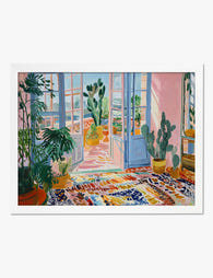
Mediterranean, for warmth
Mediterranean prints bring sun-bleached terracotta, ochre, olive, and sea blue. They produce rooms that feel relaxed and a little holiday-shaped, even in February. Pair with travertine, rattan, and bouclé. The dominant tone is usually warm white or sand, the accent a faded coral or deep cypress green.
Best for kitchens, dining rooms, and any room you want to feel social.
If you're not sure where to start, the Fab Favourites collection is a useful shortcut. It's the prints customers keep coming back to, which usually means they work hard across a range of room styles.
What if your art doesn't match your sofa?
Here's the real question hiding underneath this one: does art need to match furniture at all?
It doesn't. Matching is a low bar. What you actually want is a relationship between the art and the room, and relationships don't require sameness. A burnt orange print can live happily above a forest green sofa if you bridge them with a rug or cushion that contains both tones. A moody charcoal abstract can hang above a cream sofa with no shared colour at all, as long as the room supports the contrast with other dark elements: a black floor lamp, a dark wood coffee table, a deep-toned throw.
The fear of "clashing" is mostly a hangover from a more rigid decade of decorating. Contemporary rooms are built on tension, not symmetry. The print that looks slightly unexpected above your sofa is the one that makes the room feel collected rather than purchased.
If you genuinely can't find a way to make a piece work, the issue is usually scale or framing, not colour. A print that's too small for the wall above a sofa will always feel adrift, no matter how well its palette aligns. As a rough guide, your art should span roughly two-thirds of the width of the furniture below it. A 60x80cm print works above a small loveseat, while a three-seater sofa wants something closer to 70x100cm or a pair of prints together.
A note on framing too. The biggest reason art looks wrong in a room often isn't the art itself, it's a flimsy frame, a warped mount, or a print that's been shoved into something that doesn't fit. Buying framed and unframed work that's properly fitted, with solid wood frames and UV-protective glazing, makes a more visible difference than people expect. Good framing reads as intentionality, even from across the room.

Three prints, three rooms, three palettes
To make this concrete, here's how the same approach plays out across three completely different starting points.
The botanical living room
Start with a fern print on a soft cream ground with deep forest leaves and a single rust seed pod in the foreground. Dominant: warm cream, applied to walls in a desaturated shade and a linen sofa. Secondary: forest green, picked up in heavy curtains and a single armchair. Accent: rust, in three cushions, a ceramic vase, and the spines of books on a low shelf. Add oak floors, a jute rug, and a brass floor lamp. The result is calm, layered, and feels like it has always been there.
The abstract bedroom
Start with a large abstract in chalky bone, deep navy, and a streak of mustard. Dominant: bone, on the walls and in oversized linen bedding. Secondary: navy, in the headboard and a pair of bedside lamps. Accent: mustard, in a single bolster cushion, a throw at the foot of the bed, and a small ceramic on the dresser. Add black hardware and a dark walnut nightstand. Modern, considered, slightly moody.
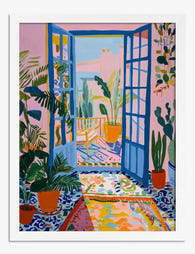
The Mediterranean kitchen
Start with a Sicilian coastline print in ochre, sea blue, and faded terracotta rooftops. Dominant: ochre, in a soft wash on the walls and warm wood cabinetry. Secondary: sea blue, in tiles or a hand-glazed splashback. Accent: terracotta, in pots, a runner along the island, and ceramic mugs hanging on hooks. Add travertine surfaces and rattan pendant lights. The room feels like it's hosting people even when it's empty.

Where to start
Pick the room you spend the most time in and find one piece you genuinely love before you change anything else. Browse the full art prints collection without thinking about your sofa. Save five. Live with them on a Pinterest board for a week, then pick the one that still pulls you in. Pull three colours. Build outward.
The room you end up with won't look like a magazine. It'll look like yours, which is the point.

Fab-produkter som visas i denna blogg
-

Poster modernt färgspel med turkosa väggar och gul stol
Translation missing: sv.products.product.sale_price Från £11.95£19.95 -
Poster randigt porträtt
Translation missing: sv.products.product.sale_price Från £11.95£19.95 -

Poster Vincent van Goghs sovrum
Translation missing: sv.products.product.sale_price Från £11.95£19.95 -

Poster Matisse-inspirerad sovrumsvy
Translation missing: sv.products.product.sale_price Från £11.95£19.95 -
Poster Matisse-inspirerad soligt uterum
Translation missing: sv.products.product.sale_price Från £11.95£19.95 -

Poster färgstark modernistisk interiör
Translation missing: sv.products.product.sale_price Från £11.95£19.95 -

Poster färgglad popkonst för vardagsrummet
Translation missing: sv.products.product.sale_price Från £11.95£19.95 -

Poster färgstark modern konst
Translation missing: sv.products.product.sale_price Från £11.95£19.95 -
Poster Matisse-inspirerat uterum
Translation missing: sv.products.product.sale_price Från £11.95£19.95 -

Poster minimalistisk bäddad säng – orange och blå
Translation missing: sv.products.product.sale_price Från £11.95£19.95 -

Poster Matisse-inspirerad mysig fristad
Translation missing: sv.products.product.sale_price Från £11.95£19.95 -

Poster lugn oas – inspirerad av Matisse
Translation missing: sv.products.product.sale_price Från £11.95£19.95 -

Poster färgstark Matisse-inspirerad oas
Translation missing: sv.products.product.sale_price Från £11.95£19.95 -

Poster mysigt hemmabibliotek med gul soffa
Translation missing: sv.products.product.sale_price Från £11.95£19.95 -

Poster med retrokänsla – illustrerade stolar och bord
Translation missing: sv.products.product.sale_price Från £11.95£19.95 -
Poster ateljéinteriör av Raoul Dufy
Translation missing: sv.products.product.sale_price Från £11.95£19.95 -

Canvastavlor färgklick till vardagsrummet
Translation missing: sv.products.product.sale_price Från £49.95£74.95 -

Poster solbelyst modern inredning
Translation missing: sv.products.product.sale_price Från £11.95£19.95 -
Poster Matisse-inspirerat uterum
Translation missing: sv.products.product.sale_price Från £11.95£19.95


Mer från The Frame

Every Bird in William Morris's Designs: The Sto...
Why birds obsessed William Morris more than any other motif Morris designed acanthus leaves, willow boughs, strawberries, tulips and pomegranates, but he kept coming back to birds. Between the 1870s...

The Best Beige Art Prints for Bedrooms (And Exa...
Most guides tell you how to hang art, but not which beige prints actually suit a bedroom, or what size to buy for your specific bed. This one does both....

The Most Famous William Morris Designs, Ranked:...
William Morris designed over 50 patterns in his lifetime, and roughly six of them get all the attention. That's mostly fair, but not entirely. Here's our honest ranking of the...