How to Build a Dog-Themed Gallery Wall That Looks Considered, Not Chaotic
A curator's approach to dog art, with layout templates, frame rules, and the one mistake that ruins every themed wall.

Loving dog art is easy. Arranging six pieces of it on one wall without your house looking like a dog-themed gift shop is the hard part. This guide walks you through the curation rules, layout templates and exact measurements that turn enthusiasm into something genuinely beautiful.
Why a themed gallery wall works better than a random cluster
A themed wall has a built-in advantage: the subject matter does half the design work for you. When every piece shares a clear connection, a viewer's eye reads the wall as one composition rather than a scattered collection of unrelated things.
The risk with dog art specifically is that "theme" tips into "shrine." A border collie portrait next to a paw-print typography print next to a cartoon dachshund and a "Home is where the dog is" sign reads as enthusiasm, not curation. The fix is treating dog art the way a gallerist would treat any themed collection: with restraint, consistency, and a clear point of view.
The goal is a wall that says "this person has taste and happens to love dogs," not "this person loves dogs and bought everything labelled 'dog art' for sale online."

Choosing a layout: grid, salon hang, or linear row
Three layouts cover almost every wall worth filling. Pick based on the space and your tolerance for fiddling.
The grid
Equal-sized prints in straight rows and columns. Calm, formal, easy to plan. A 2x3 grid of six 30x40cm prints works beautifully above a sofa or sideboard. This is the most forgiving layout for mixed dog art because the rigid structure absorbs visual variety. If your prints span styles (one photograph, one illustration, one watercolour), a grid quietly unifies them.
The salon hang
Mixed sizes, asymmetrical, but with a defined outer rectangle. This is the layout most people picture when they hear "gallery wall." It looks effortless and is actually the hardest to get right. Plan it on the floor first (more on that below) and resist the urge to keep adding. Seven to nine pieces is usually the sweet spot.
The linear row
A single horizontal line of three to five prints, all the same size, hung at the same height. Underrated. Works brilliantly above a console table, along a hallway, or up a staircase. If you've inherited a long, narrow wall and feel paralysed, default to this.
Mixing dog art styles without it looking messy (the 2-style rule)
Here's the single most useful rule for themed walls: stick to two styles, maximum.
Dog art exists in every conceivable form. Vintage oil portraits, modern line drawings, black-and-white photography, watercolour illustrations, abstract minimalist silhouettes, retro pop art, botanical-style breed studies. Each of these is lovely on its own. Cram four or five together and the wall reads as chaos no matter how good the individual pieces are.
Combinations that work:
- Vintage portraits + modern line drawings. The contrast between traditional and contemporary feels deliberate.
- Black-and-white photography + watercolour illustrations. One graphic, one painterly. The shared softness ties them.
- Botanical-style breed studies + minimalist silhouettes. Both quiet, both detail-led.
- Pop art + typography prints. Bold-on-bold, shared graphic energy.
Combinations that don't work:
- Photography + watercolour + line drawing + vintage oil. Four styles competing.
- Cartoon illustrations + realistic portraits. Tonal whiplash.
- Anything mixing serious and whimsical. Pick a register and commit.
When browsing dog art prints, decide on your two styles before you start adding to basket. It's the difference between a coherent wall and an expensive mistake.
A note on breed specificity
If you have a beagle, a wall of nine beagle portraits is too much beagle. Mix in general dog imagery, abstract canine forms, or one or two non-dog prints. Lean too specific and the wall stops reading as art and starts reading as merchandise.
How many prints you need for common wall sizes
Use these as starting templates. Adjust to your wall, but the piece counts and ratios hold up.
Above a standard 3-seater sofa (180-200cm wide)
Aim for an arrangement that spans roughly two-thirds the width of the sofa.
- 5-piece grid: Five 40x50cm prints in a single row, or a 2-over-3 staggered grid. Keep 5cm between frames.
- 7-piece salon hang: One 50x70cm anchor, four 30x40cm supporting prints, two 21x30cm accent prints. Total span around 130cm wide, 90cm tall.
Above a console table or sideboard (120-140cm wide)
- 3-piece linear row: Three 40x50cm prints, evenly spaced with 6cm gaps.
- 5-piece salon hang: One 50x70cm anchor offset to one side, surrounded by four smaller prints.
A tall, narrow wall (stairwell or hallway)
- Linear staircase: Five to seven prints at 30x40cm, each stepped to follow the stair line, 8cm vertical spacing.
- Vertical stack: Three 40x50cm prints stacked, 5cm gaps.
A full feature wall (8-foot / 244cm wide)
- 9-piece salon hang: One 70x100cm anchor, two 50x70cm secondaries, four 30x40cm mediums, two 21x30cm accents. Span the full wall but leave at least 30cm breathing room from the edges.
Spacing rule of thumb: 5-7cm between frames for tight, intentional clusters. 8-10cm if you want a more relaxed feel. Less than 4cm starts to look cramped. More than 12cm and the wall stops reading as one composition.

Keeping frames consistent: pick one finish and stick with it
This is non-negotiable. Mismatched frames are the single biggest reason themed walls look chaotic, and it's the easiest thing to get right.
Choose one finish for the entire wall:
- All black. Crisp, modern, works in almost any room.
- All natural wood (oak or ash). Warm, contemporary, brilliant against white or off-white walls.
- All white. Clean, gallery-like, best for colourful or photography-heavy prints.
That's it. Don't mix black and wood. Don't add one gold frame because it was on sale. The whole point of frame consistency is that it allows the art to vary while the wall still feels unified.
This is also where framing quality starts to matter. Cheap frames warp, the print bubbles inside the glazing, and corners separate within a year. A gallery wall is only as good as its weakest frame, and a single dodgy one drags the whole thing down. Look for solid wood frames (no MDF or veneer), a UV-protective glaze that won't yellow, and prints fitted properly at the point of manufacture rather than shipped flat for you to assemble. Our framed prints arrive ready to hang with fixtures already attached, which removes most of the variables that ruin DIY gallery walls.
A quick word on mounts
White mounts inside the frame add breathing room and a sense of formality. They make a smaller print feel more substantial and give mixed styles a stronger shared visual language. If you're nervous about mixing styles, mounts will help.
Adding non-dog prints to balance the wall
Counterintuitively, the best dog gallery walls aren't 100% dogs. One or two carefully chosen non-dog prints break up the theme and stop it tipping into novelty territory.
What works:
- A botanical print. Shares an organic, natural sensibility with most dog art.
- An abstract shape or colour study. Adds visual rest between busier figurative pieces.
- A typography print. A single line of text, set quietly. Avoid anything dog-related; the point is contrast.
- A landscape or moody photograph. Adds depth and a sense of place.
The ratio to aim for is roughly 75-80% dog art, 20-25% supporting pieces. On a seven-piece wall, that's five or six dog prints and one or two non-dog prints. Browse the broader animal art prints collection if you want to keep things in the same family without staying strictly canine.
Building a colour palette
Dog art comes in every colour imaginable, which is precisely why you need to limit yours. Pick two or three colours that will repeat across the wall and edit ruthlessly toward them. Examples that work:
- Black and white photography + warm sepia and cream tones.
- Navy, rust, and natural wood.
- Charcoal, sage, and off-white.
- Black, ochre, and terracotta.
If a print you love doesn't sit within your palette, save it for another room. Permission granted.
Step-by-step hanging guide with measurements
Don't start with a hammer. Start with paper.
1. Lay it out on the floor first
Clear a floor space the same size as your wall. Arrange the prints face-up. Move them around. Take a photo on your phone and look at it small; problems become obvious at thumbnail size that you'd miss up close.
2. Cut paper templates
Trace each frame onto kraft paper or newspaper. Cut them out. Mark the position of the hanging fixture on each template (measure from the top of the frame down to where the wall hook will sit).
3. Tape templates to the wall
Use low-tack masking tape. Start with your anchor piece (the largest print) at the centre of where the arrangement will sit. Build outward. Step back regularly. Rearrange as needed. Live with it for a day if you can.
4. Set your centre height
The centre of the overall arrangement should sit at roughly 145-150cm from the floor, which is standard gallery eye-level. If you're hanging above furniture, the bottom of the lowest frame should sit 15-25cm above the top of the sofa or sideboard.
5. Mark and hammer
With templates in place, hammer hooks straight through the marked points on the paper. Tear the paper away. Hang.
6. Use a spirit level
Always. Eyeballing it never works.

Our favourite dog gallery wall combinations
A few combinations we keep coming back to, with specific dimensions and styling notes.
The classic study
Vintage-style breed portraits + one botanical print, all in oak frames with white mounts. Works in libraries, studies, and anywhere with a leather chair. Five pieces at 30x40cm in a tight grid.
The modern minimalist
Black-and-white line drawings of dogs + one abstract shape print, all in black frames, no mounts. Works in modern hallways and above mid-century sideboards. Three to five pieces in a linear row at 40x50cm.
The soft and painterly
Watercolour dog illustrations + one watercolour landscape, all in white frames with white mounts. Works in bedrooms and softer living rooms. Seven pieces in a salon hang.
The bold graphic
Pop-art dog portraits + one typography print, all in black frames. Works in kitchens, kids' rooms, and any space that needs energy. Six pieces in a 2x3 grid at 30x40cm.
If you want a shortcut, our pre-curated wall art sets take care of the styling decisions for you, with the ratios and palettes already balanced.

A final word on editing
The hardest part of building a themed wall isn't choosing what goes on it. It's choosing what doesn't. If you've got twelve dog prints you love and a wall that fits seven, the answer isn't to squeeze all twelve in. Pick the seven that work hardest together. Save the rest for the bedroom, the hallway, or next year.
Walls aren't permanent. Rotating art seasonally, swapping a piece in or out when something new catches your eye, is part of the pleasure. The best gallery walls aren't finished. They're just well-edited at any given moment.

Fab-produkter som visas i denna blogg
-

Canvastavlor stiliga hundar i svart och varm beige
Translation missing: sv.products.product.sale_price Från £49.95£74.95 -

Poster lekfulla hundar i färg
Translation missing: sv.products.product.sale_price Från £11.95£19.95 -

Canvastavlor lekfulla hundar i pastelltoner
Translation missing: sv.products.product.sale_price Från £49.95£74.95 -

Canvastavlor med svart hund i färgstark interiör
Translation missing: sv.products.product.sale_price Från £49.95£74.95 -

Canvastavlor hund med attityd
Translation missing: sv.products.product.sale_price Från £49.95£74.95 -

Canvastavlor hund med solglasögon
Translation missing: sv.products.product.sale_price Från £49.95£74.95 -

Poster minimalistiskt hundporträtt i jordnära toner
Translation missing: sv.products.product.sale_price Från £11.95£19.95 -

Canvastavlor lekfull taxparad i svartvitt
Translation missing: sv.products.product.sale_price Från £49.95£74.95 -

Canvastavlor hundmotiv i mjuka färger
Translation missing: sv.products.product.sale_price Från £49.95£74.95 -

Poster tax i akvarell, inspirerande motiv
Translation missing: sv.products.product.sale_price Från £11.95£19.95 -

Poster skiss av glad hund
Translation missing: sv.products.product.sale_price Från £11.95£19.95 -
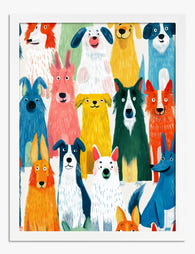
Canvastavlor lekfull parad av färgglada hundar
Translation missing: sv.products.product.sale_price Från £49.95£74.95 -

Poster fyra trofasta hundar på bokstapel
Translation missing: sv.products.product.sale_price Från £11.95£19.95 -

Canvastavlor trofast blick – hundporträtt i varma toner
Translation missing: sv.products.product.sale_price Från £49.95£74.95 -
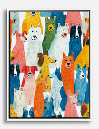
Poster färgglad hundparad
Translation missing: sv.products.product.sale_price Från £11.95£19.95 -

Canvastavlor lekfull hundparad
Translation missing: sv.products.product.sale_price Från £49.95£74.95 -

Canvastavlor lekfulla valpar i parad
Translation missing: sv.products.product.sale_price Från £49.95£74.95


Mer från The Frame

Thrushes, Hares, and Peacocks: The Animals in W...
Why Morris put animals at the centre of his designs William Morris wasn't decorating walls with cute creatures. He was making a quiet argument. While Victorian factories churned out cheap,...

From Dutch Masters to Modern Minimalism: The Ke...
Search "types of flower bouquet art" and you'll get wedding centrepieces, posy guides, and cascading bridal arrangements. Useful if you're getting married. Useless if you're trying to choose what goes...

Every Flower in William Morris's World: A Guide...
William Morris designed roughly 50 wallpapers and around 30 chintzes across his career, and almost every single one features a plant. If you've ever stood in front of a Morris...